Willkommen bei den Top‑Schriften – hier treffen Beliebtheit und Qualität aufeinander. Das sind die in diesem Jahr am häufigsten heruntergeladenen und genutzten Fonts. Wenn Sie sichere Optionen für Logo, Web oder Social suchen, starten Sie hier.
Jeder Top‑Font überzeugt durch Balance, Lesbarkeit und Vielseitigkeit. Sie finden moderne Sans‑Serifs, elegante Scripts, Vintage‑Serifs und minimalistische Displays.
-
( Fonts by NDISCOVER )
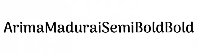
A playful, semi-bold font with rounded characters and a modern touch.
 Herunterladen 469 Downloads@WebFont
 -
( Fonts by BLKBK Fonts - www.blkbk.shop - Personal-use only. For commercial use please contact owner. Sponsoren Schriftart )
A bold, hand-drawn font with a rustic and organic feel.
![Hall Trash Frei Schriftart Herunterladen]() Herunterladen 469 Downloads
Herunterladen 469 Downloads -
( Fonts by a Neale Davidson - www.pixelsagas.com. Personal-use only. For commercial use please contact owner. )
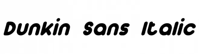
A playful, bold, and rounded italic font with a dynamic and energetic style.
![Dunkin Sans Italic Frei Schriftart Herunterladen]() Herunterladen 469 Downloads@WebFont
Herunterladen 469 Downloads@WebFont -
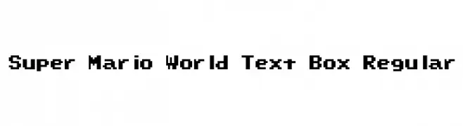
![Super Mario World Text Box Regular Frei Schriftart Herunterladen]() Herunterladen 469 Downloads@WebFont
Herunterladen 469 Downloads@WebFont -
( Fonts by Cristiano Sobral - Personal-use only. For commercial use please contact owner. )
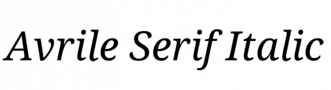
An elegant serif font with a classic italic style, perfect for sophisticated designs.
![Avrile Serif Italic Frei Schriftart Herunterladen]() Herunterladen 469 Downloads@WebFont
Herunterladen 469 Downloads@WebFont -
( Fonts by Jen Jones )
A playful, rounded font with smooth curves and consistent stroke width.
![HelloLori Frei Schriftart Herunterladen]() Herunterladen 469 Downloads@WebFont
Herunterladen 469 Downloads@WebFont -
( Fonts by Typodermic Fonts )
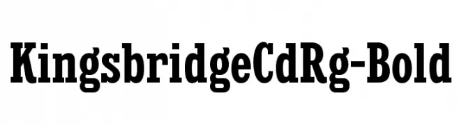
A bold, classic serif typeface with strong, authoritative characters.
![KingsbridgeCdRg-Bold Frei Schriftart Herunterladen]() Herunterladen 469 Downloads@WebFont
Herunterladen 469 Downloads@WebFont -
![Charger Frei Schriftart Herunterladen]() Herunterladen 469 Downloads@WebFont
Herunterladen 469 Downloads@WebFont -
( Fonts by MiniCandy - Personal-use only. For commercial use please contact owner. )
A playful, bold font with rounded, bubble-like characters and heart-shaped elements.
![SweetLove Frei Schriftart Herunterladen]() Herunterladen 469 Downloads@WebFont
Herunterladen 469 Downloads@WebFont -
( Fonts by www.gust.org.pl )
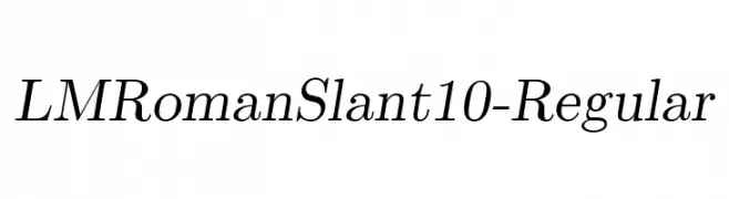
Elegant serif font with a slant, featuring moderate contrast and classic styling.
![LMRomanSlant10-Regular Frei Schriftart Herunterladen]() Herunterladen 469 Downloads@WebFont
Herunterladen 469 Downloads@WebFont -
( Fonts by www.norfok.com - Norfok® Incredible Font Design - Thomas W. Otto )
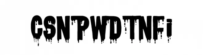
A bold, dripping font perfect for horror-themed designs.
![CSNPWDTNFI Frei Schriftart Herunterladen]() Herunterladen 469 Downloads@WebFont
Herunterladen 469 Downloads@WebFont -
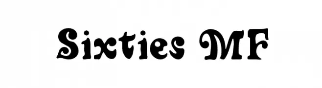
![Sixties MF Frei Schriftart Herunterladen]() Herunterladen 469 Downloads@WebFont
Herunterladen 469 Downloads@WebFont -
![persische Keilschrift Frei Schriftart Herunterladen]() Herunterladen 469 Downloads@WebFont
Herunterladen 469 Downloads@WebFont -
( Sembodo Studio )
A bold, geometric font with a futuristic and industrial design.
![ROBOTOP Frei Schriftart Herunterladen]() Herunterladen 469 Downloads@WebFont
Herunterladen 469 Downloads@WebFont -
( www.h19a.net/ )
A geometric, abstract font with bold, angular shapes and a futuristic aesthetic.
![H19A Luna Frei Schriftart Herunterladen]() Herunterladen 469 Downloads@WebFont
Herunterladen 469 Downloads@WebFont -
( Fonts by Paul Lloyd )
An ornate and intricate decorative font with elaborate swirls and flourishes.
![Hentzau_Initials Frei Schriftart Herunterladen]() Herunterladen 469 Downloads@WebFont
Herunterladen 469 Downloads@WebFont -
( Fonts by Tlatous Type )
A playful, handwritten font with a casual and friendly appearance.
![DonutCandy-Regular Frei Schriftart Herunterladen]() Herunterladen 469 Downloads@WebFont
Herunterladen 469 Downloads@WebFont -
![BAM It's Andrea! Frei Schriftart Herunterladen]() Herunterladen 469 Downloads@WebFont
Herunterladen 469 Downloads@WebFont -
![Defactica Frei Schriftart Herunterladen]() Herunterladen 469 Downloads@WebFont
Herunterladen 469 Downloads@WebFont -
( Fonts by Edric Studio www.creativefabrica.com/designer/edricstudio/ - Personal-use only. For commercial use please contact owner. )
A bold, modern stencil-like font with geometric cuts and angles.
![ALDITH Frei Schriftart Herunterladen]() Herunterladen 469 Downloads@WebFont
Herunterladen 469 Downloads@WebFont -
( Fonts by Daniel Zadorozny - www.iconian.com - Free for personal use )
A bold, artistic font with flowing strokes and decorative elements.
![First Order Frei Schriftart Herunterladen]() Herunterladen 469 Downloads@WebFont
Herunterladen 469 Downloads@WebFont -
( Typhoon Type - Suthi Srisopha - www.typhoontype.net )
An elegant and ornate script font with intricate swirls and flourishes.
![Lonely Basket Frei Schriftart Herunterladen]() Herunterladen 469 Downloads@WebFont
Herunterladen 469 Downloads@WebFont -
( Fonts by www.typodermicfonts.com - Ray Larabie )
An elegant italic font with graceful curves and balanced contrast.
![Echelon-Italic Frei Schriftart Herunterladen]() Herunterladen 469 Downloads@WebFont
Herunterladen 469 Downloads@WebFont -
![Delinquent-Caps Frei Schriftart Herunterladen]() Herunterladen 469 Downloads@WebFont
Herunterladen 469 Downloads@WebFont -
![Reject Frei Schriftart Herunterladen]() Herunterladen 468 Downloads@WebFont
Herunterladen 468 Downloads@WebFont -
( Fonts by Paul Lloyd )
A decorative font with whimsical swirls and curves, perfect for creative designs.
![Helena-Wide Frei Schriftart Herunterladen]() Herunterladen 468 Downloads
Herunterladen 468 Downloads -
( Fonts by NubeFonts - nubefonts.blogspot.com - Personal-use only. For commercial use please contact owner. )
A playful, hand-drawn font with a whimsical and informal style.
![Soul Frei Schriftart Herunterladen]() Herunterladen 468 Downloads@WebFont
Herunterladen 468 Downloads@WebFont -
( Fonts by Style-7 - www.styleseven.com - Personal-use only. For commercial use please contact owner. )
A pixelated, retro-style font inspired by early digital displays.
![High Pixel-7 Frei Schriftart Herunterladen]() Herunterladen 468 Downloads@WebFont
Herunterladen 468 Downloads@WebFont -
( Tácio Brito )
A geometric, modern font with bold, clean lines and a slightly condensed style.
![Poseidonia Regular Frei Schriftart Herunterladen]() Herunterladen 468 Downloads@WebFont
Herunterladen 468 Downloads@WebFont -
![BertaDrug Frei Schriftart Herunterladen]() Herunterladen 468 Downloads@WebFont
Herunterladen 468 Downloads@WebFont -
![Coolio Frei Schriftart Herunterladen]() Herunterladen 468 Downloads@WebFont
Herunterladen 468 Downloads@WebFont -
![Juvenile personal use Frei Schriftart Herunterladen]() Herunterladen 468 Downloads@WebFont
Herunterladen 468 Downloads@WebFont -
![Amaya Technical Regular Frei Schriftart Herunterladen]() Herunterladen 468 Downloads@WebFont
Herunterladen 468 Downloads@WebFont -
( Fonts by Daniel Zadorozny - www.iconian.com - Free for personal use )
A bold, italicized font with smooth, rounded strokes and an extended form.
![Action Man Extended Italic Frei Schriftart Herunterladen]() Herunterladen 468 Downloads@WebFont
Herunterladen 468 Downloads@WebFont -
![Visitation Regular Frei Schriftart Herunterladen]() Herunterladen 468 Downloads@WebFont
Herunterladen 468 Downloads@WebFont


Welche Schriften sind gerade am populärsten?
Poppins, Roboto, Montserrat, Open Sans und Lato sind wegen ihrer klaren Formen und breiten Einsetzbarkeit sehr gefragt – von Markenauftritt über Landingpages bis hin zu Postern.
Welche Fonts eignen sich für Logos?
Geometrische Sans‑Serifs (z. B. Poppins, Familien im Gotham‑Stil) sind ein häufiger Griff für sauberes, skalierbares Branding. Für eine persönlichere Note bleiben Scripts und Handschrift‑Stile beliebt. Kombinieren Sie einen prägnanten Headline‑Font mit einer neutralen Brotschrift für Wiedererkennung und Harmonie.
Wie oft wird die Top‑Liste aktualisiert?
Regelmäßig – basierend auf realen Downloads und Interaktionen. Schauen Sie öfter vorbei, um aufstrebende Favoriten früh zu entdecken.
💡 Tipp: Seite bookmarken – Trends wechseln schnell, und heutige Top‑Schriften inspirieren morgen vielleicht das Rebranding.