Willkommen bei den Top‑Schriften – hier treffen Beliebtheit und Qualität aufeinander. Das sind die in diesem Jahr am häufigsten heruntergeladenen und genutzten Fonts. Wenn Sie sichere Optionen für Logo, Web oder Social suchen, starten Sie hier.
Jeder Top‑Font überzeugt durch Balance, Lesbarkeit und Vielseitigkeit. Sie finden moderne Sans‑Serifs, elegante Scripts, Vintage‑Serifs und minimalistische Displays.
-
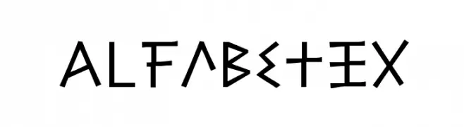
( Fonts by Apostrophic Lab )
A playful, angular font inspired by runic and geometric shapes.
 Herunterladen 466 Downloads@WebFont
 -
![JMLetter Frei Schriftart Herunterladen]() Herunterladen 466 Downloads@WebFont
Herunterladen 466 Downloads@WebFont -
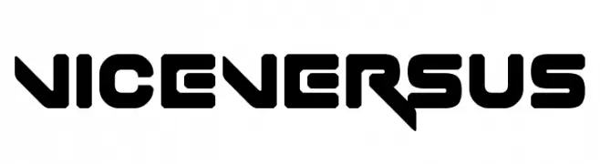
( Fonts by www.chequered.ink - Chequered Ink - Personal-use only. For commercial use please contact owner. )
A bold, futuristic font with geometric and angular design elements.
![Vice Versus Frei Schriftart Herunterladen]() Herunterladen 466 Downloads@WebFont
Herunterladen 466 Downloads@WebFont -
![CreatureA Frei Schriftart Herunterladen]() Herunterladen 466 Downloads@WebFont
Herunterladen 466 Downloads@WebFont -
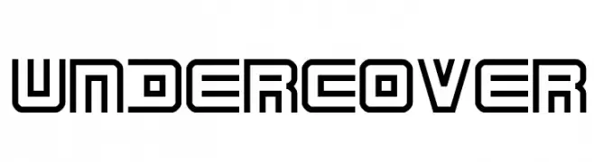
( Fonts by Jacob Fisher - www.pizzadude.dk )
A geometric, futuristic font with a stencil-like design and bold, angular lines.
![Undercover Frei Schriftart Herunterladen]() Herunterladen 466 Downloads@WebFont
Herunterladen 466 Downloads@WebFont -
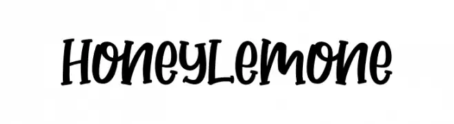
( Fonts by Andrimada Creative )
A playful, hand-drawn font with bold, rounded strokes and a whimsical style.
![Honey Lemone Frei Schriftart Herunterladen]() Herunterladen 466 Downloads@WebFont
Herunterladen 466 Downloads@WebFont -
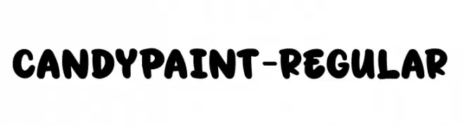
( Fonts by Eifetstype )
A playful, bold font with rounded, bubbly characters and a hand-drawn feel.
![CandyPaint-Regular Frei Schriftart Herunterladen]() Herunterladen 466 Downloads@WebFont
Herunterladen 466 Downloads@WebFont -
( Fonts by Tigadestd )
A playful, bold font with rounded, thick strokes and a whimsical, friendly appearance.
![Baby Panda Frei Schriftart Herunterladen]() Herunterladen 466 Downloads@WebFont
Herunterladen 466 Downloads@WebFont -
![Scrappy looking demo Frei Schriftart Herunterladen]() Herunterladen 466 Downloads@WebFont
Herunterladen 466 Downloads@WebFont -
( Fonts by a Neale Davidson - www.pixelsagas.com. Personal-use only. For commercial use please contact owner. )
A bold, italicized font with a futuristic, mechanical style.
![Mech Tech Bold Italic Frei Schriftart Herunterladen]() Herunterladen 466 Downloads@WebFont
Herunterladen 466 Downloads@WebFont -
![CARBONCILLO PALO Normal Frei Schriftart Herunterladen]() Herunterladen 466 Downloads@WebFont
Herunterladen 466 Downloads@WebFont -
( Fonts by Levi Halmos )
A bold, geometric font with a modern and futuristic style.
![Smart and Sexy Bold Frei Schriftart Herunterladen]() Herunterladen 466 Downloads@WebFont
Herunterladen 466 Downloads@WebFont -
( Fonts by Kimberly Geswein - kimberlygeswein.com/ )
A clean, modern sans-serif font with uniform stroke width and excellent readability.
![KG Neatly Printed Spaced Frei Schriftart Herunterladen]() Herunterladen 466 Downloads@WebFont
Herunterladen 466 Downloads@WebFont -
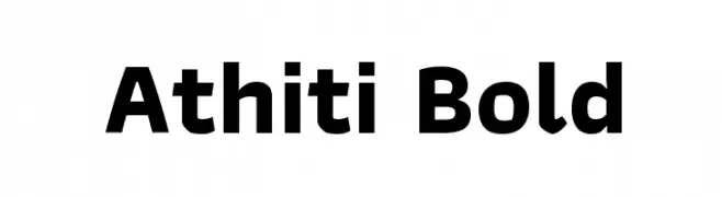
( Copyright (c) 2015, Cadson Demak (info@cadsondemak.com) )
A bold, modern sans-serif font with clean lines and rounded edges.
![Athiti Bold Frei Schriftart Herunterladen]() Herunterladen 466 Downloads@WebFont
Herunterladen 466 Downloads@WebFont -
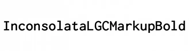
( Personal-use only. For commercial use please contact owner. )
A bold, monospaced typeface with a clean and modern design.
![Inconsolata LGC Markup Bold Frei Schriftart Herunterladen]() Herunterladen 466 Downloads@WebFont
Herunterladen 466 Downloads@WebFont -
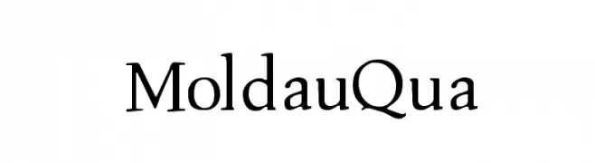
( Fonts by Manfred Klein. Free for private and charity use. Free for commercial with donation to organizations )
A classic serif font with elegant strokes and moderate contrast.
![MoldauQua Frei Schriftart Herunterladen]() Herunterladen 466 Downloads@WebFont
Herunterladen 466 Downloads@WebFont -
![Digital Readout Thick Upright Frei Schriftart Herunterladen]() Herunterladen 466 Downloads@WebFont
Herunterladen 466 Downloads@WebFont -
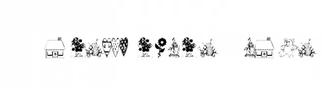
( Fonts by Adult Ramblings - Anastacia E. Zittel - Personal-use only. For commercial use please contact owner. )
A decorative dingbat set featuring playful and whimsical illustrations.
![AEZAnastacia's Dings Frei Schriftart Herunterladen]() Herunterladen 466 Downloads@WebFont
Herunterladen 466 Downloads@WebFont -
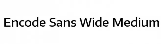
( Copyright (c) 2012, Impallari Type (www.impallari.com), with Reserved Font Name Encode Sans. )
A modern, wide sans-serif font with excellent readability and balanced proportions.
![Encode Sans Wide Medium Frei Schriftart Herunterladen]() Herunterladen 466 Downloads@WebFont
Herunterladen 466 Downloads@WebFont -
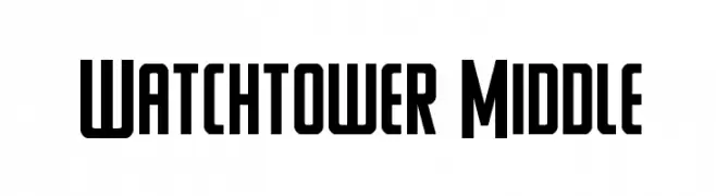
( Iconian Fonts - Daniel Zadorozny - www.iconian.com )
A bold, geometric font with a modern, condensed style.
![Watchtower Middle Frei Schriftart Herunterladen]() Herunterladen 466 Downloads@WebFont
Herunterladen 466 Downloads@WebFont -
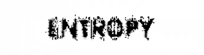
( Fonts by Rob Dobi - Toxic Type - www.dobi.nu )
A distressed, chaotic font with jagged, irregular edges.
![Entropy Frei Schriftart Herunterladen]() Herunterladen 466 Downloads@WebFont
Herunterladen 466 Downloads@WebFont -
![Ass Backwards Frei Schriftart Herunterladen]() Herunterladen 466 Downloads@WebFont
Herunterladen 466 Downloads@WebFont -
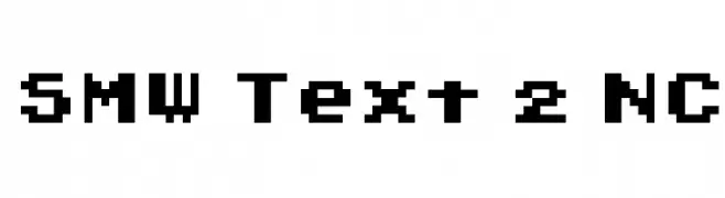
( Font by Jayvee D. Enaguas - grandchaos9000.deviantart.com )
A bold, pixelated font with a retro, digital aesthetic.
![SMW Text 2 NC Frei Schriftart Herunterladen]() Herunterladen 466 Downloads@WebFont
Herunterladen 466 Downloads@WebFont -
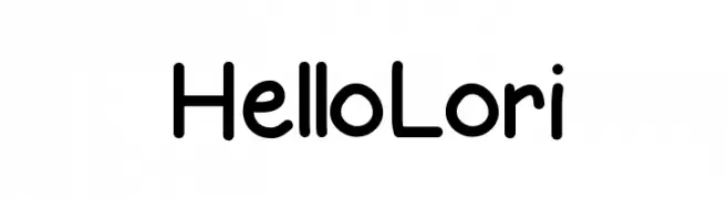
( Fonts by Jen Jones )
A playful, rounded font with smooth curves and consistent stroke width.
![HelloLori Frei Schriftart Herunterladen]() Herunterladen 466 Downloads@WebFont
Herunterladen 466 Downloads@WebFont -
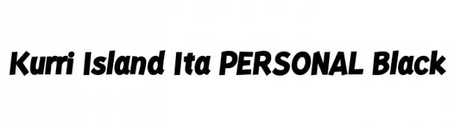
( Fonts by Måns Grebäck )
A bold, italicized font with high contrast and a modern, dynamic style.
![Kurri Island Ita PERSONAL Black Frei Schriftart Herunterladen]() Herunterladen 466 Downloads@WebFont
Herunterladen 466 Downloads@WebFont -
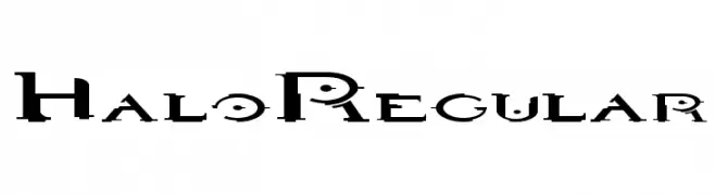
![HaloRegular Frei Schriftart Herunterladen]() Herunterladen 466 Downloads@WebFont
Herunterladen 466 Downloads@WebFont -
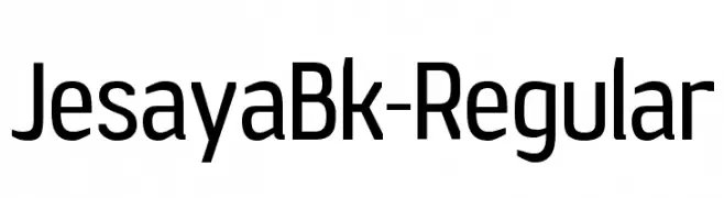
( Fonts by Raymond Larabie - Personal-use only. For commercial use please contact owner. )
A modern sans-serif font with a clean, professional look and slightly condensed structure.
![JesayaBk-Regular Frei Schriftart Herunterladen]() Herunterladen 466 Downloads@WebFont
Herunterladen 466 Downloads@WebFont -
( Fonts by dartcanada.tripod.com - Darren Rigby )
A modern, geometric font with a sleek, condensed design.
![Thin Dime Frei Schriftart Herunterladen]() Herunterladen 466 Downloads
Herunterladen 466 Downloads -
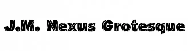
Schriftart von defharo. For commercial use please contact the owner.
![J.M. Nexus Grotesque Frei Schriftart Herunterladen]() Herunterladen 466 Downloads@WebFont
Herunterladen 466 Downloads@WebFont -
( www.wartoft.nu/ )
Playful handwritten font with a casual style.
![Sebran3 Frei Schriftart Herunterladen]() Herunterladen 466 Downloads@WebFont
Herunterladen 466 Downloads@WebFont -
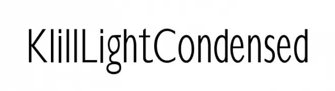
( Fonts by Manfred Klein - manfred-klein.ina-mar.com )
A sleek, modern, and condensed font with a light weight and minimalistic design.
![KlillLightCondensed Frei Schriftart Herunterladen]() Herunterladen 466 Downloads@WebFont
Herunterladen 466 Downloads@WebFont -
( Fonts by Storytype Studio )
A bold, angular font with a strong, modern aesthetic.
![BRENTON Frei Schriftart Herunterladen]() Herunterladen 466 Downloads@WebFont
Herunterladen 466 Downloads@WebFont -
( Fonts by Typhoon Type - Suthi Srisopha - www.typhoontype.net - Personal-use only. For commercial use please contact owner. )
A playful, festive script font with elegant loops and holiday-themed elements.
![ChristmasSquad-PersonalUse Frei Schriftart Herunterladen]() Herunterladen 466 Downloads@WebFont
Herunterladen 466 Downloads@WebFont -
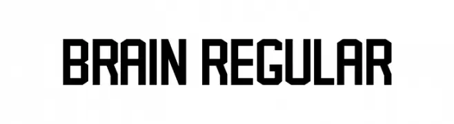
( Fonts by Vladimir Nikolic - Personal-use only. For commercial use please contact owner. )
A bold, geometric font with a modern, industrial style.
![Brain Regular Frei Schriftart Herunterladen]() Herunterladen 466 Downloads@WebFont
Herunterladen 466 Downloads@WebFont -
![Bu Marker SC Bold Frei Schriftart Herunterladen]() Herunterladen 466 Downloads@WebFont
Herunterladen 466 Downloads@WebFont


Welche Schriften sind gerade am populärsten?
Poppins, Roboto, Montserrat, Open Sans und Lato sind wegen ihrer klaren Formen und breiten Einsetzbarkeit sehr gefragt – von Markenauftritt über Landingpages bis hin zu Postern.
Welche Fonts eignen sich für Logos?
Geometrische Sans‑Serifs (z. B. Poppins, Familien im Gotham‑Stil) sind ein häufiger Griff für sauberes, skalierbares Branding. Für eine persönlichere Note bleiben Scripts und Handschrift‑Stile beliebt. Kombinieren Sie einen prägnanten Headline‑Font mit einer neutralen Brotschrift für Wiedererkennung und Harmonie.
Wie oft wird die Top‑Liste aktualisiert?
Regelmäßig – basierend auf realen Downloads und Interaktionen. Schauen Sie öfter vorbei, um aufstrebende Favoriten früh zu entdecken.
💡 Tipp: Seite bookmarken – Trends wechseln schnell, und heutige Top‑Schriften inspirieren morgen vielleicht das Rebranding.