Willkommen bei den Top‑Schriften – hier treffen Beliebtheit und Qualität aufeinander. Das sind die in diesem Jahr am häufigsten heruntergeladenen und genutzten Fonts. Wenn Sie sichere Optionen für Logo, Web oder Social suchen, starten Sie hier.
Jeder Top‑Font überzeugt durch Balance, Lesbarkeit und Vielseitigkeit. Sie finden moderne Sans‑Serifs, elegante Scripts, Vintage‑Serifs und minimalistische Displays.
-
 Herunterladen 461 Downloads@WebFont
 -
![Thanksgiving 2016 Frei Schriftart Herunterladen]() Herunterladen 461 Downloads@WebFont
Herunterladen 461 Downloads@WebFont -
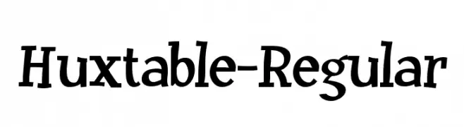
( Fonts by www.typodermicfonts.com - Ray Larabie )
A bold, dynamic serif font with medium contrast and a playful slant.
![Huxtable-Regular Frei Schriftart Herunterladen]() Herunterladen 461 Downloads@WebFont
Herunterladen 461 Downloads@WebFont -
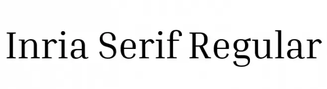
( Copyright 2017 The Inria Serif Project Authors (https://github.com/BlackFoundryCom/InriaFonts) )
A classic serif typeface with moderate contrast and elegant serifs.
![Inria Serif Regular Frei Schriftart Herunterladen]() Herunterladen 461 Downloads@WebFont
Herunterladen 461 Downloads@WebFont -
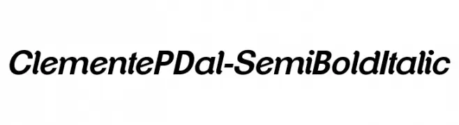
![ClementePDal-SemiBoldItalic Frei Schriftart Herunterladen]() Herunterladen 461 Downloads@WebFont
Herunterladen 461 Downloads@WebFont -
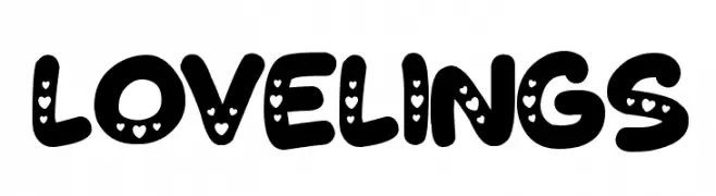
![Lovelings Frei Schriftart Herunterladen]() Herunterladen 461 Downloads@WebFont
Herunterladen 461 Downloads@WebFont -
( Copyright (c) 2015 Indian Type Foundry (info@indiantypefoundry.com) )
A clean and modern sans-serif font with uniform stroke width and excellent readability.
![Hind Vadodara Light Frei Schriftart Herunterladen]() Herunterladen 461 Downloads@WebFont
Herunterladen 461 Downloads@WebFont -
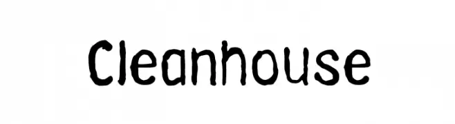
Schriftart von NicholasJudy456. For commercial use please contact the owner.
![Cleanhouse Frei Schriftart Herunterladen]() Herunterladen 461 Downloads@WebFont
Herunterladen 461 Downloads@WebFont -
![Noyes Frei Schriftart Herunterladen]() Herunterladen 461 Downloads@WebFont
Herunterladen 461 Downloads@WebFont -
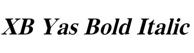
( Fonts by Behnam - Personal-use only. For commercial use please contact owner. )
A bold, italic font with strong, dynamic strokes and a pronounced slant.
![XB Yas Bold Italic Frei Schriftart Herunterladen]() Herunterladen 461 Downloads@WebFont
Herunterladen 461 Downloads@WebFont -
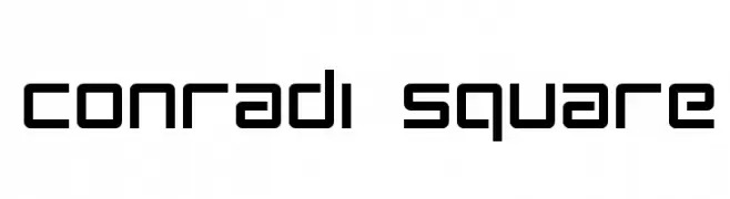
( ideogram - www.ideogram.nl )
A geometric, modular font with a modern, futuristic aesthetic.
![Conradi Square Frei Schriftart Herunterladen]() Herunterladen 461 Downloads@WebFont
Herunterladen 461 Downloads@WebFont -
( Fonts by Daniel Zadorozny - www.iconian.com )
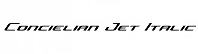
A modern, italic font with sharp, angular edges and a futuristic style.
![Concielian Jet Italic Frei Schriftart Herunterladen]() Herunterladen 461 Downloads@WebFont
Herunterladen 461 Downloads@WebFont -
( Fonts by www.junkohanhero.com )
A bold, playful, and three-dimensional hand-drawn font with a cartoonish style.
![Kulminoituva Frei Schriftart Herunterladen]() Herunterladen 461 Downloads@WebFont
Herunterladen 461 Downloads@WebFont -
( Font by Jonathan Harris - www.tattoowoo.com )
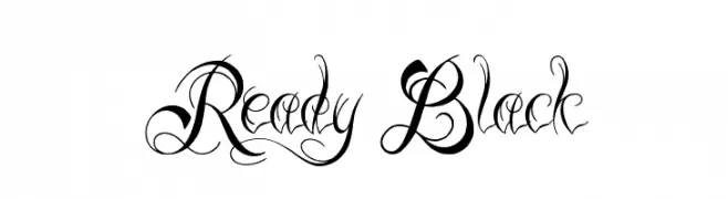
An elegant script font with intricate swashes and decorative elements.
![Ready Black Frei Schriftart Herunterladen]() Herunterladen 461 Downloads@WebFont
Herunterladen 461 Downloads@WebFont -
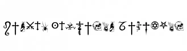
![Fiolex Mephisto Dingbats Frei Schriftart Herunterladen]() Herunterladen 461 Downloads@WebFont
Herunterladen 461 Downloads@WebFont -
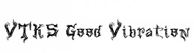
![VTKS Good Vibration Frei Schriftart Herunterladen]() Herunterladen 461 Downloads@WebFont
Herunterladen 461 Downloads@WebFont -
( Copyright 2016 The Saira Project Authors (omnibus.type@gmail.com), with reserved font name "Saira". )
A sleek, modern, extra condensed font with a minimalist design.
![Saira ExtraCondensed Light Frei Schriftart Herunterladen]() Herunterladen 461 Downloads@WebFont
Herunterladen 461 Downloads@WebFont -
![Mikey's Matrix Frei Schriftart Herunterladen]() Herunterladen 461 Downloads@WebFont
Herunterladen 461 Downloads@WebFont -
( Fonts by Ferdiansyah )
A playful, flowing script font with a casual, handwritten style.
![Alleana Script Frei Schriftart Herunterladen]() Herunterladen 461 Downloads@WebFont
Herunterladen 461 Downloads@WebFont -
( Fonts by Des Gomez )
A playful, handwritten font with bold, irregular strokes and a whimsical style.
![Bombay Frei Schriftart Herunterladen]() Herunterladen 461 Downloads@WebFont
Herunterladen 461 Downloads@WebFont -
( Fonts by Youssef Habchi - Personal-use only. For commercial use please contact owner. )
A dynamic, cursive font with fluid strokes and a handwritten aesthetic.
![SandDunes Frei Schriftart Herunterladen]() Herunterladen 461 Downloads@WebFont
Herunterladen 461 Downloads@WebFont -
( Fonts by www.studiotypo.com - Personal-use only. For commercial use please contact owner. )
A bold, shadowed font with a playful, comic book style.
![Naughty Squirrel Shadowed Demo Frei Schriftart Herunterladen]() Herunterladen 461 Downloads@WebFont
Herunterladen 461 Downloads@WebFont -
( www.junkohanhero.com )
A bold, distressed font with a vintage, rugged appearance.
![Kuumotus Frei Schriftart Herunterladen]() Herunterladen 461 Downloads@WebFont
Herunterladen 461 Downloads@WebFont -
( Fonts by Mans Greback - Personal-use only. For commercial use please contact owner. )
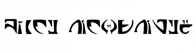
A bold, italicized font with high contrast and dynamic slanted letterforms.
![Aliey PERSONAL USE ONLY Bold Italic Frei Schriftart Herunterladen]() Herunterladen 461 Downloads@WebFont
Herunterladen 461 Downloads@WebFont -
( Fonts by a Max Infeld - XEROGRAPHER FONTS - xerographer.blogspot.com . Personal-use only. For commercial use please contact owner. )
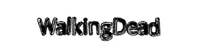
A rugged, distressed font with a bold, hand-drawn appearance.
![WalkingDead Frei Schriftart Herunterladen]() Herunterladen 461 Downloads@WebFont
Herunterladen 461 Downloads@WebFont -
( Fonts by dustBUST - Andreas Nylin )
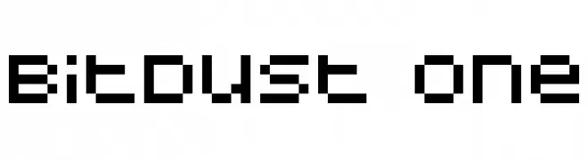
A pixelated, retro-style font with a digital, blocky design.
![BitDust One Frei Schriftart Herunterladen]() Herunterladen 461 Downloads@WebFont
Herunterladen 461 Downloads@WebFont -
( Fonts by fsuarez913 )
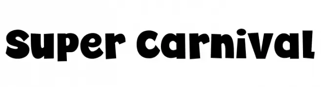
A bold, playful font with rounded, whimsical characters ideal for energetic designs.
![Super Carnival Frei Schriftart Herunterladen]() Herunterladen 461 Downloads@WebFont
Herunterladen 461 Downloads@WebFont -
( Fonts by Altsys Metamorphosis )
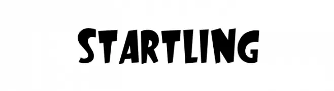
A bold, playful font with dynamic, comic-style characters.
![Startling Frei Schriftart Herunterladen]() Herunterladen 461 Downloads@WebFont
Herunterladen 461 Downloads@WebFont -
![AleriaScript Frei Schriftart Herunterladen]() Herunterladen 461 Downloads@WebFont
Herunterladen 461 Downloads@WebFont -
( Fonts by Steve Ferrera )
A futuristic, alien-inspired font with bold, abstract letterforms.
![Space Encounter Frei Schriftart Herunterladen]() Herunterladen 461 Downloads@WebFont
Herunterladen 461 Downloads@WebFont -
( Fonts by Ingo Zimmermann - www.ingofonts.com )
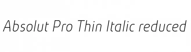
A sleek, modern font with thin, italicized letterforms and a minimalist design.
![Absolut Pro Thin Italic reduced Frei Schriftart Herunterladen]() Herunterladen 461 Downloads@WebFont
Herunterladen 461 Downloads@WebFont -
( Fonts by Craft Supply Co. )
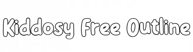
A playful, outlined font with bold, rounded characters and a whimsical style.
![Kiddosy Free Outline Frei Schriftart Herunterladen]() Herunterladen 461 Downloads@WebFont
Herunterladen 461 Downloads@WebFont -
( Fonts by K_IN Studio - Personal-use only. For commercial use please contact owner. )
A playful, handwritten-style font with smooth, rounded characters.
![Ballpoint Frei Schriftart Herunterladen]() Herunterladen 461 Downloads@WebFont
Herunterladen 461 Downloads@WebFont -
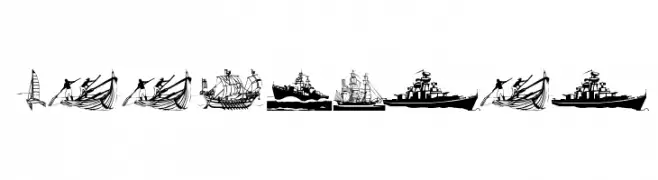
( Fonts by Manfred Klein. Free for private and charity use. Free for commercial with donation to organizations )
Intricate ship illustrations form each character in a maritime-themed decorative font.
![Seefahrer Frei Schriftart Herunterladen]() Herunterladen 461 Downloads@WebFont
Herunterladen 461 Downloads@WebFont -
( Fonts by Benoit Champy - www.vnbc.fr - Personal-use only. For commercial use please contact owner. )
A playful handwritten font with rounded, slightly irregular letterforms.
![ANDi Frei Schriftart Herunterladen]() Herunterladen 461 Downloads@WebFont
Herunterladen 461 Downloads@WebFont


Welche Schriften sind gerade am populärsten?
Poppins, Roboto, Montserrat, Open Sans und Lato sind wegen ihrer klaren Formen und breiten Einsetzbarkeit sehr gefragt – von Markenauftritt über Landingpages bis hin zu Postern.
Welche Fonts eignen sich für Logos?
Geometrische Sans‑Serifs (z. B. Poppins, Familien im Gotham‑Stil) sind ein häufiger Griff für sauberes, skalierbares Branding. Für eine persönlichere Note bleiben Scripts und Handschrift‑Stile beliebt. Kombinieren Sie einen prägnanten Headline‑Font mit einer neutralen Brotschrift für Wiedererkennung und Harmonie.
Wie oft wird die Top‑Liste aktualisiert?
Regelmäßig – basierend auf realen Downloads und Interaktionen. Schauen Sie öfter vorbei, um aufstrebende Favoriten früh zu entdecken.
💡 Tipp: Seite bookmarken – Trends wechseln schnell, und heutige Top‑Schriften inspirieren morgen vielleicht das Rebranding.