Willkommen bei den Top‑Schriften – hier treffen Beliebtheit und Qualität aufeinander. Das sind die in diesem Jahr am häufigsten heruntergeladenen und genutzten Fonts. Wenn Sie sichere Optionen für Logo, Web oder Social suchen, starten Sie hier.
Jeder Top‑Font überzeugt durch Balance, Lesbarkeit und Vielseitigkeit. Sie finden moderne Sans‑Serifs, elegante Scripts, Vintage‑Serifs und minimalistische Displays.
-
( Fonts by Ghuroba Studio )
A playful, rounded font with smooth, curvy lines and consistent stroke width.
 Herunterladen 79 Downloads@WebFont
 -
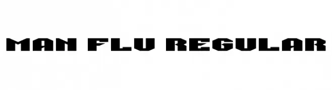
( Fonts by www.chequered.ink - Chequered Ink - Personal-use only. For commercial use please contact owner. )
A bold, geometric font with a modern, industrial style.
![Man Flu Regular Frei Schriftart Herunterladen]() Herunterladen 79 Downloads@WebFont
Herunterladen 79 Downloads@WebFont -
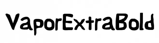
( Fonts by CannotIntoSpaceFonts - KineticPlasma Fonts - Personal-use only. For commercial use please contact owner. )
A bold, playful font with a hand-drawn, irregular style.
![Vapor ExtraBold Frei Schriftart Herunterladen]() Herunterladen 79 Downloads@WebFont
Herunterladen 79 Downloads@WebFont -
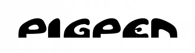
( House of Eraser - hem.passagen.se/duggregn/fonts.html )
A playful, bold font with rounded, cartoonish characters.
![Pigpen Frei Schriftart Herunterladen]() Herunterladen 79 Downloads@WebFont
Herunterladen 79 Downloads@WebFont -
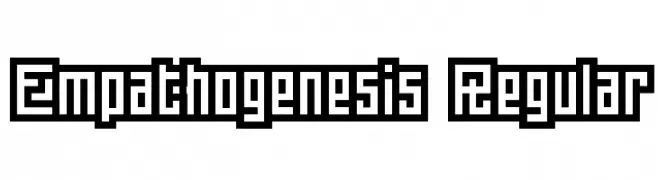
![Empathogenesis Regular Frei Schriftart Herunterladen]() Herunterladen 79 Downloads@WebFont
Herunterladen 79 Downloads@WebFont -
-
![Proton SemiBold Frei Schriftart Herunterladen]() Herunterladen 79 Downloads@WebFont
Herunterladen 79 Downloads@WebFont -
( Fonts by AminMario - Amin Mario - Personal-use only. For commercial use please contact owner. )
A cursive, handwritten font with elegant, flowing strokes.
![Ivory Coast Frei Schriftart Herunterladen]() Herunterladen 79 Downloads@WebFont
Herunterladen 79 Downloads@WebFont -
( Fonts by Glyphstyle - Dimas Ardhi - Personal-use only. For commercial use please contact owner. )
A sophisticated cursive script with fluid, connected strokes.
![Holligate Signature Demo Frei Schriftart Herunterladen]() Herunterladen 79 Downloads@WebFont
Herunterladen 79 Downloads@WebFont -
( Fonts by Bart Thomasse - Company Peperklips - https://www.peperklips.nl/ . For personal use only. An alternative alphabet for the Dutch language. You can find more details on the (Dutch) website peperklips.nl about how it works. )
An abstract, geometric font with artistic and symbolic character designs.
![Peperklips Klassiek Mono Frei Schriftart Herunterladen]() Herunterladen 79 Downloads@WebFont
Herunterladen 79 Downloads@WebFont -
![Hong Kong Hustle Condensed Condensed Frei Schriftart Herunterladen]() Herunterladen 79 Downloads@WebFont
Herunterladen 79 Downloads@WebFont
Welche Schriften sind gerade am populärsten?
Poppins, Roboto, Montserrat, Open Sans und Lato sind wegen ihrer klaren Formen und breiten Einsetzbarkeit sehr gefragt – von Markenauftritt über Landingpages bis hin zu Postern.
Welche Fonts eignen sich für Logos?
Geometrische Sans‑Serifs (z. B. Poppins, Familien im Gotham‑Stil) sind ein häufiger Griff für sauberes, skalierbares Branding. Für eine persönlichere Note bleiben Scripts und Handschrift‑Stile beliebt. Kombinieren Sie einen prägnanten Headline‑Font mit einer neutralen Brotschrift für Wiedererkennung und Harmonie.
Wie oft wird die Top‑Liste aktualisiert?
Regelmäßig – basierend auf realen Downloads und Interaktionen. Schauen Sie öfter vorbei, um aufstrebende Favoriten früh zu entdecken.
💡 Tipp: Seite bookmarken – Trends wechseln schnell, und heutige Top‑Schriften inspirieren morgen vielleicht das Rebranding.