Willkommen bei den Top‑Schriften – hier treffen Beliebtheit und Qualität aufeinander. Das sind die in diesem Jahr am häufigsten heruntergeladenen und genutzten Fonts. Wenn Sie sichere Optionen für Logo, Web oder Social suchen, starten Sie hier.
Jeder Top‑Font überzeugt durch Balance, Lesbarkeit und Vielseitigkeit. Sie finden moderne Sans‑Serifs, elegante Scripts, Vintage‑Serifs und minimalistische Displays.
-
( Fonts by Benoit Sjoholm - www.benoitsjoholm.com - All my fonts are for sale )
A modern, rounded font with clean lines and balanced proportions.
 Herunterladen 456 Downloads@WebFont
 -
( Fonts by Woodcutter Manero - http://www.woodcutter.es - Personal-use only. For commercial use please contact owner. )
A bold, vintage decorative font with distressed textures and ornate details.
![Le Casino Royale Frei Schriftart Herunterladen]() Herunterladen 456 Downloads@WebFont
Herunterladen 456 Downloads@WebFont -
( truefonts.blogspot.com )
A decorative font featuring stylized chess pieces and boards.
![Chess TFB Frei Schriftart Herunterladen]() Herunterladen 456 Downloads@WebFont
Herunterladen 456 Downloads@WebFont -
![Burnt Scratches Frei Schriftart Herunterladen]() Herunterladen 456 Downloads@WebFont
Herunterladen 456 Downloads@WebFont -
( K-Type Freebies (Free for Personal Use Only) FROM http://www.k-type.com )
A bold, italicized font with a modern and dynamic style.
![Excite Bold Italic Frei Schriftart Herunterladen]() Herunterladen 456 Downloads@WebFont
Herunterladen 456 Downloads@WebFont -
( Fonts by Steve Cloutier - www.cloutierfontes.ca )
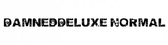
A bold, distressed font with a grunge aesthetic, featuring unique textures and edgy details.
![DamnedDeluxe Normal Frei Schriftart Herunterladen]() Herunterladen 456 Downloads@WebFont
Herunterladen 456 Downloads@WebFont -
( Fonts by EssentialsStudio - Personal-use only. For commercial use please contact owner. )
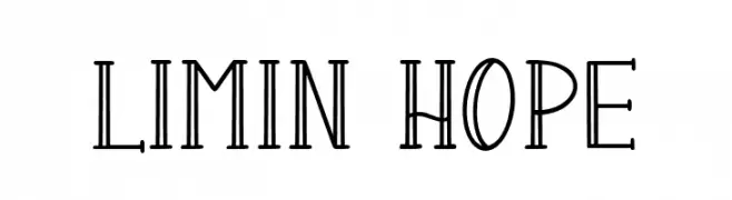
A decorative font with tall, slender characters and a geometric, vintage-modern style.
![LIMIN HOPE Frei Schriftart Herunterladen]() Herunterladen 456 Downloads@WebFont
Herunterladen 456 Downloads@WebFont -
( Fonts by a Max Infeld - XEROGRAPHER FONTS - xerographer.blogspot.com . Personal-use only. For commercial use please contact owner. )
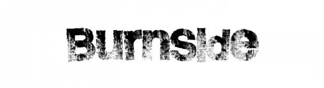
A bold, distressed font with a grunge, textured style.
![BurnSide Frei Schriftart Herunterladen]() Herunterladen 456 Downloads@WebFont
Herunterladen 456 Downloads@WebFont -
( Fonts by Thirtypath - Personal-use only. For commercial use please contact owner. )
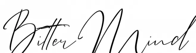
A flowing, cursive script font with elegant, connected strokes.
![Bitter Mind Frei Schriftart Herunterladen]() Herunterladen 456 Downloads@WebFont
Herunterladen 456 Downloads@WebFont -
( Fonts by a Neale Davidson - www.pixelsagas.com. Personal-use only. For commercial use please contact owner. )
A bold, italicized font with a modern, angular design.
![LaBeouf Bold Italic Frei Schriftart Herunterladen]() Herunterladen 456 Downloads@WebFont
Herunterladen 456 Downloads@WebFont -
( Fonts by www.blambot.com )
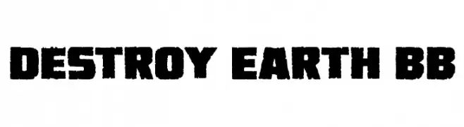
A bold, distressed font with a rugged, industrial feel.
![Destroy Earth BB Frei Schriftart Herunterladen]() Herunterladen 456 Downloads@WebFont
Herunterladen 456 Downloads@WebFont -
( Fonts by Philipp H. Poll - Personal-use only. For commercial use please contact owner. )
A bold, italic serif font with a classic and elegant style.
![Libertinus Serif Bold Italic Frei Schriftart Herunterladen]() Herunterladen 456 Downloads@WebFont
Herunterladen 456 Downloads@WebFont -
( Fonts by Spork Thug Typography - Josh Wilhelm - www.lifewithouttaffy.com/taffy/blog )
A playful, bold font with irregular, hand-drawn shapes.
![Fridge Magnets Frei Schriftart Herunterladen]() Herunterladen 456 Downloads@WebFont
Herunterladen 456 Downloads@WebFont -
( Fonts by DM Studio )
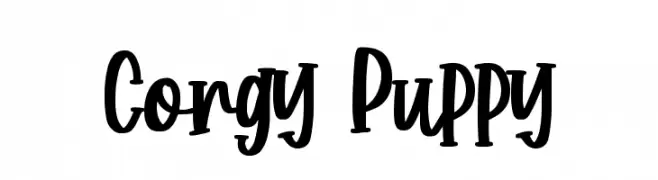
A playful, handwritten font with bold, energetic characters.
![Corgy Puppy Frei Schriftart Herunterladen]() Herunterladen 456 Downloads@WebFont
Herunterladen 456 Downloads@WebFont -
( Fonts by Repi Hilmana )
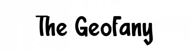
A playful, bold font with rounded edges and consistent width.
![The Geofany Frei Schriftart Herunterladen]() Herunterladen 456 Downloads@WebFont
Herunterladen 456 Downloads@WebFont -
![Sawasdee Frei Schriftart Herunterladen]() Herunterladen 456 Downloads@WebFont
Herunterladen 456 Downloads@WebFont -
( Fonts by Darcy Baldwin - darcybaldwin.com. Free for personal use only )
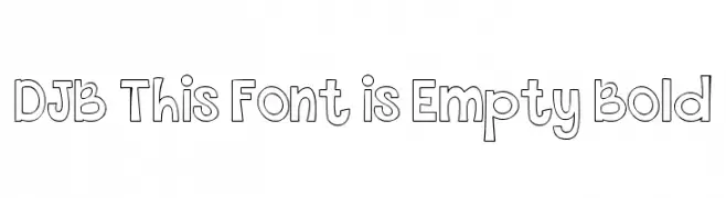
A playful, bold, and hollow font with whimsical, outlined characters.
![DJB This Font is Empty Bold Frei Schriftart Herunterladen]() Herunterladen 456 Downloads@WebFont
Herunterladen 456 Downloads@WebFont -
( fey design - Fey Design - www.creativemarket.com/feydesign )
A flowing, cursive script font with elegant, interconnected letters.
![Hometown Script Free Frei Schriftart Herunterladen]() Herunterladen 456 Downloads@WebFont
Herunterladen 456 Downloads@WebFont -
( Fonts by www.freakyfonts.de )
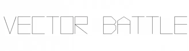
A geometric, angular font with a futuristic and technical design.
![Vector Battle Frei Schriftart Herunterladen]() Herunterladen 456 Downloads@WebFont
Herunterladen 456 Downloads@WebFont -
( Fonts by a Neale Davidson - www.pixelsagas.com. Personal-use only. For commercial use please contact owner. )
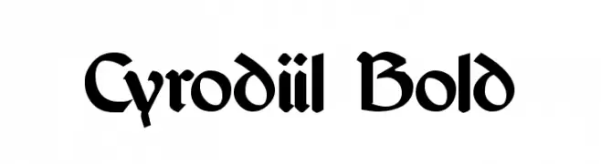
A bold, medieval-inspired font with sharp serifs and a gothic influence.
![Cyrodiil Bold Frei Schriftart Herunterladen]() Herunterladen 456 Downloads@WebFont
Herunterladen 456 Downloads@WebFont -
( Fonts by Alit Suarnegara - Alit Design - www.alitdesign.net - Personal-use only. For commercial use please contact owner. )
A bold, high-contrast serif font with a modern yet classic appeal.
![Milk n Balls Black Demo Frei Schriftart Herunterladen]() Herunterladen 456 Downloads@WebFont
Herunterladen 456 Downloads@WebFont -
![VTC-KomikaHeadLinerOne Bold Frei Schriftart Herunterladen]() Herunterladen 456 Downloads@WebFont
Herunterladen 456 Downloads@WebFont -
( Addax Designs - www.nt-p.net/adx/index.html )
A modern, geometric sans-serif font with clean lines and balanced proportions.
![TeaPot Frei Schriftart Herunterladen]() Herunterladen 455 Downloads@WebFont
Herunterladen 455 Downloads@WebFont -
( Fonts by Fachran Heit )
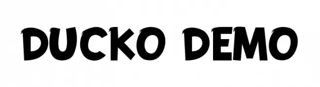
A bold, playful font with thick, uneven strokes and a whimsical, cartoonish style.
![DUCKO DEMO Frei Schriftart Herunterladen]() Herunterladen 455 Downloads@WebFont
Herunterladen 455 Downloads@WebFont -
![Trancet Normal Frei Schriftart Herunterladen]() Herunterladen 455 Downloads@WebFont
Herunterladen 455 Downloads@WebFont -
( Fonts by Edric Studio www.creativefabrica.com/designer/edricstudio/ - Personal-use only. For commercial use please contact owner. )
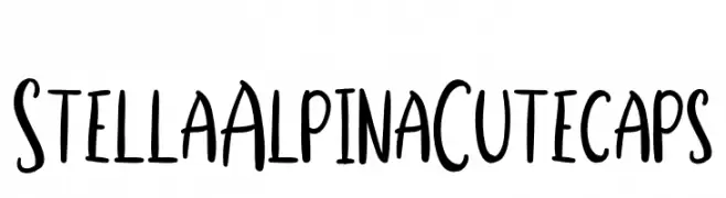
A playful, hand-drawn font with tall, narrow characters and a whimsical style.
![Stella Alpina Cutecaps Frei Schriftart Herunterladen]() Herunterladen 455 Downloads@WebFont
Herunterladen 455 Downloads@WebFont -
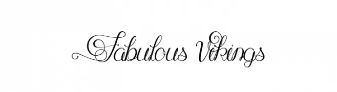
![Fabulous Vikings Frei Schriftart Herunterladen]() Herunterladen 455 Downloads@WebFont
Herunterladen 455 Downloads@WebFont -
( Fonts by Daniel Zadorozny - www.iconian.com )
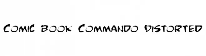
A bold, distorted font with a rugged, comic book style.
![Comic Book Commando Distorted Frei Schriftart Herunterladen]() Herunterladen 455 Downloads@WebFont
Herunterladen 455 Downloads@WebFont -
( Fonts by Google - Personal-use only. For commercial use please contact owner. )
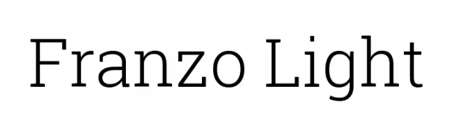
A clean, modern font with balanced spacing and consistent stroke width.
![Franzo Light Frei Schriftart Herunterladen]() Herunterladen 455 Downloads@WebFont
Herunterladen 455 Downloads@WebFont -
( Fonts by Ana Sanfelippo )
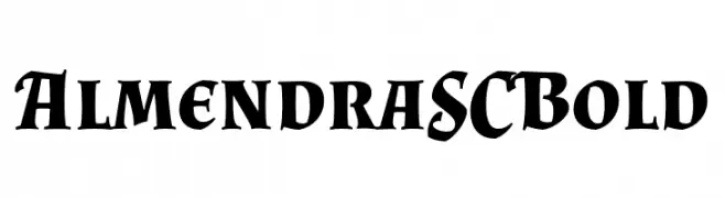
A bold serif font with sharp serifs and high contrast, ideal for impactful headlines.
![Almendra SC Bold Frei Schriftart Herunterladen]() Herunterladen 455 Downloads@WebFont
Herunterladen 455 Downloads@WebFont -
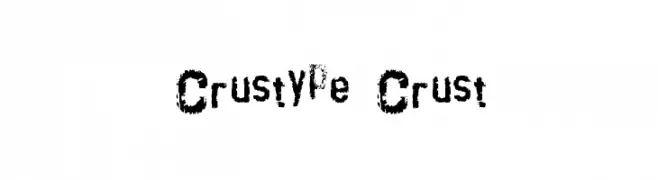
![crustype_crust Frei Schriftart Herunterladen]() Herunterladen 455 Downloads@WebFont
Herunterladen 455 Downloads@WebFont -
( Fonts by Manfred Klein - manfred-klein.ina-mar.com )
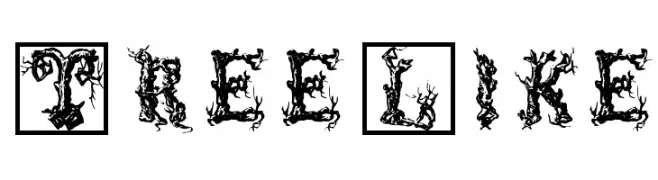
A decorative font with characters resembling intricate tree branches and roots.
![TreeLike Frei Schriftart Herunterladen]() Herunterladen 455 Downloads@WebFont
Herunterladen 455 Downloads@WebFont -
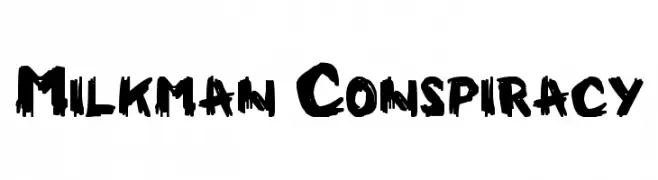
![Milkman Conspiracy Frei Schriftart Herunterladen]() Herunterladen 455 Downloads@WebFont
Herunterladen 455 Downloads@WebFont -
( Fonts by Vladimir Nikolic )
A bold, decorative font with a 3D effect and patterned interiors.
![Adagio Regular Frei Schriftart Herunterladen]() Herunterladen 455 Downloads@WebFont
Herunterladen 455 Downloads@WebFont -
( Fonts by Katelyn Heins )
A lively, cursive script font with fluid, connected letters and playful contrast.
![Spring Script Frei Schriftart Herunterladen]() Herunterladen 455 Downloads@WebFont
Herunterladen 455 Downloads@WebFont


Welche Schriften sind gerade am populärsten?
Poppins, Roboto, Montserrat, Open Sans und Lato sind wegen ihrer klaren Formen und breiten Einsetzbarkeit sehr gefragt – von Markenauftritt über Landingpages bis hin zu Postern.
Welche Fonts eignen sich für Logos?
Geometrische Sans‑Serifs (z. B. Poppins, Familien im Gotham‑Stil) sind ein häufiger Griff für sauberes, skalierbares Branding. Für eine persönlichere Note bleiben Scripts und Handschrift‑Stile beliebt. Kombinieren Sie einen prägnanten Headline‑Font mit einer neutralen Brotschrift für Wiedererkennung und Harmonie.
Wie oft wird die Top‑Liste aktualisiert?
Regelmäßig – basierend auf realen Downloads und Interaktionen. Schauen Sie öfter vorbei, um aufstrebende Favoriten früh zu entdecken.
💡 Tipp: Seite bookmarken – Trends wechseln schnell, und heutige Top‑Schriften inspirieren morgen vielleicht das Rebranding.