Willkommen bei den Top‑Schriften – hier treffen Beliebtheit und Qualität aufeinander. Das sind die in diesem Jahr am häufigsten heruntergeladenen und genutzten Fonts. Wenn Sie sichere Optionen für Logo, Web oder Social suchen, starten Sie hier.
Jeder Top‑Font überzeugt durch Balance, Lesbarkeit und Vielseitigkeit. Sie finden moderne Sans‑Serifs, elegante Scripts, Vintage‑Serifs und minimalistische Displays.
-
 Herunterladen 448 Downloads@WebFont
 -
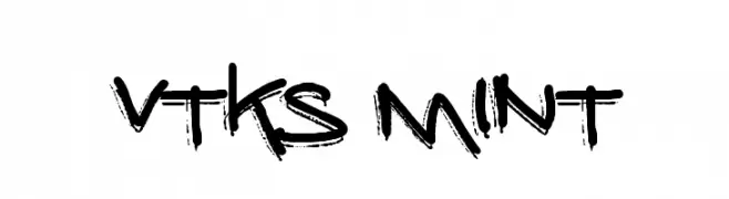
( Fonts by Douglas Vitkauskas - www.vtksdesign.com. Personal-use only. For commercial use please contact owner. )
A bold, graffiti-inspired font with a rough, hand-drawn appearance.
![vtks mint Frei Schriftart Herunterladen]() Herunterladen 448 Downloads@WebFont
Herunterladen 448 Downloads@WebFont -
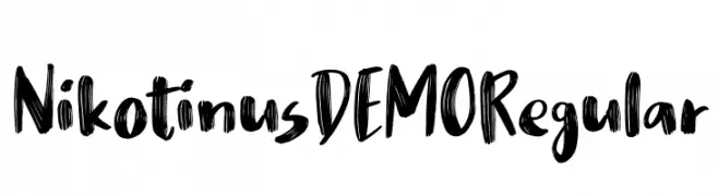
( bogstav - www.bogstav.com )
A bold, hand-painted style font with dynamic, brush-like strokes.
![Nikotinus DEMO Regular Frei Schriftart Herunterladen]() Herunterladen 448 Downloads@WebFont
Herunterladen 448 Downloads@WebFont -
( Fonts by www.selawetype.com - Personal-use only. FOR DONATION https://www.paypal.me/selawe . For commercial use please contact owner. )
An elegant, cursive font with fluid, sweeping strokes and artistic flair.
![NalikaSignature Frei Schriftart Herunterladen]() Herunterladen 448 Downloads@WebFont
Herunterladen 448 Downloads@WebFont -
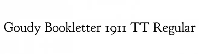
( Fonts by www.crudfactory.com )
A classic serif typeface with elegant proportions and moderate contrast.
![Goudy Bookletter 1911 TT Regular Frei Schriftart Herunterladen]() Herunterladen 448 Downloads@WebFont
Herunterladen 448 Downloads@WebFont -
( Fonts by www.blambot.com )
A bold, industrial font with a futuristic, geometric design.
![MechEffects2 BB Frei Schriftart Herunterladen]() Herunterladen 448 Downloads@WebFont
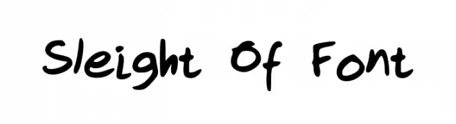
Herunterladen 448 Downloads@WebFont -
![Sleight Of Font Frei Schriftart Herunterladen]() Herunterladen 448 Downloads@WebFont
Herunterladen 448 Downloads@WebFont -
( www.emmabowey.co.uk )
A playful, bold font with rounded, bubbly characters.
![Sponge Frei Schriftart Herunterladen]() Herunterladen 448 Downloads@WebFont
Herunterladen 448 Downloads@WebFont -
( Fonts by Noah Type - noahtype.com - Personal-use only. For commercial use please contact owner. )
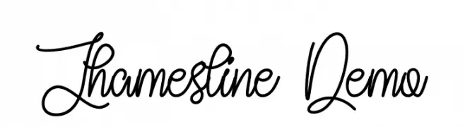
An ornate and decorative script font with elegant swirls and flowing lines.
![Jhamesline Demo Frei Schriftart Herunterladen]() Herunterladen 448 Downloads@WebFont
Herunterladen 448 Downloads@WebFont -
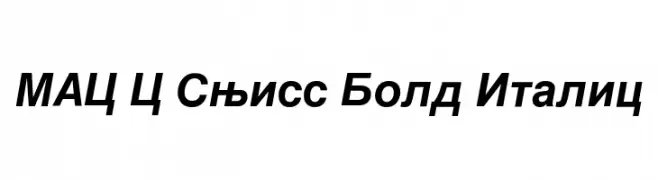
![MAC C Swiss Bold Italic Frei Schriftart Herunterladen]() Herunterladen 448 Downloads
Herunterladen 448 Downloads -
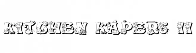
![Kitchen Kapers II Frei Schriftart Herunterladen]() Herunterladen 448 Downloads@WebFont
Herunterladen 448 Downloads@WebFont -
( Free for Personal Use. To use commercially please visit the www.bvfonts.com )
A playful, hand-drawn font with a rough, organic texture.
![GrumbleOT Frei Schriftart Herunterladen]() Herunterladen 448 Downloads@WebFont
Herunterladen 448 Downloads@WebFont -
( Fonts by Harold Lohner - www.haroldsfonts.com )
A bold, hand-painted style font with dynamic, expressive characters.
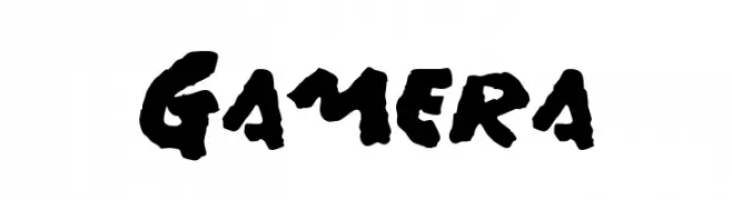
![Gamera Frei Schriftart Herunterladen]() Herunterladen 448 Downloads@WebFont
Herunterladen 448 Downloads@WebFont -
![Uqammaq Heavy Frei Schriftart Herunterladen]() Herunterladen 448 Downloads@WebFont
Herunterladen 448 Downloads@WebFont -
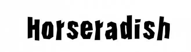
![Horseradish Frei Schriftart Herunterladen]() Herunterladen 448 Downloads@WebFont
Herunterladen 448 Downloads@WebFont -
( Fonts by Dieter Steffmann )
A bold, blackletter-inspired font with sharp, angular lines and a gothic feel.
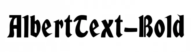
![AlbertText-Bold Frei Schriftart Herunterladen]() Herunterladen 448 Downloads@WebFont
Herunterladen 448 Downloads@WebFont -
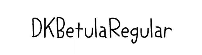
![DK Betula Regular Frei Schriftart Herunterladen]() Herunterladen 448 Downloads@WebFont
Herunterladen 448 Downloads@WebFont -
( Free for personal use - Fonts by Markus Schroppel. For commercial license please donate to http://www.die-gute-schrift.de/donation.html )
A distressed, stencil-like font with a vintage, grunge aesthetic.
![LL Tippa Frei Schriftart Herunterladen]() Herunterladen 448 Downloads@WebFont
Herunterladen 448 Downloads@WebFont -
( Fonts by RaisProject )
A modern, elegant script font with smooth, flowing curves and excellent readability.
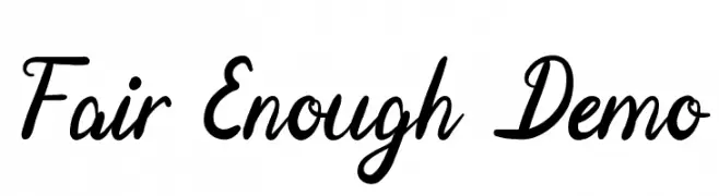
![Fair Enough Demo Frei Schriftart Herunterladen]() Herunterladen 448 Downloads@WebFont
Herunterladen 448 Downloads@WebFont -
![One Way Frei Schriftart Herunterladen]() Herunterladen 448 Downloads@WebFont
Herunterladen 448 Downloads@WebFont -
( Fonts by www.seansart.net )
An edgy, thorn-inspired font with a gothic and aggressive style.
![Thorns Frei Schriftart Herunterladen]() Herunterladen 448 Downloads@WebFont
Herunterladen 448 Downloads@WebFont -
( Fonts by Jonathan S. Harris - www.tattoowoo.com. Personal-use only. For commercial use please contact owner. )
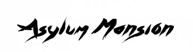
A bold, expressive brush-style font with dynamic strokes and artistic flair.
![Asylum Mansion Frei Schriftart Herunterladen]() Herunterladen 448 Downloads@WebFont
Herunterladen 448 Downloads@WebFont -
( Fonts by dustBUST - Andreas Nylin )
A bold, italicized font with a futuristic and sleek design.
![Sci Fied BoldItalic Frei Schriftart Herunterladen]() Herunterladen 448 Downloads@WebFont
Herunterladen 448 Downloads@WebFont -
( Free for a personal use. For a commercial use please visit www.kevinandamanda.com )
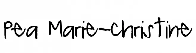
A playful, casual handwritten font with irregular, organic strokes.
![Pea Marie-Christine Frei Schriftart Herunterladen]() Herunterladen 448 Downloads@WebFont
Herunterladen 448 Downloads@WebFont -
![Roman Acid Frei Schriftart Herunterladen]() Herunterladen 448 Downloads@WebFont
Herunterladen 448 Downloads@WebFont -
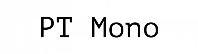
( Fonts by Paratype )
A clean, modern monospaced font with uniform character width and geometric design.
![PT Mono Frei Schriftart Herunterladen]() Herunterladen 448 Downloads@WebFont
Herunterladen 448 Downloads@WebFont -
( www.classless.biz )
A bold, playful handwritten font with rounded edges and a casual style.
![JLEE Frei Schriftart Herunterladen]() Herunterladen 448 Downloads@WebFont
Herunterladen 448 Downloads@WebFont -
( Fonts by BLKBK Fonts - www.blkbk.shop - Personal-use only. For commercial use please contact owner. Sponsoren Schriftart )
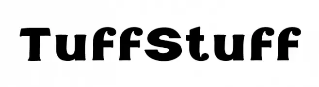
A bold, modern font with strong, consistent strokes and minimal contrast.
![Tuff Stuff Frei Schriftart Herunterladen]() Herunterladen 448 Downloads
Herunterladen 448 Downloads -
( Fonts by joorgemoron - Personal-use only. For commercial use please contact owner. )
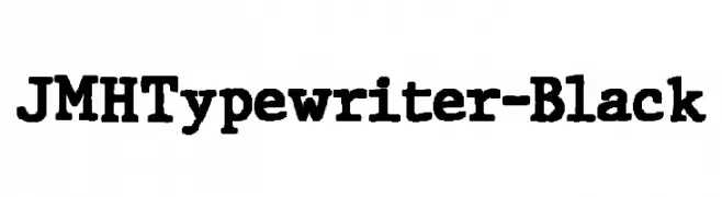
A bold, vintage typewriter-style font with slab serifs and strong, uniform strokes.
![JMHTypewriter-Black Frei Schriftart Herunterladen]() Herunterladen 448 Downloads@WebFont
Herunterladen 448 Downloads@WebFont -
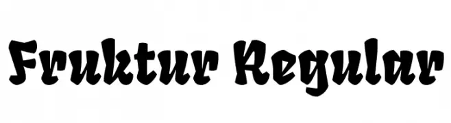
( Copyright (c) 2013 by Sorkin Type Co (www.sorkintype.com), with Reserved Font Name "Fruktur". )
A bold, decorative font with a blackletter-inspired style.
![Fruktur Regular Frei Schriftart Herunterladen]() Herunterladen 448 Downloads@WebFont
Herunterladen 448 Downloads@WebFont -
![JH_Digital Nominal Frei Schriftart Herunterladen]() Herunterladen 448 Downloads@WebFont
Herunterladen 448 Downloads@WebFont -
( Fonts by Apostrophic Lab )
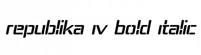
A bold, italicized font with a modern, futuristic design and geometric structure.
![Republika IV Bold Italic Frei Schriftart Herunterladen]() Herunterladen 448 Downloads@WebFont
Herunterladen 448 Downloads@WebFont -
( Fonts by Steve Cloutier - www.cloutierfontes.ca )
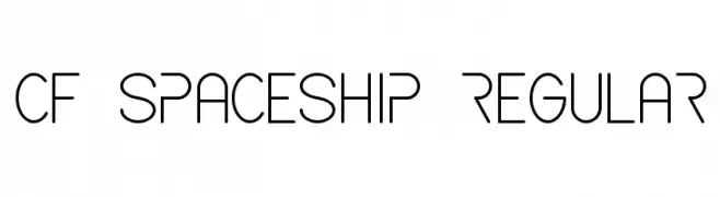
A futuristic, geometric font with clean lines and rounded edges.
![CF Spaceship Regular Frei Schriftart Herunterladen]() Herunterladen 448 Downloads@WebFont
Herunterladen 448 Downloads@WebFont -
( Fonts by Sasha Pavljenko - Personal-use only. For commercial use please contact owner. )
A bold, geometric font with strong, angular lines and a modern look.
![Wadik Bold Frei Schriftart Herunterladen]() Herunterladen 448 Downloads@WebFont
Herunterladen 448 Downloads@WebFont -
![Zebrures Tryout Frei Schriftart Herunterladen]() Herunterladen 448 Downloads@WebFont
Herunterladen 448 Downloads@WebFont


Welche Schriften sind gerade am populärsten?
Poppins, Roboto, Montserrat, Open Sans und Lato sind wegen ihrer klaren Formen und breiten Einsetzbarkeit sehr gefragt – von Markenauftritt über Landingpages bis hin zu Postern.
Welche Fonts eignen sich für Logos?
Geometrische Sans‑Serifs (z. B. Poppins, Familien im Gotham‑Stil) sind ein häufiger Griff für sauberes, skalierbares Branding. Für eine persönlichere Note bleiben Scripts und Handschrift‑Stile beliebt. Kombinieren Sie einen prägnanten Headline‑Font mit einer neutralen Brotschrift für Wiedererkennung und Harmonie.
Wie oft wird die Top‑Liste aktualisiert?
Regelmäßig – basierend auf realen Downloads und Interaktionen. Schauen Sie öfter vorbei, um aufstrebende Favoriten früh zu entdecken.
💡 Tipp: Seite bookmarken – Trends wechseln schnell, und heutige Top‑Schriften inspirieren morgen vielleicht das Rebranding.