Willkommen bei den Top‑Schriften – hier treffen Beliebtheit und Qualität aufeinander. Das sind die in diesem Jahr am häufigsten heruntergeladenen und genutzten Fonts. Wenn Sie sichere Optionen für Logo, Web oder Social suchen, starten Sie hier.
Jeder Top‑Font überzeugt durch Balance, Lesbarkeit und Vielseitigkeit. Sie finden moderne Sans‑Serifs, elegante Scripts, Vintage‑Serifs und minimalistische Displays.
-
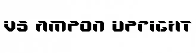
( Fonts by Daniel Zadorozny - www.iconian.com - Free for personal use )
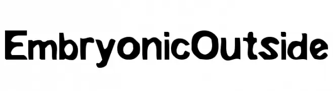
A futuristic and geometric font with clean lines and expanded width.
 Herunterladen 443 Downloads@WebFont
 -
![EmbryonicOutside Frei Schriftart Herunterladen]() Herunterladen 443 Downloads@WebFont
Herunterladen 443 Downloads@WebFont -
( Le Parte Studio )
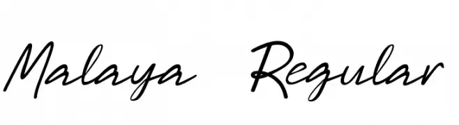
A casual, elegant handwritten font with smooth, flowing lines.
![Malaya Regular Frei Schriftart Herunterladen]() Herunterladen 443 Downloads@WebFont
Herunterladen 443 Downloads@WebFont -
( Fonts by typeformerstudio.com - Personal-use only. For commercial use please contact owner. )
A classic serif font with elegant strokes and pronounced serifs.
![Salfish Frei Schriftart Herunterladen]() Herunterladen 443 Downloads@WebFont
Herunterladen 443 Downloads@WebFont -
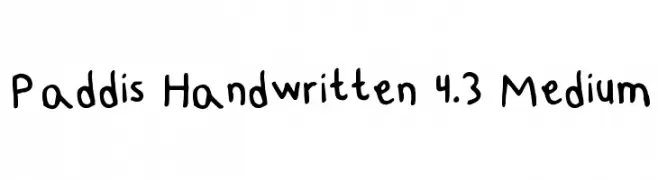
Schriftart von HalmiBox. For commercial use please contact the owner.
![Paddis Handwritten 4.3 Medium Frei Schriftart Herunterladen]() Herunterladen 443 Downloads@WebFont
Herunterladen 443 Downloads@WebFont -
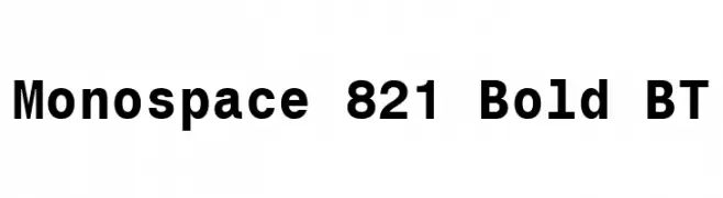
![Monospace 821 Bold BT Frei Schriftart Herunterladen]() Herunterladen 443 Downloads@WebFont
Herunterladen 443 Downloads@WebFont -
![V5 Ampon Upright Frei Schriftart Herunterladen]() Herunterladen 443 Downloads@WebFont
Herunterladen 443 Downloads@WebFont -
( Fonts by MJType )
Playful handwritten font.
![Mistica Blue Frei Schriftart Herunterladen]() Herunterladen 443 Downloads@WebFont
Herunterladen 443 Downloads@WebFont -
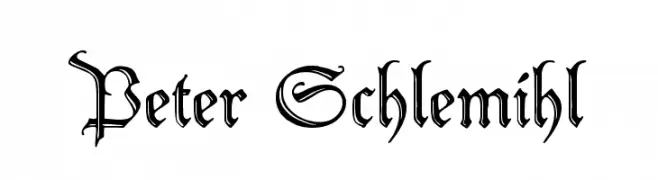
( Fonts by Dieter Steffmann )
A classic blackletter font with ornate, angular letterforms and decorative flourishes.
![Peter Schlemihl Frei Schriftart Herunterladen]() Herunterladen 443 Downloads@WebFont
Herunterladen 443 Downloads@WebFont -
![AI kelso LI Frei Schriftart Herunterladen]() Herunterladen 443 Downloads@WebFont
Herunterladen 443 Downloads@WebFont -
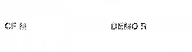
![CF Motherboard DEMO Regular Frei Schriftart Herunterladen]() Herunterladen 443 Downloads@WebFont
Herunterladen 443 Downloads@WebFont -
( Rachel San )
A modern, light sans-serif font with clean lines and excellent readability.
![MadeynSans Light Frei Schriftart Herunterladen]() Herunterladen 443 Downloads@WebFont
Herunterladen 443 Downloads@WebFont -
( Fonts by a Neale Davidson - www.pixelsagas.com. Personal-use only. For commercial use please contact owner. )
A bold, italicized font with a modern, dynamic style and strong visual impact.
![Sternbach Bold Italic Frei Schriftart Herunterladen]() Herunterladen 443 Downloads@WebFont
Herunterladen 443 Downloads@WebFont -
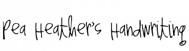
( Free for a personal use. For a commercial use please visit www.kevinandamanda.com )
A playful, casual handwritten font with an informal and personal style.
![Pea Heather's Handwriting Frei Schriftart Herunterladen]() Herunterladen 443 Downloads@WebFont
Herunterladen 443 Downloads@WebFont -
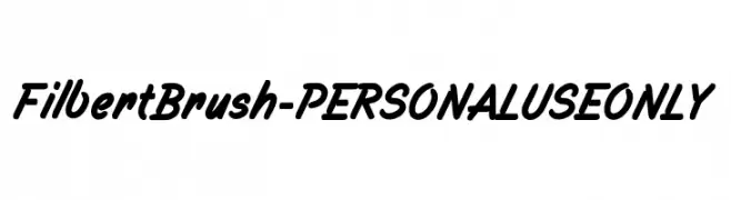
( Måns Grebäck - www.mansgreback.com )
A bold, brush-style font with dynamic and artistic strokes.
![Filbert Brush - PERSONAL USE ONLY Frei Schriftart Herunterladen]() Herunterladen 443 Downloads@WebFont
Herunterladen 443 Downloads@WebFont -
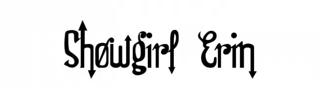
( Fonts by Matthew Austin Petty - www.disturbed.com )
A bold, decorative font with elongated serifs and playful curves.
![Showgirl Erin Frei Schriftart Herunterladen]() Herunterladen 443 Downloads@WebFont
Herunterladen 443 Downloads@WebFont -
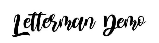
( Fonts by Noah Type - noahtype.com - Personal-use only. For commercial use please contact owner. )
A bold, expressive script font with interconnected, flowing letters.
![Letterman Demo Frei Schriftart Herunterladen]() Herunterladen 443 Downloads@WebFont
Herunterladen 443 Downloads@WebFont -
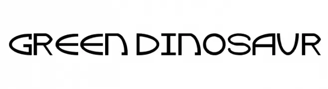
![Green Dinosaur Frei Schriftart Herunterladen]() Herunterladen 443 Downloads@WebFont
Herunterladen 443 Downloads@WebFont -
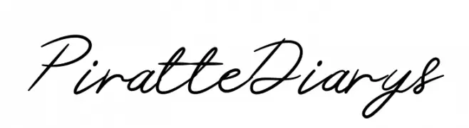
( Fonts by Eko Mulyani )
Elegant cursive script font.
![Piratte Diarys Frei Schriftart Herunterladen]() Herunterladen 443 Downloads@WebFont
Herunterladen 443 Downloads@WebFont -
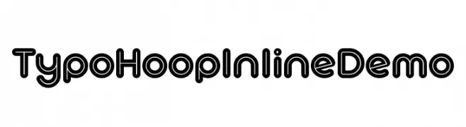
( Fonts by StudioTypo - Personal-use only. For commercial use please contact owner. )
A bold, inline font with rounded edges and a modern, playful style.
![Typo Hoop Inline Demo Frei Schriftart Herunterladen]() Herunterladen 443 Downloads@WebFont
Herunterladen 443 Downloads@WebFont -
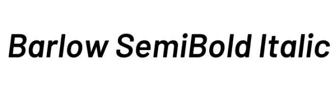
( Copyright 2017 The Barlow Project Authors (https://github.com/jpt/barlow) )
A modern, semi-bold, italic sans-serif font with a clean and dynamic style.
![Barlow SemiBold Italic Frei Schriftart Herunterladen]() Herunterladen 443 Downloads@WebFont
Herunterladen 443 Downloads@WebFont -
![DHF Broffont Script Italic Frei Schriftart Herunterladen]() Herunterladen 443 Downloads@WebFont
Herunterladen 443 Downloads@WebFont -
( Fonts by CannotIntoSpaceFonts - KineticPlasma Fonts - Personal-use only. For commercial use please contact owner. )
An abstract, graffiti-like font with bold, irregular shapes.
![Warzone Frei Schriftart Herunterladen]() Herunterladen 443 Downloads@WebFont
Herunterladen 443 Downloads@WebFont -
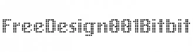
![FreeDesign001Bitbit Frei Schriftart Herunterladen]() Herunterladen 443 Downloads@WebFont
Herunterladen 443 Downloads@WebFont -
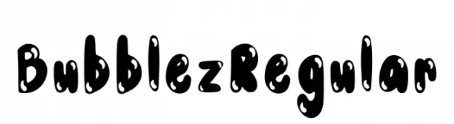
( Fonts by Marina Sanders )
A playful, bubbly font with bold, rounded characters and a whimsical style.
![Bubblez Regular Frei Schriftart Herunterladen]() Herunterladen 443 Downloads@WebFont
Herunterladen 443 Downloads@WebFont -
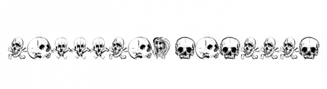
( Fonts by Billy Argel - www.billyargel.com - Personal-use only. For commercial use please contact owner. )
Ornate skull illustrations form each character in this decorative display font.
![Untitled-Regular Frei Schriftart Herunterladen]() Herunterladen 443 Downloads@WebFont
Herunterladen 443 Downloads@WebFont -
( Fonts by Pizzadude )
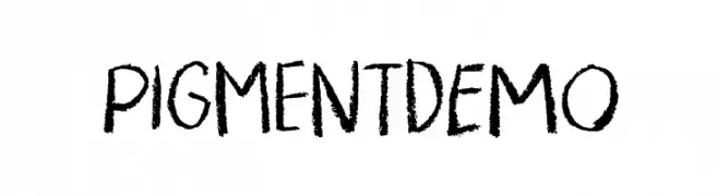
A textured, hand-drawn font with an informal, artistic style.
![PigmentDEMO Frei Schriftart Herunterladen]() Herunterladen 443 Downloads@WebFont
Herunterladen 443 Downloads@WebFont -
( Fonts by www.kimberlygeswein.com - Kimberly Geswein )
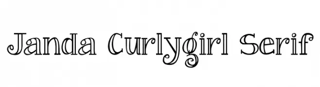
A playful serif font with curly, whimsical elements.
![Janda Curlygirl Serif Frei Schriftart Herunterladen]() Herunterladen 443 Downloads@WebFont
Herunterladen 443 Downloads@WebFont -
( Fonts by Andrew McCluskey - nalgames.com. Personal-use only. For commercial use please contact owner. )
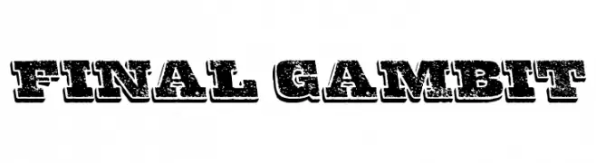
A bold, distressed font with a vintage, textured appearance.
![Final Gambit Frei Schriftart Herunterladen]() Herunterladen 443 Downloads@WebFont
Herunterladen 443 Downloads@WebFont -
![Runes of the Dragon Frei Schriftart Herunterladen]() Herunterladen 443 Downloads@WebFont
Herunterladen 443 Downloads@WebFont -
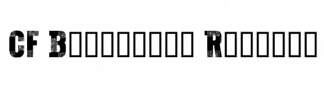
( Fonts by Steve Cloutier - www.cloutierfontes.ca )
A bold, distressed font with a textured, vintage appearance.
![CF Bucherons Regular Frei Schriftart Herunterladen]() Herunterladen 443 Downloads@WebFont
Herunterladen 443 Downloads@WebFont -
( Fonts by Adobe )
A bold, modern sans-serif font with clean lines and high legibility.
![Source Sans Pro Bold Frei Schriftart Herunterladen]() Herunterladen 443 Downloads@WebFont
Herunterladen 443 Downloads@WebFont -
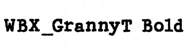
( Fonts by Vigilante Typeface Corporation Larry Yerkes. Personal-use only. For commercial use please contact owner. )
A bold, textured font with a vintage, handcrafted appearance.
![WBX_GrannyT Bold Frei Schriftart Herunterladen]() Herunterladen 443 Downloads@WebFont
Herunterladen 443 Downloads@WebFont -
( Fonts by Steve Cloutier - www.cloutierfontes.ca )
A bold, distressed font with a rugged, grunge aesthetic.
![Trashed light Regular Frei Schriftart Herunterladen]() Herunterladen 443 Downloads@WebFont
Herunterladen 443 Downloads@WebFont -
( Fonts by Fillo Graphic )
A whimsical decorative font with heart motifs in each character.
![Heart Display Frei Schriftart Herunterladen]() Herunterladen 443 Downloads@WebFont
Herunterladen 443 Downloads@WebFont


Welche Schriften sind gerade am populärsten?
Poppins, Roboto, Montserrat, Open Sans und Lato sind wegen ihrer klaren Formen und breiten Einsetzbarkeit sehr gefragt – von Markenauftritt über Landingpages bis hin zu Postern.
Welche Fonts eignen sich für Logos?
Geometrische Sans‑Serifs (z. B. Poppins, Familien im Gotham‑Stil) sind ein häufiger Griff für sauberes, skalierbares Branding. Für eine persönlichere Note bleiben Scripts und Handschrift‑Stile beliebt. Kombinieren Sie einen prägnanten Headline‑Font mit einer neutralen Brotschrift für Wiedererkennung und Harmonie.
Wie oft wird die Top‑Liste aktualisiert?
Regelmäßig – basierend auf realen Downloads und Interaktionen. Schauen Sie öfter vorbei, um aufstrebende Favoriten früh zu entdecken.
💡 Tipp: Seite bookmarken – Trends wechseln schnell, und heutige Top‑Schriften inspirieren morgen vielleicht das Rebranding.