Willkommen bei den Top‑Schriften – hier treffen Beliebtheit und Qualität aufeinander. Das sind die in diesem Jahr am häufigsten heruntergeladenen und genutzten Fonts. Wenn Sie sichere Optionen für Logo, Web oder Social suchen, starten Sie hier.
Jeder Top‑Font überzeugt durch Balance, Lesbarkeit und Vielseitigkeit. Sie finden moderne Sans‑Serifs, elegante Scripts, Vintage‑Serifs und minimalistische Displays.
-
( www.juancasco.net )
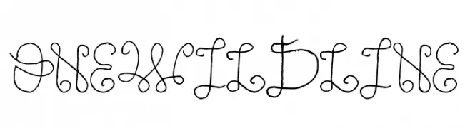
A whimsical, single-line calligraphic font with elegant loops and curves.
 Herunterladen 75 Downloads@WebFont
 -
( Fonts by Peter Olexa - www.dealjumbo.com - Personal-use only. For commercial use please contact owner. )
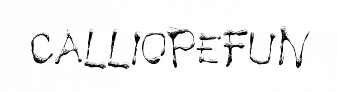
A playful, brushstroke-style font with a lively and artistic design.
![Calliope fun Frei Schriftart Herunterladen]() Herunterladen 75 Downloads@WebFont
Herunterladen 75 Downloads@WebFont -
( Fonts by NeutroneLabs - Kapri Prianto - Personal-use only. For commercial use please contact owner. )
A playful, hand-drawn font with a doodle-like, textured style.
![Space Kids Frei Schriftart Herunterladen]() Herunterladen 75 Downloads@WebFont
Herunterladen 75 Downloads@WebFont -
( Vladimir Nikolic - www.coroflot.com/vladimirnikolic )
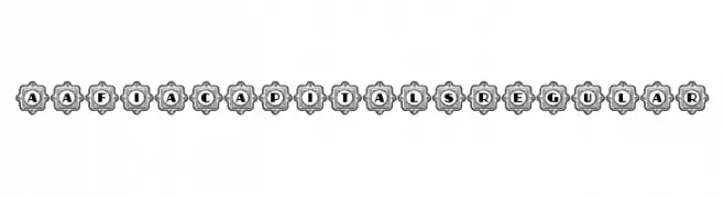
A decorative font with uppercase letters and numbers in ornate frames.
![Aafia Capitals Regular Frei Schriftart Herunterladen]() Herunterladen 75 Downloads@WebFont
Herunterladen 75 Downloads@WebFont -
( weknow - Wino S Kadir - www.creativefabrica.com/designer/weknow/ )
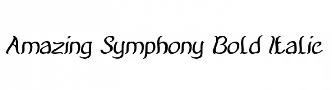
A bold, italic script font with elegant curves and a flowing style.
![Amazing Symphony Bold Italic Frei Schriftart Herunterladen]() Herunterladen 75 Downloads@WebFont
Herunterladen 75 Downloads@WebFont -
-
( Fonts by Gassstype )
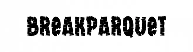
A bold, distressed font with a fragmented, edgy design.
![Break Parquet Frei Schriftart Herunterladen]() Herunterladen 75 Downloads@WebFont
Herunterladen 75 Downloads@WebFont -
( Fikry Alif - fontbundles.net/admin/products.php )
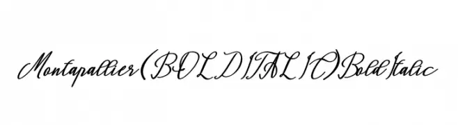
A bold and italic script font with elegant, flowing cursive letters.
![Montapallier (BOLD ITALIC) Bold Italic Frei Schriftart Herunterladen]() Herunterladen 75 Downloads@WebFont
Herunterladen 75 Downloads@WebFont -
( Fonts by share font )
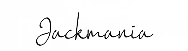
A lively and expressive handwritten font with fluid strokes.
![Jackmania Frei Schriftart Herunterladen]() Herunterladen 75 Downloads@WebFont
Herunterladen 75 Downloads@WebFont -
( Fonts by Edric Studio www.creativefabrica.com/designer/edricstudio/ - Personal-use only. For commercial use please contact owner. )
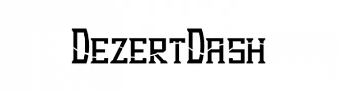
A bold, angular font with a modern, industrial style.
![Dezert Dash Frei Schriftart Herunterladen]() Herunterladen 75 Downloads@WebFont
Herunterladen 75 Downloads@WebFont -
( Fonts by selawetype )
A modern, geometric font with angular and edgy characters.
![Limoline Frei Schriftart Herunterladen]() Herunterladen 75 Downloads@WebFont
Herunterladen 75 Downloads@WebFont


Welche Schriften sind gerade am populärsten?
Poppins, Roboto, Montserrat, Open Sans und Lato sind wegen ihrer klaren Formen und breiten Einsetzbarkeit sehr gefragt – von Markenauftritt über Landingpages bis hin zu Postern.
Welche Fonts eignen sich für Logos?
Geometrische Sans‑Serifs (z. B. Poppins, Familien im Gotham‑Stil) sind ein häufiger Griff für sauberes, skalierbares Branding. Für eine persönlichere Note bleiben Scripts und Handschrift‑Stile beliebt. Kombinieren Sie einen prägnanten Headline‑Font mit einer neutralen Brotschrift für Wiedererkennung und Harmonie.
Wie oft wird die Top‑Liste aktualisiert?
Regelmäßig – basierend auf realen Downloads und Interaktionen. Schauen Sie öfter vorbei, um aufstrebende Favoriten früh zu entdecken.
💡 Tipp: Seite bookmarken – Trends wechseln schnell, und heutige Top‑Schriften inspirieren morgen vielleicht das Rebranding.