Willkommen bei den Top‑Schriften – hier treffen Beliebtheit und Qualität aufeinander. Das sind die in diesem Jahr am häufigsten heruntergeladenen und genutzten Fonts. Wenn Sie sichere Optionen für Logo, Web oder Social suchen, starten Sie hier.
Jeder Top‑Font überzeugt durch Balance, Lesbarkeit und Vielseitigkeit. Sie finden moderne Sans‑Serifs, elegante Scripts, Vintage‑Serifs und minimalistische Displays.
-
( Nils Stahl )
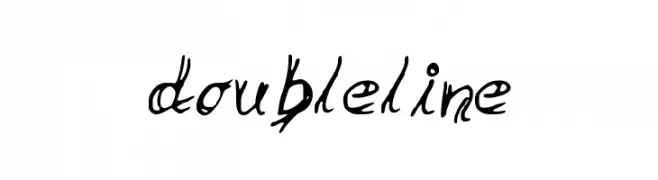
A dynamic, angular font with sharp strokes and a sense of movement.
 Herunterladen 74 Downloads@WebFont
 -
( Fonts by Scratch Design )
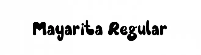
A playful, bold font with rounded edges and a bubbly appearance.
![Mayarita Regular Frei Schriftart Herunterladen]() Herunterladen 74 Downloads@WebFont
Herunterladen 74 Downloads@WebFont -
( Fonts by Moly Mol )
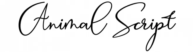
Elegant, handwritten script with flowing, connected strokes.
![Animal Script Frei Schriftart Herunterladen]() Herunterladen 74 Downloads@WebFont
Herunterladen 74 Downloads@WebFont -
( Iconian Fonts - Daniel Zadorozny - www.iconian.com )
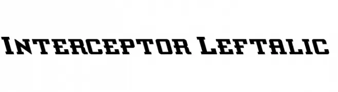
A bold, left-slanted font with a dynamic and energetic style.
![Interceptor Leftalic Frei Schriftart Herunterladen]() Herunterladen 74 Downloads@WebFont
Herunterladen 74 Downloads@WebFont -
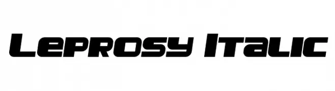
( Vladimir Nikolic - www.coroflot.com/vladimirnikolic )
A bold, italicized font with a dynamic and modern style.
![Leprosy Italic Frei Schriftart Herunterladen]() Herunterladen 74 Downloads@WebFont
Herunterladen 74 Downloads@WebFont -
-
( Fonts by Gassstype )
A bold, playful font with a hand-drawn, friendly appearance.
![Artka Frei Schriftart Herunterladen]() Herunterladen 74 Downloads@WebFont
Herunterladen 74 Downloads@WebFont -
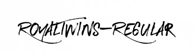
( Leonard Posavec - LeoSupply.co - Leonard Posavec - leosupply.co )
A bold, expressive handwritten font with dynamic strokes.
![RoyalTwins-Regular Frei Schriftart Herunterladen]() Herunterladen 74 Downloads@WebFont
Herunterladen 74 Downloads@WebFont -
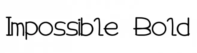
( Magic Fonts )
A playful and modern font with geometric and organic shapes.
![Impossible Bold Frei Schriftart Herunterladen]() Herunterladen 74 Downloads@WebFont
Herunterladen 74 Downloads@WebFont -
( Fonts by Alex Slobzheninov - Personal-use only. For commercial use please contact owner. )
A modern, slanted sans-serif font with clean lines and balanced spacing.
![Subjectivity-RegularSlanted Frei Schriftart Herunterladen]() Herunterladen 74 Downloads@WebFont
Herunterladen 74 Downloads@WebFont -
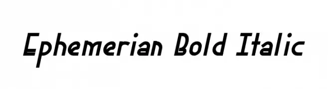
( Fonts by Xerographer Fonts )
A bold, italicized font with a modern and dynamic style.
![Ephemerian Bold Italic Frei Schriftart Herunterladen]() Herunterladen 74 Downloads@WebFont
Herunterladen 74 Downloads@WebFont


Welche Schriften sind gerade am populärsten?
Poppins, Roboto, Montserrat, Open Sans und Lato sind wegen ihrer klaren Formen und breiten Einsetzbarkeit sehr gefragt – von Markenauftritt über Landingpages bis hin zu Postern.
Welche Fonts eignen sich für Logos?
Geometrische Sans‑Serifs (z. B. Poppins, Familien im Gotham‑Stil) sind ein häufiger Griff für sauberes, skalierbares Branding. Für eine persönlichere Note bleiben Scripts und Handschrift‑Stile beliebt. Kombinieren Sie einen prägnanten Headline‑Font mit einer neutralen Brotschrift für Wiedererkennung und Harmonie.
Wie oft wird die Top‑Liste aktualisiert?
Regelmäßig – basierend auf realen Downloads und Interaktionen. Schauen Sie öfter vorbei, um aufstrebende Favoriten früh zu entdecken.
💡 Tipp: Seite bookmarken – Trends wechseln schnell, und heutige Top‑Schriften inspirieren morgen vielleicht das Rebranding.