Willkommen bei den Top‑Schriften – hier treffen Beliebtheit und Qualität aufeinander. Das sind die in diesem Jahr am häufigsten heruntergeladenen und genutzten Fonts. Wenn Sie sichere Optionen für Logo, Web oder Social suchen, starten Sie hier.
Jeder Top‑Font überzeugt durch Balance, Lesbarkeit und Vielseitigkeit. Sie finden moderne Sans‑Serifs, elegante Scripts, Vintage‑Serifs und minimalistische Displays.
-
( Fonts by BLKBK Fonts - www.blkbk.shop - Personal-use only. For commercial use please contact owner. Sponsoren Schriftart )
A bold, cursive script font with a fluid, handwritten style.
 Herunterladen 437 Downloads
 -
( Fonts by Almarkhatype Studio )
A bold, modern font with a vintage touch, featuring thick strokes and a slightly condensed structure.
![Rockbitz Frei Schriftart Herunterladen]() Herunterladen 437 Downloads@WebFont
Herunterladen 437 Downloads@WebFont -
( Fonts by Fenny Wiryani - Personal-use only. For commercial use please contact owner. )
A bold, ornate Blackletter font with sharp, angular lines and medieval flair.
![Black Window Frei Schriftart Herunterladen]() Herunterladen 437 Downloads@WebFont
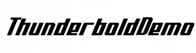
Herunterladen 437 Downloads@WebFont -
![Thunderbold Demo Frei Schriftart Herunterladen]() Herunterladen 437 Downloads@WebFont
Herunterladen 437 Downloads@WebFont -
( Fonts by Apostrophic Lab )
A sleek, modern font with elongated, narrow characters and minimal contrast.
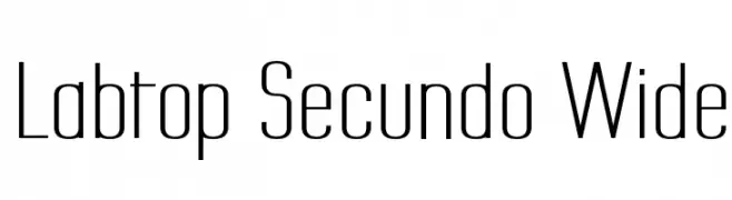
![Labtop Secundo Wide Frei Schriftart Herunterladen]() Herunterladen 437 Downloads@WebFont
Herunterladen 437 Downloads@WebFont -
( Fonts by a Neale Davidson - www.pixelsagas.com. Personal-use only. For commercial use please contact owner. )
A modern, geometric font with clean lines and consistent stroke width.
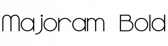
![Majoram Bold Frei Schriftart Herunterladen]() Herunterladen 437 Downloads@WebFont
Herunterladen 437 Downloads@WebFont -
( Fonts by DesignByPlatform - Studio Aurora - https://creativemarket.com/studioaurora - Personal-use only. For commercial use please contact owner. )
A modern, geometric font with unique cuts and bold shapes.
![Sukima Bold Frei Schriftart Herunterladen]() Herunterladen 437 Downloads@WebFont
Herunterladen 437 Downloads@WebFont -
( Fonts by ingoFonts. http://www.ingofonts.de )
A classic, elegant serif font with graceful curves and pronounced serifs.
![CharpentierRenaissancePro-Itali Frei Schriftart Herunterladen]() Herunterladen 437 Downloads@WebFont
Herunterladen 437 Downloads@WebFont -
( Fonts by PremiereGraphics )
A distressed, brush-style script font with a rugged, artistic appearance.
![Jumper^ Frei Schriftart Herunterladen]() Herunterladen 437 Downloads@WebFont
Herunterladen 437 Downloads@WebFont -
( Fonts by Arkandis Digital Foundry )
A bold, decorative serif font with Gothic influences and high contrast strokes.
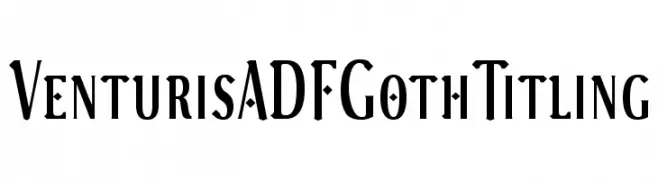
![VenturisADFGothTitling Frei Schriftart Herunterladen]() Herunterladen 437 Downloads@WebFont
Herunterladen 437 Downloads@WebFont -
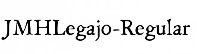
Schriftart von joorgemoron. For commercial use please contact the owner.
( Free for personal use. )
A classic, handwritten-style font with an elegant and historical touch.
![JMHLegajo-Regular Frei Schriftart Herunterladen]() Herunterladen 437 Downloads@WebFont
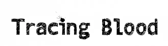
Herunterladen 437 Downloads@WebFont -
![Tracing Blood Frei Schriftart Herunterladen]() Herunterladen 437 Downloads@WebFont
Herunterladen 437 Downloads@WebFont -
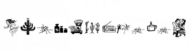
( Fonts by Galdino Otten Fonts - www.galdinootten.com - Personal-use only. For commercial use please contact owner. )
Illustrative, folk-inspired display font with high-contrast pictograms.
![Cordel Junina Frei Schriftart Herunterladen]() Herunterladen 437 Downloads@WebFont
Herunterladen 437 Downloads@WebFont -
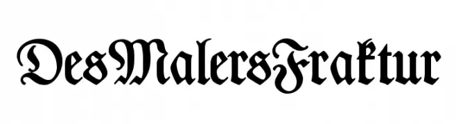
( Fonts by www.peter-wiegel.de. Personal-use only. For commercial use please contact owner. )
A traditional Blackletter font with ornate, medieval-inspired design.
![DesMalersFraktur Frei Schriftart Herunterladen]() Herunterladen 437 Downloads@WebFont
Herunterladen 437 Downloads@WebFont -
Schriftart von jlog3000. For commercial use please contact the owner.
( Fonts by John Ocasio. Free for personal use only )
A bold, geometric font with sharp, angular edges and a modern, futuristic style.
![J-LOG Razor Edge Sans Normal Frei Schriftart Herunterladen]() Herunterladen 437 Downloads@WebFont
Herunterladen 437 Downloads@WebFont -
Schriftart von antipixel. For commercial use please contact the owner.
![Nue Bold Frei Schriftart Herunterladen]() Herunterladen 437 Downloads@WebFont
Herunterladen 437 Downloads@WebFont -
( Fonts by Manfred Klein. Free for private and charity use. Free for commercial with donation to organizations )
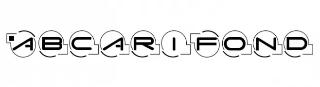
A futuristic, geometric font with characters enclosed in circles, offering a modern and technological look.
![AbcariFond Frei Schriftart Herunterladen]() Herunterladen 437 Downloads@WebFont
Herunterladen 437 Downloads@WebFont -
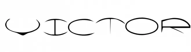
![Victor Frei Schriftart Herunterladen]() Herunterladen 437 Downloads@WebFont
Herunterladen 437 Downloads@WebFont -
( Adam Wunn )
A bold, textured font with diagonal line patterns, perfect for modern displays.
![No Parking Frei Schriftart Herunterladen]() Herunterladen 437 Downloads@WebFont
Herunterladen 437 Downloads@WebFont -
( Fonts by Octotype - www.foundmyfont.com - Personal-use only. For commercial use please contact owner. )
An elegant script font with flowing, intricate loops and swirls, exuding sophistication.
![CharmingStrangulation Frei Schriftart Herunterladen]() Herunterladen 437 Downloads@WebFont
Herunterladen 437 Downloads@WebFont -
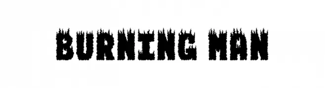
( Fonts by www.dcoxy.com )
A bold, fiery font with a dramatic burning effect.
![BURNING MAN Frei Schriftart Herunterladen]() Herunterladen 437 Downloads@WebFont
Herunterladen 437 Downloads@WebFont -
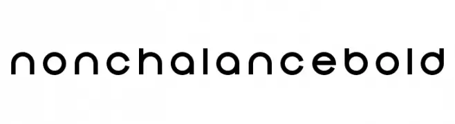
( Colorbean )
A modern, geometric sans-serif font with a bold and clean design.
![Nonchalance Bold Frei Schriftart Herunterladen]() Herunterladen 436 Downloads@WebFont
Herunterladen 436 Downloads@WebFont -
( Iconian Fonts - Daniel Zadorozny - www.iconian.com )
A futuristic, italicized font with bold, angular letterforms and a dynamic style.
![Space Ranger Super-Italic Frei Schriftart Herunterladen]() Herunterladen 436 Downloads@WebFont
Herunterladen 436 Downloads@WebFont -
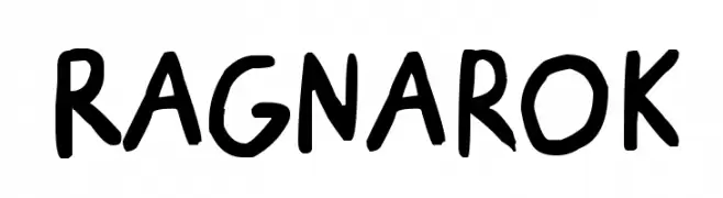
![Ragnarok Frei Schriftart Herunterladen]() Herunterladen 436 Downloads@WebFont
Herunterladen 436 Downloads@WebFont -
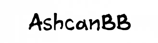
( Fonts by www.blambot.com )
A playful, hand-drawn font with an informal and whimsical style.
![AshcanBB Frei Schriftart Herunterladen]() Herunterladen 436 Downloads@WebFont
Herunterladen 436 Downloads@WebFont -
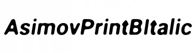
( Fonts by CannotIntoSpaceFonts - KineticPlasma Fonts - Personal-use only. For commercial use please contact owner. )
A bold, rounded, and slightly italicized font with a modern and approachable style.
![Asimov Print B Italic Frei Schriftart Herunterladen]() Herunterladen 436 Downloads@WebFont
Herunterladen 436 Downloads@WebFont -
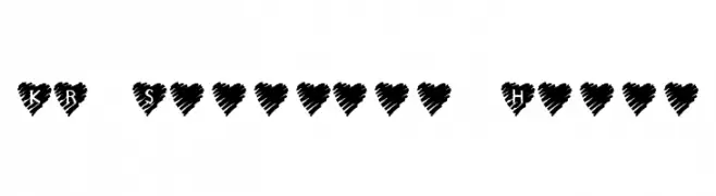
( Fonts by Kat`s Fun Fonts - Personal-use only. For commercial use please contact owner. )
A playful, heart-themed decorative font with a hand-drawn style.
![KR Scribble Heart Frei Schriftart Herunterladen]() Herunterladen 436 Downloads@WebFont
Herunterladen 436 Downloads@WebFont -
( Fonts by www.peter-wiegel.de. Personal-use only. For commercial use please contact owner. )
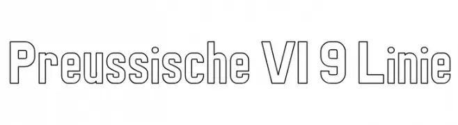
A bold, geometric outline font with a modern and structured appearance.
![Preussische VI 9 Linie Frei Schriftart Herunterladen]() Herunterladen 436 Downloads@WebFont
Herunterladen 436 Downloads@WebFont -
![Gramius 'Blizzard' Frei Schriftart Herunterladen]() Herunterladen 436 Downloads@WebFont
Herunterladen 436 Downloads@WebFont -
![NuBatman Frei Schriftart Herunterladen]() Herunterladen 436 Downloads@WebFont
Herunterladen 436 Downloads@WebFont -
( Fonts by Get Studio - Hermansyah , - Personal-use only. For commercial use please contact owner. )
A lively and expressive handwritten font with dynamic strokes.
![Mauritania Regular Frei Schriftart Herunterladen]() Herunterladen 436 Downloads@WebFont
Herunterladen 436 Downloads@WebFont -
![CyberBunny Frei Schriftart Herunterladen]() Herunterladen 436 Downloads@WebFont
Herunterladen 436 Downloads@WebFont -
( Fonts by youssef-habchi.com - Personal-use only. For commercial use please contact owner. )
A bold, brush script font with dynamic and expressive strokes.
![Crabmeal Frei Schriftart Herunterladen]() Herunterladen 436 Downloads@WebFont
Herunterladen 436 Downloads@WebFont -
( Fonts by site.xavier.edu/polt/typewriters/ - Richard Polt )
A vintage serif font with a textured, handcrafted appearance.
![Reiner Graphika Frei Schriftart Herunterladen]() Herunterladen 436 Downloads@WebFont
Herunterladen 436 Downloads@WebFont -
( Fonts by Darcy Baldwin - darcybaldwin.com. Free for personal use only )
A playful and whimsical script font with flowing, connected letters.
![DJB Dear St. Nick Frei Schriftart Herunterladen]() Herunterladen 436 Downloads@WebFont
Herunterladen 436 Downloads@WebFont


Welche Schriften sind gerade am populärsten?
Poppins, Roboto, Montserrat, Open Sans und Lato sind wegen ihrer klaren Formen und breiten Einsetzbarkeit sehr gefragt – von Markenauftritt über Landingpages bis hin zu Postern.
Welche Fonts eignen sich für Logos?
Geometrische Sans‑Serifs (z. B. Poppins, Familien im Gotham‑Stil) sind ein häufiger Griff für sauberes, skalierbares Branding. Für eine persönlichere Note bleiben Scripts und Handschrift‑Stile beliebt. Kombinieren Sie einen prägnanten Headline‑Font mit einer neutralen Brotschrift für Wiedererkennung und Harmonie.
Wie oft wird die Top‑Liste aktualisiert?
Regelmäßig – basierend auf realen Downloads und Interaktionen. Schauen Sie öfter vorbei, um aufstrebende Favoriten früh zu entdecken.
💡 Tipp: Seite bookmarken – Trends wechseln schnell, und heutige Top‑Schriften inspirieren morgen vielleicht das Rebranding.