Willkommen bei den Top‑Schriften – hier treffen Beliebtheit und Qualität aufeinander. Das sind die in diesem Jahr am häufigsten heruntergeladenen und genutzten Fonts. Wenn Sie sichere Optionen für Logo, Web oder Social suchen, starten Sie hier.
Jeder Top‑Font überzeugt durch Balance, Lesbarkeit und Vielseitigkeit. Sie finden moderne Sans‑Serifs, elegante Scripts, Vintage‑Serifs und minimalistische Displays.
-
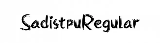
( Fonts by twinletter - Rozikan - Personal-use only. For commercial use please contact owner. )
A bold, hand-drawn font with jagged, expressive strokes.
 Herunterladen 73 Downloads@WebFont
 -
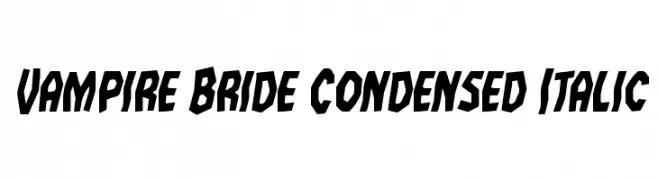
( Fonts by Iconian Fonts )
Bold, condensed, and italic with sharp angles and dynamic style.
![Vampire Bride Condensed Italic Frei Schriftart Herunterladen]() Herunterladen 73 Downloads@WebFont
Herunterladen 73 Downloads@WebFont -
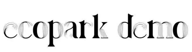
( Fonts by 177Studio )
A bold, decorative font with intricate line detailing and a modern twist.
![ecopark demo Frei Schriftart Herunterladen]() Herunterladen 73 Downloads@WebFont
Herunterladen 73 Downloads@WebFont -
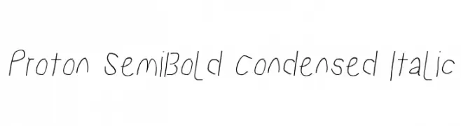
![Proton SemiBold Condensed Italic Frei Schriftart Herunterladen]() Herunterladen 73 Downloads@WebFont
Herunterladen 73 Downloads@WebFont -
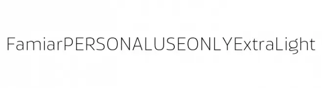
( Fonts by Mans Greback - Personal-use only. For commercial use please contact owner. )
A clean, minimalist font with thin, elongated characters and a modern aesthetic.
![Famiar PERSONAL USE ONLY ExtraLight Frei Schriftart Herunterladen]() Herunterladen 73 Downloads@WebFont
Herunterladen 73 Downloads@WebFont -
-
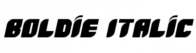
( Fonts by www.studiotypo.com - Personal-use only. For commercial use please contact owner. )
A bold, italicized font with a modern and dynamic style.
![Boldie Italic Frei Schriftart Herunterladen]() Herunterladen 73 Downloads@WebFont
Herunterladen 73 Downloads@WebFont -
( LJ Design Studios - www.ljdesignstudios.com )
A bold, geometric font with integrated arrow motifs for a dynamic look.
![Rock Arrow Frei Schriftart Herunterladen]() Herunterladen 73 Downloads@WebFont
Herunterladen 73 Downloads@WebFont -
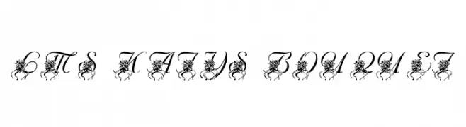
( London's Letters - www.londonsletters.com/ )
An ornate script font with floral embellishments, perfect for elegant designs.
![LMS Katy's Bouquet Frei Schriftart Herunterladen]() Herunterladen 73 Downloads@WebFont
Herunterladen 73 Downloads@WebFont -
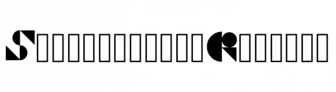
![Shapeshifter Regular Frei Schriftart Herunterladen]() Herunterladen 73 Downloads@WebFont
Herunterladen 73 Downloads@WebFont -
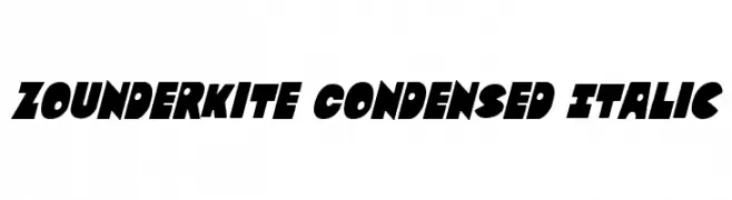
( Fonts by Iconian Fonts )
A bold, condensed, and italicized font with a dynamic and modern style.
![Zounderkite Condensed Italic Frei Schriftart Herunterladen]() Herunterladen 73 Downloads@WebFont
Herunterladen 73 Downloads@WebFont
Welche Schriften sind gerade am populärsten?
Poppins, Roboto, Montserrat, Open Sans und Lato sind wegen ihrer klaren Formen und breiten Einsetzbarkeit sehr gefragt – von Markenauftritt über Landingpages bis hin zu Postern.
Welche Fonts eignen sich für Logos?
Geometrische Sans‑Serifs (z. B. Poppins, Familien im Gotham‑Stil) sind ein häufiger Griff für sauberes, skalierbares Branding. Für eine persönlichere Note bleiben Scripts und Handschrift‑Stile beliebt. Kombinieren Sie einen prägnanten Headline‑Font mit einer neutralen Brotschrift für Wiedererkennung und Harmonie.
Wie oft wird die Top‑Liste aktualisiert?
Regelmäßig – basierend auf realen Downloads und Interaktionen. Schauen Sie öfter vorbei, um aufstrebende Favoriten früh zu entdecken.
💡 Tipp: Seite bookmarken – Trends wechseln schnell, und heutige Top‑Schriften inspirieren morgen vielleicht das Rebranding.