Willkommen bei den Top‑Schriften – hier treffen Beliebtheit und Qualität aufeinander. Das sind die in diesem Jahr am häufigsten heruntergeladenen und genutzten Fonts. Wenn Sie sichere Optionen für Logo, Web oder Social suchen, starten Sie hier.
Jeder Top‑Font überzeugt durch Balance, Lesbarkeit und Vielseitigkeit. Sie finden moderne Sans‑Serifs, elegante Scripts, Vintage‑Serifs und minimalistische Displays.
-
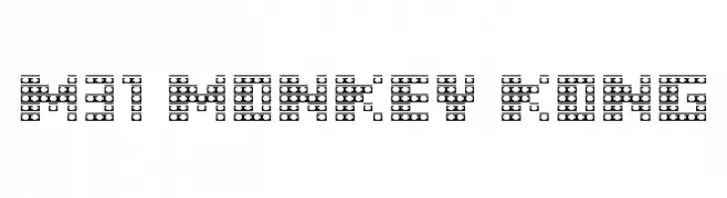
( Fonts by Miffies - mfs.jp.org - Personal-use only. For commercial use please contact owner. )
A pixelated, arcade-inspired font with a nostalgic, digital look.
 Herunterladen 433 Downloads@WebFont
 -
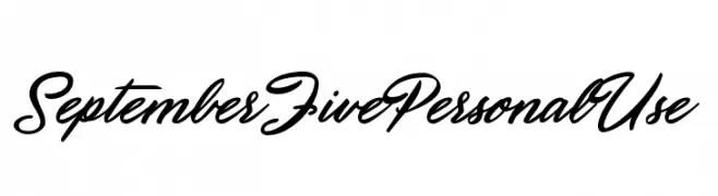
( Fonts by Billy Argel - www.billyargel.com - Personal-use only. For commercial use please contact owner. )
A dynamic and flowing script font with elegant, cursive letterforms.
![September Five Personal Use Frei Schriftart Herunterladen]() Herunterladen 433 Downloads@WebFont
Herunterladen 433 Downloads@WebFont -
( Fonts by Pennyzine - www.thedevilinjasonramirez.com - Free for personal use )
A bold, distressed font with a gritty, punk-inspired aesthetic.
![Fear of a Punk Planet Frei Schriftart Herunterladen]() Herunterladen 433 Downloads@WebFont
Herunterladen 433 Downloads@WebFont -
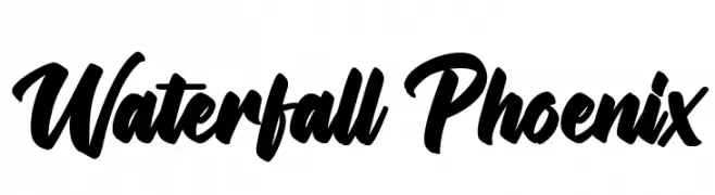
( Fonts by Octotype - www.foundmyfont.com - Personal-use only. For commercial use please contact owner. )
A bold, dynamic script font with fluid, cursive strokes.
![Waterfall Phoenix Frei Schriftart Herunterladen]() Herunterladen 433 Downloads@WebFont
Herunterladen 433 Downloads@WebFont -
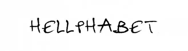
![hellphabet Frei Schriftart Herunterladen]() Herunterladen 433 Downloads@WebFont
Herunterladen 433 Downloads@WebFont -
( Fonts by Måns Grebäck )
A bold, serif font with thick strokes and a vintage style.
![Vacer Serif Personal Fat Frei Schriftart Herunterladen]() Herunterladen 433 Downloads@WebFont
Herunterladen 433 Downloads@WebFont -
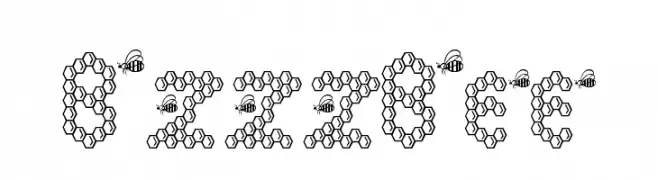
![BzzzBee Frei Schriftart Herunterladen]() Herunterladen 433 Downloads@WebFont
Herunterladen 433 Downloads@WebFont -
![NBA EAST Frei Schriftart Herunterladen]() Herunterladen 433 Downloads@WebFont
Herunterladen 433 Downloads@WebFont -
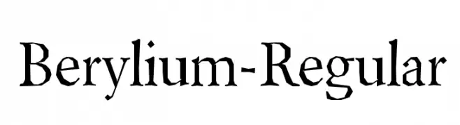
( Fonts by www.typodermicfonts.com - Ray Larabie )
A classic serif font with a distressed, hand-crafted look.
![Berylium-Regular Frei Schriftart Herunterladen]() Herunterladen 433 Downloads@WebFont
Herunterladen 433 Downloads@WebFont -
( Fonts by www.blambot.com )
A bold, slanted font with smooth, rounded characters for a dynamic look.
![ManlyMen BB Bold Frei Schriftart Herunterladen]() Herunterladen 433 Downloads@WebFont
Herunterladen 433 Downloads@WebFont -
( Fonts by a Max Infeld - XEROGRAPHER FONTS - xerographer.blogspot.com . Personal-use only. For commercial use please contact owner. )
A bold, dynamic font with a 3D shadow effect and playful structure.
![JustQuick Frei Schriftart Herunterladen]() Herunterladen 433 Downloads@WebFont
Herunterladen 433 Downloads@WebFont -
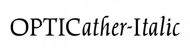
( Fonts by Castcraft Software - opti.netii.net - check the website before use )
A classic serif font with elegant italicized lines and medium contrast.
![OPTICather-Italic Frei Schriftart Herunterladen]() Herunterladen 433 Downloads@WebFont
Herunterladen 433 Downloads@WebFont -
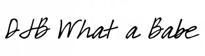
( Fonts by Darcy Baldwin - darcybaldwin.com. Free for personal use only )
A playful, handwritten font with fluid, dynamic strokes and a casual style.
![DJB What a Babe Frei Schriftart Herunterladen]() Herunterladen 433 Downloads@WebFont
Herunterladen 433 Downloads@WebFont -
( Fonts by www.woodardworks.com )
A modern, geometric font with uniform stroke widths and a minimalistic design.
![Laconic-Light Frei Schriftart Herunterladen]() Herunterladen 433 Downloads@WebFont
Herunterladen 433 Downloads@WebFont -
( Allen R. Walden )
A geometric, angular font with a futuristic, digital display style.
![Crystal Italic Frei Schriftart Herunterladen]() Herunterladen 433 Downloads
Herunterladen 433 Downloads -
( Fonts by a Jayvee Enaguas - harvettfox96.deviantart.com. Personal-use only. For commercial use please contact owner. )
A bold, pixelated font with a retro digital aesthetic.
![Pixel Operator 8 Bold Frei Schriftart Herunterladen]() Herunterladen 433 Downloads@WebFont
Herunterladen 433 Downloads@WebFont -
( Fonts by 50Fox Studio - www.50fox.com - Personal-use only. For commercial use please contact owner. )
A bold, condensed, and modern sans-serif font with high contrast.
![ImperfectoRegular Frei Schriftart Herunterladen]() Herunterladen 433 Downloads@WebFont
Herunterladen 433 Downloads@WebFont -
( Fonts by Stefanus Kurniawan )
A bold slab serif font with strong serifs and a modern yet timeless appeal.
![oce slab serif Frei Schriftart Herunterladen]() Herunterladen 433 Downloads@WebFont
Herunterladen 433 Downloads@WebFont -
( Fonts by Zea Fonts - Personal-use only. For commercial use please contact owner. )
A bold, geometric font with a modern and futuristic style.
![GOVER Frei Schriftart Herunterladen]() Herunterladen 433 Downloads@WebFont
Herunterladen 433 Downloads@WebFont -
( Font by Sven Stuber - www.superlooper.de )
A pixelated, retro-style font with a blocky, digital appearance.
![supernatural_10_01 Frei Schriftart Herunterladen]() Herunterladen 433 Downloads@WebFont
Herunterladen 433 Downloads@WebFont -
![Commodore 64 Angled Frei Schriftart Herunterladen]() Herunterladen 433 Downloads@WebFont
Herunterladen 433 Downloads@WebFont -
( Fonts by Graphiqa Studio )
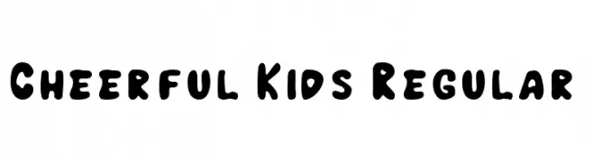
A playful, bubbly font with rounded, hand-drawn characters.
![Cheerful Kids Regular Frei Schriftart Herunterladen]() Herunterladen 433 Downloads@WebFont
Herunterladen 433 Downloads@WebFont -
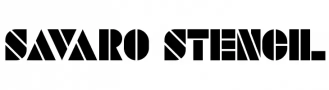
![SAVARO STENCIL Frei Schriftart Herunterladen]() Herunterladen 433 Downloads@WebFont
Herunterladen 433 Downloads@WebFont -
( Fonts by Arkandis Digital Foundry )
A bold, modern sans-serif font with clean lines and strong visual impact.
![IkariusADFNo2Std-Bold Frei Schriftart Herunterladen]() Herunterladen 433 Downloads@WebFont
Herunterladen 433 Downloads@WebFont -
( Fonts by a Neale Davidson - www.pixelsagas.com. Personal-use only. For commercial use please contact owner. )
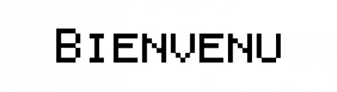
A pixelated, monospaced font with a retro digital aesthetic.
![Bienvenu Frei Schriftart Herunterladen]() Herunterladen 433 Downloads@WebFont
Herunterladen 433 Downloads@WebFont -
( Fonts by Manuel Viergutz - Typo Graphic Design - www.typographicdesign.de )
A bold, geometric font with a modern, industrial style.
![BlockHead Bold Frei Schriftart Herunterladen]() Herunterladen 433 Downloads@WebFont
Herunterladen 433 Downloads@WebFont -
( Fonts by Fontfabric - Svetoslav Simov - Personal-use only. For commercial use please contact owner. )
A modern, geometric sans-serif font with balanced spacing and a professional appearance.
![Code Next-Trial Book Frei Schriftart Herunterladen]() Herunterladen 433 Downloads@WebFont
Herunterladen 433 Downloads@WebFont -
![SPAtlantis Frei Schriftart Herunterladen]() Herunterladen 433 Downloads@WebFont
Herunterladen 433 Downloads@WebFont -
( Fonts by Daniel Zadorozny - www.iconian.com )
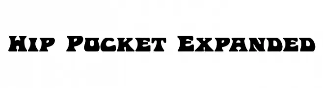
A bold, playful font with exaggerated, rounded edges and a wide stance.
![Hip Pocket Expanded Frei Schriftart Herunterladen]() Herunterladen 433 Downloads@WebFont
Herunterladen 433 Downloads@WebFont -
( Fonts by twinletter )
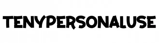
A bold, playful font with a hand-drawn, whimsical style.
![Teny Personal Use Frei Schriftart Herunterladen]() Herunterladen 433 Downloads@WebFont
Herunterladen 433 Downloads@WebFont -
( Personal-use only. For commercial use please contact owner. )
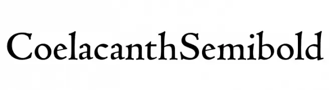
A classic serif font with an artistic, hand-crafted appearance.
![Coelacanth Semibold Frei Schriftart Herunterladen]() Herunterladen 433 Downloads@WebFont
Herunterladen 433 Downloads@WebFont -
( Fonts by www.hindson.com.au )
A bold and artistic font featuring stylized musical accidentals.
![Accidentals Frei Schriftart Herunterladen]() Herunterladen 433 Downloads@WebFont
Herunterladen 433 Downloads@WebFont -
( Fonts by The Typerex )
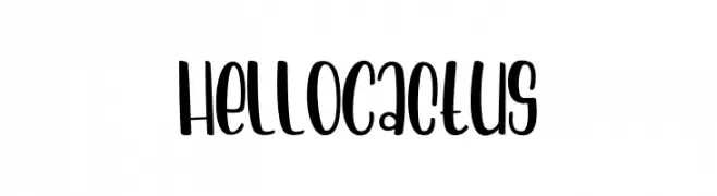
A playful, handwritten font with a bold and whimsical style.
![Hello Cactus Frei Schriftart Herunterladen]() Herunterladen 433 Downloads@WebFont
Herunterladen 433 Downloads@WebFont -
( Fonts by 38.lineart - Muhammad Ridha Agusni - Personal-use only. For commercial use please contact owner. )
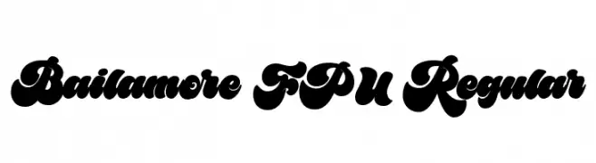
A bold, playful font with thick, rounded strokes and a whimsical style.
![Bailamore FPU Regular Frei Schriftart Herunterladen]() Herunterladen 433 Downloads@WebFont
Herunterladen 433 Downloads@WebFont -
( Fonts by imagex )
A playful, bold font with cartoonish, exaggerated curves and a lively appearance.
![The Last Comic On Earth Frei Schriftart Herunterladen]() Herunterladen 433 Downloads@WebFont
Herunterladen 433 Downloads@WebFont


Welche Schriften sind gerade am populärsten?
Poppins, Roboto, Montserrat, Open Sans und Lato sind wegen ihrer klaren Formen und breiten Einsetzbarkeit sehr gefragt – von Markenauftritt über Landingpages bis hin zu Postern.
Welche Fonts eignen sich für Logos?
Geometrische Sans‑Serifs (z. B. Poppins, Familien im Gotham‑Stil) sind ein häufiger Griff für sauberes, skalierbares Branding. Für eine persönlichere Note bleiben Scripts und Handschrift‑Stile beliebt. Kombinieren Sie einen prägnanten Headline‑Font mit einer neutralen Brotschrift für Wiedererkennung und Harmonie.
Wie oft wird die Top‑Liste aktualisiert?
Regelmäßig – basierend auf realen Downloads und Interaktionen. Schauen Sie öfter vorbei, um aufstrebende Favoriten früh zu entdecken.
💡 Tipp: Seite bookmarken – Trends wechseln schnell, und heutige Top‑Schriften inspirieren morgen vielleicht das Rebranding.