Willkommen bei den Top‑Schriften – hier treffen Beliebtheit und Qualität aufeinander. Das sind die in diesem Jahr am häufigsten heruntergeladenen und genutzten Fonts. Wenn Sie sichere Optionen für Logo, Web oder Social suchen, starten Sie hier.
Jeder Top‑Font überzeugt durch Balance, Lesbarkeit und Vielseitigkeit. Sie finden moderne Sans‑Serifs, elegante Scripts, Vintage‑Serifs und minimalistische Displays.
-
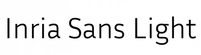
( Copyright 2017 The Inria Sans Project Authors (https://github.com/BlackFoundryCom/InriaFonts) )
A modern, light sans-serif font with clean, minimalistic design.
 Herunterladen 429 Downloads@WebFont
 -
( Bayley Design - William Bayley - behance.net/bayleydesign www.freshcomfonts.co.uk/william-suckling-22-c.asp )
A bold, geometric font with sharp angles and a modern Gothic influence.
![AXE Frei Schriftart Herunterladen]() Herunterladen 429 Downloads@WebFont
Herunterladen 429 Downloads@WebFont -
( Fonts by www.junkohanhero.com - Personal-use only. For commercial use please contact owner. )
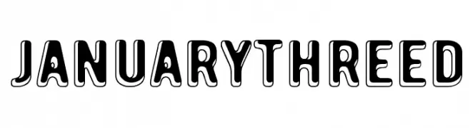
A bold, playful font with a three-dimensional effect and rounded edges.
![January Threed Frei Schriftart Herunterladen]() Herunterladen 429 Downloads@WebFont
Herunterladen 429 Downloads@WebFont -
![NBA EAST Frei Schriftart Herunterladen]() Herunterladen 429 Downloads@WebFont
Herunterladen 429 Downloads@WebFont -
( Fonts by a www.fontfabric.com. Personal-use only. For commercial use please contact owner. )
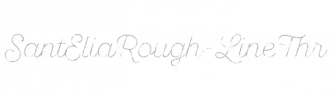
A cursive, hand-drawn font with a rough, artistic style.
![SantEliaRough-LineThr Frei Schriftart Herunterladen]() Herunterladen 429 Downloads@WebFont
Herunterladen 429 Downloads@WebFont -
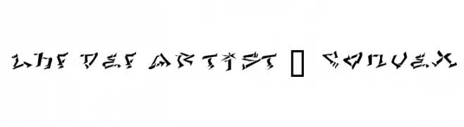
![LHF Def Artist | CONVEX Frei Schriftart Herunterladen]() Herunterladen 429 Downloads
Herunterladen 429 Downloads -
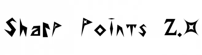
![Sharp Points 2.0 Frei Schriftart Herunterladen]() Herunterladen 429 Downloads@WebFont
Herunterladen 429 Downloads@WebFont -
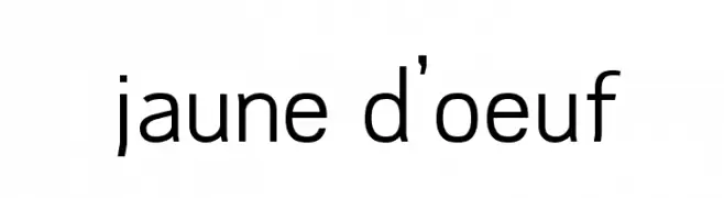
![jaune d'oeuf Frei Schriftart Herunterladen]() Herunterladen 429 Downloads@WebFont
Herunterladen 429 Downloads@WebFont -
( Fonts by CannotIntoSpaceFonts - KineticPlasma Fonts - Personal-use only. For commercial use please contact owner. )
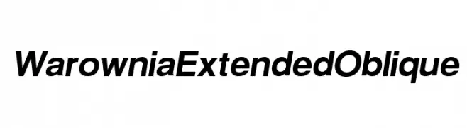
A modern, oblique font with extended width and consistent stroke width for a sleek, professional look.
![Warownia Extended Oblique Frei Schriftart Herunterladen]() Herunterladen 429 Downloads@WebFont
Herunterladen 429 Downloads@WebFont -
( Fonts by Jonathan Harris - www.tattoowoo.com )
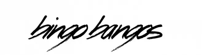
A bold, brush-stroke font with a dynamic and energetic style.
![Bingo Bangos Frei Schriftart Herunterladen]() Herunterladen 429 Downloads@WebFont
Herunterladen 429 Downloads@WebFont -
( Fonts by Des Gomez )
A playful, hand-drawn font with a sketch-like, textured appearance.
![Misunderstood Frei Schriftart Herunterladen]() Herunterladen 429 Downloads@WebFont
Herunterladen 429 Downloads@WebFont -
( Fonts by RudynFluffy )
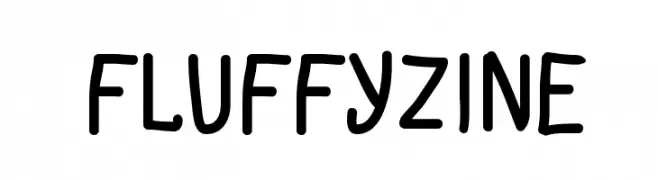
A playful, handwritten font with a casual and friendly style.
![FluffyZine Frei Schriftart Herunterladen]() Herunterladen 429 Downloads@WebFont
Herunterladen 429 Downloads@WebFont -
( Fonts by olexstudio - Firman Syah - Personal-use only. For commercial use please contact owner. )
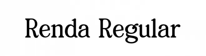
A classic serif font with elegant and pronounced serifs, offering a timeless and sophisticated look.
![Renda Regular Frei Schriftart Herunterladen]() Herunterladen 429 Downloads@WebFont
Herunterladen 429 Downloads@WebFont -
( Fonts by www.fontpanda.com. Personal-use only. For commercial use please contact owner. )
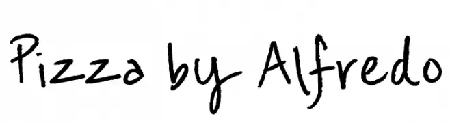
A playful, handwritten font with bold, dynamic strokes.
![Pizza by Alfredo Frei Schriftart Herunterladen]() Herunterladen 429 Downloads@WebFont
Herunterladen 429 Downloads@WebFont -
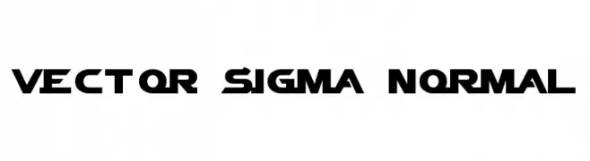
![Vector Sigma Normal Frei Schriftart Herunterladen]() Herunterladen 429 Downloads@WebFont
Herunterladen 429 Downloads@WebFont -
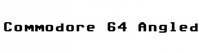
![Commodore 64 Angled Frei Schriftart Herunterladen]() Herunterladen 429 Downloads@WebFont
Herunterladen 429 Downloads@WebFont -
( Fonts by PutraCetol Studio )
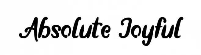
A bold, playful script font with flowing, cursive letterforms.
![Absolute Joyful Frei Schriftart Herunterladen]() Herunterladen 429 Downloads@WebFont
Herunterladen 429 Downloads@WebFont -
( Fonts by Linafis Studio - Ahmad Fashihullisan - Personal-use only. For commercial use please contact owner. )
A bold, cracked texture font with a rugged, urban style.
![CRACK WALL Regular Frei Schriftart Herunterladen]() Herunterladen 429 Downloads@WebFont
Herunterladen 429 Downloads@WebFont -
![Smush Light Frei Schriftart Herunterladen]() Herunterladen 429 Downloads@WebFont
Herunterladen 429 Downloads@WebFont -
( Fonts by a Youssef Habchi - youssef-habchi.com. Personal-use only. For commercial use please contact owner. )
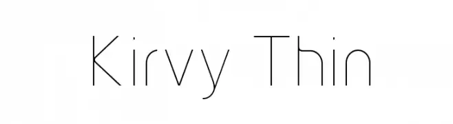
A sleek, modern font with thin lines and balanced spacing.
![Kirvy Thin Frei Schriftart Herunterladen]() Herunterladen 429 Downloads@WebFont
Herunterladen 429 Downloads@WebFont -
( Fonts by Nick Curtis - www.nicksfonts.com )
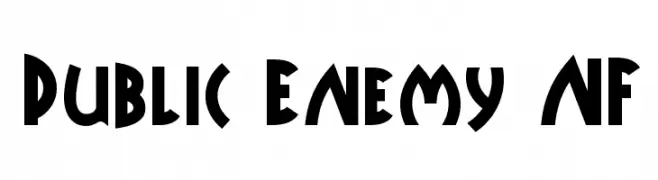
A bold, geometric font with Art Deco influences, ideal for impactful designs.
![Public Enemy NF Frei Schriftart Herunterladen]() Herunterladen 429 Downloads@WebFont
Herunterladen 429 Downloads@WebFont -
![mineee lol Frei Schriftart Herunterladen]() Herunterladen 429 Downloads@WebFont
Herunterladen 429 Downloads@WebFont -
( Fonts by Daniel Zadorozny - www.iconian.com )
A bold, italic, and expanded font with a futuristic and dynamic style.
![Star Eagle Expanded Bold Italic Frei Schriftart Herunterladen]() Herunterladen 429 Downloads@WebFont
Herunterladen 429 Downloads@WebFont -
( Fonts by Khurasan )
A playful, bold font with rounded edges and a hand-drawn look.
![Corner Cafe Frei Schriftart Herunterladen]() Herunterladen 429 Downloads@WebFont
Herunterladen 429 Downloads@WebFont -
![From_the_Dead Frei Schriftart Herunterladen]() Herunterladen 429 Downloads@WebFont
Herunterladen 429 Downloads@WebFont -
( Fonts by twinletter )
A bold, playful font with a hand-drawn, whimsical style.
![Teny Personal Use Frei Schriftart Herunterladen]() Herunterladen 429 Downloads@WebFont
Herunterladen 429 Downloads@WebFont -
( Fonts by Peax Webdesign - www.peax-webdesign.com. Personal-use only. For commercial use please contact owner. )
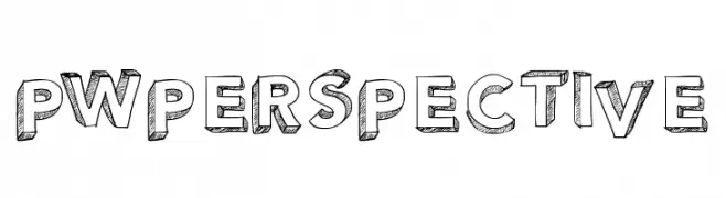
A bold, hand-drawn 3D font with a playful, sketch-like texture.
![PWPerspective Frei Schriftart Herunterladen]() Herunterladen 429 Downloads@WebFont
Herunterladen 429 Downloads@WebFont -
( Fonts by zulkhairilettering - Zulkhairi M Saleh - Personal-use only. For commercial use please contact owner. )
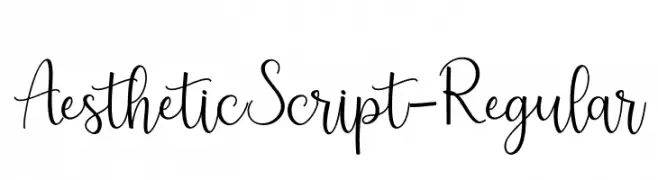
A graceful and flowing script font with elegant curves.
![AestheticScript-Regular Frei Schriftart Herunterladen]() Herunterladen 429 Downloads@WebFont
Herunterladen 429 Downloads@WebFont -
( Fonts by Galdino Otten - galdinootten.com )
A playful, hand-drawn style font with irregular strokes and a whimsical appearance.
![Almost Cartoon Frei Schriftart Herunterladen]() Herunterladen 429 Downloads@WebFont
Herunterladen 429 Downloads@WebFont -
( Fonts by Graham Meade - GemFonts )
A modern, geometric font with layered lines and a structured appearance.
![Ericott Frei Schriftart Herunterladen]() Herunterladen 429 Downloads@WebFont
Herunterladen 429 Downloads@WebFont -
( Fonts by Sharkshock Productions----www.sharkshock.com. Personal-use only. For commercial use please contact owner. )
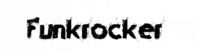
A bold, grunge-style font with a distressed, textured appearance.
![Funkrocker Frei Schriftart Herunterladen]() Herunterladen 429 Downloads@WebFont
Herunterladen 429 Downloads@WebFont -
( Fonts by Iconian Fonts )
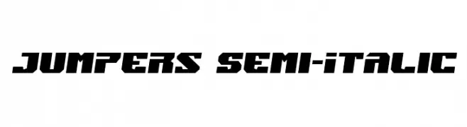
A bold, angular, semi-italic font with a dynamic and modern style.
![Jumpers Semi-Italic Frei Schriftart Herunterladen]() Herunterladen 429 Downloads@WebFont
Herunterladen 429 Downloads@WebFont -
( Fonts by arwah12 - Personal-use only. For commercial use please contact owner. )
A modern sans-serif font with rounded edges and uniform stroke width.
![Qualio Frei Schriftart Herunterladen]() Herunterladen 429 Downloads@WebFont
Herunterladen 429 Downloads@WebFont -
( Malindo Creative - www.creativefabrica.com/ref/112799/ )
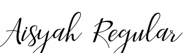
An elegant, flowing script font with smooth, cursive strokes.
![Aisyah Regular Frei Schriftart Herunterladen]() Herunterladen 429 Downloads@WebFont
Herunterladen 429 Downloads@WebFont -
( Fonts by www.peter-wiegel.de. Personal-use only. For commercial use please contact owner. )
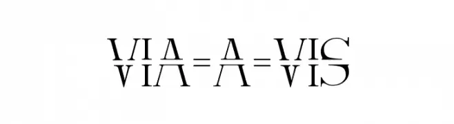
A modern, artistic font with horizontally split characters and bold strokes.
![Via-A-Vis Frei Schriftart Herunterladen]() Herunterladen 429 Downloads@WebFont
Herunterladen 429 Downloads@WebFont


Welche Schriften sind gerade am populärsten?
Poppins, Roboto, Montserrat, Open Sans und Lato sind wegen ihrer klaren Formen und breiten Einsetzbarkeit sehr gefragt – von Markenauftritt über Landingpages bis hin zu Postern.
Welche Fonts eignen sich für Logos?
Geometrische Sans‑Serifs (z. B. Poppins, Familien im Gotham‑Stil) sind ein häufiger Griff für sauberes, skalierbares Branding. Für eine persönlichere Note bleiben Scripts und Handschrift‑Stile beliebt. Kombinieren Sie einen prägnanten Headline‑Font mit einer neutralen Brotschrift für Wiedererkennung und Harmonie.
Wie oft wird die Top‑Liste aktualisiert?
Regelmäßig – basierend auf realen Downloads und Interaktionen. Schauen Sie öfter vorbei, um aufstrebende Favoriten früh zu entdecken.
💡 Tipp: Seite bookmarken – Trends wechseln schnell, und heutige Top‑Schriften inspirieren morgen vielleicht das Rebranding.