Willkommen bei den Top‑Schriften – hier treffen Beliebtheit und Qualität aufeinander. Das sind die in diesem Jahr am häufigsten heruntergeladenen und genutzten Fonts. Wenn Sie sichere Optionen für Logo, Web oder Social suchen, starten Sie hier.
Jeder Top‑Font überzeugt durch Balance, Lesbarkeit und Vielseitigkeit. Sie finden moderne Sans‑Serifs, elegante Scripts, Vintage‑Serifs und minimalistische Displays.
-
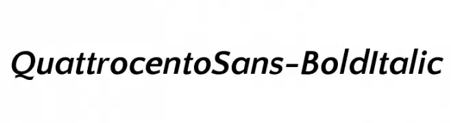
( Copyright (c) 2011, Pablo Impallari (www.impallari.com|impallari@gmail.com) )
A bold, italicized sans-serif font with a modern and elegant style.
 Herunterladen 411 Downloads@WebFont
 -
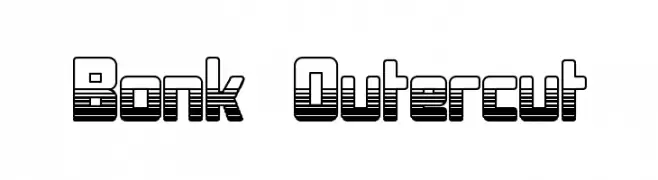
( Fonts by Graham Meade - GemFonts )
A bold, layered font with a three-dimensional, futuristic design.
![Bonk Outercut Frei Schriftart Herunterladen]() Herunterladen 411 Downloads@WebFont
Herunterladen 411 Downloads@WebFont -
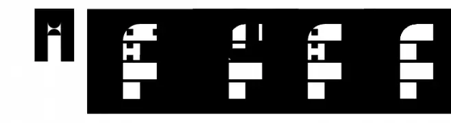
Schriftart von danny91194. For commercial use please contact the owner.
![N8 UngdeOmi Regular Frei Schriftart Herunterladen]() Herunterladen 411 Downloads@WebFont
Herunterladen 411 Downloads@WebFont -
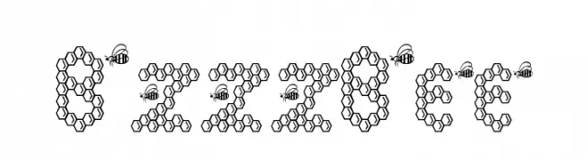
![BzzzBee Frei Schriftart Herunterladen]() Herunterladen 411 Downloads@WebFont
Herunterladen 411 Downloads@WebFont -
( K-Type Freebies (Free for Personal Use Only) FROM http://www.k-type.com )
A modern, tall, and narrow font with a clean and elegant design.
![Susanna Frei Schriftart Herunterladen]() Herunterladen 411 Downloads@WebFont
Herunterladen 411 Downloads@WebFont -
-
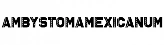
![Ambystoma Mexicanum Frei Schriftart Herunterladen]() Herunterladen 411 Downloads@WebFont
Herunterladen 411 Downloads@WebFont -
( Fonts by www.chequered.ink - Chequered Ink - Personal-use only. For commercial use please contact owner. )
A bold, modern font with tall, narrow uppercase letters and balanced lowercase characters.
![Acetate Frei Schriftart Herunterladen]() Herunterladen 411 Downloads@WebFont
Herunterladen 411 Downloads@WebFont -
( Musafir LAB )
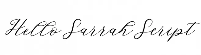
A graceful script font with fluid, interconnected strokes and a refined aesthetic.
![HelloSarrahScript Frei Schriftart Herunterladen]() Herunterladen 411 Downloads@WebFont
Herunterladen 411 Downloads@WebFont -
( Fonts by Maelle.K - Thomas Boucherie )
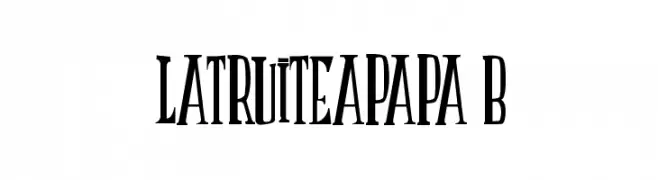
A bold, high-contrast font with vintage flair and elegant serifs.
![LATRUITEAPAPA B Frei Schriftart Herunterladen]() Herunterladen 411 Downloads@WebFont
Herunterladen 411 Downloads@WebFont -
( Fonts by a Max Infeld - XEROGRAPHER FONTS - xerographer.blogspot.com . Personal-use only. For commercial use please contact owner. )
A bold, hand-drawn font with a sketch-like, graffiti-inspired style.
![PhatRave Frei Schriftart Herunterladen]() Herunterladen 411 Downloads@WebFont
Herunterladen 411 Downloads@WebFont -
( Free for personal use - bythebutterfly.com )
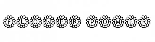
A whimsical font with characters enclosed in flower shapes, perfect for playful designs.
![Flower Power Frei Schriftart Herunterladen]() Herunterladen 411 Downloads@WebFont
Herunterladen 411 Downloads@WebFont -
![Sextan Roman Frei Schriftart Herunterladen]() Herunterladen 411 Downloads@WebFont
Herunterladen 411 Downloads@WebFont -
( Fonts by Ana )
A bold, expressive handwritten font with dynamic strokes.
![Delirium Sample Frei Schriftart Herunterladen]() Herunterladen 411 Downloads@WebFont
Herunterladen 411 Downloads@WebFont -
( Fonts by Darrell Flood - Personal-use only. For commercial use please contact owner. )
A bold, geometric font with a futuristic and industrial design.
![Robot Crush Frei Schriftart Herunterladen]() Herunterladen 411 Downloads@WebFont
Herunterladen 411 Downloads@WebFont -
( Fonts by Kelvin Ma - letterpunch.blogspot.com - Personal-use only. For commercial use please contact owner. )
A playful, rounded font with a modern and approachable style.
![Maritime Tropical Neue Frei Schriftart Herunterladen]() Herunterladen 411 Downloads@WebFont
Herunterladen 411 Downloads@WebFont -
( Fonts by Kong Font - https://fontkong.com/ - Personal-use only. For commercial use please contact owner. )
An elegant, flowing script font with interconnected, cursive strokes.
![Northwest Signature Italic Frei Schriftart Herunterladen]() Herunterladen 411 Downloads@WebFont
Herunterladen 411 Downloads@WebFont -
![Kowalski Frei Schriftart Herunterladen]() Herunterladen 411 Downloads@WebFont
Herunterladen 411 Downloads@WebFont -
( Fonts by MJType )
Playful handwritten font with an informal style.
![Water Air Frei Schriftart Herunterladen]() Herunterladen 411 Downloads@WebFont
Herunterladen 411 Downloads@WebFont -
( Fonts by Zetafonts )
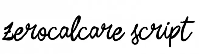
A lively and energetic script font with fluid, cursive strokes.
![Zerocalcare Script Frei Schriftart Herunterladen]() Herunterladen 411 Downloads@WebFont
Herunterladen 411 Downloads@WebFont -
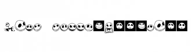
![Jack Skellingtonbats Frei Schriftart Herunterladen]() Herunterladen 411 Downloads@WebFont
Herunterladen 411 Downloads@WebFont -
![Ratty Tatty Frei Schriftart Herunterladen]() Herunterladen 411 Downloads@WebFont
Herunterladen 411 Downloads@WebFont -
( Fonts by Daniel Zadorozny - www.iconian.com - Free for personal use )
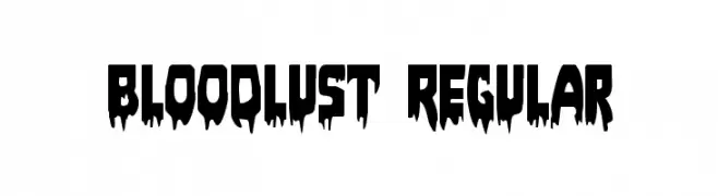
A bold, horror-themed font with a dripping effect.
![Bloodlust Regular Frei Schriftart Herunterladen]() Herunterladen 411 Downloads@WebFont
Herunterladen 411 Downloads@WebFont -
( Fonts by David Rakowski )
An ornate and decorative font with intricate floral patterns in uppercase letters.
![ZallmanCaps Frei Schriftart Herunterladen]() Herunterladen 411 Downloads@WebFont
Herunterladen 411 Downloads@WebFont -
![Sulatko Frei Schriftart Herunterladen]() Herunterladen 411 Downloads@WebFont
Herunterladen 411 Downloads@WebFont -
( Fonts by Southype )
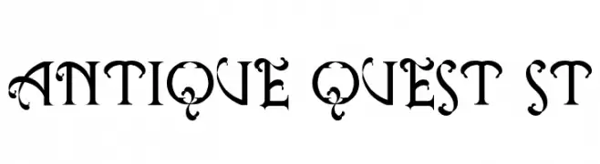
An ornate, medieval-style decorative font with intricate flourishes.
![Antique Quest St Frei Schriftart Herunterladen]() Herunterladen 411 Downloads@WebFont
Herunterladen 411 Downloads@WebFont -
( Fonts by Manuel Viergutz - Typo Graphic Design - www.typographicdesign.de )
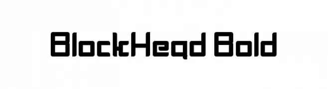
A bold, geometric font with a modern, industrial style.
![BlockHead Bold Frei Schriftart Herunterladen]() Herunterladen 411 Downloads@WebFont
Herunterladen 411 Downloads@WebFont -
( Fonts by Fontfabric - Svetoslav Simov - Personal-use only. For commercial use please contact owner. )
A modern, geometric sans-serif font with balanced spacing and a professional appearance.
![Code Next-Trial Book Frei Schriftart Herunterladen]() Herunterladen 411 Downloads@WebFont
Herunterladen 411 Downloads@WebFont -
( Andreas Johansson - hem.passagen.se/anjo77/font/ )
A geometric, futuristic font with a modular and minimalistic design.
![Void Frei Schriftart Herunterladen]() Herunterladen 411 Downloads@WebFont
Herunterladen 411 Downloads@WebFont -
( 100% Free - www.aronveraart.nl )
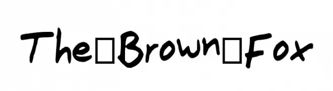
A playful, bold handwritten font with a casual and friendly style.
![The_Brown_Fox Frei Schriftart Herunterladen]() Herunterladen 411 Downloads@WebFont
Herunterladen 411 Downloads@WebFont -
( Fonts by Rab1d Rabb1t )
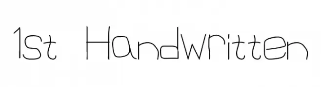
A playful, casual handwritten font with thin, uneven strokes.
![1st Handwritten Frei Schriftart Herunterladen]() Herunterladen 411 Downloads@WebFont
Herunterladen 411 Downloads@WebFont -
( Fonts by a Situjuh Nazara - c7n1.wordpress.com. Personal-use only. For commercial use please contact owner. )
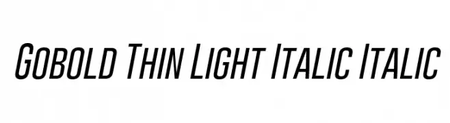
A sleek, modern, and italicized font with thin, consistent strokes and a condensed form.
![Gobold Thin Light Italic Italic Frei Schriftart Herunterladen]() Herunterladen 411 Downloads@WebFont
Herunterladen 411 Downloads@WebFont -
( Fonts by Woodcutter Manero - www.woodcutter.es - Personal-use only. For commercial use please contact owner. )
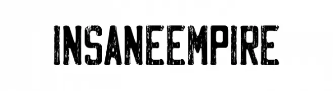
A bold, distressed font with a rugged, vintage appearance.
![Insane Empire Frei Schriftart Herunterladen]() Herunterladen 411 Downloads@WebFont
Herunterladen 411 Downloads@WebFont -
( Fonts by Nick Curtis - www.nicksfonts.com )
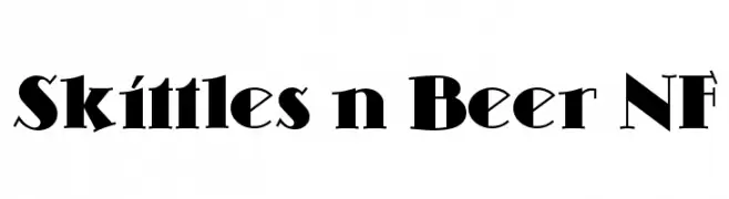
A bold, modern font with sharp angles and unique serifs.
![Skittles n Beer NF Frei Schriftart Herunterladen]() Herunterladen 411 Downloads@WebFont
Herunterladen 411 Downloads@WebFont -
( Fonts by Daniel Zadorozny - www.iconian.com - Free for personal use )
A bold, expanded, and italicized font with a futuristic and dynamic style.
![Hong Kong Hustle Expanded Italic Frei Schriftart Herunterladen]() Herunterladen 411 Downloads@WebFont
Herunterladen 411 Downloads@WebFont -
![Dirty and Classic Frei Schriftart Herunterladen]() Herunterladen 411 Downloads@WebFont
Herunterladen 411 Downloads@WebFont


Welche Schriften sind gerade am populärsten?
Poppins, Roboto, Montserrat, Open Sans und Lato sind wegen ihrer klaren Formen und breiten Einsetzbarkeit sehr gefragt – von Markenauftritt über Landingpages bis hin zu Postern.
Welche Fonts eignen sich für Logos?
Geometrische Sans‑Serifs (z. B. Poppins, Familien im Gotham‑Stil) sind ein häufiger Griff für sauberes, skalierbares Branding. Für eine persönlichere Note bleiben Scripts und Handschrift‑Stile beliebt. Kombinieren Sie einen prägnanten Headline‑Font mit einer neutralen Brotschrift für Wiedererkennung und Harmonie.
Wie oft wird die Top‑Liste aktualisiert?
Regelmäßig – basierend auf realen Downloads und Interaktionen. Schauen Sie öfter vorbei, um aufstrebende Favoriten früh zu entdecken.
💡 Tipp: Seite bookmarken – Trends wechseln schnell, und heutige Top‑Schriften inspirieren morgen vielleicht das Rebranding.