Willkommen bei den Top‑Schriften – hier treffen Beliebtheit und Qualität aufeinander. Das sind die in diesem Jahr am häufigsten heruntergeladenen und genutzten Fonts. Wenn Sie sichere Optionen für Logo, Web oder Social suchen, starten Sie hier.
Jeder Top‑Font überzeugt durch Balance, Lesbarkeit und Vielseitigkeit. Sie finden moderne Sans‑Serifs, elegante Scripts, Vintage‑Serifs und minimalistische Displays.
-
( Fonts by Dibujado )
A pixelated, italic font with a retro digital style.
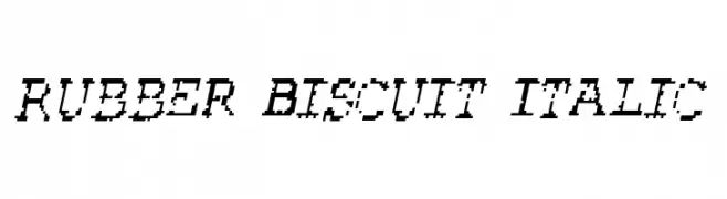 Herunterladen 70 Downloads@WebFont
 -
( Fonts by Daniel Zadorozny - www.iconian.com )
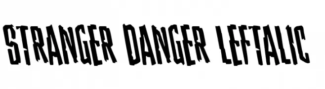
A bold, left-slanted font with an edgy and dynamic style.
![Stranger Danger Leftalic Frei Schriftart Herunterladen]() Herunterladen 70 Downloads@WebFont
Herunterladen 70 Downloads@WebFont -
( Fonts by Biroakakarati - Personal-use only. For commercial use please contact owner. )
A bold, flame-inspired font with dynamic, fiery strokes.
![Burn Frei Schriftart Herunterladen]() Herunterladen 70 Downloads@WebFont
Herunterladen 70 Downloads@WebFont -
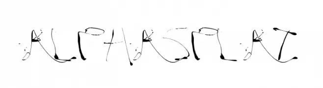
![Alphasplat Frei Schriftart Herunterladen]() Herunterladen 70 Downloads@WebFont
Herunterladen 70 Downloads@WebFont -
( Fonts by Fontry - M.G. Adkins - Personal-use only. For commercial use please contact owner. )
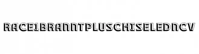
A bold, chiseled font with a three-dimensional effect, ideal for impactful designs.
![RACE1 Brannt Plus Chiseled NCV Frei Schriftart Herunterladen]() Herunterladen 70 Downloads@WebFont
Herunterladen 70 Downloads@WebFont -
-
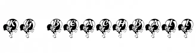
( Katz Fontz - katzfonts.50megs.com/kg.html )
A playful, decorative font with letters inside beach balls, perfect for fun projects.
![KG BEACHBALL Frei Schriftart Herunterladen]() Herunterladen 70 Downloads@WebFont
Herunterladen 70 Downloads@WebFont -
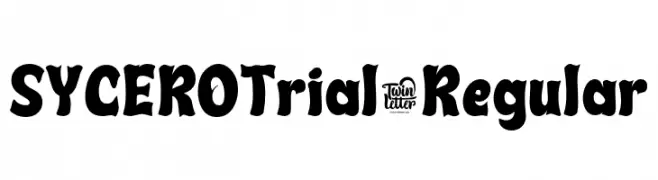
( Fonts by twinletter )
A bold, playful font with thick, rounded strokes and a hand-drawn feel.
![SYCEROTrial-Regular Frei Schriftart Herunterladen]() Herunterladen 70 Downloads@WebFont
Herunterladen 70 Downloads@WebFont -
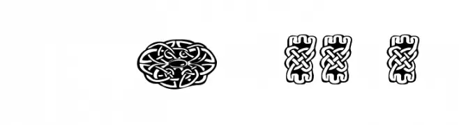
( Fonts by Font Environment - fontenvironment.com )
An intricate, decorative font inspired by traditional tattoo art.
![FE-TattooNo.1 Frei Schriftart Herunterladen]() Herunterladen 70 Downloads@WebFont
Herunterladen 70 Downloads@WebFont -
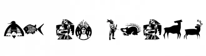
( Fonts by Kat`s Fun Fonts - Personal-use only. For commercial use please contact owner. )
A decorative font with culturally inspired symbols and illustrations.
![KR NA Dings Frei Schriftart Herunterladen]() Herunterladen 70 Downloads@WebFont
Herunterladen 70 Downloads@WebFont -
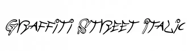
![Graffiti Street Italic Frei Schriftart Herunterladen]() Herunterladen 70 Downloads@WebFont
Herunterladen 70 Downloads@WebFont

Welche Schriften sind gerade am populärsten?
Poppins, Roboto, Montserrat, Open Sans und Lato sind wegen ihrer klaren Formen und breiten Einsetzbarkeit sehr gefragt – von Markenauftritt über Landingpages bis hin zu Postern.
Welche Fonts eignen sich für Logos?
Geometrische Sans‑Serifs (z. B. Poppins, Familien im Gotham‑Stil) sind ein häufiger Griff für sauberes, skalierbares Branding. Für eine persönlichere Note bleiben Scripts und Handschrift‑Stile beliebt. Kombinieren Sie einen prägnanten Headline‑Font mit einer neutralen Brotschrift für Wiedererkennung und Harmonie.
Wie oft wird die Top‑Liste aktualisiert?
Regelmäßig – basierend auf realen Downloads und Interaktionen. Schauen Sie öfter vorbei, um aufstrebende Favoriten früh zu entdecken.
💡 Tipp: Seite bookmarken – Trends wechseln schnell, und heutige Top‑Schriften inspirieren morgen vielleicht das Rebranding.