Willkommen bei den Top‑Schriften – hier treffen Beliebtheit und Qualität aufeinander. Das sind die in diesem Jahr am häufigsten heruntergeladenen und genutzten Fonts. Wenn Sie sichere Optionen für Logo, Web oder Social suchen, starten Sie hier.
Jeder Top‑Font überzeugt durch Balance, Lesbarkeit und Vielseitigkeit. Sie finden moderne Sans‑Serifs, elegante Scripts, Vintage‑Serifs und minimalistische Displays.
-
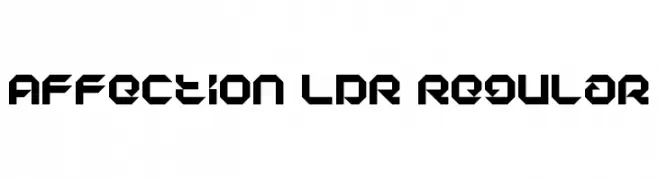
( Free for personal use - fontstruct.fontshop.com/fontstructors/neoqueto )
A bold, geometric font with sharp angles and a futuristic style.
 Herunterladen 420 Downloads@WebFont
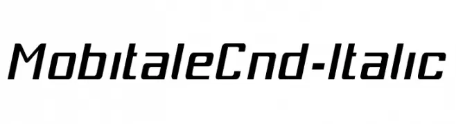
 -
![MobitaleCnd-Italic Frei Schriftart Herunterladen]() Herunterladen 420 Downloads@WebFont
Herunterladen 420 Downloads@WebFont -
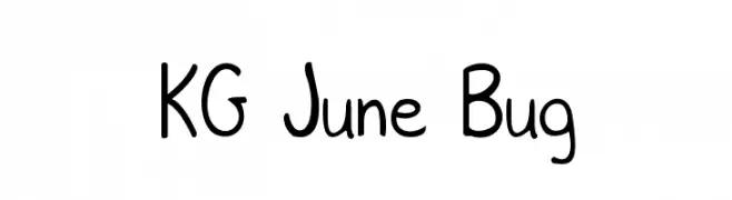
( Fonts by www.kimberlygeswein.com - Kimberly Geswein )
A playful, handwritten font with rounded edges and a casual style.
![KG June Bug Frei Schriftart Herunterladen]() Herunterladen 420 Downloads@WebFont
Herunterladen 420 Downloads@WebFont -
![ae_Electron Frei Schriftart Herunterladen]() Herunterladen 420 Downloads@WebFont
Herunterladen 420 Downloads@WebFont -
![Refuse Trip Frei Schriftart Herunterladen]() Herunterladen 420 Downloads@WebFont
Herunterladen 420 Downloads@WebFont -
( Fonts by Toto )
A bold, decorative font with vintage, Western-themed embellishments.
![K22 Eureka Frei Schriftart Herunterladen]() Herunterladen 420 Downloads@WebFont
Herunterladen 420 Downloads@WebFont -
![DonAquarel Frei Schriftart Herunterladen]() Herunterladen 419 Downloads@WebFont
Herunterladen 419 Downloads@WebFont -
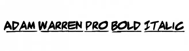
( Fonts by Press Gang Studios - Andeh Pinkard - www.pressgang-studios.com )
A bold, handwritten font with a dynamic, italic style.
![Adam Warren pro Bold Italic Frei Schriftart Herunterladen]() Herunterladen 419 Downloads@WebFont
Herunterladen 419 Downloads@WebFont -
( Noto is a trademark of Google Inc. Noto fonts are open source. All Noto fonts are published under the SIL Open Font License, Version 1.1 )
A modern sans-serif font for Kannada script, ideal for UI design.
![Noto Sans Kannada UI Frei Schriftart Herunterladen]() Herunterladen 419 Downloads@WebFont
Herunterladen 419 Downloads@WebFont -
![oh yeah Frei Schriftart Herunterladen]() Herunterladen 419 Downloads@WebFont
Herunterladen 419 Downloads@WebFont -
( Fonts by Galdino Otten )
A playful, hand-drawn font with bold, rounded letters and a sketchy outline.
![Christmas Cookies Frei Schriftart Herunterladen]() Herunterladen 419 Downloads@WebFont
Herunterladen 419 Downloads@WebFont -
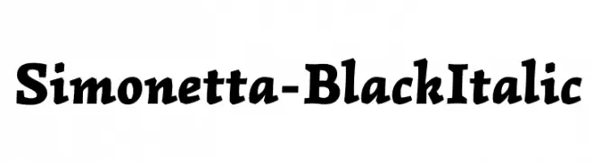
( Copyright (c) 2011-2012, Brownfox (www.brownfox.org gayaneh.b@gmail.com), with Reserved Font Name "Simonetta" )
A bold, italic serif font with a dynamic and energetic style.
![Simonetta-BlackItalic Frei Schriftart Herunterladen]() Herunterladen 419 Downloads@WebFont
Herunterladen 419 Downloads@WebFont -
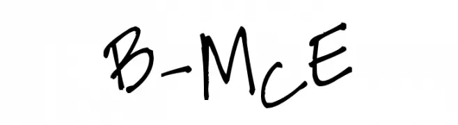
( Fonts by www.fontpanda.com. Personal-use only. For commercial use please contact owner. )
A playful, handwritten font with a casual and informal style.
![B-McE Frei Schriftart Herunterladen]() Herunterladen 419 Downloads@WebFont
Herunterladen 419 Downloads@WebFont -
![Stylin'BRK Frei Schriftart Herunterladen]() Herunterladen 419 Downloads@WebFont
Herunterladen 419 Downloads@WebFont -
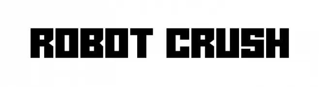
( Fonts by Darrell Flood - Personal-use only. For commercial use please contact owner. )
A bold, geometric font with a futuristic and industrial design.
![Robot Crush Frei Schriftart Herunterladen]() Herunterladen 419 Downloads@WebFont
Herunterladen 419 Downloads@WebFont -
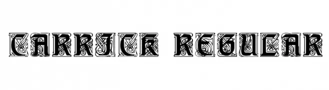
![Carrick Regular Frei Schriftart Herunterladen]() Herunterladen 419 Downloads@WebFont
Herunterladen 419 Downloads@WebFont -
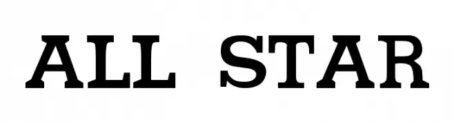
( Fontomen - www.algonet.se/~j-j/ )
A bold slab serif font with strong, geometric characters and block-like serifs.
![All star Frei Schriftart Herunterladen]() Herunterladen 419 Downloads@WebFont
Herunterladen 419 Downloads@WebFont -
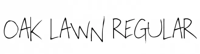
( Fonts by Chris Vile - fontmonger.com - Personal-use only. For commercial use please contact owner. )
A playful, handwritten font with a casual and dynamic style.
![Oak Lawn Regular Frei Schriftart Herunterladen]() Herunterladen 419 Downloads@WebFont
Herunterladen 419 Downloads@WebFont -
![Symbol MW Bold Frei Schriftart Herunterladen]() Herunterladen 419 Downloads@WebFont
Herunterladen 419 Downloads@WebFont -
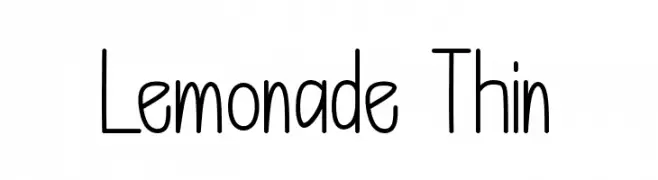
( Fonts by Bringtype Studio )
A playful, hand-drawn style font with tall, narrow letters and consistent stroke thickness.
![Lemonade Thin Frei Schriftart Herunterladen]() Herunterladen 419 Downloads@WebFont
Herunterladen 419 Downloads@WebFont -
![Jibriel Frei Schriftart Herunterladen]() Herunterladen 419 Downloads@WebFont
Herunterladen 419 Downloads@WebFont -
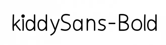
( Fonts by Manuel Viergutz - Typo Graphic Design - www.typographicdesign.de )
A playful, rounded sans-serif font with a clean and modern look.
![kiddySans-Bold Frei Schriftart Herunterladen]() Herunterladen 419 Downloads@WebFont
Herunterladen 419 Downloads@WebFont -
![Shree-Pun-0955 Frei Schriftart Herunterladen]() Herunterladen 419 Downloads@WebFont
Herunterladen 419 Downloads@WebFont -
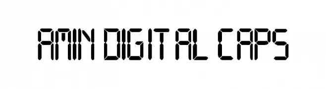
![Amin Digital CAPS Frei Schriftart Herunterladen]() Herunterladen 419 Downloads@WebFont
Herunterladen 419 Downloads@WebFont -
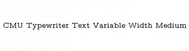
( Fonts by Donald E. Knuth - Personal-use only. For commercial use please contact owner. )
A classic typewriter-style font with medium weight and variable width.
![CMU Typewriter Text Variable Width Medium Frei Schriftart Herunterladen]() Herunterladen 419 Downloads@WebFont
Herunterladen 419 Downloads@WebFont -
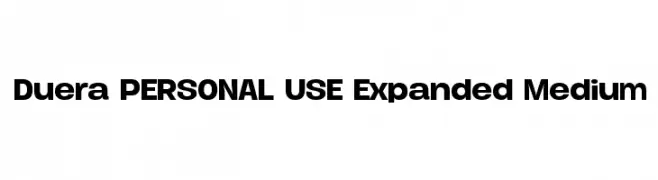
( Måns Grebäck - www.mansgreback.com )
A bold, modern font with expanded letterforms and consistent thickness.
![Duera PERSONAL USE Expanded Medium Frei Schriftart Herunterladen]() Herunterladen 419 Downloads@WebFont
Herunterladen 419 Downloads@WebFont -
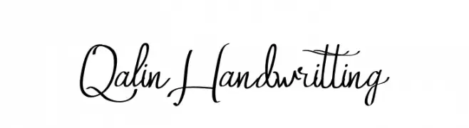
( Fonts by Edric Studio www.creativefabrica.com/designer/edricstudio/ - Personal-use only. For commercial use please contact owner. )
A charming handwritten font with fluid, elegant strokes and a playful yet refined style.
![Qalin Handwritting Frei Schriftart Herunterladen]() Herunterladen 419 Downloads@WebFont
Herunterladen 419 Downloads@WebFont -
![ReedFont Frei Schriftart Herunterladen]() Herunterladen 419 Downloads
Herunterladen 419 Downloads -
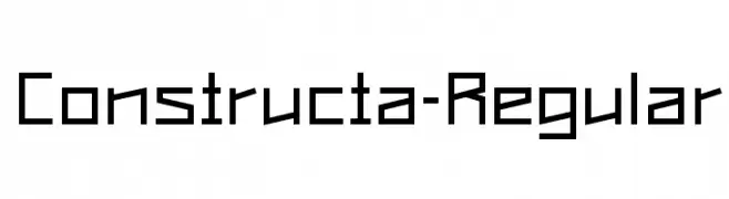
( Free for personal use - www.nicolasgafner.ch )
A geometric, angular font with sharp edges and distinct shapes.
![Constructa-Regular Frei Schriftart Herunterladen]() Herunterladen 419 Downloads@WebFont
Herunterladen 419 Downloads@WebFont -
( Fonts by Daniel Zadorozny - www.iconian.com - Free for personal use )
A bold, brush-style italic font with dynamic, expressive strokes.
![Fight Kid Italic Frei Schriftart Herunterladen]() Herunterladen 419 Downloads@WebFont
Herunterladen 419 Downloads@WebFont -
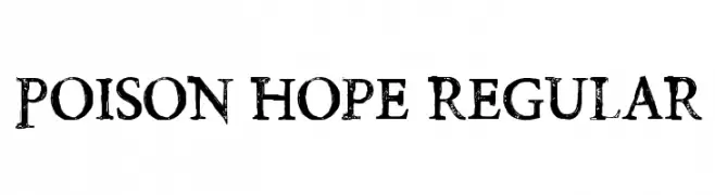
( Fonts by Chris Vile )
A distressed serif font with a grungy, vintage appearance.
![Poison Hope Regular Frei Schriftart Herunterladen]() Herunterladen 419 Downloads@WebFont
Herunterladen 419 Downloads@WebFont -
( Foundmyfont Studio Typeface LTD - www.foundmyfont.com )
An elegant, flowing script font with ornate, cursive letters and a festive feel.
![Fascinating Christmas Frei Schriftart Herunterladen]() Herunterladen 419 Downloads@WebFont
Herunterladen 419 Downloads@WebFont -
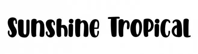
( Fonts by Holydie Studio )
A playful, bold font with rounded, thick strokes and a whimsical style.
![Sunshine Tropical Frei Schriftart Herunterladen]() Herunterladen 419 Downloads@WebFont
Herunterladen 419 Downloads@WebFont -
![Dark-Garden---Michal-Kosmulski- Frei Schriftart Herunterladen]() Herunterladen 419 Downloads@WebFont
Herunterladen 419 Downloads@WebFont -
![Skellingtonbats Frei Schriftart Herunterladen]() Herunterladen 419 Downloads@WebFont
Herunterladen 419 Downloads@WebFont


Welche Schriften sind gerade am populärsten?
Poppins, Roboto, Montserrat, Open Sans und Lato sind wegen ihrer klaren Formen und breiten Einsetzbarkeit sehr gefragt – von Markenauftritt über Landingpages bis hin zu Postern.
Welche Fonts eignen sich für Logos?
Geometrische Sans‑Serifs (z. B. Poppins, Familien im Gotham‑Stil) sind ein häufiger Griff für sauberes, skalierbares Branding. Für eine persönlichere Note bleiben Scripts und Handschrift‑Stile beliebt. Kombinieren Sie einen prägnanten Headline‑Font mit einer neutralen Brotschrift für Wiedererkennung und Harmonie.
Wie oft wird die Top‑Liste aktualisiert?
Regelmäßig – basierend auf realen Downloads und Interaktionen. Schauen Sie öfter vorbei, um aufstrebende Favoriten früh zu entdecken.
💡 Tipp: Seite bookmarken – Trends wechseln schnell, und heutige Top‑Schriften inspirieren morgen vielleicht das Rebranding.