Willkommen bei den Top‑Schriften – hier treffen Beliebtheit und Qualität aufeinander. Das sind die in diesem Jahr am häufigsten heruntergeladenen und genutzten Fonts. Wenn Sie sichere Optionen für Logo, Web oder Social suchen, starten Sie hier.
Jeder Top‑Font überzeugt durch Balance, Lesbarkeit und Vielseitigkeit. Sie finden moderne Sans‑Serifs, elegante Scripts, Vintage‑Serifs und minimalistische Displays.
-
 Herunterladen 415 Downloads@WebFont
 -
( Fonts by BrandSemut - A Sidiq - Personal-use only. For commercial use please contact owner. )
A high-contrast, elegant serif font with bold uppercase and smooth lowercase letters.
![Galins Frei Schriftart Herunterladen]() Herunterladen 415 Downloads@WebFont
Herunterladen 415 Downloads@WebFont -
( Fonts by Andrew McCluskey - nalgames.com. Personal-use only. For commercial use please contact owner. )
A bold, textured font with a playful and dynamic style.
![Positive Reinforcement Frei Schriftart Herunterladen]() Herunterladen 415 Downloads@WebFont
Herunterladen 415 Downloads@WebFont -
( Rogier van Dalen - home.kabelfoon.nl/~slam/fonts/fonts.html )
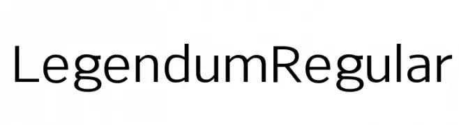
A modern, geometric sans-serif font with balanced proportions and high readability.
![Legendum Regular Frei Schriftart Herunterladen]() Herunterladen 415 Downloads@WebFont
Herunterladen 415 Downloads@WebFont -
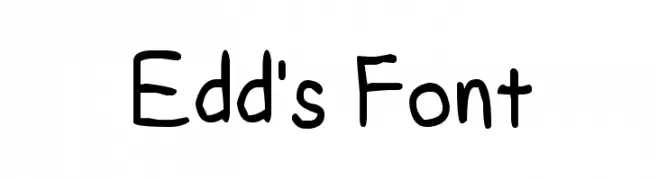
![Edd's Font Frei Schriftart Herunterladen]() Herunterladen 415 Downloads@WebFont
Herunterladen 415 Downloads@WebFont -
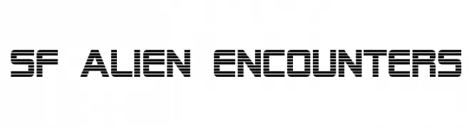
![SF Alien Encounters Frei Schriftart Herunterladen]() Herunterladen 415 Downloads@WebFont
Herunterladen 415 Downloads@WebFont -
![silly Frei Schriftart Herunterladen]() Herunterladen 415 Downloads@WebFont
Herunterladen 415 Downloads@WebFont -
Schriftart von danny91194. For commercial use please contact the owner.
( r )
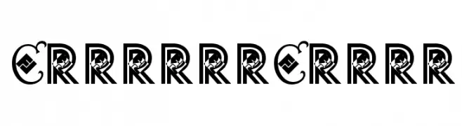
A decorative font with ornate, stylized letterforms and high contrast.
![CountryCrock Frei Schriftart Herunterladen]() Herunterladen 415 Downloads@WebFont
Herunterladen 415 Downloads@WebFont -
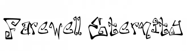
![Farewell Eternity Frei Schriftart Herunterladen]() Herunterladen 415 Downloads@WebFont
Herunterladen 415 Downloads@WebFont -
( Fonts by HENRIavecunK. Personal-use only. For commercial use please contact owner. )
A bold, outlined, and condensed font with a strong visual impact.
![Backboard Outline Frei Schriftart Herunterladen]() Herunterladen 415 Downloads@WebFont
Herunterladen 415 Downloads@WebFont -
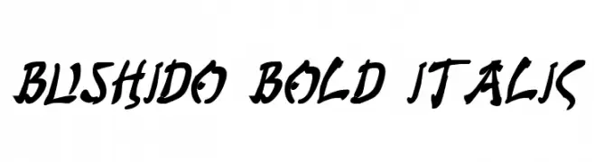
( Fonts by Daniel Zadorozny - www.iconian.com - Free for personal use )
A bold, italicized font with a dynamic, brush-like style.
![Bushido Bold Italic Frei Schriftart Herunterladen]() Herunterladen 415 Downloads@WebFont
Herunterladen 415 Downloads@WebFont -
![Dameron Academy Frei Schriftart Herunterladen]() Herunterladen 415 Downloads@WebFont
Herunterladen 415 Downloads@WebFont -
![i-hearts Frei Schriftart Herunterladen]() Herunterladen 415 Downloads@WebFont
Herunterladen 415 Downloads@WebFont -
Schriftart von HammerBro101. For commercial use please contact the owner.
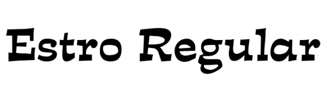
![Estro Regular Frei Schriftart Herunterladen]() Herunterladen 415 Downloads@WebFont
Herunterladen 415 Downloads@WebFont -
![Rund Marker Frei Schriftart Herunterladen]() Herunterladen 415 Downloads@WebFont
Herunterladen 415 Downloads@WebFont -
![Carla_outline Frei Schriftart Herunterladen]() Herunterladen 415 Downloads@WebFont
Herunterladen 415 Downloads@WebFont -
( Fonts by Juan Casco )
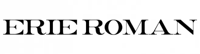
A bold, high-contrast serif font with a classic yet modern style.
![Erie Roman Frei Schriftart Herunterladen]() Herunterladen 415 Downloads@WebFont
Herunterladen 415 Downloads@WebFont -
( Fonts by Nick Curtis - www.nicksfonts.com )
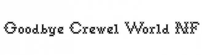
A decorative font with a cross-stitch pattern, evoking a handcrafted feel.
![Goodbye Crewel World NF Frei Schriftart Herunterladen]() Herunterladen 415 Downloads@WebFont
Herunterladen 415 Downloads@WebFont -
( Free for non-commercial use. For commercial use please buy a license. http://www.cape-arcona.com )
Bold, geometric font with a strong, modern presence.
![CAGingerMintFill Frei Schriftart Herunterladen]() Herunterladen 415 Downloads@WebFont
Herunterladen 415 Downloads@WebFont -
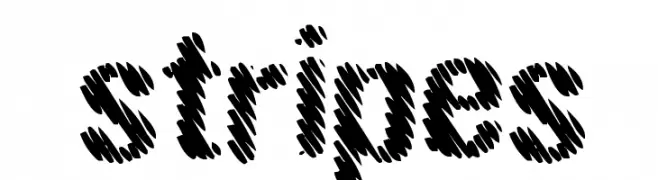
![stripes Frei Schriftart Herunterladen]() Herunterladen 415 Downloads@WebFont
Herunterladen 415 Downloads@WebFont -
( Fonts by Patria Ari Typestudio )
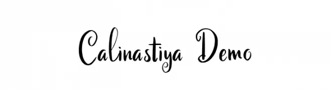
A decorative script font with elegant loops and swirls.
![Calinastiya Demo Frei Schriftart Herunterladen]() Herunterladen 415 Downloads@WebFont
Herunterladen 415 Downloads@WebFont -
( Paul Lloyd Fonts )
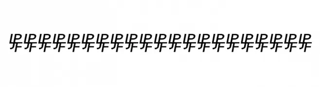
Abstract pattern with repetitive, interconnected shapes.
![Birmingham Sans Serif Frei Schriftart Herunterladen]() Herunterladen 415 Downloads@WebFont
Herunterladen 415 Downloads@WebFont -
( Free for a personal use. For a commercial use please visit www.kevinandamanda.com )
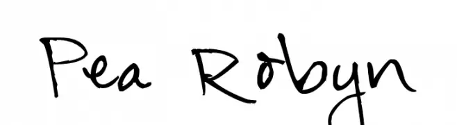
A casual and playful handwritten font with dynamic strokes.
![Pea Robyn Frei Schriftart Herunterladen]() Herunterladen 415 Downloads@WebFont
Herunterladen 415 Downloads@WebFont -
( Fonts by Daniel Zadorozny - www.iconian.com - Free for personal use )
A bold, condensed italic font with a modern, angular design.
![Gemina Condensed Italic Frei Schriftart Herunterladen]() Herunterladen 415 Downloads@WebFont
Herunterladen 415 Downloads@WebFont -
( Fonts by Des Gomez )
A playful, handwritten font with rounded edges and artistic loops.
![PinkClouds Frei Schriftart Herunterladen]() Herunterladen 415 Downloads@WebFont
Herunterladen 415 Downloads@WebFont -
![SHAKAGRAPHICS 09 Frei Schriftart Herunterladen]() Herunterladen 414 Downloads@WebFont
Herunterladen 414 Downloads@WebFont -
![snoop Frei Schriftart Herunterladen]() Herunterladen 414 Downloads@WebFont
Herunterladen 414 Downloads@WebFont -
( Fonts by Manfred Klein - manfred-klein.ina-mar.com )
A classic serif font with elegant, tall letters and sharp serifs.
![TrajanusBriX-Invers Frei Schriftart Herunterladen]() Herunterladen 414 Downloads@WebFont
Herunterladen 414 Downloads@WebFont -
( Fonts by Namara Creative Studio - Personal-use only. For commercial use please contact owner. )
A bold, condensed font with a modern, sleek design.
![Marbellya Bold Condensed Frei Schriftart Herunterladen]() Herunterladen 414 Downloads@WebFont
Herunterladen 414 Downloads@WebFont -
![ZILAP GEOMETRIK Frei Schriftart Herunterladen]() Herunterladen 414 Downloads@WebFont
Herunterladen 414 Downloads@WebFont -
![Zono Bold Frei Schriftart Herunterladen]() Herunterladen 414 Downloads@WebFont
Herunterladen 414 Downloads@WebFont -
![TeXGyreAdventor-Italic Frei Schriftart Herunterladen]() Herunterladen 414 Downloads@WebFont
Herunterladen 414 Downloads@WebFont -
( Fonts by Paul Reid - tracertong.co.uk )
A sleek, modern italic font with elongated, condensed letterforms.
![Universal Accreditation Italic Frei Schriftart Herunterladen]() Herunterladen 414 Downloads@WebFont
Herunterladen 414 Downloads@WebFont -
![QUESTOR Frei Schriftart Herunterladen]() Herunterladen 414 Downloads@WebFont
Herunterladen 414 Downloads@WebFont -
( Fonts by Typodermic Fonts )
A bold, modern font with strong geometric shapes and consistent stroke width.
![BenchGrinderTitling-Regular Frei Schriftart Herunterladen]() Herunterladen 414 Downloads@WebFont
Herunterladen 414 Downloads@WebFont


Welche Schriften sind gerade am populärsten?
Poppins, Roboto, Montserrat, Open Sans und Lato sind wegen ihrer klaren Formen und breiten Einsetzbarkeit sehr gefragt – von Markenauftritt über Landingpages bis hin zu Postern.
Welche Fonts eignen sich für Logos?
Geometrische Sans‑Serifs (z. B. Poppins, Familien im Gotham‑Stil) sind ein häufiger Griff für sauberes, skalierbares Branding. Für eine persönlichere Note bleiben Scripts und Handschrift‑Stile beliebt. Kombinieren Sie einen prägnanten Headline‑Font mit einer neutralen Brotschrift für Wiedererkennung und Harmonie.
Wie oft wird die Top‑Liste aktualisiert?
Regelmäßig – basierend auf realen Downloads und Interaktionen. Schauen Sie öfter vorbei, um aufstrebende Favoriten früh zu entdecken.
💡 Tipp: Seite bookmarken – Trends wechseln schnell, und heutige Top‑Schriften inspirieren morgen vielleicht das Rebranding.