Willkommen bei den Top‑Schriften – hier treffen Beliebtheit und Qualität aufeinander. Das sind die in diesem Jahr am häufigsten heruntergeladenen und genutzten Fonts. Wenn Sie sichere Optionen für Logo, Web oder Social suchen, starten Sie hier.
Jeder Top‑Font überzeugt durch Balance, Lesbarkeit und Vielseitigkeit. Sie finden moderne Sans‑Serifs, elegante Scripts, Vintage‑Serifs und minimalistische Displays.
-
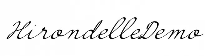
( jean.boyault.pagesperso-orange.fr/ )
An elegant script font with flowing, cursive strokes and high contrast.
 Herunterladen 410 Downloads@WebFont
 -
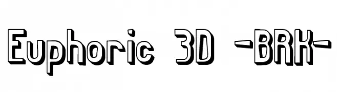
( Fonts by www.aenigmafonts.com )
A bold, 3D geometric font with a striking shadow effect.
![Euphoric 3D -BRK- Frei Schriftart Herunterladen]() Herunterladen 410 Downloads@WebFont
Herunterladen 410 Downloads@WebFont -
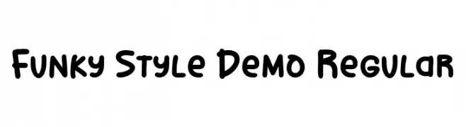
( Fonts by olivetype )
A playful, bold font with rounded edges and a hand-drawn style.
![Funky Style Demo Regular Frei Schriftart Herunterladen]() Herunterladen 410 Downloads@WebFont
Herunterladen 410 Downloads@WebFont -
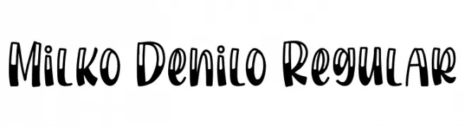
( Fonts by Bangkit Tri Setiadi )
A playful, bold, and handwritten-style font with thick strokes and rounded edges.
![Milko Denilo Regular Frei Schriftart Herunterladen]() Herunterladen 410 Downloads@WebFont
Herunterladen 410 Downloads@WebFont -
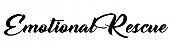
( Fonts by Billy Argel Fonts - www.billyargel.com - Personal-use only. For commercial use please contact owner. )
Elegant cursive script with bold strokes and decorative flourishes.
![Emotional Rescue Frei Schriftart Herunterladen]() Herunterladen 410 Downloads@WebFont
Herunterladen 410 Downloads@WebFont -
( Fonts by Belina Studio )
Bold, playful handwritten font.
![MyBook Frei Schriftart Herunterladen]() Herunterladen 410 Downloads@WebFont
Herunterladen 410 Downloads@WebFont -
( Fonts by David Kerkhoff - www.hanodedphotography.com )
A bold, playful font with rounded, hand-drawn letterforms.
![Pinda Frei Schriftart Herunterladen]() Herunterladen 410 Downloads@WebFont
Herunterladen 410 Downloads@WebFont -
( Fonts by Ana )
A bold, playful handwritten font with thick strokes and rounded edges.
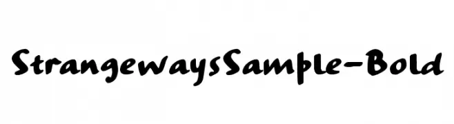
![StrangewaysSample-Bold Frei Schriftart Herunterladen]() Herunterladen 410 Downloads@WebFont
Herunterladen 410 Downloads@WebFont -
( Fonts by Graham Meade - GemFonts )
A modern, outline-style font with tall, narrow characters and a sleek appearance.
![Labtop Outline Frei Schriftart Herunterladen]() Herunterladen 410 Downloads@WebFont
Herunterladen 410 Downloads@WebFont -
![RedWood Thick Frei Schriftart Herunterladen]() Herunterladen 410 Downloads@WebFont
Herunterladen 410 Downloads@WebFont -
![hamu font Frei Schriftart Herunterladen]() Herunterladen 410 Downloads@WebFont
Herunterladen 410 Downloads@WebFont -
![LCR Parrot Talk Frei Schriftart Herunterladen]() Herunterladen 410 Downloads@WebFont
Herunterladen 410 Downloads@WebFont -
![Parvoflavin Light Skew Frei Schriftart Herunterladen]() Herunterladen 410 Downloads@WebFont
Herunterladen 410 Downloads@WebFont -
( Fonts by wep )
A bold, distressed font with a playful and rugged appearance.
![Incar Frei Schriftart Herunterladen]() Herunterladen 410 Downloads@WebFont
Herunterladen 410 Downloads@WebFont -
( Tama Putra - be.net/tmptr )
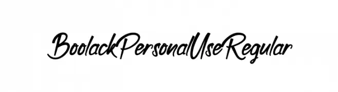
A dynamic and flowing script font with elegant, cursive letterforms.
![Boolack Personal Use Regular Frei Schriftart Herunterladen]() Herunterladen 410 Downloads@WebFont
Herunterladen 410 Downloads@WebFont -
( Fonts by Apostrophic Lab )
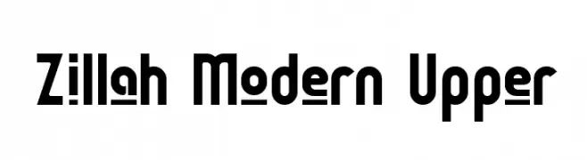
A modern, bold, and geometric font with a slightly condensed structure.
![Zillah Modern Upper Frei Schriftart Herunterladen]() Herunterladen 409 Downloads@WebFont
Herunterladen 409 Downloads@WebFont -
( Copyright (c) 2010, Santiago Orozco (hi@typemade.mx) )
A refined italic serif font with a modern yet classic style.
![Josefin Slab Italic Frei Schriftart Herunterladen]() Herunterladen 409 Downloads@WebFont
Herunterladen 409 Downloads@WebFont -
![The Dark Jackal Frei Schriftart Herunterladen]() Herunterladen 409 Downloads@WebFont
Herunterladen 409 Downloads@WebFont -
![ReliantShadowFree Frei Schriftart Herunterladen]() Herunterladen 409 Downloads@WebFont
Herunterladen 409 Downloads@WebFont -
( Fonts by Darcy Baldwin - darcybaldwin.com. Free for personal use only )
A playful, handwritten font with smooth, rounded strokes and a casual vibe.
![DJB Me and My Shadow Light Frei Schriftart Herunterladen]() Herunterladen 409 Downloads@WebFont
Herunterladen 409 Downloads@WebFont -
![KurierCondHeavy-Regular Frei Schriftart Herunterladen]() Herunterladen 409 Downloads@WebFont
Herunterladen 409 Downloads@WebFont -
![defaulterror Frei Schriftart Herunterladen]() Herunterladen 409 Downloads@WebFont
Herunterladen 409 Downloads@WebFont -
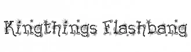
( Font by kingthingsfonts.co.uk )
A whimsical and decorative font with star-like bursts and circular embellishments.
![Kingthings Flashbang Frei Schriftart Herunterladen]() Herunterladen 409 Downloads@WebFont
Herunterladen 409 Downloads@WebFont -
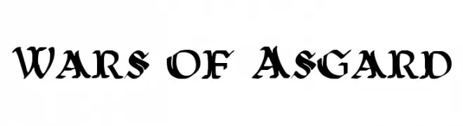
( Fonts by Daniel Zadorozny - www.iconian.com )
A bold, medieval-inspired font with sharp serifs and dramatic styling.
![Wars of Asgard Frei Schriftart Herunterladen]() Herunterladen 409 Downloads@WebFont
Herunterladen 409 Downloads@WebFont -
( Fonts by David Rakowski )
An ornate and decorative font with intricate swirls and embellishments.
![Elzevier Caps Frei Schriftart Herunterladen]() Herunterladen 409 Downloads
Herunterladen 409 Downloads -
( Free for a personal use. For a commercial use please visit www.kevinandamanda.com )
A casual, handwritten font with a playful and informal style.
![fontastic Frei Schriftart Herunterladen]() Herunterladen 409 Downloads@WebFont
Herunterladen 409 Downloads@WebFont -
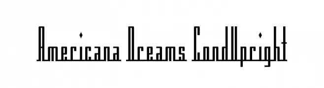
![Americana Dreams CondUpright Frei Schriftart Herunterladen]() Herunterladen 409 Downloads@WebFont
Herunterladen 409 Downloads@WebFont -
( Fonts by a Max Infeld - XEROGRAPHER FONTS - xerographer.blogspot.com . Personal-use only. For commercial use please contact owner. )
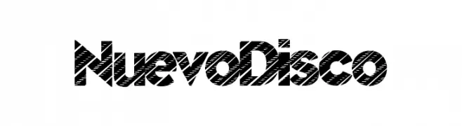
A bold, modern font with a unique diagonal line pattern for dynamic visual appeal.
![NuevoDisco Frei Schriftart Herunterladen]() Herunterladen 409 Downloads@WebFont
Herunterladen 409 Downloads@WebFont -
( Vast - Vast aka M Fairuzulhaq - creativemarket.com/vast )
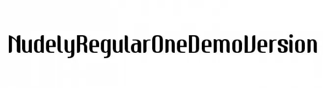
A bold, modern font with rounded and squared elements, perfect for impactful designs.
![NudelyRegularOneDemoVersion Frei Schriftart Herunterladen]() Herunterladen 409 Downloads@WebFont
Herunterladen 409 Downloads@WebFont -
( Fonts by Devin Rosado )
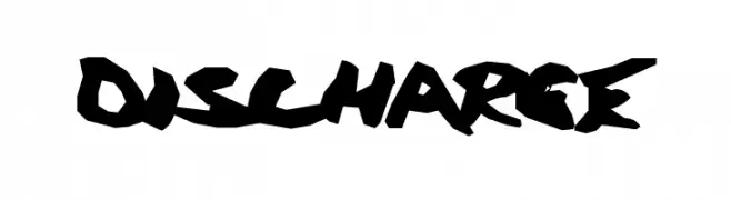
A bold, jagged font with a graffiti-inspired style.
![Discharge Frei Schriftart Herunterladen]() Herunterladen 409 Downloads@WebFont
Herunterladen 409 Downloads@WebFont -
![JeffreyPrint JL Condensed Italic Frei Schriftart Herunterladen]() Herunterladen 409 Downloads@WebFont
Herunterladen 409 Downloads@WebFont -
![Innamoramento Regular Frei Schriftart Herunterladen]() Herunterladen 409 Downloads@WebFont
Herunterladen 409 Downloads@WebFont -
( Bhavika Malhotra - www.creativemarket.com/theinkaffair/?u=theinkaffair )
A bold, handwritten font with a playful and energetic style.
![Wild Wanderlust Personal Frei Schriftart Herunterladen]() Herunterladen 409 Downloads@WebFont
Herunterladen 409 Downloads@WebFont -
( Fonts by Stefie Justprince - https://shoppy.gg/@stefiejustprince- Personal-use only. For commercial use please contact owner. )
A bold, handwritten font with dynamic, sweeping strokes and a textured, artistic feel.
![Brittanian Frei Schriftart Herunterladen]() Herunterladen 409 Downloads@WebFont
Herunterladen 409 Downloads@WebFont -
( Fonts by Cat.B )
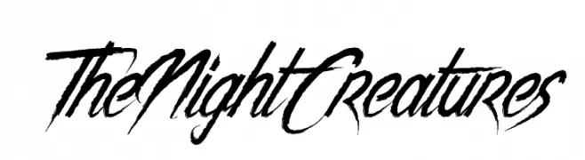
A bold, dynamic font with sharp, angular strokes and a sense of movement.
![The Night Creatures Frei Schriftart Herunterladen]() Herunterladen 409 Downloads@WebFont
Herunterladen 409 Downloads@WebFont


Welche Schriften sind gerade am populärsten?
Poppins, Roboto, Montserrat, Open Sans und Lato sind wegen ihrer klaren Formen und breiten Einsetzbarkeit sehr gefragt – von Markenauftritt über Landingpages bis hin zu Postern.
Welche Fonts eignen sich für Logos?
Geometrische Sans‑Serifs (z. B. Poppins, Familien im Gotham‑Stil) sind ein häufiger Griff für sauberes, skalierbares Branding. Für eine persönlichere Note bleiben Scripts und Handschrift‑Stile beliebt. Kombinieren Sie einen prägnanten Headline‑Font mit einer neutralen Brotschrift für Wiedererkennung und Harmonie.
Wie oft wird die Top‑Liste aktualisiert?
Regelmäßig – basierend auf realen Downloads und Interaktionen. Schauen Sie öfter vorbei, um aufstrebende Favoriten früh zu entdecken.
💡 Tipp: Seite bookmarken – Trends wechseln schnell, und heutige Top‑Schriften inspirieren morgen vielleicht das Rebranding.