Willkommen bei den Top‑Schriften – hier treffen Beliebtheit und Qualität aufeinander. Das sind die in diesem Jahr am häufigsten heruntergeladenen und genutzten Fonts. Wenn Sie sichere Optionen für Logo, Web oder Social suchen, starten Sie hier.
Jeder Top‑Font überzeugt durch Balance, Lesbarkeit und Vielseitigkeit. Sie finden moderne Sans‑Serifs, elegante Scripts, Vintage‑Serifs und minimalistische Displays.
-
( Ronosa )
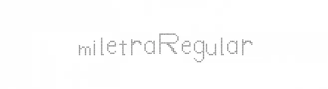
A modern, dotted font with consistent spacing and a playful style.
 Herunterladen 64 Downloads@WebFont
 -
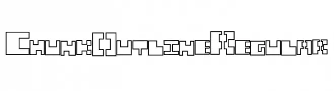
![Chunk Outline Regular Frei Schriftart Herunterladen]() Herunterladen 64 Downloads@WebFont
Herunterladen 64 Downloads@WebFont -
( Fonts by Woodcutter )
A bold, distressed font with a vintage, weathered appearance.
![El Caballero Decadente Frei Schriftart Herunterladen]() Herunterladen 64 Downloads@WebFont
Herunterladen 64 Downloads@WebFont -
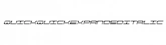
![QuickQuick Expanded Italic Frei Schriftart Herunterladen]() Herunterladen 64 Downloads@WebFont
Herunterladen 64 Downloads@WebFont -
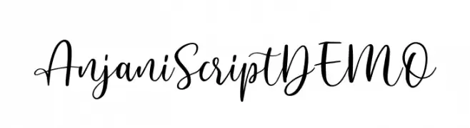
( Fonts by Letterhend Studio - Hendry Juanda - Personal-use only. For commercial use please contact owner. )
A lively and flowing script font with elegant, interconnected letters.
![AnjaniScriptDEMO Frei Schriftart Herunterladen]() Herunterladen 64 Downloads@WebFont
Herunterladen 64 Downloads@WebFont -
-
( Fonts by briZoft - Personal-use only. For commercial use please contact owner. )
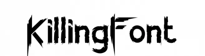
A jagged, distressed font with sharp, irregular strokes for a chaotic look.
![KillingFont Frei Schriftart Herunterladen]() Herunterladen 64 Downloads@WebFont
Herunterladen 64 Downloads@WebFont -
( Fonts by Adrián Yanes )
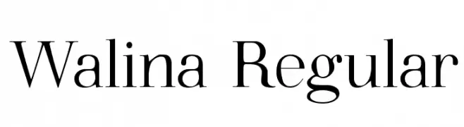
A classic serif font with elegant strokes and sharp serifs.
![Walina Regular Frei Schriftart Herunterladen]() Herunterladen 64 Downloads@WebFont
Herunterladen 64 Downloads@WebFont -
( Fonts by Kong Font - fontkong.com - Personal-use only. For commercial use please contact owner. )
A bold, angular font with a hand-drawn, graffiti-like style.
![Insurgence Frei Schriftart Herunterladen]() Herunterladen 64 Downloads@WebFont
Herunterladen 64 Downloads@WebFont -
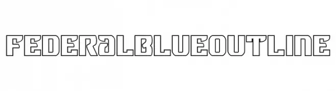
![Federal Blue Outline Frei Schriftart Herunterladen]() Herunterladen 64 Downloads@WebFont
Herunterladen 64 Downloads@WebFont -
( Fonts by Allouse Studio - Personal-use only. For commercial use please contact owner. )
A bold, playful handwritten font with dynamic strokes.
![Jungledise Frei Schriftart Herunterladen]() Herunterladen 64 Downloads@WebFont
Herunterladen 64 Downloads@WebFont


Welche Schriften sind gerade am populärsten?
Poppins, Roboto, Montserrat, Open Sans und Lato sind wegen ihrer klaren Formen und breiten Einsetzbarkeit sehr gefragt – von Markenauftritt über Landingpages bis hin zu Postern.
Welche Fonts eignen sich für Logos?
Geometrische Sans‑Serifs (z. B. Poppins, Familien im Gotham‑Stil) sind ein häufiger Griff für sauberes, skalierbares Branding. Für eine persönlichere Note bleiben Scripts und Handschrift‑Stile beliebt. Kombinieren Sie einen prägnanten Headline‑Font mit einer neutralen Brotschrift für Wiedererkennung und Harmonie.
Wie oft wird die Top‑Liste aktualisiert?
Regelmäßig – basierend auf realen Downloads und Interaktionen. Schauen Sie öfter vorbei, um aufstrebende Favoriten früh zu entdecken.
💡 Tipp: Seite bookmarken – Trends wechseln schnell, und heutige Top‑Schriften inspirieren morgen vielleicht das Rebranding.