Willkommen bei den Top‑Schriften – hier treffen Beliebtheit und Qualität aufeinander. Das sind die in diesem Jahr am häufigsten heruntergeladenen und genutzten Fonts. Wenn Sie sichere Optionen für Logo, Web oder Social suchen, starten Sie hier.
Jeder Top‑Font überzeugt durch Balance, Lesbarkeit und Vielseitigkeit. Sie finden moderne Sans‑Serifs, elegante Scripts, Vintage‑Serifs und minimalistische Displays.
-
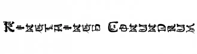
( Font by kingthingsfonts.co.uk )
A decorative and intricate font with a whimsical, fantasy-inspired design.
 Herunterladen 407 Downloads@WebFont
 -
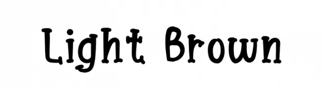
( Fonts by Prioritype )
A playful and whimsical font with bold, rounded letterforms.
![Light Brown Frei Schriftart Herunterladen]() Herunterladen 407 Downloads@WebFont
Herunterladen 407 Downloads@WebFont -
( Fonts by Des Gomez )
A bold, playful handwritten font with thick strokes and a casual style.
![Crush Frei Schriftart Herunterladen]() Herunterladen 407 Downloads@WebFont
Herunterladen 407 Downloads@WebFont -
( Noto is a trademark of Google Inc. Noto fonts are open source. All Noto fonts are published under the SIL Open Font License, Version 1.1 )
A clean, modern sans-serif typeface with a light weight and balanced design.
![Noto Sans Symbols Light Frei Schriftart Herunterladen]() Herunterladen 407 Downloads@WebFont
Herunterladen 407 Downloads@WebFont -
( Fonts by hvnter.net - Personal-use only. For commercial use please contact owner. )
A bold, modern font with geometric influences and uniform stroke widths.
![Medium Frei Schriftart Herunterladen]() Herunterladen 407 Downloads@WebFont
Herunterladen 407 Downloads@WebFont -
![Pixel Coleco Frei Schriftart Herunterladen]() Herunterladen 407 Downloads@WebFont
Herunterladen 407 Downloads@WebFont -
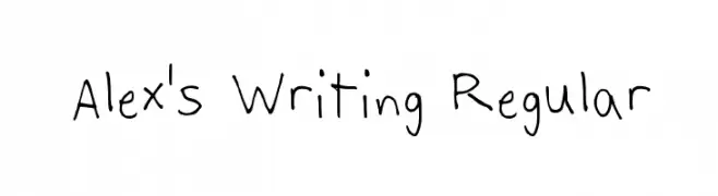
( Fonts by Alex Dupré )
A casual, handwritten font with a playful and authentic feel.
![Alex's Writing Regular Frei Schriftart Herunterladen]() Herunterladen 407 Downloads@WebFont
Herunterladen 407 Downloads@WebFont -
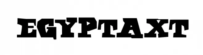
( Fonts by Manfred Klein - manfred-klein.ina-mar.com )
A bold, geometric font with sharp, angular characters.
![EgyptAxt Frei Schriftart Herunterladen]() Herunterladen 407 Downloads@WebFont
Herunterladen 407 Downloads@WebFont -
( Fonts by ShyFonts )
A bold, extended font with a dynamic slant and sharp angles.
![SF Americana Dreams Extended Bold Frei Schriftart Herunterladen]() Herunterladen 407 Downloads@WebFont
Herunterladen 407 Downloads@WebFont -
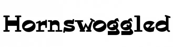
( Fonts by Nick Curtis - www.nicksfonts.com )
A bold, whimsical font with exaggerated serifs and a playful, vintage feel.
![Hornswoggled Frei Schriftart Herunterladen]() Herunterladen 407 Downloads@WebFont
Herunterladen 407 Downloads@WebFont -
( Fonts by Haslinda Adnan )
A playful, rounded font with a whimsical and friendly appearance.
![kiddy Frei Schriftart Herunterladen]() Herunterladen 407 Downloads@WebFont
Herunterladen 407 Downloads@WebFont -
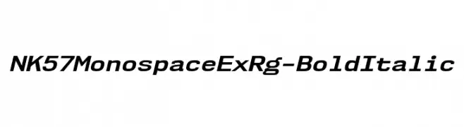
( Fonts by Typodermic Fonts )
A bold, italicized monospaced font with a modern and structured appearance.
![NK57MonospaceExRg-BoldItalic Frei Schriftart Herunterladen]() Herunterladen 407 Downloads@WebFont
Herunterladen 407 Downloads@WebFont -
( Fonts by omnibus-type.com. Personal-use only. For commercial use please contact owner. )
Bold and italicized font with a modern and dynamic style.
![Asap-BoldItalic Frei Schriftart Herunterladen]() Herunterladen 407 Downloads@WebFont
Herunterladen 407 Downloads@WebFont -
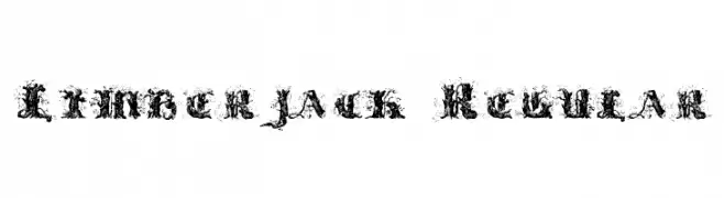
![Limberjack Regular Frei Schriftart Herunterladen]() Herunterladen 407 Downloads@WebFont
Herunterladen 407 Downloads@WebFont -
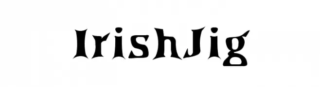
( Fonts by Abstract Type Design - Patrick Durr )
A bold, decorative font with Celtic influences and angular serifs.
![IrishJig Frei Schriftart Herunterladen]() Herunterladen 407 Downloads@WebFont
Herunterladen 407 Downloads@WebFont -
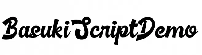
( Fonts by www.movefont .com - Personal-use only. For commercial use please contact owner. )
A bold and dynamic script font with sweeping curves and elegant flourishes.
![Basuki Script Demo Frei Schriftart Herunterladen]() Herunterladen 406 Downloads@WebFont
Herunterladen 406 Downloads@WebFont -
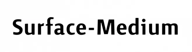
( Fonts by Bruno Herfst )
A clean, modern sans-serif font with balanced proportions and a professional appearance.
![Surface-Medium Frei Schriftart Herunterladen]() Herunterladen 406 Downloads@WebFont
Herunterladen 406 Downloads@WebFont -
![Uplifting Frei Schriftart Herunterladen]() Herunterladen 406 Downloads@WebFont
Herunterladen 406 Downloads@WebFont -
![Ancient G Written Frei Schriftart Herunterladen]() Herunterladen 406 Downloads@WebFont
Herunterladen 406 Downloads@WebFont -
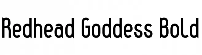
( Fonts by Levi Halmos )
A bold, modern font with geometric lines and a sleek appearance.
![Redhead Goddess Bold Frei Schriftart Herunterladen]() Herunterladen 406 Downloads@WebFont
Herunterladen 406 Downloads@WebFont -
( Fonts by Darcy Baldwin - darcybaldwin.com. Free for personal use only )
A playful, handwritten font with a casual and friendly style.
![DJB Carly Sue Got Married Frei Schriftart Herunterladen]() Herunterladen 406 Downloads@WebFont
Herunterladen 406 Downloads@WebFont -
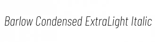
( Copyright 2017 The Barlow Project Authors (https://github.com/jpt/barlow) )
A sleek, modern, condensed font with an extra light weight and italic style.
![Barlow Condensed ExtraLight Italic Frei Schriftart Herunterladen]() Herunterladen 406 Downloads@WebFont
Herunterladen 406 Downloads@WebFont -
( Fonts by Christian Robertson - Personal-use only. For commercial use please contact owner. )
A clean, modern, and condensed typeface with uniform stroke width and excellent readability.
![Roboto Condensed Regular Frei Schriftart Herunterladen]() Herunterladen 406 Downloads@WebFont
Herunterladen 406 Downloads@WebFont -
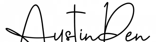
( Ahmad Khaidir - creativemarket.com/Dierstudio )
A dynamic and expressive handwritten font with fluid strokes and artistic flair.
![AustinPen Frei Schriftart Herunterladen]() Herunterladen 406 Downloads@WebFont
Herunterladen 406 Downloads@WebFont -
( Fonts by www.fontdiner.com )
A playful and whimsical font with curly, looping strokes and decorative elements.
![Rickles Frei Schriftart Herunterladen]() Herunterladen 406 Downloads@WebFont
Herunterladen 406 Downloads@WebFont -
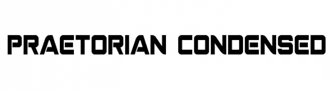
( Fonts by Daniel Zadorozny - www.iconian.com )
A bold, condensed font with a geometric and modern style.
![Praetorian Condensed Frei Schriftart Herunterladen]() Herunterladen 406 Downloads@WebFont
Herunterladen 406 Downloads@WebFont -
( Fonts by Typearound )
A bold, handwritten font with a playful and friendly style.
![Junior Star Frei Schriftart Herunterladen]() Herunterladen 406 Downloads@WebFont
Herunterladen 406 Downloads@WebFont -
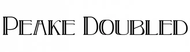
( Fonts by Paul Lloyd )
A modern, geometric font with a doubled line effect for added depth.
![Peake Doubled Frei Schriftart Herunterladen]() Herunterladen 406 Downloads@WebFont
Herunterladen 406 Downloads@WebFont -
( Fonts by Luke Aldric )
A bold, playful font with thick, rounded characters and a whimsical style.
![Magic English Frei Schriftart Herunterladen]() Herunterladen 406 Downloads@WebFont
Herunterladen 406 Downloads@WebFont -
( Fonts by Daniel Zadorozny - www.iconian.com - Free for personal use )
A bold, angular font with a dynamic, forward-leaning slant.
![Skirmisher Rotalic Frei Schriftart Herunterladen]() Herunterladen 406 Downloads@WebFont
Herunterladen 406 Downloads@WebFont -
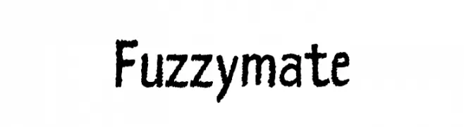
![Fuzzymate Frei Schriftart Herunterladen]() Herunterladen 406 Downloads@WebFont
Herunterladen 406 Downloads@WebFont -
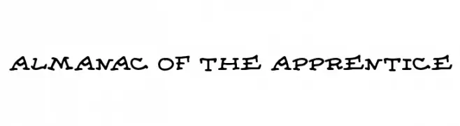
( Fonts by Cumberland Fontworks - http://www222.pair.com/sjohn/fonts.htm - S. John Ross )
A playful, hand-drawn font with bold, irregular strokes and a whimsical style.
![Almanac of the Apprentice Frei Schriftart Herunterladen]() Herunterladen 406 Downloads@WebFont
Herunterladen 406 Downloads@WebFont -
( Fonts by Billy Argel - Personal-use only. For commercial use please contact owner. )
A bold, dynamic script font with interconnected, flowing letters and a modern, playful style.
![Barbecue Personal Use Frei Schriftart Herunterladen]() Herunterladen 406 Downloads@WebFont
Herunterladen 406 Downloads@WebFont -
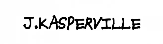
( Fonts by Michael Tension - www.TensionType.com )
A bold, hand-drawn font with a playful, graffiti-like style.
![J.Kasperville Frei Schriftart Herunterladen]() Herunterladen 406 Downloads@WebFont
Herunterladen 406 Downloads@WebFont -
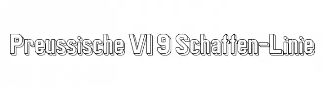
( Fonts by www.peter-wiegel.de. Personal-use only. For commercial use please contact owner. )
A bold, outlined font with a shadow effect, offering a three-dimensional look.
![Preussische VI 9 Schatten-Linie Frei Schriftart Herunterladen]() Herunterladen 406 Downloads@WebFont
Herunterladen 406 Downloads@WebFont


Welche Schriften sind gerade am populärsten?
Poppins, Roboto, Montserrat, Open Sans und Lato sind wegen ihrer klaren Formen und breiten Einsetzbarkeit sehr gefragt – von Markenauftritt über Landingpages bis hin zu Postern.
Welche Fonts eignen sich für Logos?
Geometrische Sans‑Serifs (z. B. Poppins, Familien im Gotham‑Stil) sind ein häufiger Griff für sauberes, skalierbares Branding. Für eine persönlichere Note bleiben Scripts und Handschrift‑Stile beliebt. Kombinieren Sie einen prägnanten Headline‑Font mit einer neutralen Brotschrift für Wiedererkennung und Harmonie.
Wie oft wird die Top‑Liste aktualisiert?
Regelmäßig – basierend auf realen Downloads und Interaktionen. Schauen Sie öfter vorbei, um aufstrebende Favoriten früh zu entdecken.
💡 Tipp: Seite bookmarken – Trends wechseln schnell, und heutige Top‑Schriften inspirieren morgen vielleicht das Rebranding.