Willkommen bei den Top‑Schriften – hier treffen Beliebtheit und Qualität aufeinander. Das sind die in diesem Jahr am häufigsten heruntergeladenen und genutzten Fonts. Wenn Sie sichere Optionen für Logo, Web oder Social suchen, starten Sie hier.
Jeder Top‑Font überzeugt durch Balance, Lesbarkeit und Vielseitigkeit. Sie finden moderne Sans‑Serifs, elegante Scripts, Vintage‑Serifs und minimalistische Displays.
-
 Herunterladen 405 Downloads@WebFont
 -
![HomegirlKiddo Frei Schriftart Herunterladen]() Herunterladen 405 Downloads@WebFont
Herunterladen 405 Downloads@WebFont -
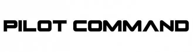
( Fonts by Daniel Zadorozny - www.iconian.com - Personal-use only. For commercial use please contact owner. )
A bold, geometric font with a futuristic and industrial design.
![Pilot Command Frei Schriftart Herunterladen]() Herunterladen 405 Downloads@WebFont
Herunterladen 405 Downloads@WebFont -
![AnatoleFranceiFNormal Frei Schriftart Herunterladen]() Herunterladen 405 Downloads@WebFont
Herunterladen 405 Downloads@WebFont -
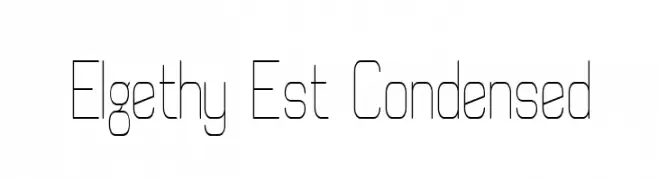
( Fonts by Graham Meade - GemFonts )
A modern, geometric, and condensed font with thin lines and a minimalist style.
![Elgethy Est Condensed Frei Schriftart Herunterladen]() Herunterladen 405 Downloads@WebFont
Herunterladen 405 Downloads@WebFont -
( Fonts by Dave Kellam - Brian Stuparyk - www.eightface.com )
A playful, hand-drawn font with bold, irregular letterforms.
![Cof Frei Schriftart Herunterladen]() Herunterladen 405 Downloads@WebFont
Herunterladen 405 Downloads@WebFont -
![Jagged Dreams Frei Schriftart Herunterladen]() Herunterladen 405 Downloads@WebFont
Herunterladen 405 Downloads@WebFont -
( Fonts by Mytype Studio - Mhd Husaini - Personal-use only. For commercial use please contact owner. )
A dynamic and elegant script font with flowing, cursive letterforms.
![Atarashi Frei Schriftart Herunterladen]() Herunterladen 405 Downloads@WebFont
Herunterladen 405 Downloads@WebFont -
![Doodle Art Frei Schriftart Herunterladen]() Herunterladen 405 Downloads@WebFont
Herunterladen 405 Downloads@WebFont -
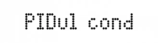
![PIDvl cond Frei Schriftart Herunterladen]() Herunterladen 405 Downloads@WebFont
Herunterladen 405 Downloads@WebFont -
( Fonts by Daniel Zadorozny - www.iconian.com - Free for personal use )
A modern, geometric font with a bold, condensed style and sharp, angular characters.
![Concielian Break Condensed Frei Schriftart Herunterladen]() Herunterladen 405 Downloads@WebFont
Herunterladen 405 Downloads@WebFont -
( Fonts by Abo Daniel Studio )
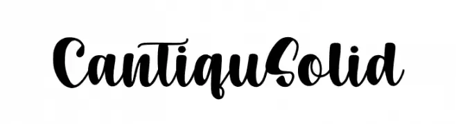
A bold, flowing script font with elegant, connected characters.
![Cantiqu Solid Frei Schriftart Herunterladen]() Herunterladen 405 Downloads@WebFont
Herunterladen 405 Downloads@WebFont -
![Flogged Frei Schriftart Herunterladen]() Herunterladen 405 Downloads@WebFont
Herunterladen 405 Downloads@WebFont -
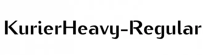
![KurierHeavy-Regular Frei Schriftart Herunterladen]() Herunterladen 405 Downloads@WebFont
Herunterladen 405 Downloads@WebFont -
![SUMMER SOUNDS GOOD Frei Schriftart Herunterladen]() Herunterladen 405 Downloads@WebFont
Herunterladen 405 Downloads@WebFont -
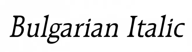
![Bulgarian Italic Frei Schriftart Herunterladen]() Herunterladen 405 Downloads@WebFont
Herunterladen 405 Downloads@WebFont -
( Fonts by Nick Curtis - www.nicksfonts.com )
A bold, theatrical font with dramatic curves and vintage flair.
![Milton Burlesque NF Frei Schriftart Herunterladen]() Herunterladen 405 Downloads@WebFont
Herunterladen 405 Downloads@WebFont -
( Fonts by CannotIntoSpaceFonts - KineticPlasma Fonts - Personal-use only. For commercial use please contact owner. )
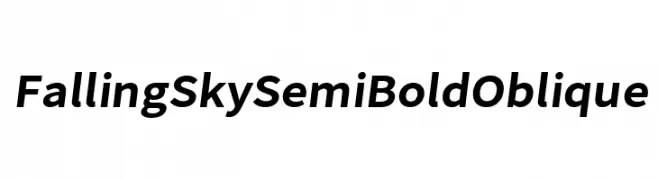
A modern, semi-bold oblique sans-serif font with a dynamic and clean appearance.
![Falling Sky SemiBold Oblique Frei Schriftart Herunterladen]() Herunterladen 405 Downloads@WebFont
Herunterladen 405 Downloads@WebFont -
( Fonts by Studio Hello Good )
Playful, hand-drawn rounded font.
![Udara Malam Frei Schriftart Herunterladen]() Herunterladen 405 Downloads@WebFont
Herunterladen 405 Downloads@WebFont -
( Fonts by Annastasia Jessica )
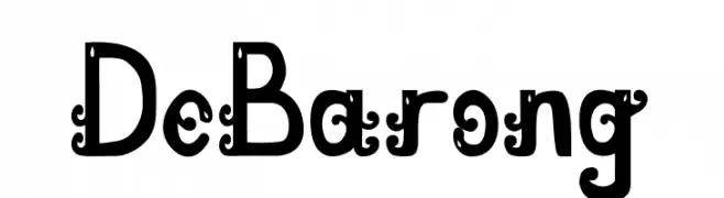
A decorative font with ornate curls and embellishments.
![De Barong Frei Schriftart Herunterladen]() Herunterladen 405 Downloads@WebFont
Herunterladen 405 Downloads@WebFont -
( Fonts by Manfred Klein. Free for private and charity use. Free for commercial with donation to organizations )
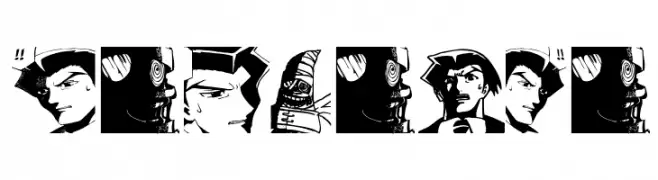
Artistic manga-style illustrations form each character.
![Mangalia Frei Schriftart Herunterladen]() Herunterladen 405 Downloads@WebFont
Herunterladen 405 Downloads@WebFont -
( Fonts by a Neale Davidson - www.pixelsagas.com. Personal-use only. For commercial use please contact owner. )
A bold, italic, and condensed font with a modern, dynamic style.
![Plavsky Condensed Bold Italic Frei Schriftart Herunterladen]() Herunterladen 405 Downloads@WebFont
Herunterladen 405 Downloads@WebFont -
( Fonts by Daniel Zadorozny - www.iconian.com )
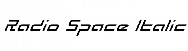
A futuristic, italicized font with angular, dynamic characters.
![Radio Space Italic Frei Schriftart Herunterladen]() Herunterladen 405 Downloads@WebFont
Herunterladen 405 Downloads@WebFont -
![Wabroye Frei Schriftart Herunterladen]() Herunterladen 405 Downloads@WebFont
Herunterladen 405 Downloads@WebFont -
![AuX DotBitC Frei Schriftart Herunterladen]() Herunterladen 405 Downloads@WebFont
Herunterladen 405 Downloads@WebFont -
( Fonts by Khrys Bosland )
A playful, hand-drawn font with bold, rounded characters.
![KBPayTheLady Frei Schriftart Herunterladen]() Herunterladen 405 Downloads@WebFont
Herunterladen 405 Downloads@WebFont -
( Fonts by Typodermic Fonts )
A bold, italicized monospaced font with a modern, dynamic style.
![NK57MonospaceCdRg-BoldItalic Frei Schriftart Herunterladen]() Herunterladen 405 Downloads@WebFont
Herunterladen 405 Downloads@WebFont -
( Fonts by CannotIntoSpaceFonts - KineticPlasma Fonts - Personal-use only. For commercial use please contact owner. )
A bold, oblique font with a modern and dynamic style.
![Falling Sky ExtraBold Oblique Frei Schriftart Herunterladen]() Herunterladen 404 Downloads@WebFont
Herunterladen 404 Downloads@WebFont -
( austiebost.net )
A whimsical, hand-drawn font with playful curls and a sketch-like texture.
![Austie Bost Cartwheels Frei Schriftart Herunterladen]() Herunterladen 404 Downloads@WebFont
Herunterladen 404 Downloads@WebFont -
( Fonts by MCKL )
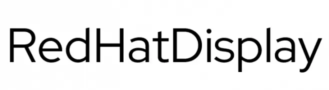
A modern, geometric sans-serif font with clean lines and open forms.
![Red Hat Display Frei Schriftart Herunterladen]() Herunterladen 404 Downloads@WebFont
Herunterladen 404 Downloads@WebFont -
( Fonts by Arkandis Digital Foundry )
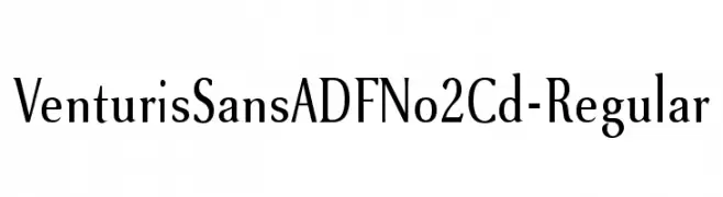
A classic serif font with modern elegance and refined letterforms.
![VenturisSansADFNo2Cd-Regular Frei Schriftart Herunterladen]() Herunterladen 404 Downloads@WebFont
Herunterladen 404 Downloads@WebFont -
( Fonts by Kong Font - https://fontkong.com/ - Personal-use only. For commercial use please contact owner. )
A playful and elegant handwritten script font with dynamic strokes.
![Faster Bottom Frei Schriftart Herunterladen]() Herunterladen 404 Downloads@WebFont
Herunterladen 404 Downloads@WebFont -
( Iconian Fonts - Daniel Zadorozny - www.iconian.com )
A futuristic, angular font with bold, geometric shapes.
![Space Ranger Title Frei Schriftart Herunterladen]() Herunterladen 404 Downloads@WebFont
Herunterladen 404 Downloads@WebFont -
( Fonts by Omar Mogollón )
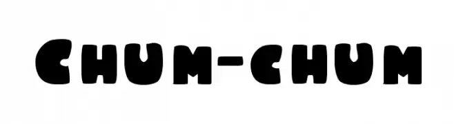
A bold, playful font with a chunky, rounded style perfect for informal projects.
![Chum-chum Frei Schriftart Herunterladen]() Herunterladen 404 Downloads@WebFont
Herunterladen 404 Downloads@WebFont -
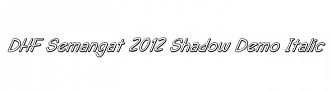
![DHF Semangat 2012 Shadow Demo Italic Frei Schriftart Herunterladen]() Herunterladen 404 Downloads@WebFont
Herunterladen 404 Downloads@WebFont


Welche Schriften sind gerade am populärsten?
Poppins, Roboto, Montserrat, Open Sans und Lato sind wegen ihrer klaren Formen und breiten Einsetzbarkeit sehr gefragt – von Markenauftritt über Landingpages bis hin zu Postern.
Welche Fonts eignen sich für Logos?
Geometrische Sans‑Serifs (z. B. Poppins, Familien im Gotham‑Stil) sind ein häufiger Griff für sauberes, skalierbares Branding. Für eine persönlichere Note bleiben Scripts und Handschrift‑Stile beliebt. Kombinieren Sie einen prägnanten Headline‑Font mit einer neutralen Brotschrift für Wiedererkennung und Harmonie.
Wie oft wird die Top‑Liste aktualisiert?
Regelmäßig – basierend auf realen Downloads und Interaktionen. Schauen Sie öfter vorbei, um aufstrebende Favoriten früh zu entdecken.
💡 Tipp: Seite bookmarken – Trends wechseln schnell, und heutige Top‑Schriften inspirieren morgen vielleicht das Rebranding.