Willkommen bei den Top‑Schriften – hier treffen Beliebtheit und Qualität aufeinander. Das sind die in diesem Jahr am häufigsten heruntergeladenen und genutzten Fonts. Wenn Sie sichere Optionen für Logo, Web oder Social suchen, starten Sie hier.
Jeder Top‑Font überzeugt durch Balance, Lesbarkeit und Vielseitigkeit. Sie finden moderne Sans‑Serifs, elegante Scripts, Vintage‑Serifs und minimalistische Displays.
-
( Fonts by Vladimir Nikolic )
A bold, geometric font with a three-dimensional effect.
 Herunterladen 400 Downloads@WebFont
 -
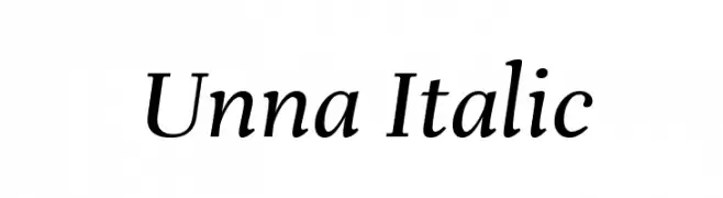
( Copyright 2016 The Unna Project Authors (omnibus.type@gmail.com) )
Elegant serif font with an italic slant and moderate contrast.
![Unna Italic Frei Schriftart Herunterladen]() Herunterladen 400 Downloads@WebFont
Herunterladen 400 Downloads@WebFont -
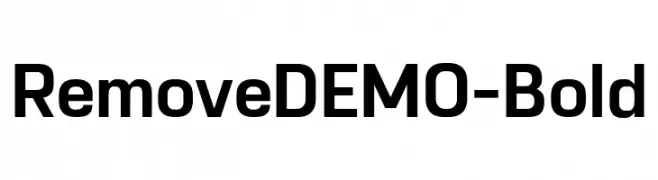
( Fonts by Eko Bimantara - Personal-use only. For commercial use please contact owner. )
A bold, modern sans-serif font with clean lines and strong presence.
![RemoveDEMO-Bold Frei Schriftart Herunterladen]() Herunterladen 400 Downloads@WebFont
Herunterladen 400 Downloads@WebFont -
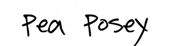
( Free for a personal use. For a commercial use please visit www.kevinandamanda.com )
A playful, handwritten font with bold, expressive strokes.
![Pea Posey Frei Schriftart Herunterladen]() Herunterladen 399 Downloads@WebFont
Herunterladen 399 Downloads@WebFont -
![transMutation Frei Schriftart Herunterladen]() Herunterladen 399 Downloads@WebFont
Herunterladen 399 Downloads@WebFont -
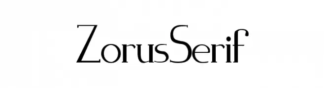
( Fonts by Jeremie Dupuis - Personal-use only. For commercial use please contact owner. )
An elegant serif font with high contrast and refined curves.
![Zorus Serif Frei Schriftart Herunterladen]() Herunterladen 399 Downloads@WebFont
Herunterladen 399 Downloads@WebFont -
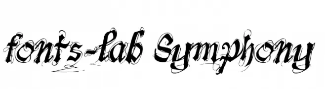
( Fonts by www.fontscafe.com )
An ornate, decorative font with bold, calligraphic strokes and elaborate flourishes.
![fonts-lab Symphony Frei Schriftart Herunterladen]() Herunterladen 399 Downloads@WebFont
Herunterladen 399 Downloads@WebFont -
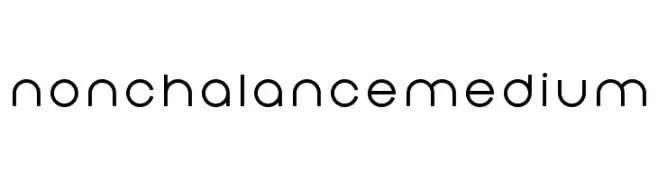
( Colorbean )
A clean, geometric font with a modern and balanced design.
![Nonchalance Medium Frei Schriftart Herunterladen]() Herunterladen 399 Downloads@WebFont
Herunterladen 399 Downloads@WebFont -
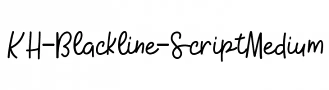
( Kristy Hatswell - www.webcodesigns.com/ )
A playful, handwritten script font with a casual and fluid style.
![KH-Blackline-Script Medium Frei Schriftart Herunterladen]() Herunterladen 399 Downloads@WebFont
Herunterladen 399 Downloads@WebFont -
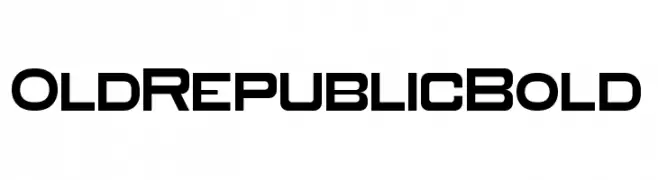
( Fonts by Trollax Kinora - Personal-use only. For commercial use please contact owner. )
A bold, geometric font with a modern and futuristic style.
![Old Republic Bold Frei Schriftart Herunterladen]() Herunterladen 399 Downloads@WebFont
Herunterladen 399 Downloads@WebFont -
![WednesdayLetteringPractice Frei Schriftart Herunterladen]() Herunterladen 399 Downloads@WebFont
Herunterladen 399 Downloads@WebFont -
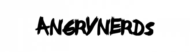
( Fonts by a Max Infeld - XEROGRAPHER FONTS - xerographer.blogspot.com . Personal-use only. For commercial use please contact owner. )
A bold, brush-style font with dynamic, edgy strokes.
![AngryNerds Frei Schriftart Herunterladen]() Herunterladen 399 Downloads@WebFont
Herunterladen 399 Downloads@WebFont -
![Hussar3D Four Frei Schriftart Herunterladen]() Herunterladen 399 Downloads@WebFont
Herunterladen 399 Downloads@WebFont -
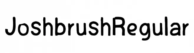
( Fonts by Ahmad Dindin )
A playful, handwritten font with a casual and friendly style.
![Joshbrush Regular Frei Schriftart Herunterladen]() Herunterladen 399 Downloads@WebFont
Herunterladen 399 Downloads@WebFont -
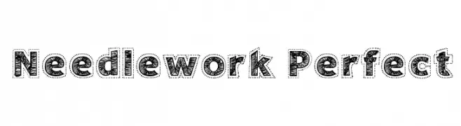
( Fonts by Galdino Otten - galdinootten.com )
A decorative font with a needlework-inspired, stitched appearance.
![Needlework Perfect Frei Schriftart Herunterladen]() Herunterladen 399 Downloads@WebFont
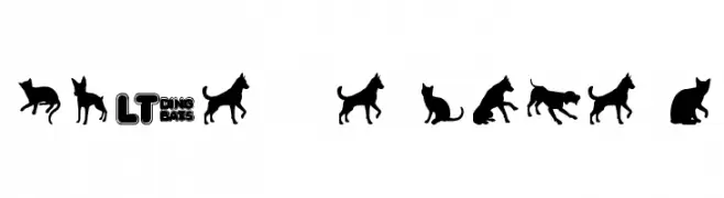
Herunterladen 399 Downloads@WebFont -
![Cats vs Dogs LT Frei Schriftart Herunterladen]() Herunterladen 399 Downloads@WebFont
Herunterladen 399 Downloads@WebFont -
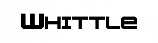
( Fonts by a Neale Davidson - www.pixelsagas.com. Personal-use only. For commercial use please contact owner. )
A bold, geometric font with a futuristic and industrial design.
![Whittle Frei Schriftart Herunterladen]() Herunterladen 399 Downloads@WebFont
Herunterladen 399 Downloads@WebFont -
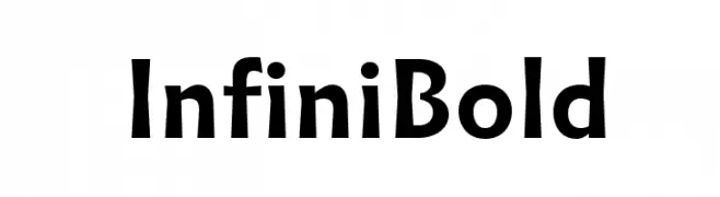
( Fonts by Sandrine Nugue - Personal-use only. For commercial use please contact owner. )
A bold, modern font with a dynamic and elegant style.
![Infini Bold Frei Schriftart Herunterladen]() Herunterladen 399 Downloads@WebFont
Herunterladen 399 Downloads@WebFont -
( Fonts by Zetafonts - Personal-use only. For commercial use please contact owner. )
A bold, modern font with strong, geometric characters and minimal contrast.
![Altair Ultra Frei Schriftart Herunterladen]() Herunterladen 399 Downloads@WebFont
Herunterladen 399 Downloads@WebFont -
( Fonts by Situjuh Nazara - 7ntypes.com - Personal-use only. For commercial use please contact owner. )
A playful, bold script font with a handwritten, whimsical style.
![Behind The Scenery Frei Schriftart Herunterladen]() Herunterladen 399 Downloads@WebFont
Herunterladen 399 Downloads@WebFont -
![Sombras-Jed- Frei Schriftart Herunterladen]() Herunterladen 399 Downloads@WebFont
Herunterladen 399 Downloads@WebFont -
( Fonts by Dennis Ludlow - Sharkshock Productions )
A bold, geometric font with a futuristic and dynamic style.
![Fujita Ray [Demo] Frei Schriftart Herunterladen]() Herunterladen 399 Downloads@WebFont
Herunterladen 399 Downloads@WebFont -
![Nightcap NF Frei Schriftart Herunterladen]() Herunterladen 399 Downloads@WebFont
Herunterladen 399 Downloads@WebFont -
( Fonts by Shara Weber )
A whimsical, star-studded font with a celestial theme.
![MidnightConstellations Frei Schriftart Herunterladen]() Herunterladen 399 Downloads@WebFont
Herunterladen 399 Downloads@WebFont -
![Carolus Italic Frei Schriftart Herunterladen]() Herunterladen 399 Downloads@WebFont
Herunterladen 399 Downloads@WebFont -
![Lushus Frei Schriftart Herunterladen]() Herunterladen 399 Downloads@WebFont
Herunterladen 399 Downloads@WebFont -
( Fonts by a Neale Davidson - www.pixelsagas.com. Personal-use only. For commercial use please contact owner. )
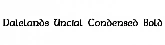
A bold, condensed font with medieval influences and modern readability.
![Dalelands Uncial Condensed Bold Frei Schriftart Herunterladen]() Herunterladen 399 Downloads@WebFont
Herunterladen 399 Downloads@WebFont -
![Stolen LlamaRegular Frei Schriftart Herunterladen]() Herunterladen 399 Downloads@WebFont
Herunterladen 399 Downloads@WebFont -
( Noto is a trademark of Google Inc. Noto fonts are open source. All Noto fonts are published under the SIL Open Font License, Version 1.1 )
A bold, sans-serif font with clean lines and excellent readability.
![Noto Sans Bengali UI Bold Frei Schriftart Herunterladen]() Herunterladen 399 Downloads@WebFont
Herunterladen 399 Downloads@WebFont -
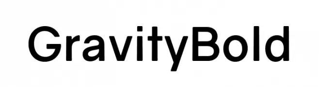
( Fonts by Vincenzo Vuono - Personal-use only. For commercial use please contact owner. )
A bold, modern sans-serif font with a clean and geometric design.
![Gravity Bold Frei Schriftart Herunterladen]() Herunterladen 399 Downloads@WebFont
Herunterladen 399 Downloads@WebFont -
( Fonts by Nick Curtis - www.nicksfonts.com )
A bold, angular font with a futuristic and geometric style.
![Nickley NF Frei Schriftart Herunterladen]() Herunterladen 399 Downloads@WebFont
Herunterladen 399 Downloads@WebFont -
( Fonts by www.houseoflime.com )
Highly decorative, illustrated zodiac-themed display set.
![Zodiac Frei Schriftart Herunterladen]() Herunterladen 399 Downloads@WebFont
Herunterladen 399 Downloads@WebFont -
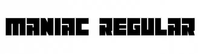
( Vladimir Nikolic - www.coroflot.com/vladimirnikolic )
A bold, geometric font with a retro, arcade-inspired style.
![Maniac Regular Frei Schriftart Herunterladen]() Herunterladen 399 Downloads@WebFont
Herunterladen 399 Downloads@WebFont -
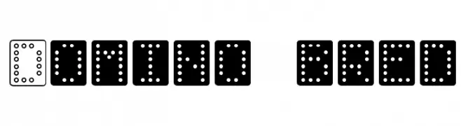
( Fonts by Klaus Johansen - www.listemageren.dK )
A playful, domino-inspired font with characters formed by dot patterns.
![Domino bred Frei Schriftart Herunterladen]() Herunterladen 399 Downloads@WebFont
Herunterladen 399 Downloads@WebFont -
( Fonts by Wei Huang - Personal-use only. For commercial use please contact owner. )
A modern, semi-bold italic sans-serif font with clean lines and a dynamic style.
![Work Sans SemiBold Italic Frei Schriftart Herunterladen]() Herunterladen 399 Downloads@WebFont
Herunterladen 399 Downloads@WebFont


![Fujita Ray [Demo] Frei Schriftart Herunterladen](https://d144mzi0q5mijx.cloudfront.net/img/F/U/Fujita-Ray-Demo.webp)


Welche Schriften sind gerade am populärsten?
Poppins, Roboto, Montserrat, Open Sans und Lato sind wegen ihrer klaren Formen und breiten Einsetzbarkeit sehr gefragt – von Markenauftritt über Landingpages bis hin zu Postern.
Welche Fonts eignen sich für Logos?
Geometrische Sans‑Serifs (z. B. Poppins, Familien im Gotham‑Stil) sind ein häufiger Griff für sauberes, skalierbares Branding. Für eine persönlichere Note bleiben Scripts und Handschrift‑Stile beliebt. Kombinieren Sie einen prägnanten Headline‑Font mit einer neutralen Brotschrift für Wiedererkennung und Harmonie.
Wie oft wird die Top‑Liste aktualisiert?
Regelmäßig – basierend auf realen Downloads und Interaktionen. Schauen Sie öfter vorbei, um aufstrebende Favoriten früh zu entdecken.
💡 Tipp: Seite bookmarken – Trends wechseln schnell, und heutige Top‑Schriften inspirieren morgen vielleicht das Rebranding.