Willkommen bei den Top‑Schriften – hier treffen Beliebtheit und Qualität aufeinander. Das sind die in diesem Jahr am häufigsten heruntergeladenen und genutzten Fonts. Wenn Sie sichere Optionen für Logo, Web oder Social suchen, starten Sie hier.
Jeder Top‑Font überzeugt durch Balance, Lesbarkeit und Vielseitigkeit. Sie finden moderne Sans‑Serifs, elegante Scripts, Vintage‑Serifs und minimalistische Displays.
-
( Fonts by www.typodermicfonts.com - Ray Larabie )
A bold, modern font with a strong and impactful design.
 Herunterladen 4582 Downloads@WebFont
 -
( Fonts by Apostrophic Lab )
A bold, modern sans-serif font with geometric shapes and consistent stroke widths.
![Florencesans SC Black Frei Schriftart Herunterladen]() Herunterladen 4582 Downloads@WebFont
Herunterladen 4582 Downloads@WebFont -
( Copyright (c) 2012, Vernon Adams (vern@newtypography.co.uk), with Reserved Font Names "Trocchi" )
A modern serif font with clean lines and balanced proportions, ideal for versatile use.
![Trocchi Frei Schriftart Herunterladen]() Herunterladen 4581 Downloads@WebFont
Herunterladen 4581 Downloads@WebFont -
( Fonts by www.kimberlygeswein.com - Kimberly Geswein )
A playful, decorative set of frames and arrows with unique patterns and handwritten words.
![KG Flavor and Frames Three Frei Schriftart Herunterladen]() Herunterladen 4579 Downloads@WebFont
Herunterladen 4579 Downloads@WebFont -
![Kimberley Frei Schriftart Herunterladen]() Herunterladen 4578 Downloads@WebFont
Herunterladen 4578 Downloads@WebFont -
![Khmer OS Pheatra C5 Frei Schriftart Herunterladen]() Herunterladen 4577 Downloads@WebFont
Herunterladen 4577 Downloads@WebFont -
( Fonts by a Anton Krylov . Personal-use only. For commercial use please contact owner. )
A bold, athletic typeface ideal for sports-themed designs.
![I.F.C. HARDBALL Frei Schriftart Herunterladen]() Herunterladen 4575 Downloads@WebFont
Herunterladen 4575 Downloads@WebFont -
( Copyright (c) 2010-2014 by tyPoland Lukasz Dziedzic (team@latofonts.com) with Reserved Font Name "Lato" )
A bold, italic sans-serif font with a modern and dynamic style.
![Lato Bold Italic Frei Schriftart Herunterladen]() Herunterladen 4575 Downloads@WebFont
Herunterladen 4575 Downloads@WebFont -
( Fonts by www.fontalicious.com )
A bold, cartoonish font with a hand-drawn, stone-like appearance.
![Caveman Frei Schriftart Herunterladen]() Herunterladen 4575 Downloads@WebFont
Herunterladen 4575 Downloads@WebFont -
( Fonts by a Neale Davidson - www.pixelsagas.com. Personal-use only. For commercial use please contact owner. )
A modern, geometric font with a futuristic and technical design.
![PCap Terminal Frei Schriftart Herunterladen]() Herunterladen 4573 Downloads@WebFont
Herunterladen 4573 Downloads@WebFont -
![Republica Minor Frei Schriftart Herunterladen]() Herunterladen 4573 Downloads@WebFont
Herunterladen 4573 Downloads@WebFont -
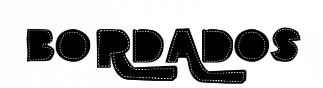
( www.behance.net/rasdesign )
A bold, embroidered-style font with a playful and decorative design.
![BORDADOS Frei Schriftart Herunterladen]() Herunterladen 4572 Downloads@WebFont
Herunterladen 4572 Downloads@WebFont -
![10 Lil' Ghosts Frei Schriftart Herunterladen]() Herunterladen 4571 Downloads@WebFont
Herunterladen 4571 Downloads@WebFont -
( Fonts by Typologic - Fadiel Muhammad - Personal-use only. For commercial use please contact owner. )
A bold, expanded font with a strong, modern presence.
![AkiraExpanded-SuperBold Frei Schriftart Herunterladen]() Herunterladen 4569 Downloads@WebFont
Herunterladen 4569 Downloads@WebFont -
( Copyright 2014, Erin McLaughlin (hello@erinmclaughlin.com). )
A bold, modern sans-serif typeface with geometric shapes and uniform stroke width.
![Yantramanav Black Frei Schriftart Herunterladen]() Herunterladen 4567 Downloads@WebFont
Herunterladen 4567 Downloads@WebFont -
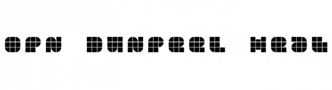
![OPN DunPeel Heat Frei Schriftart Herunterladen]() Herunterladen 4567 Downloads@WebFont
Herunterladen 4567 Downloads@WebFont -
![Fossil Regular Frei Schriftart Herunterladen]() Herunterladen 4567 Downloads@WebFont
Herunterladen 4567 Downloads@WebFont -
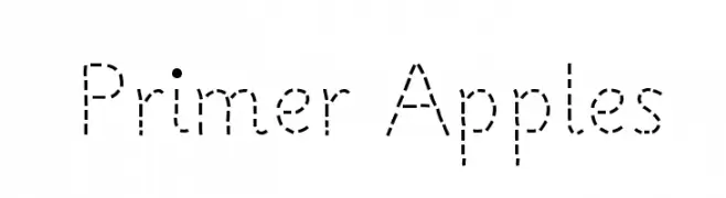
![Primer Apples Frei Schriftart Herunterladen]() Herunterladen 4567 Downloads@WebFont
Herunterladen 4567 Downloads@WebFont -
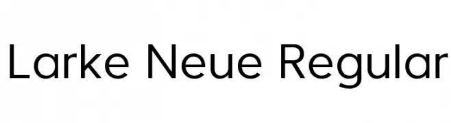
( Fonts by Steve Gardner - www.explogos.com. Personal-use only. For commercial use please contact owner. )
A modern, clean sans-serif typeface with excellent readability.
![Larke Neue Regular Frei Schriftart Herunterladen]() Herunterladen 4565 Downloads@WebFont
Herunterladen 4565 Downloads@WebFont -
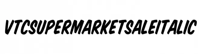
![VTCSuperMarketSaleItalic Frei Schriftart Herunterladen]() Herunterladen 4564 Downloads@WebFont
Herunterladen 4564 Downloads@WebFont -
( Fonts by Best Font Studio - Rifan Asri - Personal-use only. For commercial use please contact owner. )
A playful and dynamic script font with a handwritten feel.
![jandle Regular Frei Schriftart Herunterladen]() Herunterladen 4563 Downloads@WebFont
Herunterladen 4563 Downloads@WebFont -
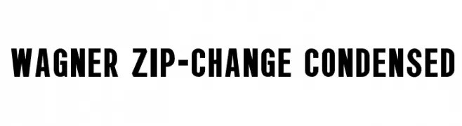
![Wagner Zip-Change Condensed Frei Schriftart Herunterladen]() Herunterladen 4563 Downloads@WebFont
Herunterladen 4563 Downloads@WebFont -
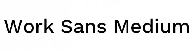
( Copyright (c) 2014-2015 Wei Huang (wweeiihhuuaanngg@gmail.com) )
A modern, clean sans-serif font with geometric shapes and uniform strokes.
![Work Sans Medium Frei Schriftart Herunterladen]() Herunterladen 4560 Downloads@WebFont
Herunterladen 4560 Downloads@WebFont -
![Cloud World Frei Schriftart Herunterladen]() Herunterladen 4560 Downloads@WebFont
Herunterladen 4560 Downloads@WebFont -
( Fonts by ShyFonts )
A bold, oblique sans-serif font with a dynamic and modern style.
![SF Quartzite Bold Oblique Frei Schriftart Herunterladen]() Herunterladen 4560 Downloads@WebFont
Herunterladen 4560 Downloads@WebFont -
( Fonts by Mozilla Foundation - Personal-use only. For commercial use please contact owner. )
A bold, modern sans-serif font with high contrast and strong presence.
![Fira Sans Ultra Frei Schriftart Herunterladen]() Herunterladen 4559 Downloads@WebFont
Herunterladen 4559 Downloads@WebFont -
![Galliard Bold BT Frei Schriftart Herunterladen]() Herunterladen 4559 Downloads@WebFont
Herunterladen 4559 Downloads@WebFont -
( Fonts by Marsnev - Muhammad Ariq Syauqi - Personal-use only. For commercial use please contact owner. )
A bold, modern sans-serif font with geometric influences and strong visual impact.
![LEMON MILK Regular Frei Schriftart Herunterladen]() Herunterladen 4558 Downloads@WebFont
Herunterladen 4558 Downloads@WebFont -
( Fonts by Rajesh Rajput - gumroad.com/rajputrajesh_448 - Personal-use only. For commercial use please contact owner. )
A bold, italicized font with a modern and dynamic style.
![Morganite Bold Italic Frei Schriftart Herunterladen]() Herunterladen 4556 Downloads@WebFont
Herunterladen 4556 Downloads@WebFont -
![Back To The Future Frei Schriftart Herunterladen]() Herunterladen 4556 Downloads@WebFont
Herunterladen 4556 Downloads@WebFont -
( Copyright HanYang I&C Co.,Ltd. All rights reserved. )
A bold, modern sans-serif typeface with clean lines and uniform width.
![Gothic A1 Bold Frei Schriftart Herunterladen]() Herunterladen 4555 Downloads@WebFont
Herunterladen 4555 Downloads@WebFont -
![Brush Hand New Frei Schriftart Herunterladen]() Herunterladen 4555 Downloads@WebFont
Herunterladen 4555 Downloads@WebFont -
( Fonts by Fran Fernandez - Personal-use only. For commercial use please contact owner. )
A bold, blocky font with playful pet silhouettes integrated into the design.
![Life of Pets Frei Schriftart Herunterladen]() Herunterladen 4553 Downloads@WebFont
Herunterladen 4553 Downloads@WebFont -
( Copyright (c) 2014, Indian Type Foundry (info@indiantypefoundry.com). )
A casual, handwritten-style font with smooth, rounded strokes.
![Kalam Frei Schriftart Herunterladen]() Herunterladen 4552 Downloads@WebFont
Herunterladen 4552 Downloads@WebFont -
( Fonts by a Neale Davidson - www.pixelsagas.com. Personal-use only. For commercial use please contact owner. )
A bold, italic font with geometric shapes and sharp angles, exuding energy and modernity.
![Bayformance Italic Frei Schriftart Herunterladen]() Herunterladen 4551 Downloads@WebFont
Herunterladen 4551 Downloads@WebFont


Welche Schriften sind gerade am populärsten?
Poppins, Roboto, Montserrat, Open Sans und Lato sind wegen ihrer klaren Formen und breiten Einsetzbarkeit sehr gefragt – von Markenauftritt über Landingpages bis hin zu Postern.
Welche Fonts eignen sich für Logos?
Geometrische Sans‑Serifs (z. B. Poppins, Familien im Gotham‑Stil) sind ein häufiger Griff für sauberes, skalierbares Branding. Für eine persönlichere Note bleiben Scripts und Handschrift‑Stile beliebt. Kombinieren Sie einen prägnanten Headline‑Font mit einer neutralen Brotschrift für Wiedererkennung und Harmonie.
Wie oft wird die Top‑Liste aktualisiert?
Regelmäßig – basierend auf realen Downloads und Interaktionen. Schauen Sie öfter vorbei, um aufstrebende Favoriten früh zu entdecken.
💡 Tipp: Seite bookmarken – Trends wechseln schnell, und heutige Top‑Schriften inspirieren morgen vielleicht das Rebranding.