Willkommen bei den Top‑Schriften – hier treffen Beliebtheit und Qualität aufeinander. Das sind die in diesem Jahr am häufigsten heruntergeladenen und genutzten Fonts. Wenn Sie sichere Optionen für Logo, Web oder Social suchen, starten Sie hier.
Jeder Top‑Font überzeugt durch Balance, Lesbarkeit und Vielseitigkeit. Sie finden moderne Sans‑Serifs, elegante Scripts, Vintage‑Serifs und minimalistische Displays.
-
( Fonts by Vunira Design - Personal-use only. For commercial use please contact owner. )
A bold, expressive script font with elegant curves and a dynamic style.
 Herunterladen 396 Downloads@WebFont
 -
( Fonts by Natalia Kasatkina )
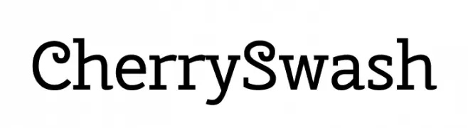
A classic serif font with elegant swashes and playful curves.
![Cherry Swash Frei Schriftart Herunterladen]() Herunterladen 396 Downloads@WebFont
Herunterladen 396 Downloads@WebFont -
( Fonts by Rajesh Rajput - gumroad.com/rajputrajesh_448 - Personal-use only. For commercial use please contact owner. )
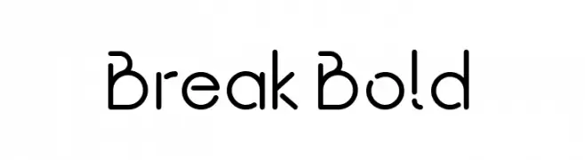
A modern, geometric font with clean lines and a futuristic aesthetic.
![Break Bold Frei Schriftart Herunterladen]() Herunterladen 396 Downloads@WebFont
Herunterladen 396 Downloads@WebFont -
( Fonts by a Neale Davidson - www.pixelsagas.com. Personal-use only. For commercial use please contact owner. )
A modern, geometric font with a condensed and uniform appearance.
![Carlton Frei Schriftart Herunterladen]() Herunterladen 396 Downloads@WebFont
Herunterladen 396 Downloads@WebFont -
( Fonts by www.chequered.ink - Chequered Ink - Personal-use only. For commercial use please contact owner. )
A modern sans-serif font with geometric shapes and uniform stroke width.
![Q for the Memories Frei Schriftart Herunterladen]() Herunterladen 396 Downloads@WebFont
Herunterladen 396 Downloads@WebFont -
( Fonts by www.typodermicfonts.com - Ray Larabie )
A bold, 3D decorative font with a playful and dynamic style.
![Soul Mama Frei Schriftart Herunterladen]() Herunterladen 396 Downloads@WebFont
Herunterladen 396 Downloads@WebFont -
( Fonts by Craft Supply Co - Personal-use only. For commercial use please contact owner. )
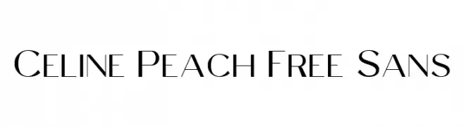
A modern, elegant sans-serif font with clean lines and a sophisticated appearance.
![Celine Peach Free Sans Frei Schriftart Herunterladen]() Herunterladen 396 Downloads@WebFont
Herunterladen 396 Downloads@WebFont -
( Fonts by Daniel Zadorozny - www.iconian.com )
A futuristic, geometric font with bold, angular letterforms and unique cutouts.
![Xephyr Frei Schriftart Herunterladen]() Herunterladen 396 Downloads@WebFont
Herunterladen 396 Downloads@WebFont -
( Fonts by madeDeduk )
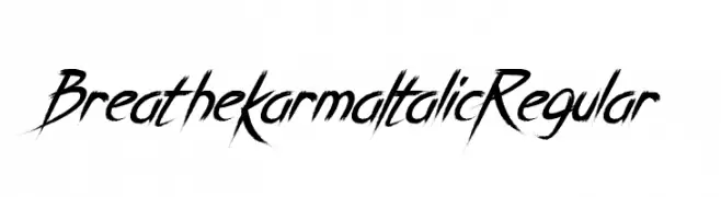
A dynamic, edgy font with sharp, angular strokes and an italicized appearance.
![Breathe Karma Italic Regular Frei Schriftart Herunterladen]() Herunterladen 396 Downloads@WebFont
Herunterladen 396 Downloads@WebFont -
( Fonts by Eko Bimantara - Personal-use only. For commercial use please contact owner. )
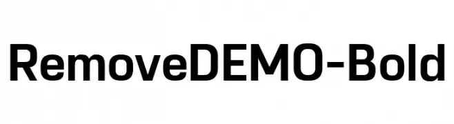
A bold, modern sans-serif font with clean lines and strong presence.
![RemoveDEMO-Bold Frei Schriftart Herunterladen]() Herunterladen 396 Downloads@WebFont
Herunterladen 396 Downloads@WebFont -
( pointlab studio - creativemarket.com/pointlab )
A bold, expressive handwritten font with thick, brush-like strokes.
![BlastpinkScript Frei Schriftart Herunterladen]() Herunterladen 396 Downloads@WebFont
Herunterladen 396 Downloads@WebFont -
( Copyright (c) 2009-2011 by Accademia di Belle Arti di Urbino and students of MA course of Visual design. Some rights reserved. )
A modern, semi-bold italic font with clean strokes and dynamic slant.
![Titillium WebSemiBold Italic Frei Schriftart Herunterladen]() Herunterladen 396 Downloads@WebFont
Herunterladen 396 Downloads@WebFont -
( Fonts by Daniel Zadorozny - www.iconian.com - Free for personal use )
A bold, geometric, and condensed font with a modern, futuristic style.
![uni-sol condensed Frei Schriftart Herunterladen]() Herunterladen 395 Downloads@WebFont
Herunterladen 395 Downloads@WebFont -
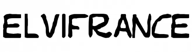
![Elvifrance Frei Schriftart Herunterladen]() Herunterladen 395 Downloads@WebFont
Herunterladen 395 Downloads@WebFont -
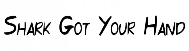
( Fonts by Aryel Filipe )
A playful, hand-drawn font with bold and irregular strokes.
![Shark Got Your Hand Frei Schriftart Herunterladen]() Herunterladen 395 Downloads@WebFont
Herunterladen 395 Downloads@WebFont -
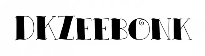
![DKZeebonk Frei Schriftart Herunterladen]() Herunterladen 395 Downloads@WebFont
Herunterladen 395 Downloads@WebFont -
( Fonts by a Neale Davidson - www.pixelsagas.com. Personal-use only. For commercial use please contact owner. )
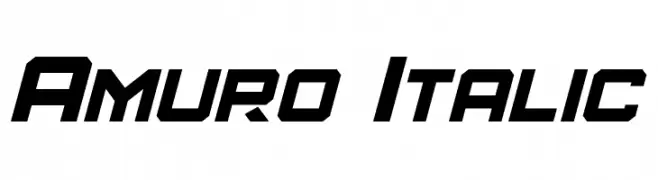
A bold, italicized font with a futuristic and dynamic style.
![Amuro Italic Frei Schriftart Herunterladen]() Herunterladen 395 Downloads@WebFont
Herunterladen 395 Downloads@WebFont -
Schriftart von fontsnthings. For commercial use please contact the owner.
![Circle Things 2 Frei Schriftart Herunterladen]() Herunterladen 395 Downloads@WebFont
Herunterladen 395 Downloads@WebFont -
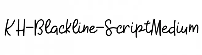
( Kristy Hatswell - www.webcodesigns.com/ )
A playful, handwritten script font with a casual and fluid style.
![KH-Blackline-Script Medium Frei Schriftart Herunterladen]() Herunterladen 395 Downloads@WebFont
Herunterladen 395 Downloads@WebFont -
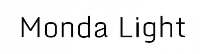
( Fonts by Vernon Adams - Personal-use only. For commercial use please contact owner. )
A modern, geometric sans-serif font with clear, balanced characters.
![Monda Light Frei Schriftart Herunterladen]() Herunterladen 395 Downloads@WebFont
Herunterladen 395 Downloads@WebFont -
( Fonts by Kong Font )
A bold, playful font with rounded edges and a bubbly appearance.
![Jackdean Frei Schriftart Herunterladen]() Herunterladen 395 Downloads@WebFont
Herunterladen 395 Downloads@WebFont -
Schriftart von JuanCasco. For commercial use please contact the owner.
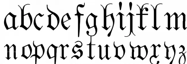
( Fonts by Juan Casco - www.juancasco.net )
A bold, ornate Blackletter font with intricate details and a historical feel.
![Fraktura Frei Schriftart Herunterladen]() Herunterladen 395 Downloads@WebFont
Herunterladen 395 Downloads@WebFont -
![Kruti Dev 070 Condensed Frei Schriftart Herunterladen]() Herunterladen 395 Downloads@WebFont
Herunterladen 395 Downloads@WebFont -
( Fonts by a Situjuh Nazara - c7n1.wordpress.com. Personal-use only. For commercial use please contact owner. )
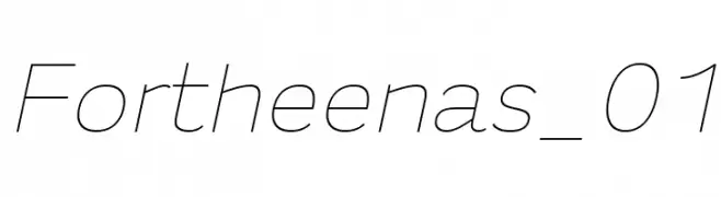
A sleek, modern font with clean, geometric lines and a slightly condensed style.
![Fortheenas_01 Frei Schriftart Herunterladen]() Herunterladen 395 Downloads@WebFont
Herunterladen 395 Downloads@WebFont -
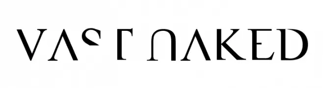
![VAST Naked Frei Schriftart Herunterladen]() Herunterladen 395 Downloads@WebFont
Herunterladen 395 Downloads@WebFont -
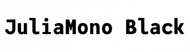
( Fonts by cormullion )
A bold, monospaced font with a modern and robust design.
![JuliaMono Black Frei Schriftart Herunterladen]() Herunterladen 395 Downloads@WebFont
Herunterladen 395 Downloads@WebFont -
( Fonts by Modestype Studio )
A playful, bold font with rounded edges and a friendly appearance.
![Sandraloka Frei Schriftart Herunterladen]() Herunterladen 395 Downloads@WebFont
Herunterladen 395 Downloads@WebFont -
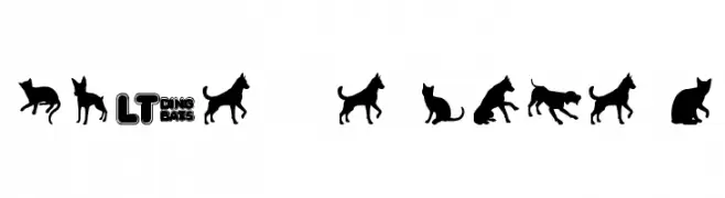
![Cats vs Dogs LT Frei Schriftart Herunterladen]() Herunterladen 395 Downloads@WebFont
Herunterladen 395 Downloads@WebFont -
![Subelair Frei Schriftart Herunterladen]() Herunterladen 395 Downloads@WebFont
Herunterladen 395 Downloads@WebFont -
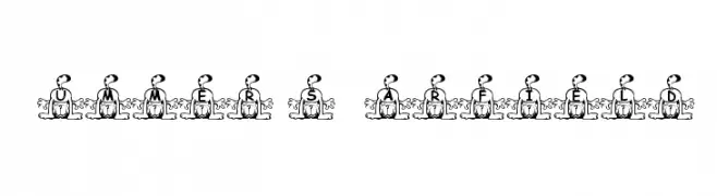
![Summer's Garfield Frei Schriftart Herunterladen]() Herunterladen 395 Downloads@WebFont
Herunterladen 395 Downloads@WebFont -
( Fonts by Benoit Sjoholm - www.benoitsjoholm.com - All my fonts are for sale )
A bold, modern font with rounded, slightly condensed characters and a playful style.
![Kabys Frei Schriftart Herunterladen]() Herunterladen 395 Downloads@WebFont
Herunterladen 395 Downloads@WebFont -
Schriftart von defharo. For commercial use please contact the owner.
![Disoluta-Regular Frei Schriftart Herunterladen]() Herunterladen 395 Downloads@WebFont
Herunterladen 395 Downloads@WebFont -
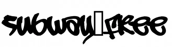
( Fonts by or from www.graffitifonts.net )
A bold, graffiti-inspired font with dynamic strokes and urban flair.
![Subway_Free Frei Schriftart Herunterladen]() Herunterladen 395 Downloads@WebFont
Herunterladen 395 Downloads@WebFont -
( Fonts by Dave Fabik - home.teleport.com/~dfabik/ )
A bold, playful font with a hand-drawn, whimsical style.
![Quainte Frei Schriftart Herunterladen]() Herunterladen 395 Downloads@WebFont
Herunterladen 395 Downloads@WebFont -
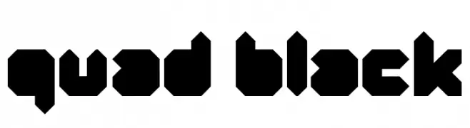
( Fonts by www.Fontfabric.com )
A bold, geometric font with a futuristic and industrial aesthetic.
![Quad-Black Frei Schriftart Herunterladen]() Herunterladen 395 Downloads@WebFont
Herunterladen 395 Downloads@WebFont


Welche Schriften sind gerade am populärsten?
Poppins, Roboto, Montserrat, Open Sans und Lato sind wegen ihrer klaren Formen und breiten Einsetzbarkeit sehr gefragt – von Markenauftritt über Landingpages bis hin zu Postern.
Welche Fonts eignen sich für Logos?
Geometrische Sans‑Serifs (z. B. Poppins, Familien im Gotham‑Stil) sind ein häufiger Griff für sauberes, skalierbares Branding. Für eine persönlichere Note bleiben Scripts und Handschrift‑Stile beliebt. Kombinieren Sie einen prägnanten Headline‑Font mit einer neutralen Brotschrift für Wiedererkennung und Harmonie.
Wie oft wird die Top‑Liste aktualisiert?
Regelmäßig – basierend auf realen Downloads und Interaktionen. Schauen Sie öfter vorbei, um aufstrebende Favoriten früh zu entdecken.
💡 Tipp: Seite bookmarken – Trends wechseln schnell, und heutige Top‑Schriften inspirieren morgen vielleicht das Rebranding.