Willkommen bei den Top‑Schriften – hier treffen Beliebtheit und Qualität aufeinander. Das sind die in diesem Jahr am häufigsten heruntergeladenen und genutzten Fonts. Wenn Sie sichere Optionen für Logo, Web oder Social suchen, starten Sie hier.
Jeder Top‑Font überzeugt durch Balance, Lesbarkeit und Vielseitigkeit. Sie finden moderne Sans‑Serifs, elegante Scripts, Vintage‑Serifs und minimalistische Displays.
-
 Herunterladen 394 Downloads@WebFont
 -
( Chequered Ink - chequered.ink/ )
A bold, geometric font with a futuristic and modern style.
![Fluid Lighter Frei Schriftart Herunterladen]() Herunterladen 394 Downloads@WebFont
Herunterladen 394 Downloads@WebFont -
![sB Cross Frei Schriftart Herunterladen]() Herunterladen 394 Downloads@WebFont
Herunterladen 394 Downloads@WebFont -
( Fonts by Moses BIma Dewantara )
A futuristic, geometric font with thin lines and bold striped patterns.
![Space Regular Frei Schriftart Herunterladen]() Herunterladen 394 Downloads@WebFont
Herunterladen 394 Downloads@WebFont -
( Fonts by Hanken Design Co. - Personal-use only. For commercial use please contact owner. )
A modern, geometric sans-serif font with uniform strokes and clear characters.
![HK Grotesk Regular Frei Schriftart Herunterladen]() Herunterladen 394 Downloads@WebFont
Herunterladen 394 Downloads@WebFont -
( Fonts by Edric Studio - Personal-use only. For commercial use please contact owner. )
A bold, modern sans-serif font with clean lines and excellent readability.
![Airframe Demo Bold Frei Schriftart Herunterladen]() Herunterladen 394 Downloads@WebFont
Herunterladen 394 Downloads@WebFont -
( Fonts by Tokokoo Studio )
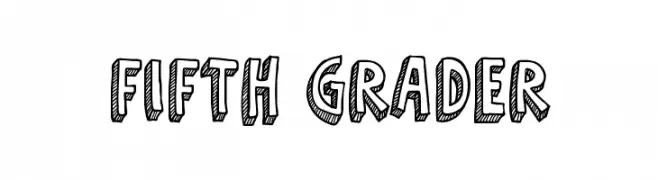
A bold, hand-drawn font with a playful, three-dimensional effect.
![Fifth Grader Frei Schriftart Herunterladen]() Herunterladen 394 Downloads@WebFont
Herunterladen 394 Downloads@WebFont -
( Fonts by Werdi Nur Sholihah )
Hand-drawn botanical icon font with playful leaf and plant illustrations.
![daun Frei Schriftart Herunterladen]() Herunterladen 394 Downloads@WebFont
Herunterladen 394 Downloads@WebFont -
( Fonts by Saridezra - Personal-use only. For commercial use please contact owner. )
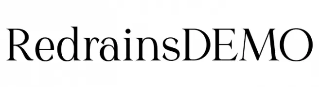
A classic serif font with high contrast and sharp serifs, offering elegance and readability.
![Redrains DEMO Frei Schriftart Herunterladen]() Herunterladen 394 Downloads@WebFont
Herunterladen 394 Downloads@WebFont -
( Fonts by Ira Joyce Alvarez )
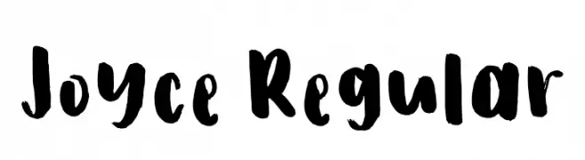
A bold, expressive handwritten font with brush-like strokes and playful forms.
![Joyce Regular Frei Schriftart Herunterladen]() Herunterladen 394 Downloads@WebFont
Herunterladen 394 Downloads@WebFont -
![ALBUMME SMOOTH Frei Schriftart Herunterladen]() Herunterladen 394 Downloads@WebFont
Herunterladen 394 Downloads@WebFont -
![Monsta Frei Schriftart Herunterladen]() Herunterladen 394 Downloads@WebFont
Herunterladen 394 Downloads@WebFont -
( Fonts by a Neale Davidson - www.pixelsagas.com. Personal-use only. For commercial use please contact owner. )
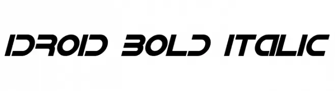
A bold, italicized font with a futuristic and dynamic design.
![IDroid Bold Italic Frei Schriftart Herunterladen]() Herunterladen 394 Downloads@WebFont
Herunterladen 394 Downloads@WebFont -
( Fonts by Manjali Studio - Personal-use only. For commercial use please contact owner. )
A bold, playful script font with flowing, cursive letters.
![Chicken Sandwich Frei Schriftart Herunterladen]() Herunterladen 394 Downloads@WebFont
Herunterladen 394 Downloads@WebFont -
( deFharo - Fernando Haro - defharo.com )
A modern and elegant typeface with a clean, balanced design.
![FlamanteCairoBook Frei Schriftart Herunterladen]() Herunterladen 394 Downloads@WebFont
Herunterladen 394 Downloads@WebFont -
![Amin_Hurgada Outline Frei Schriftart Herunterladen]() Herunterladen 394 Downloads@WebFont
Herunterladen 394 Downloads@WebFont -
( Fonts by Jehoo Creative - Anwar Patihan - Personal-use only. For commercial use please contact owner. )
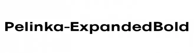
A bold, expanded font with a modern and professional appearance.
![Pelinka-ExpandedBold Frei Schriftart Herunterladen]() Herunterladen 394 Downloads@WebFont
Herunterladen 394 Downloads@WebFont -
![Big Ham Frei Schriftart Herunterladen]() Herunterladen 394 Downloads@WebFont
Herunterladen 394 Downloads@WebFont -
![Jekyll BRK Frei Schriftart Herunterladen]() Herunterladen 394 Downloads@WebFont
Herunterladen 394 Downloads@WebFont -
( Sahirul Iman - creativemarket.com/nami_studio )
A bold, rounded font with a playful and friendly style.
![StarlightPersonal Frei Schriftart Herunterladen]() Herunterladen 394 Downloads@WebFont
Herunterladen 394 Downloads@WebFont -
( Fonts by Cumberland Fontworks - http://www222.pair.com/sjohn/fonts.htm - S. John Ross )
A bold, distressed font with a grunge, weathered appearance.
![Struck Dead Frei Schriftart Herunterladen]() Herunterladen 394 Downloads@WebFont
Herunterladen 394 Downloads@WebFont -
( Fonts by Adien Gunarta - naraaksara.com - Personal-use only. For commercial use please contact owner. )
A hand-drawn, rustic font with playful, uneven strokes.
![Surabanglus Normal Frei Schriftart Herunterladen]() Herunterladen 394 Downloads@WebFont
Herunterladen 394 Downloads@WebFont -
( Fonts by Daniel Zadorozny - www.iconian.com - Free for personal use )
A bold, italic, and futuristic font with sharp angles and high contrast.
![Livewired Expanded Italic Frei Schriftart Herunterladen]() Herunterladen 394 Downloads@WebFont
Herunterladen 394 Downloads@WebFont -
( Fonts by Manfred Klein - manfred-klein.ina-mar.com )
A bold, Gothic-style font with intricate flourishes and a dramatic presence.
![ZenFrax Frei Schriftart Herunterladen]() Herunterladen 394 Downloads@WebFont
Herunterladen 394 Downloads@WebFont -
( Fonts by Apostrophic Lab )
A bold, italicized sans-serif font with a modern and dynamic style.
![Florencesans SC Bold Italic Frei Schriftart Herunterladen]() Herunterladen 394 Downloads@WebFont
Herunterladen 394 Downloads@WebFont -
( Fonts by Belina Studio )
A whimsical font blending serif and script styles for a playful yet elegant look.
![Magic Frei Schriftart Herunterladen]() Herunterladen 394 Downloads@WebFont
Herunterladen 394 Downloads@WebFont -
( Fonts by www.peter-wiegel.de. Personal-use only. For commercial use please contact owner. )
A bold, dynamic font with sharp edges and smooth curves, perfect for dramatic designs.
![FetteMikado Frei Schriftart Herunterladen]() Herunterladen 394 Downloads@WebFont
Herunterladen 394 Downloads@WebFont -
( Fonts by Letterafa Studio )
A playful, handwritten font with rounded, consistent strokes and a casual vibe.
![Playmate Frei Schriftart Herunterladen]() Herunterladen 394 Downloads@WebFont
Herunterladen 394 Downloads@WebFont -
( Fonts by Marco Antonio Ramirez Murga )
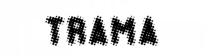
A bold, dot-patterned font with a modern and artistic style.
![TRAMA Frei Schriftart Herunterladen]() Herunterladen 394 Downloads@WebFont
Herunterladen 394 Downloads@WebFont -
( Fonts by Castcraft Software - OPTI Fonts Archive - opti.netii.net - Personal-use only. For commercial use please contact owner. )
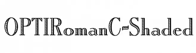
A bold, shaded font with a classic and decorative style.
![OPTIRomanC-Shaded Frei Schriftart Herunterladen]() Herunterladen 394 Downloads@WebFont
Herunterladen 394 Downloads@WebFont -
Schriftart von antipixel. For commercial use please contact the owner.
![NueLight Frei Schriftart Herunterladen]() Herunterladen 394 Downloads@WebFont
Herunterladen 394 Downloads@WebFont -
( Fonts by www.houseoflime.com )
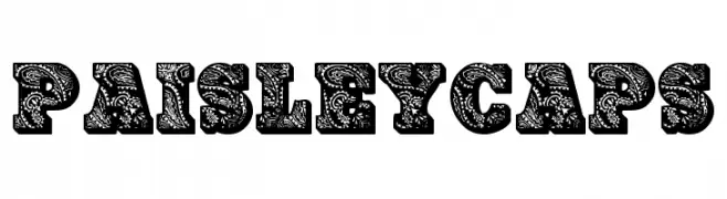
A decorative font with intricate paisley patterns filling each character.
![PaisleyCaps Frei Schriftart Herunterladen]() Herunterladen 394 Downloads@WebFont
Herunterladen 394 Downloads@WebFont -
![DiamondsintheSky Frei Schriftart Herunterladen]() Herunterladen 394 Downloads@WebFont
Herunterladen 394 Downloads@WebFont -
( Fonts by Almarkhatype Studio )
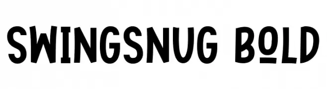
A bold, playful font with a whimsical and energetic style.
![Swingsnug Bold Frei Schriftart Herunterladen]() Herunterladen 394 Downloads@WebFont
Herunterladen 394 Downloads@WebFont -
( Fonts by Jacob Fisher - www.pizzadude.dk )
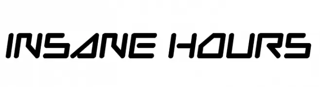
A futuristic, angular font with bold, geometric letterforms.
![Insane Hours Frei Schriftart Herunterladen]() Herunterladen 394 Downloads@WebFont
Herunterladen 394 Downloads@WebFont


Welche Schriften sind gerade am populärsten?
Poppins, Roboto, Montserrat, Open Sans und Lato sind wegen ihrer klaren Formen und breiten Einsetzbarkeit sehr gefragt – von Markenauftritt über Landingpages bis hin zu Postern.
Welche Fonts eignen sich für Logos?
Geometrische Sans‑Serifs (z. B. Poppins, Familien im Gotham‑Stil) sind ein häufiger Griff für sauberes, skalierbares Branding. Für eine persönlichere Note bleiben Scripts und Handschrift‑Stile beliebt. Kombinieren Sie einen prägnanten Headline‑Font mit einer neutralen Brotschrift für Wiedererkennung und Harmonie.
Wie oft wird die Top‑Liste aktualisiert?
Regelmäßig – basierend auf realen Downloads und Interaktionen. Schauen Sie öfter vorbei, um aufstrebende Favoriten früh zu entdecken.
💡 Tipp: Seite bookmarken – Trends wechseln schnell, und heutige Top‑Schriften inspirieren morgen vielleicht das Rebranding.