Willkommen bei den Top‑Schriften – hier treffen Beliebtheit und Qualität aufeinander. Das sind die in diesem Jahr am häufigsten heruntergeladenen und genutzten Fonts. Wenn Sie sichere Optionen für Logo, Web oder Social suchen, starten Sie hier.
Jeder Top‑Font überzeugt durch Balance, Lesbarkeit und Vielseitigkeit. Sie finden moderne Sans‑Serifs, elegante Scripts, Vintage‑Serifs und minimalistische Displays.
-
( Fonts by BNF Type Foundry / Dogu Kaya - bnftype.com - Personal-use only. For commercial use please contact owner. )
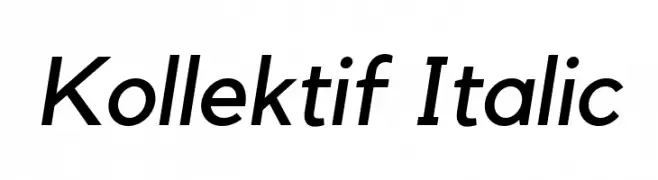
A modern, italic sans-serif font with clean lines and a versatile style.
 Herunterladen 390 Downloads@WebFont
 -
( Fonts by Hanoded )
A playful, handwritten font with a casual and friendly style.
![CrowdPleaserDEMO-Regular Frei Schriftart Herunterladen]() Herunterladen 390 Downloads@WebFont
Herunterladen 390 Downloads@WebFont -
( Font by Mark Burrough - www.teamscope.com.au Sponsoren Schriftart )
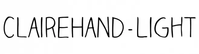
A playful, casual handwritten font with smooth lines and consistent stroke width.
![ClaireHand-Light Frei Schriftart Herunterladen]() Herunterladen 390 Downloads
Herunterladen 390 Downloads -
( Fonts by Vladimir Nikolic - www.creativefabrica.com/designer/vladimirnikolic/ - Personal-use only. For commercial use please contact owner. )
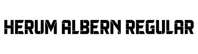
A bold, geometric font with a futuristic and angular design.
![Herum Albern Regular Frei Schriftart Herunterladen]() Herunterladen 390 Downloads@WebFont
Herunterladen 390 Downloads@WebFont -
( Fonts by Paul Lloyd )
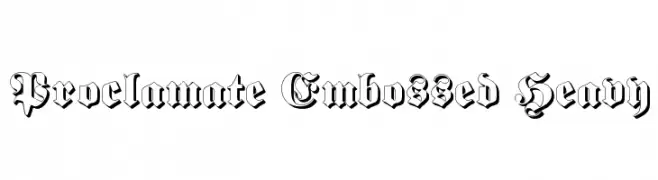
A bold, embossed blackletter-style font with intricate details.
![Proclamate Embossed Heavy Frei Schriftart Herunterladen]() Herunterladen 390 Downloads@WebFont
Herunterladen 390 Downloads@WebFont -
( Fonts by Kelvin Ma - letterpunch.blogspot.com - Personal-use only. For commercial use please contact owner. )
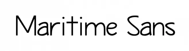
A clean, modern sans-serif font with a geometric structure and balanced appearance.
![Maritime Sans Frei Schriftart Herunterladen]() Herunterladen 390 Downloads@WebFont
Herunterladen 390 Downloads@WebFont -
![RachelaBold Frei Schriftart Herunterladen]() Herunterladen 390 Downloads@WebFont
Herunterladen 390 Downloads@WebFont -
( Vlad Viperov )
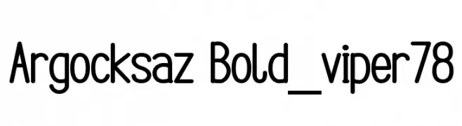
A playful, rounded font with consistent stroke width and smooth curves.
![Argocksaz Bold_viper78 Frei Schriftart Herunterladen]() Herunterladen 390 Downloads@WebFont
Herunterladen 390 Downloads@WebFont -
( Fonts by Vincenzo Vuono - Personal-use only. For commercial use please contact owner. )
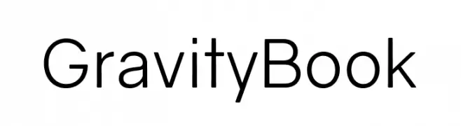
A modern sans-serif font with geometric shapes and uniform strokes.
![Gravity Book Frei Schriftart Herunterladen]() Herunterladen 390 Downloads@WebFont
Herunterladen 390 Downloads@WebFont -
( Fonts by Pablo Impallari, Andres Torresi, & Cristiano Sobral - Personal-use only. For commercial use please contact owner. )
A bold, modern sans-serif font with clean lines and strong presence.
![Plata Sans ExtraBold Frei Schriftart Herunterladen]() Herunterladen 390 Downloads@WebFont
Herunterladen 390 Downloads@WebFont -
( Fonts by weknow - Wino S Kadir )
A futuristic, geometric font with rounded edges and cut-out sections.
![silverbend Frei Schriftart Herunterladen]() Herunterladen 390 Downloads@WebFont
Herunterladen 390 Downloads@WebFont -
![capital fun Frei Schriftart Herunterladen]() Herunterladen 390 Downloads@WebFont
Herunterladen 390 Downloads@WebFont -
( Peter Olexa - www.dealjumbo.com )
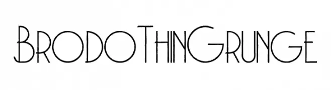
A thin, grunge-style font with a textured, vintage appearance.
![Brodo Thin Grunge Frei Schriftart Herunterladen]() Herunterladen 390 Downloads@WebFont
Herunterladen 390 Downloads@WebFont -
( Fonts by ShyFonts )
A bold, geometric font with a futuristic, outlined design.
![SF Chromium 24 SC Bold Frei Schriftart Herunterladen]() Herunterladen 390 Downloads@WebFont
Herunterladen 390 Downloads@WebFont -
( Fonts by Bride & Groom www.brideandgroomdirect.co.uk )
A playful, whimsical handwritten font with tall, narrow letters and a casual style.
![Laura-Alternate Frei Schriftart Herunterladen]() Herunterladen 390 Downloads@WebFont
Herunterladen 390 Downloads@WebFont -
( Fonts by Moses BIma Dewantara )
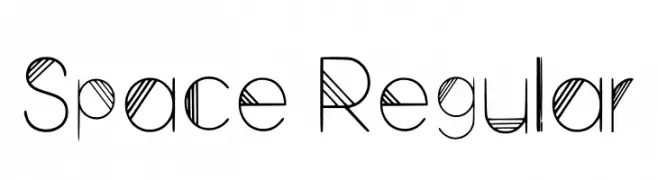
A futuristic, geometric font with thin lines and bold striped patterns.
![Space Regular Frei Schriftart Herunterladen]() Herunterladen 390 Downloads@WebFont
Herunterladen 390 Downloads@WebFont -
![smart Frei Schriftart Herunterladen]() Herunterladen 390 Downloads@WebFont
Herunterladen 390 Downloads@WebFont -
![TSISQUILISDA Frei Schriftart Herunterladen]() Herunterladen 390 Downloads@WebFont
Herunterladen 390 Downloads@WebFont -
( Personal-use only. For commercial use please contact owner. )
A bold, modern font with a geometric and condensed style.
![Bizmeud Frei Schriftart Herunterladen]() Herunterladen 390 Downloads@WebFont
Herunterladen 390 Downloads@WebFont -
![Ceasar Frei Schriftart Herunterladen]() Herunterladen 390 Downloads@WebFont
Herunterladen 390 Downloads@WebFont -
( Fonts by Dibujado )
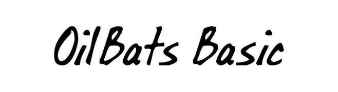
A bold, handwritten font with a playful and dynamic style.
![OilBats Basic Frei Schriftart Herunterladen]() Herunterladen 390 Downloads@WebFont
Herunterladen 390 Downloads@WebFont -
( Fonts by Kong Font )
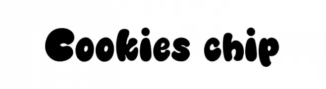
A playful, bold font with rounded, bubbly characters ideal for fun and whimsical designs.
![Cookies chip Frei Schriftart Herunterladen]() Herunterladen 390 Downloads@WebFont
Herunterladen 390 Downloads@WebFont -
( Copyright (c) 2012-2015, The Mozilla Foundation and Telefonica S.A. )
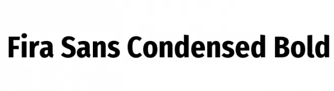
A bold, condensed sans-serif font with a modern and clean design.
![Fira Sans Condensed Bold Frei Schriftart Herunterladen]() Herunterladen 390 Downloads@WebFont
Herunterladen 390 Downloads@WebFont -
![Ekster Techno Frei Schriftart Herunterladen]() Herunterladen 390 Downloads@WebFont
Herunterladen 390 Downloads@WebFont -
( Fonts by www.waltervelezart.com )
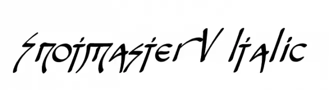
An expressive, italic font with sharp, angular strokes and dynamic flair.
![Snotmaster V Italic Frei Schriftart Herunterladen]() Herunterladen 390 Downloads@WebFont
Herunterladen 390 Downloads@WebFont -
( Fonts by Khaled Aldousari )
Ornate floral decorative font with detailed botanical elements.
![fotograami-flower Frei Schriftart Herunterladen]() Herunterladen 390 Downloads@WebFont
Herunterladen 390 Downloads@WebFont -
( Fonts by Cumberland Fontworks - http://www222.pair.com/sjohn/fonts.htm - S. John Ross )
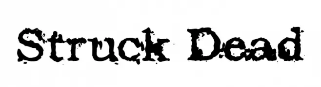
A bold, distressed font with a grunge, weathered appearance.
![Struck Dead Frei Schriftart Herunterladen]() Herunterladen 390 Downloads@WebFont
Herunterladen 390 Downloads@WebFont -
( Fonts by Matthew Welch - www.squaregear.net/fonts/ )
A pixelated, retro-style font with a blocky, digital appearance.
![Tiny Regular Frei Schriftart Herunterladen]() Herunterladen 390 Downloads@WebFont
Herunterladen 390 Downloads@WebFont -
( Fonts by a Neale Davidson - www.pixelsagas.com. Personal-use only. For commercial use please contact owner. )
A modern, condensed italic font with a sleek and dynamic style.
![Imaki Condensed Italic Frei Schriftart Herunterladen]() Herunterladen 390 Downloads@WebFont
Herunterladen 390 Downloads@WebFont -
( Fonts by Belina Studio )
A whimsical font blending serif and script styles for a playful yet elegant look.
![Magic Frei Schriftart Herunterladen]() Herunterladen 390 Downloads@WebFont
Herunterladen 390 Downloads@WebFont -
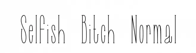
![Selfish Bitch Normal Frei Schriftart Herunterladen]() Herunterladen 390 Downloads@WebFont
Herunterladen 390 Downloads@WebFont -
( Fonts by www.peter-wiegel.de. Personal-use only. For commercial use please contact owner. )
A bold, dynamic font with sharp edges and smooth curves, perfect for dramatic designs.
![FetteMikado Frei Schriftart Herunterladen]() Herunterladen 390 Downloads@WebFont
Herunterladen 390 Downloads@WebFont -
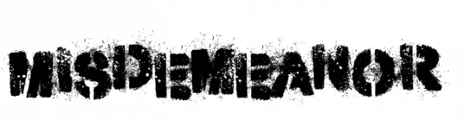
( Fonts by Kevin Christopher - www.kcfonts.com. Personal-use only. For commercial use please contact owner. )
A bold, distressed font with a spray-painted, urban aesthetic.
![Misdemeanor Frei Schriftart Herunterladen]() Herunterladen 390 Downloads@WebFont
Herunterladen 390 Downloads@WebFont -
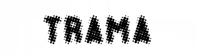
( Fonts by Marco Antonio Ramirez Murga )
A bold, dot-patterned font with a modern and artistic style.
![TRAMA Frei Schriftart Herunterladen]() Herunterladen 390 Downloads@WebFont
Herunterladen 390 Downloads@WebFont -
( Fonts by Woodcutter )
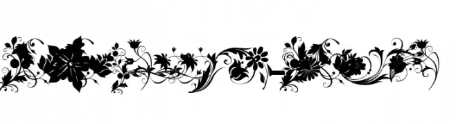
Playful, bold garden icon set with clear silhouettes.
![Garden Icons Frei Schriftart Herunterladen]() Herunterladen 390 Downloads@WebFont
Herunterladen 390 Downloads@WebFont


Welche Schriften sind gerade am populärsten?
Poppins, Roboto, Montserrat, Open Sans und Lato sind wegen ihrer klaren Formen und breiten Einsetzbarkeit sehr gefragt – von Markenauftritt über Landingpages bis hin zu Postern.
Welche Fonts eignen sich für Logos?
Geometrische Sans‑Serifs (z. B. Poppins, Familien im Gotham‑Stil) sind ein häufiger Griff für sauberes, skalierbares Branding. Für eine persönlichere Note bleiben Scripts und Handschrift‑Stile beliebt. Kombinieren Sie einen prägnanten Headline‑Font mit einer neutralen Brotschrift für Wiedererkennung und Harmonie.
Wie oft wird die Top‑Liste aktualisiert?
Regelmäßig – basierend auf realen Downloads und Interaktionen. Schauen Sie öfter vorbei, um aufstrebende Favoriten früh zu entdecken.
💡 Tipp: Seite bookmarken – Trends wechseln schnell, und heutige Top‑Schriften inspirieren morgen vielleicht das Rebranding.