Willkommen bei den Top‑Schriften – hier treffen Beliebtheit und Qualität aufeinander. Das sind die in diesem Jahr am häufigsten heruntergeladenen und genutzten Fonts. Wenn Sie sichere Optionen für Logo, Web oder Social suchen, starten Sie hier.
Jeder Top‑Font überzeugt durch Balance, Lesbarkeit und Vielseitigkeit. Sie finden moderne Sans‑Serifs, elegante Scripts, Vintage‑Serifs und minimalistische Displays.
-
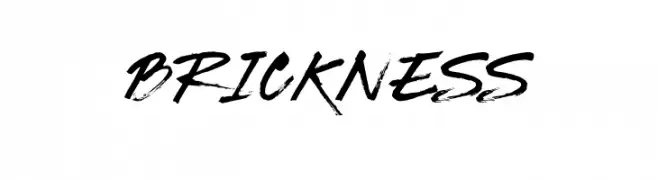
( Fonts by www.selawetype.com - Personal-use only. FOR DONATION https://www.paypal.me/selawe . For commercial use please contact owner. )
A dynamic, brush-style font with bold, expressive strokes.
 Herunterladen 392 Downloads@WebFont
 -
![Alianna Frei Schriftart Herunterladen]() Herunterladen 392 Downloads@WebFont
Herunterladen 392 Downloads@WebFont -
![Dwarf Runes 2 Frei Schriftart Herunterladen]() Herunterladen 392 Downloads
Herunterladen 392 Downloads -
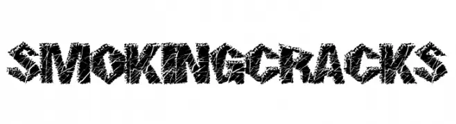
( Fonts by a Max Infeld - XEROGRAPHER FONTS - xerographer.blogspot.com . Personal-use only. For commercial use please contact owner. )
A bold, cracked texture font with an edgy, distressed style.
![SmokingCracks Frei Schriftart Herunterladen]() Herunterladen 392 Downloads@WebFont
Herunterladen 392 Downloads@WebFont -
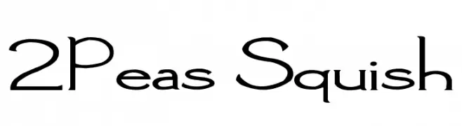
( Fonts by www.twopeasinabucket.com )
A playful and whimsical font with unique curves and angles.
![2Peas Squish Frei Schriftart Herunterladen]() Herunterladen 392 Downloads@WebFont
Herunterladen 392 Downloads@WebFont -
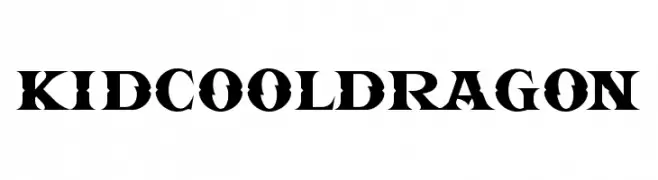
( Kidcool - creativemarket.com/kidcool_studio )
A bold, high-contrast serif font with sharp, angular serifs and a modern twist.
![KIDCOOL DRAGON Frei Schriftart Herunterladen]() Herunterladen 392 Downloads@WebFont
Herunterladen 392 Downloads@WebFont -
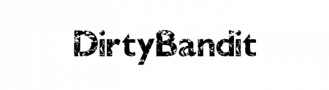
( Fonts by a Max Infeld - XEROGRAPHER FONTS - xerographer.blogspot.com . Personal-use only. For commercial use please contact owner. )
A bold, distressed font with a gritty, worn texture.
![DirtyBandit Frei Schriftart Herunterladen]() Herunterladen 392 Downloads@WebFont
Herunterladen 392 Downloads@WebFont -
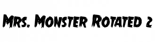
( Fonts by Daniel Zadorozny - www.iconian.com - Free for personal use )
A bold, textured font with a hand-painted, dynamic style.
![Mrs. Monster Rotated 2 Frei Schriftart Herunterladen]() Herunterladen 392 Downloads@WebFont
Herunterladen 392 Downloads@WebFont -
![Schizophrenia 2 Frei Schriftart Herunterladen]() Herunterladen 392 Downloads@WebFont
Herunterladen 392 Downloads@WebFont -
( Fonts by www.26plus-zeichen.de )
A modern sans-serif font with geometric shapes and uniform strokes.
![superficialbook Frei Schriftart Herunterladen]() Herunterladen 392 Downloads@WebFont
Herunterladen 392 Downloads@WebFont -
( Fonts by Misti`s Fonts - mistifonts.com - Personal-use only. For commercial use please contact owner. )
A playful, handwritten font with a casual and friendly style.
![SummerinDecember Frei Schriftart Herunterladen]() Herunterladen 392 Downloads@WebFont
Herunterladen 392 Downloads@WebFont -
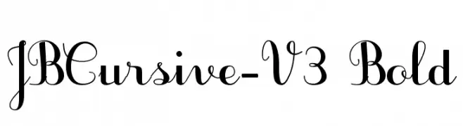
( JBFoundry - Jean Boyault - jean.boyault.pagesperso-orange.fr/ )
An elegant, bold cursive font with flowing, interconnected letters and decorative swirls.
![JBCursive-V3 Bold Frei Schriftart Herunterladen]() Herunterladen 392 Downloads@WebFont
Herunterladen 392 Downloads@WebFont -
( Free for a personal use. For a commercial use please visit www.kevinandamanda.com )
A playful, handwritten font with a casual and informal style.
![Pea Heidi Jo Messy Frei Schriftart Herunterladen]() Herunterladen 391 Downloads@WebFont
Herunterladen 391 Downloads@WebFont -
( Fonts by David Kerkhoff - www.hanodedphotography.com )
A playful, hand-drawn font with bold, irregular strokes and a whimsical style.
![Single Malta Frei Schriftart Herunterladen]() Herunterladen 391 Downloads@WebFont
Herunterladen 391 Downloads@WebFont -
( Free for a personal use. For a commercial use please visit www.kevinandamanda.com )
A playful, handwritten font with a casual and dynamic style.
![Pea Faith Frei Schriftart Herunterladen]() Herunterladen 391 Downloads@WebFont
Herunterladen 391 Downloads@WebFont -
![BM figaro A11 Frei Schriftart Herunterladen]() Herunterladen 391 Downloads@WebFont
Herunterladen 391 Downloads@WebFont -
( Fonts by Burhanul Jauhar Arifin )
A whimsical and decorative font with intricate curls and swirls.
![Adara-Regular Frei Schriftart Herunterladen]() Herunterladen 391 Downloads@WebFont
Herunterladen 391 Downloads@WebFont -
( Fonts by Aliv Pandu )
A playful and whimsical script font with elegant curves and fluid strokes.
![Sandat Frei Schriftart Herunterladen]() Herunterladen 391 Downloads@WebFont
Herunterladen 391 Downloads@WebFont -
![EASY TROUBLE Frei Schriftart Herunterladen]() Herunterladen 391 Downloads@WebFont
Herunterladen 391 Downloads@WebFont -
( Fonts by Pennyzine - www.thedevilinjasonramirez.com - Free for personal use )
A bold, distressed font with a grunge, weathered appearance.
![Elliot's Bad Day 4 Frei Schriftart Herunterladen]() Herunterladen 391 Downloads@WebFont
Herunterladen 391 Downloads@WebFont -
( Fonts by Fontfabric - Svetoslav Simov - Personal-use only. For commercial use please contact owner. )
A modern, narrow sans-serif font with a clean and professional look.
![Panton Narrow-Trial Regular Frei Schriftart Herunterladen]() Herunterladen 391 Downloads@WebFont
Herunterladen 391 Downloads@WebFont -
![BulletMix2 Frei Schriftart Herunterladen]() Herunterladen 391 Downloads@WebFont
Herunterladen 391 Downloads@WebFont -
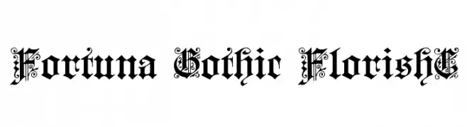
( Fonts by www.gliphmaker.com. Personal-use only. For commercial use please contact owner. )
An ornate Gothic script with intricate flourishes and bold characters.
![Fortuna Gothic FlorishC Frei Schriftart Herunterladen]() Herunterladen 391 Downloads@WebFont
Herunterladen 391 Downloads@WebFont -
( Fonts by Roland Huse - rolandhuse.com )
A thin, elegant serif font with tall, slender characters and subtle serifs.
![poor weekdays serif Frei Schriftart Herunterladen]() Herunterladen 391 Downloads@WebFont
Herunterladen 391 Downloads@WebFont -
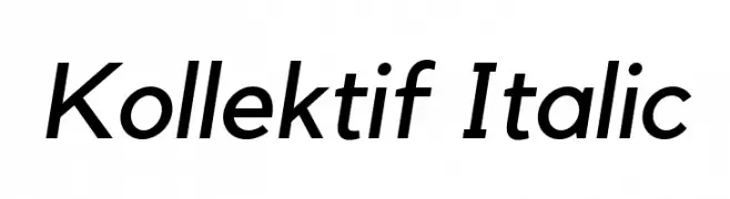
( Fonts by BNF Type Foundry / Dogu Kaya - bnftype.com - Personal-use only. For commercial use please contact owner. )
A modern, italic sans-serif font with clean lines and a versatile style.
![Kollektif Italic Frei Schriftart Herunterladen]() Herunterladen 391 Downloads@WebFont
Herunterladen 391 Downloads@WebFont -
( Fonts by www.fontpanda.com. Personal-use only. For commercial use please contact owner. )
A playful, casual handwritten font with dynamic strokes.
![Elmo Frei Schriftart Herunterladen]() Herunterladen 391 Downloads@WebFont
Herunterladen 391 Downloads@WebFont -
( new.myfonts.com/foundry/Intellecta_Design/?refby=paulow )
An ornate, baroque-style decorative font with intricate frames around bold serif letters.
![Barocque Capitals Frei Schriftart Herunterladen]() Herunterladen 391 Downloads@WebFont
Herunterladen 391 Downloads@WebFont -
![Late Nite Frei Schriftart Herunterladen]() Herunterladen 391 Downloads@WebFont
Herunterladen 391 Downloads@WebFont -
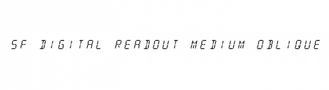
![SF Digital Readout Medium Oblique Frei Schriftart Herunterladen]() Herunterladen 391 Downloads@WebFont
Herunterladen 391 Downloads@WebFont -
( Fonts by Steve Ferrera )
A playful, bold, and whimsical font with hand-drawn, irregular strokes.
![Kringle Castle Frei Schriftart Herunterladen]() Herunterladen 391 Downloads@WebFont
Herunterladen 391 Downloads@WebFont -
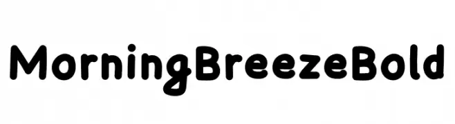
( Fonts by Szymon Furjan - Personal-use only. For commercial use please contact owner. )
A bold, playful font with rounded edges and a friendly appearance.
![Morning Breeze Bold Frei Schriftart Herunterladen]() Herunterladen 391 Downloads@WebFont
Herunterladen 391 Downloads@WebFont -
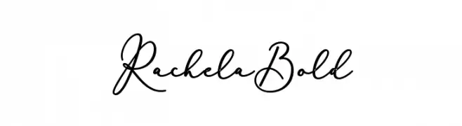
![RachelaBold Frei Schriftart Herunterladen]() Herunterladen 391 Downloads@WebFont
Herunterladen 391 Downloads@WebFont -
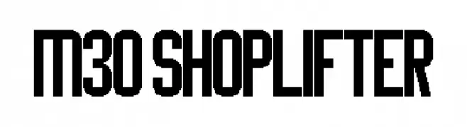
( Fonts by Miffies - mfs.jp.org - Personal-use only. For commercial use please contact owner. )
A bold, geometric font with a modern and assertive style.
![M30_SHOPLIFTER Frei Schriftart Herunterladen]() Herunterladen 391 Downloads@WebFont
Herunterladen 391 Downloads@WebFont -
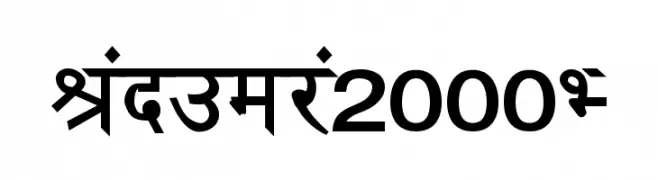
![Janmeja2000H Frei Schriftart Herunterladen]() Herunterladen 391 Downloads@WebFont
Herunterladen 391 Downloads@WebFont -
( Fonts by HENRIavecunK - Henrik - Personal-use only. For commercial use please contact owner. )
A bold, stencil-style font with high contrast and tight spacing.
![OmbudsmanStencil Frei Schriftart Herunterladen]() Herunterladen 391 Downloads@WebFont
Herunterladen 391 Downloads@WebFont


Welche Schriften sind gerade am populärsten?
Poppins, Roboto, Montserrat, Open Sans und Lato sind wegen ihrer klaren Formen und breiten Einsetzbarkeit sehr gefragt – von Markenauftritt über Landingpages bis hin zu Postern.
Welche Fonts eignen sich für Logos?
Geometrische Sans‑Serifs (z. B. Poppins, Familien im Gotham‑Stil) sind ein häufiger Griff für sauberes, skalierbares Branding. Für eine persönlichere Note bleiben Scripts und Handschrift‑Stile beliebt. Kombinieren Sie einen prägnanten Headline‑Font mit einer neutralen Brotschrift für Wiedererkennung und Harmonie.
Wie oft wird die Top‑Liste aktualisiert?
Regelmäßig – basierend auf realen Downloads und Interaktionen. Schauen Sie öfter vorbei, um aufstrebende Favoriten früh zu entdecken.
💡 Tipp: Seite bookmarken – Trends wechseln schnell, und heutige Top‑Schriften inspirieren morgen vielleicht das Rebranding.