Willkommen bei den Top‑Schriften – hier treffen Beliebtheit und Qualität aufeinander. Das sind die in diesem Jahr am häufigsten heruntergeladenen und genutzten Fonts. Wenn Sie sichere Optionen für Logo, Web oder Social suchen, starten Sie hier.
Jeder Top‑Font überzeugt durch Balance, Lesbarkeit und Vielseitigkeit. Sie finden moderne Sans‑Serifs, elegante Scripts, Vintage‑Serifs und minimalistische Displays.
-
( Fonts by a Neale Davidson - www.pixelsagas.com. Personal-use only. For commercial use please contact owner. )
A bold, geometric font with a modern, industrial style.
 Herunterladen 392 Downloads@WebFont
 -
( Copyright © 2017 IBM Corp. with Reserved Font Name "Plex" )
A refined serif font with a light weight and italic style, perfect for elegant designs.
![IBM Plex Serif Light Italic Frei Schriftart Herunterladen]() Herunterladen 392 Downloads@WebFont
Herunterladen 392 Downloads@WebFont -
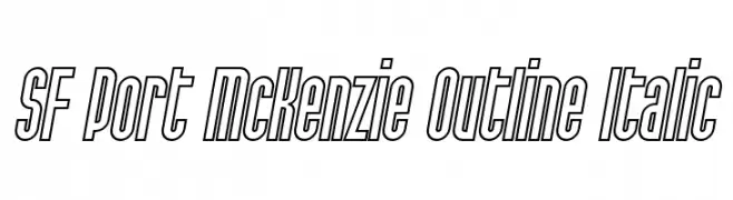
( Fonts by ShyFonts )
A bold, outlined, italic font with a modern and dynamic style.
![SF Port McKenzie Outline Italic Frei Schriftart Herunterladen]() Herunterladen 392 Downloads@WebFont
Herunterladen 392 Downloads@WebFont -
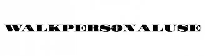
( Fonts by Billy Argel )
A bold, distressed font with a vintage, rugged appearance.
![WALK Personal Use Frei Schriftart Herunterladen]() Herunterladen 392 Downloads@WebFont
Herunterladen 392 Downloads@WebFont -
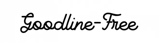
( Ingga Nafasyah - telllu.com )
A smooth, flowing script font with elegant, connected characters.
![Goodline-Free Frei Schriftart Herunterladen]() Herunterladen 392 Downloads@WebFont
Herunterladen 392 Downloads@WebFont -
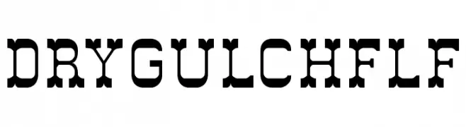
( Fonts by Casady & Greene )
A bold, slab serif font with a vintage Western aesthetic.
![DryGulchFLF Frei Schriftart Herunterladen]() Herunterladen 392 Downloads@WebFont
Herunterladen 392 Downloads@WebFont -
( Fonts by Arkandis Digital Foundry )
A bold and italicized modern font with a sleek, professional look.
![SwitzeraADF-BoldItalic Frei Schriftart Herunterladen]() Herunterladen 392 Downloads@WebFont
Herunterladen 392 Downloads@WebFont -
( Fonts by Bluestype Studio - Jefri Dwi Alfatah - Personal-use only. For commercial use please contact owner. )
A playful, hand-drawn font with rounded, bold letters and a whimsical style.
![Sweet Candy Frei Schriftart Herunterladen]() Herunterladen 392 Downloads@WebFont
Herunterladen 392 Downloads@WebFont -
![PixelPirate Frei Schriftart Herunterladen]() Herunterladen 392 Downloads@WebFont
Herunterladen 392 Downloads@WebFont -
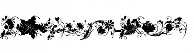
( Fonts by Khaled Aldousari )
Ornate floral decorative font with detailed botanical elements.
![fotograami-flower Frei Schriftart Herunterladen]() Herunterladen 392 Downloads@WebFont
Herunterladen 392 Downloads@WebFont -
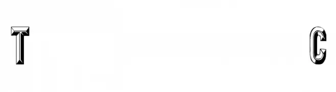
( Fonts by David Rakowski )
A bold, three-dimensional font with a vintage, geometric style.
![Tejaratchi Cn Frei Schriftart Herunterladen]() Herunterladen 392 Downloads@WebFont
Herunterladen 392 Downloads@WebFont -
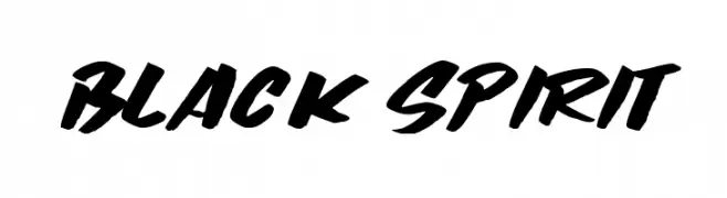
( Fonts by Lettersiro Studio )
A bold, brush-style font with dynamic and energetic strokes.
![Black Spirit Frei Schriftart Herunterladen]() Herunterladen 392 Downloads@WebFont
Herunterladen 392 Downloads@WebFont -
( Fonts by Dieter Steffmann )
A bold, three-dimensional serif font with a vintage, embossed style.
![Waterloo Relief Frei Schriftart Herunterladen]() Herunterladen 392 Downloads@WebFont
Herunterladen 392 Downloads@WebFont -
![Brain-scan Frei Schriftart Herunterladen]() Herunterladen 392 Downloads@WebFont
Herunterladen 392 Downloads@WebFont -
![Daville Condensed Slanted Frei Schriftart Herunterladen]() Herunterladen 392 Downloads@WebFont
Herunterladen 392 Downloads@WebFont -
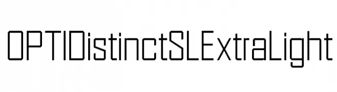
( Fonts by Castcraft Software - opti.netii.net - check the website before use )
A geometric, modern font with thin strokes and a clean, technical appearance.
![OPTIDistinctSLExtraLight Frei Schriftart Herunterladen]() Herunterladen 392 Downloads@WebFont
Herunterladen 392 Downloads@WebFont -
![Every Truetype is a Wisefont 3.0 Frei Schriftart Herunterladen]() Herunterladen 392 Downloads@WebFont
Herunterladen 392 Downloads@WebFont -
![Colourbars Frei Schriftart Herunterladen]() Herunterladen 392 Downloads@WebFont
Herunterladen 392 Downloads@WebFont -
( Fonts by EssentialsStudio - Personal-use only. For commercial use please contact owner. )
A playful, handwritten font with dynamic strokes and a whimsical style.
![Bencoleng Frei Schriftart Herunterladen]() Herunterladen 392 Downloads@WebFont
Herunterladen 392 Downloads@WebFont -
( Fonts by Typographer Mediengestaltung - Personal-use only. For commercial use please contact owner. )
An ornate Blackletter font with intricate, historical letterforms.
![Kabinett-Fraktur Mager Frei Schriftart Herunterladen]() Herunterladen 392 Downloads@WebFont
Herunterladen 392 Downloads@WebFont -
( Fonts by www.selawetype.com - Personal-use only. FOR DONATION https://www.paypal.me/selawe . For commercial use please contact owner. )
A dynamic, brush-style font with bold, expressive strokes.
![BRICKNESS Frei Schriftart Herunterladen]() Herunterladen 392 Downloads@WebFont
Herunterladen 392 Downloads@WebFont -
![Alianna Frei Schriftart Herunterladen]() Herunterladen 392 Downloads@WebFont
Herunterladen 392 Downloads@WebFont -
( Typodermic Fonts - Ray Larabie - www.typodermicfonts.com/ )
A modern sans-serif font with clean lines and excellent readability.
![MesmerizeScBk-Regular Frei Schriftart Herunterladen]() Herunterladen 392 Downloads@WebFont
Herunterladen 392 Downloads@WebFont -
![Dwarf Runes 2 Frei Schriftart Herunterladen]() Herunterladen 392 Downloads
Herunterladen 392 Downloads -
( Fonts by www.gliphmaker.com. Personal-use only. For commercial use please contact owner. )
A decorative blackletter-style font with intricate flourishes and medium contrast.
![Carmen Frei Schriftart Herunterladen]() Herunterladen 392 Downloads@WebFont
Herunterladen 392 Downloads@WebFont -
![Wicked Jumps Frei Schriftart Herunterladen]() Herunterladen 392 Downloads@WebFont
Herunterladen 392 Downloads@WebFont -
( Fonts by Wino S Kadir - weknow - www.revolge.com/shop/weknow/ - Personal-use only. For commercial use please contact owner. )
A modern, geometric font with circular and symmetrical letterforms.
![gembira Frei Schriftart Herunterladen]() Herunterladen 392 Downloads@WebFont
Herunterladen 392 Downloads@WebFont -
( Fonts by Weape Studio )
A tall, narrow, and modern font with a playful and stylish design.
![MissQueen Frei Schriftart Herunterladen]() Herunterladen 392 Downloads@WebFont
Herunterladen 392 Downloads@WebFont -
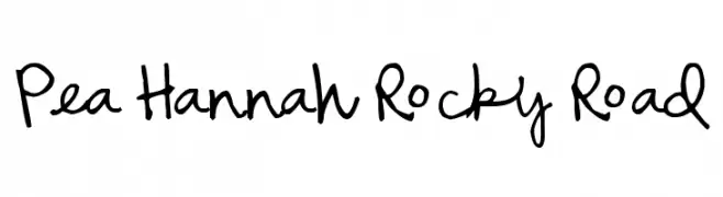
( Free for a personal use. For a commercial use please visit www.kevinandamanda.com )
A playful, casual handwritten font with a loose, flowing style.
![Pea Hannah Rocky Road Frei Schriftart Herunterladen]() Herunterladen 392 Downloads@WebFont
Herunterladen 392 Downloads@WebFont -
![13now Frei Schriftart Herunterladen]() Herunterladen 392 Downloads@WebFont
Herunterladen 392 Downloads@WebFont -
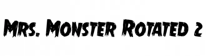
( Fonts by Daniel Zadorozny - www.iconian.com - Free for personal use )
A bold, textured font with a hand-painted, dynamic style.
![Mrs. Monster Rotated 2 Frei Schriftart Herunterladen]() Herunterladen 392 Downloads@WebFont
Herunterladen 392 Downloads@WebFont -
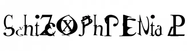
![Schizophrenia 2 Frei Schriftart Herunterladen]() Herunterladen 392 Downloads@WebFont
Herunterladen 392 Downloads@WebFont -
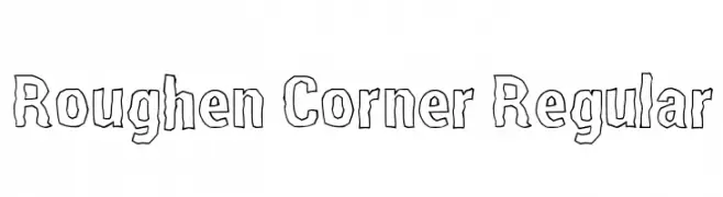
![Roughen Corner Regular Frei Schriftart Herunterladen]() Herunterladen 392 Downloads@WebFont
Herunterladen 392 Downloads@WebFont -
( Fonts by Misti`s Fonts - mistifonts.com - Personal-use only. For commercial use please contact owner. )
A playful, handwritten font with a casual and friendly style.
![SummerinDecember Frei Schriftart Herunterladen]() Herunterladen 392 Downloads@WebFont
Herunterladen 392 Downloads@WebFont -
( Barri Lubis - www.behance.net/barrilubisa8bb )
A bold, cursive font with interconnected letters and a dynamic flow.
![Mattilda Frei Schriftart Herunterladen]() Herunterladen 391 Downloads@WebFont
Herunterladen 391 Downloads@WebFont


Welche Schriften sind gerade am populärsten?
Poppins, Roboto, Montserrat, Open Sans und Lato sind wegen ihrer klaren Formen und breiten Einsetzbarkeit sehr gefragt – von Markenauftritt über Landingpages bis hin zu Postern.
Welche Fonts eignen sich für Logos?
Geometrische Sans‑Serifs (z. B. Poppins, Familien im Gotham‑Stil) sind ein häufiger Griff für sauberes, skalierbares Branding. Für eine persönlichere Note bleiben Scripts und Handschrift‑Stile beliebt. Kombinieren Sie einen prägnanten Headline‑Font mit einer neutralen Brotschrift für Wiedererkennung und Harmonie.
Wie oft wird die Top‑Liste aktualisiert?
Regelmäßig – basierend auf realen Downloads und Interaktionen. Schauen Sie öfter vorbei, um aufstrebende Favoriten früh zu entdecken.
💡 Tipp: Seite bookmarken – Trends wechseln schnell, und heutige Top‑Schriften inspirieren morgen vielleicht das Rebranding.