Willkommen bei den Top‑Schriften – hier treffen Beliebtheit und Qualität aufeinander. Das sind die in diesem Jahr am häufigsten heruntergeladenen und genutzten Fonts. Wenn Sie sichere Optionen für Logo, Web oder Social suchen, starten Sie hier.
Jeder Top‑Font überzeugt durch Balance, Lesbarkeit und Vielseitigkeit. Sie finden moderne Sans‑Serifs, elegante Scripts, Vintage‑Serifs und minimalistische Displays.
-
( Font by Mark Burrough - www.teamscope.com.au Sponsoren Schriftart )
A playful, casual handwritten font with smooth lines and consistent stroke width.
 Herunterladen 390 Downloads
 -
![bad bold college Regular Frei Schriftart Herunterladen]() Herunterladen 390 Downloads@WebFont
Herunterladen 390 Downloads@WebFont -
( Fonts by www.tepidmonkey.net )
A bold, geometric font with a modern and impactful design.
![Locked Window Frei Schriftart Herunterladen]() Herunterladen 390 Downloads@WebFont
Herunterladen 390 Downloads@WebFont -
![Ooo la la Frei Schriftart Herunterladen]() Herunterladen 390 Downloads@WebFont
Herunterladen 390 Downloads@WebFont -
![Yippee!!! Frei Schriftart Herunterladen]() Herunterladen 390 Downloads
Herunterladen 390 Downloads -
( Fonts by Nick Curtis - www.nicksfonts.com )
A bold, geometric font with angular, block-like characters.
![Indochine NF Frei Schriftart Herunterladen]() Herunterladen 390 Downloads@WebFont
Herunterladen 390 Downloads@WebFont -
( Fonts by Fred Cre )
A playful, bold handwritten font with dynamic strokes.
![ONEFINGER_CRE Frei Schriftart Herunterladen]() Herunterladen 390 Downloads@WebFont
Herunterladen 390 Downloads@WebFont -
( Fonts by David Espinosa [Type Sailor] - www.facebook.com/typesailor - Personal-use only. For commercial use please contact owner. )
An elegant serif font with a blend of classic and modern elements.
![Olimpia Frei Schriftart Herunterladen]() Herunterladen 390 Downloads@WebFont
Herunterladen 390 Downloads@WebFont -
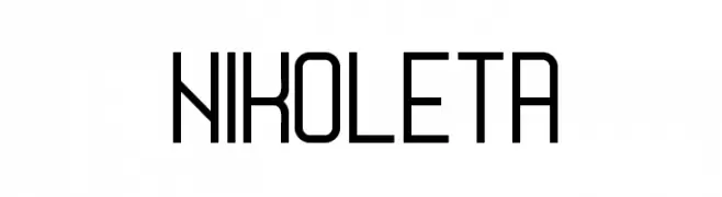
( Boris Garic )
A modern, geometric font with clean lines and uniform stroke width.
![Nikoleta Frei Schriftart Herunterladen]() Herunterladen 390 Downloads@WebFont
Herunterladen 390 Downloads@WebFont -
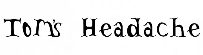
( Fonts by Divide By Zero! - fonts.tom7.com )
A quirky, hand-drawn font with irregular, jagged edges and playful character design.
![Tom's Headache Frei Schriftart Herunterladen]() Herunterladen 390 Downloads@WebFont
Herunterladen 390 Downloads@WebFont -
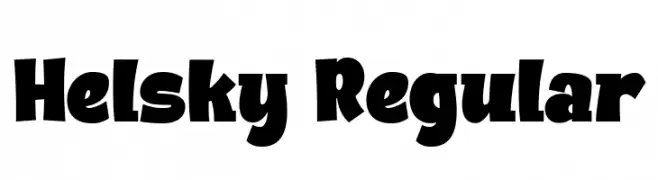
( Fonts by Bangkit Tri Setiadi )
A bold, playful font with exaggerated curves and thick strokes.
![Helsky Regular Frei Schriftart Herunterladen]() Herunterladen 390 Downloads@WebFont
Herunterladen 390 Downloads@WebFont -
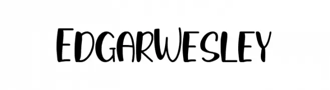
( Fonts by StringLabs )
A playful, bold font with rounded strokes and a modern, friendly style.
![Edgar Wesley Frei Schriftart Herunterladen]() Herunterladen 390 Downloads@WebFont
Herunterladen 390 Downloads@WebFont -
( Fonts by Andrew McCluskey - nalgames.com. Personal-use only. For commercial use please contact owner. )
A bold, angular font with a futuristic and edgy design.
![Vermin Vibes Corrupto Frei Schriftart Herunterladen]() Herunterladen 390 Downloads@WebFont
Herunterladen 390 Downloads@WebFont -
( Fonts by Kreative Korporation - www.kreativekorp.com )
A bold, playful font with quirky, irregular characters.
![Sorority Frei Schriftart Herunterladen]() Herunterladen 390 Downloads@WebFont
Herunterladen 390 Downloads@WebFont -
( Fonts by www.blambot.com )
A bold, hand-painted style font with dynamic, expressive characters.
![Full Bleed BB Frei Schriftart Herunterladen]() Herunterladen 390 Downloads@WebFont
Herunterladen 390 Downloads@WebFont -
![Technocrat Frei Schriftart Herunterladen]() Herunterladen 390 Downloads@WebFont
Herunterladen 390 Downloads@WebFont -
![Sensitivity Frei Schriftart Herunterladen]() Herunterladen 390 Downloads@WebFont
Herunterladen 390 Downloads@WebFont -
( Fonts by Nick Curtis - www.nicksfonts.com )
A bold, geometric font with playful and strong lines.
![Sid The Kid NF Frei Schriftart Herunterladen]() Herunterladen 390 Downloads@WebFont
Herunterladen 390 Downloads@WebFont -
![Handwriting Mehmood Frei Schriftart Herunterladen]() Herunterladen 390 Downloads@WebFont
Herunterladen 390 Downloads@WebFont -
( Fonts by Andrew Hart - dirt2.com )
An ornate and dramatic font with intricate swirls and high contrast.
![Justice by Dirt2 Frei Schriftart Herunterladen]() Herunterladen 390 Downloads@WebFont
Herunterladen 390 Downloads@WebFont -
( Fonts by Font People - Personal-use only. For commercial use please contact owner. )
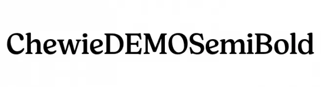
A classic serif font with semi-bold weight and moderate contrast, ideal for elegant and readable text.
![Chewie DEMO SemiBold Frei Schriftart Herunterladen]() Herunterladen 390 Downloads@WebFont
Herunterladen 390 Downloads@WebFont -
( Fonts by Kimberly Geswein - kimberlygeswein.com )
A playful, casual cursive font with a smooth, handwritten style.
![Cedarville Pnkfun1 Cursive Frei Schriftart Herunterladen]() Herunterladen 390 Downloads@WebFont
Herunterladen 390 Downloads@WebFont -
( Fonts by Colorful Typhoon - http://orange.s56.xrea.com/blog/ )
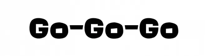
A bold, playful font with chunky, rounded characters.
![Go-Go-Go Frei Schriftart Herunterladen]() Herunterladen 390 Downloads@WebFont
Herunterladen 390 Downloads@WebFont -
( Fonts by Bree Gorton )
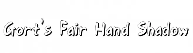
A bold, hand-drawn font with a playful shadow effect.
![Gort's Fair Hand Shadow Frei Schriftart Herunterladen]() Herunterladen 390 Downloads@WebFont
Herunterladen 390 Downloads@WebFont -
![Orion Esperanto Kursiva Frei Schriftart Herunterladen]() Herunterladen 390 Downloads
Herunterladen 390 Downloads -
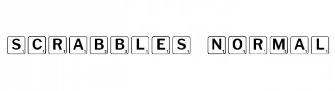
( Fonts by Rob HIndley )
A playful font resembling Scrabble tiles with bold letters and numbers in square borders.
![Scrabbles normal Frei Schriftart Herunterladen]() Herunterladen 390 Downloads@WebFont
Herunterladen 390 Downloads@WebFont -
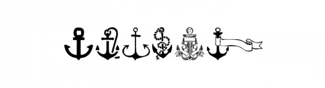
( Fonts by www.woodcutter.es - woodcutter Manero - Personal-use only. For commercial use please contact owner. )
A bold, playful font with a nautical theme and rounded, flowing characters.
![Anchor Frei Schriftart Herunterladen]() Herunterladen 390 Downloads@WebFont
Herunterladen 390 Downloads@WebFont -
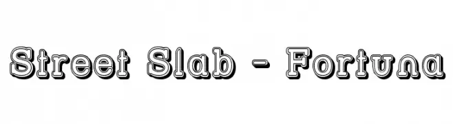
( Fonts by Apostrophic Lab )
A bold, 3D slab serif font with a shadow effect for impactful designs.
![Street Slab - Fortuna Frei Schriftart Herunterladen]() Herunterladen 390 Downloads@WebFont
Herunterladen 390 Downloads@WebFont -
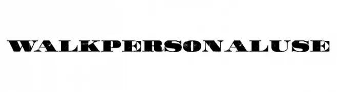
( Fonts by Billy Argel )
A bold, distressed font with a vintage, rugged appearance.
![WALK Personal Use Frei Schriftart Herunterladen]() Herunterladen 390 Downloads@WebFont
Herunterladen 390 Downloads@WebFont -
( Fonts by ShyFonts )
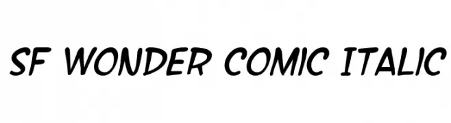
A playful, comic-style italic font with bold, rounded characters.
![SF Wonder Comic Italic Frei Schriftart Herunterladen]() Herunterladen 390 Downloads@WebFont
Herunterladen 390 Downloads@WebFont -
( Fonts by ShyFonts )
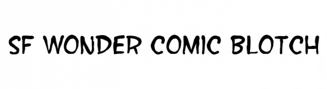
A playful, hand-drawn style font with bold, irregular strokes perfect for comic or casual designs.
![SF Wonder Comic Blotch Frei Schriftart Herunterladen]() Herunterladen 390 Downloads@WebFont
Herunterladen 390 Downloads@WebFont -
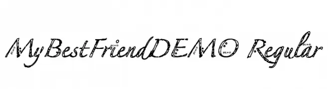
![MyBestFriendDEMO Regular Frei Schriftart Herunterladen]() Herunterladen 390 Downloads@WebFont
Herunterladen 390 Downloads@WebFont -
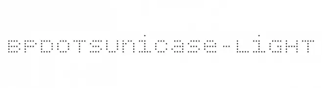
( Fonts by backpacker.gr )
A modern dotted font with a digital, tech-inspired aesthetic.
![BPdotsUnicase-Light Frei Schriftart Herunterladen]() Herunterladen 390 Downloads@WebFont
Herunterladen 390 Downloads@WebFont -
( Fonts by 7NTypes )
A dynamic, italicized script font with a fluid, handwritten style.
![Reprineato Italic Frei Schriftart Herunterladen]() Herunterladen 390 Downloads@WebFont
Herunterladen 390 Downloads@WebFont -
( Fonts by Latinotype )
A bold, playful font with rounded strokes and a friendly appearance.
![Chela One Frei Schriftart Herunterladen]() Herunterladen 390 Downloads@WebFont
Herunterladen 390 Downloads@WebFont


Welche Schriften sind gerade am populärsten?
Poppins, Roboto, Montserrat, Open Sans und Lato sind wegen ihrer klaren Formen und breiten Einsetzbarkeit sehr gefragt – von Markenauftritt über Landingpages bis hin zu Postern.
Welche Fonts eignen sich für Logos?
Geometrische Sans‑Serifs (z. B. Poppins, Familien im Gotham‑Stil) sind ein häufiger Griff für sauberes, skalierbares Branding. Für eine persönlichere Note bleiben Scripts und Handschrift‑Stile beliebt. Kombinieren Sie einen prägnanten Headline‑Font mit einer neutralen Brotschrift für Wiedererkennung und Harmonie.
Wie oft wird die Top‑Liste aktualisiert?
Regelmäßig – basierend auf realen Downloads und Interaktionen. Schauen Sie öfter vorbei, um aufstrebende Favoriten früh zu entdecken.
💡 Tipp: Seite bookmarken – Trends wechseln schnell, und heutige Top‑Schriften inspirieren morgen vielleicht das Rebranding.