Willkommen bei den Top‑Schriften – hier treffen Beliebtheit und Qualität aufeinander. Das sind die in diesem Jahr am häufigsten heruntergeladenen und genutzten Fonts. Wenn Sie sichere Optionen für Logo, Web oder Social suchen, starten Sie hier.
Jeder Top‑Font überzeugt durch Balance, Lesbarkeit und Vielseitigkeit. Sie finden moderne Sans‑Serifs, elegante Scripts, Vintage‑Serifs und minimalistische Displays.
-
( Fonts by Jonathan S. Harris - www.tattoowoo.com. Personal-use only. For commercial use please contact owner. )
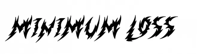
A bold, jagged font with sharp, angular edges and a fierce, aggressive style.
 Herunterladen 386 Downloads@WebFont
 -
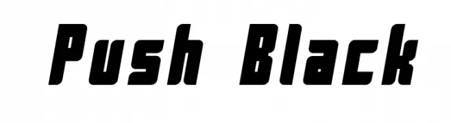
![Push Black Frei Schriftart Herunterladen]() Herunterladen 386 Downloads@WebFont
Herunterladen 386 Downloads@WebFont -
( Fonts by Daniel Zadorozny - www.iconian.com )
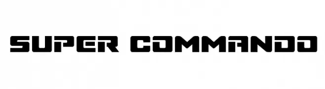
A bold, geometric font with a futuristic and industrial style.
![Super Commando Frei Schriftart Herunterladen]() Herunterladen 386 Downloads@WebFont
Herunterladen 386 Downloads@WebFont -
![SCREAM IN PAIN Frei Schriftart Herunterladen]() Herunterladen 386 Downloads@WebFont
Herunterladen 386 Downloads@WebFont -
( Fonts by Chequered Ink )
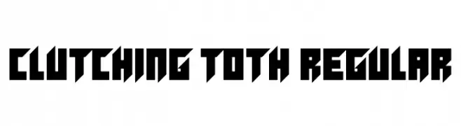
A bold, angular font with sharp geometric shapes.
![Clutching Toth Regular Frei Schriftart Herunterladen]() Herunterladen 386 Downloads@WebFont
Herunterladen 386 Downloads@WebFont -
![ElectricLiquorGoggles Frei Schriftart Herunterladen]() Herunterladen 386 Downloads@WebFont
Herunterladen 386 Downloads@WebFont -
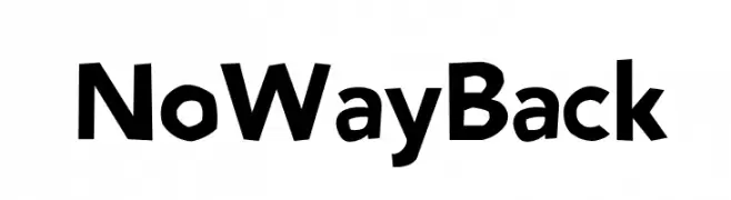
( Maxime Tolbecq - www.mplusm.be )
A bold, modern font with a playful and slightly condensed style.
![NoWayBack Frei Schriftart Herunterladen]() Herunterladen 386 Downloads@WebFont
Herunterladen 386 Downloads@WebFont -
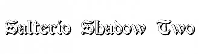
![Salterio Shadow Two Frei Schriftart Herunterladen]() Herunterladen 386 Downloads@WebFont
Herunterladen 386 Downloads@WebFont -
![Twenty12 Frei Schriftart Herunterladen]() Herunterladen 386 Downloads@WebFont
Herunterladen 386 Downloads@WebFont -
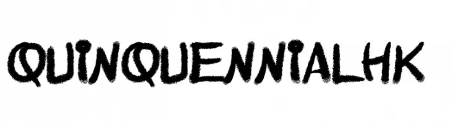
( Fonts by Poemhaiku - Huong Le Thi Thu - www.behance.net/poemhaiku )
A bold, textured handwritten font with a playful and dynamic style.
![QuinquennialHK Frei Schriftart Herunterladen]() Herunterladen 386 Downloads@WebFont
Herunterladen 386 Downloads@WebFont -
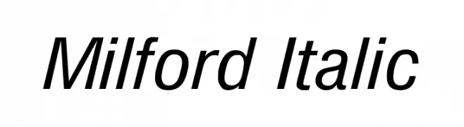
![Milford Italic Frei Schriftart Herunterladen]() Herunterladen 386 Downloads@WebFont
Herunterladen 386 Downloads@WebFont -
( Fonts by Bangkit Tri Setiadi )
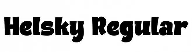
A bold, playful font with exaggerated curves and thick strokes.
![Helsky Regular Frei Schriftart Herunterladen]() Herunterladen 386 Downloads@WebFont
Herunterladen 386 Downloads@WebFont -
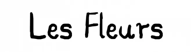
![Les Fleurs Frei Schriftart Herunterladen]() Herunterladen 386 Downloads@WebFont
Herunterladen 386 Downloads@WebFont -
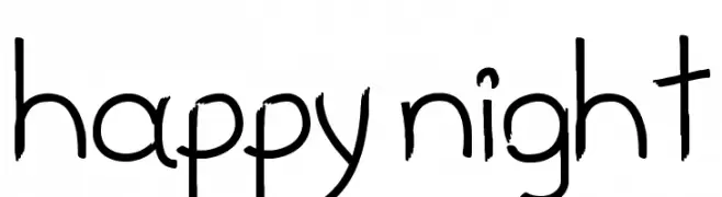
![happy night Frei Schriftart Herunterladen]() Herunterladen 386 Downloads@WebFont
Herunterladen 386 Downloads@WebFont -
( Fonts by Subectype )
A bold, playful font with rounded strokes and whimsical curves.
![Rezdone Frei Schriftart Herunterladen]() Herunterladen 386 Downloads@WebFont
Herunterladen 386 Downloads@WebFont -
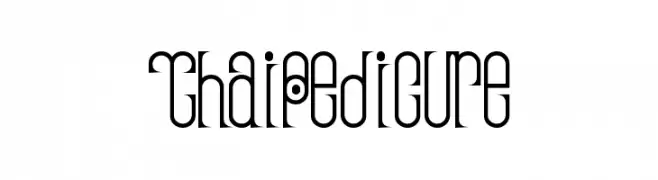
( Fonts by Daniel Gauthier )
A decorative font with elongated, narrow letterforms and circular motifs.
![ThaiPedicure Frei Schriftart Herunterladen]() Herunterladen 386 Downloads@WebFont
Herunterladen 386 Downloads@WebFont -
( Fonts by Daniel Zadorozny - www.iconian.com - Free for personal use )
A bold, jagged font with a rugged, primal appearance.
![Cro-Magnum Jagged Frei Schriftart Herunterladen]() Herunterladen 386 Downloads@WebFont
Herunterladen 386 Downloads@WebFont -
( Fonts by Benoit Sjoholm - www.benoitsjoholm.com - All my fonts are for sale )
A playful, rounded font with consistent stroke width and a modern-retro vibe.
![Kanis Frei Schriftart Herunterladen]() Herunterladen 386 Downloads@WebFont
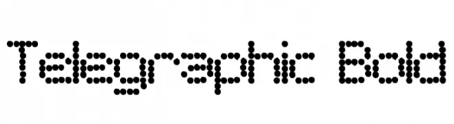
Herunterladen 386 Downloads@WebFont -
![Telegraphic Bold Frei Schriftart Herunterladen]() Herunterladen 386 Downloads@WebFont
Herunterladen 386 Downloads@WebFont -
( Fonts by Jayde Garrow - GarrowGlitch - http://jaydegarrow.wix.com/jaydefonts. Personal-use only. For commercial use please contact owner. )
A bold, geometric font with a modern and playful style, perfect for eye-catching designs.
![American DAD! Frei Schriftart Herunterladen]() Herunterladen 386 Downloads@WebFont
Herunterladen 386 Downloads@WebFont -
( Fonts by Dieter Steffmann )
A bold, decorative font with a three-dimensional contour effect.
![Roland Contour Frei Schriftart Herunterladen]() Herunterladen 386 Downloads@WebFont
Herunterladen 386 Downloads@WebFont -
( Fonts by Manfred Klein. Free for private and charity use. Free for commercial with donation to organizations )
A bold, playful font with a hand-drawn, rounded style.
![Blackredis Frei Schriftart Herunterladen]() Herunterladen 386 Downloads@WebFont
Herunterladen 386 Downloads@WebFont -
![Sensitivity Frei Schriftart Herunterladen]() Herunterladen 386 Downloads@WebFont
Herunterladen 386 Downloads@WebFont -
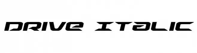
( Fonts by Daniel Zadorozny - www.iconian.com )
A bold, italic, and futuristic font with sharp, angular characters.
![Drive Italic Frei Schriftart Herunterladen]() Herunterladen 386 Downloads@WebFont
Herunterladen 386 Downloads@WebFont -
( Fonts by Tharique Azeez - Personal-use only. For commercial use please contact owner. )
A modern, clean sans-serif font with uniform stroke width and excellent readability.
![Pavanam Frei Schriftart Herunterladen]() Herunterladen 386 Downloads@WebFont
Herunterladen 386 Downloads@WebFont -
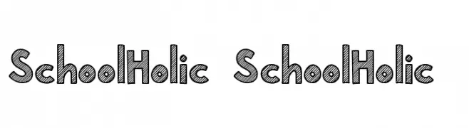
( Fonts by Subectype & Orenari )
A bold, sketch-like font with a playful, hand-drawn appearance.
![School Holic 2 School Holic 2 Frei Schriftart Herunterladen]() Herunterladen 386 Downloads@WebFont
Herunterladen 386 Downloads@WebFont -
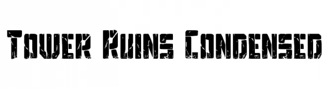
( Fonts by Daniel Zadorozny - www.iconian.com - Free for personal use )
A bold, distressed, and condensed font with an industrial, rugged appearance.
![Tower Ruins Condensed Frei Schriftart Herunterladen]() Herunterladen 386 Downloads@WebFont
Herunterladen 386 Downloads@WebFont -
( Haksen Letters - Sarwo Edhi Prayitno )
A playful and elegant script font with flowing, interconnected letters.
![Sweet Girls - Frei Schriftart Herunterladen]() Herunterladen 386 Downloads@WebFont
Herunterladen 386 Downloads@WebFont -
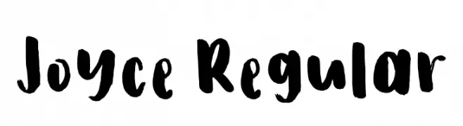
( Fonts by Ira Joyce Alvarez )
A bold, expressive handwritten font with brush-like strokes and playful forms.
![Joyce Regular Frei Schriftart Herunterladen]() Herunterladen 386 Downloads@WebFont
Herunterladen 386 Downloads@WebFont -
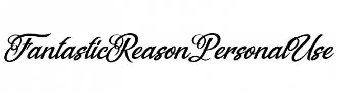
( Fonts by Billy Argel Fonts - www.billyargel.com - Personal-use only. For commercial use please contact owner. )
An elegant and ornate script font with flowing, decorative letterforms.
![Fantastic Reason Personal Use Frei Schriftart Herunterladen]() Herunterladen 386 Downloads@WebFont
Herunterladen 386 Downloads@WebFont -
( Fonts by backpacker.gr )
A modern, dotted font with a playful and bold appearance.
![BPdotsUnicase-Bold Frei Schriftart Herunterladen]() Herunterladen 386 Downloads@WebFont
Herunterladen 386 Downloads@WebFont -
![Orion Esperanto Kursiva Frei Schriftart Herunterladen]() Herunterladen 386 Downloads
Herunterladen 386 Downloads -
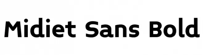
( Fonts by YOFonts - Yasuhiro Yamaoka - yoworks.com - Personal-use only. For commercial use please contact owner. )
A bold, modern sans-serif font with clean lines and excellent legibility.
![Midiet Sans Bold Frei Schriftart Herunterladen]() Herunterladen 386 Downloads@WebFont
Herunterladen 386 Downloads@WebFont -
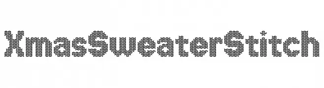
( Fonts by www.chequered.ink - Chequered Ink - Personal-use only. For commercial use please contact owner. )
A playful, knitted sweater-style font with a festive, textured appearance.
![Xmas Sweater Stitch Frei Schriftart Herunterladen]() Herunterladen 386 Downloads@WebFont
Herunterladen 386 Downloads@WebFont -
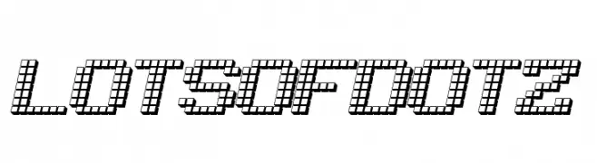
( Fonts by Jacob Fisher - www.pizzadude.dk )
A pixelated, dot-based font with a modern, tech-inspired style.
![LotsOfDotz Frei Schriftart Herunterladen]() Herunterladen 386 Downloads@WebFont
Herunterladen 386 Downloads@WebFont


Welche Schriften sind gerade am populärsten?
Poppins, Roboto, Montserrat, Open Sans und Lato sind wegen ihrer klaren Formen und breiten Einsetzbarkeit sehr gefragt – von Markenauftritt über Landingpages bis hin zu Postern.
Welche Fonts eignen sich für Logos?
Geometrische Sans‑Serifs (z. B. Poppins, Familien im Gotham‑Stil) sind ein häufiger Griff für sauberes, skalierbares Branding. Für eine persönlichere Note bleiben Scripts und Handschrift‑Stile beliebt. Kombinieren Sie einen prägnanten Headline‑Font mit einer neutralen Brotschrift für Wiedererkennung und Harmonie.
Wie oft wird die Top‑Liste aktualisiert?
Regelmäßig – basierend auf realen Downloads und Interaktionen. Schauen Sie öfter vorbei, um aufstrebende Favoriten früh zu entdecken.
💡 Tipp: Seite bookmarken – Trends wechseln schnell, und heutige Top‑Schriften inspirieren morgen vielleicht das Rebranding.