Willkommen bei den Top‑Schriften – hier treffen Beliebtheit und Qualität aufeinander. Das sind die in diesem Jahr am häufigsten heruntergeladenen und genutzten Fonts. Wenn Sie sichere Optionen für Logo, Web oder Social suchen, starten Sie hier.
Jeder Top‑Font überzeugt durch Balance, Lesbarkeit und Vielseitigkeit. Sie finden moderne Sans‑Serifs, elegante Scripts, Vintage‑Serifs und minimalistische Displays.
-
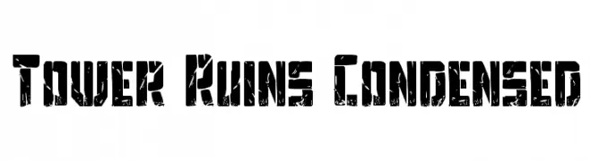
( Fonts by Daniel Zadorozny - www.iconian.com - Free for personal use )
A bold, distressed, and condensed font with an industrial, rugged appearance.
 Herunterladen 387 Downloads@WebFont
 -
( Haksen Letters - Sarwo Edhi Prayitno )
A playful and elegant script font with flowing, interconnected letters.
![Sweet Girls - Frei Schriftart Herunterladen]() Herunterladen 387 Downloads@WebFont
Herunterladen 387 Downloads@WebFont -
( Fonts by backpacker.gr )
A modern, dotted font with a playful and bold appearance.
![BPdotsUnicase-Bold Frei Schriftart Herunterladen]() Herunterladen 387 Downloads@WebFont
Herunterladen 387 Downloads@WebFont -
( Fonts by a Neale Davidson - www.pixelsagas.com. Personal-use only. For commercial use please contact owner. )
A bold, geometric font with a modern, industrial style.
![Red World Frei Schriftart Herunterladen]() Herunterladen 387 Downloads@WebFont
Herunterladen 387 Downloads@WebFont -
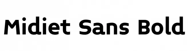
( Fonts by YOFonts - Yasuhiro Yamaoka - yoworks.com - Personal-use only. For commercial use please contact owner. )
A bold, modern sans-serif font with clean lines and excellent legibility.
![Midiet Sans Bold Frei Schriftart Herunterladen]() Herunterladen 387 Downloads@WebFont
Herunterladen 387 Downloads@WebFont -
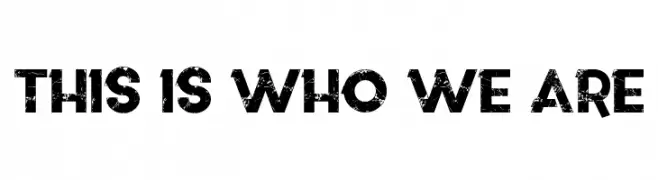
( Fonts by LJ Design Studios )
A bold, distressed font with a vintage, textured appearance.
![This is who we are Frei Schriftart Herunterladen]() Herunterladen 387 Downloads@WebFont
Herunterladen 387 Downloads@WebFont -
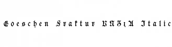
( Fonts by Peter Wiegel - www.peter-wiegel.de )
An ornate Blackletter font with intricate details and an italic style.
![Goeschen Fraktur UNZ1A Italic Frei Schriftart Herunterladen]() Herunterladen 387 Downloads@WebFont
Herunterladen 387 Downloads@WebFont -
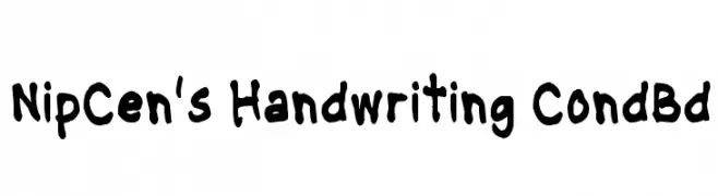
( Font by Jayvee D. Enaguas - grandchaos9000.deviantart.com )
A bold, playful handwritten font with rounded strokes and an informal style.
![NipCen's Handwriting CondBd Frei Schriftart Herunterladen]() Herunterladen 387 Downloads@WebFont
Herunterladen 387 Downloads@WebFont -
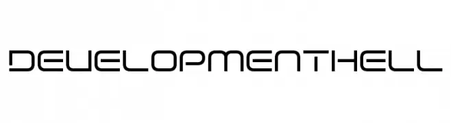
( Fonts by www.chequered.ink - Chequered Ink - Personal-use only. For commercial use please contact owner. )
A modern, geometric font with a sleek and minimalistic design.
![Development Hell Frei Schriftart Herunterladen]() Herunterladen 387 Downloads@WebFont
Herunterladen 387 Downloads@WebFont -
( Chequered Ink - chequered.ink/ )
A bold, angular font with a futuristic and dynamic style.
![Short Xurkit Tilt Frei Schriftart Herunterladen]() Herunterladen 387 Downloads@WebFont
Herunterladen 387 Downloads@WebFont -
( Fonts by Google )
A bold, condensed, and italic sans-serif typeface with high contrast and tight spacing.
![Noto Sans Condensed Black Italic Frei Schriftart Herunterladen]() Herunterladen 387 Downloads@WebFont
Herunterladen 387 Downloads@WebFont -
( Fonts by Darrell Flood )
A bold, calligraphic font inspired by traditional Asian ink styles.
![Archaic Asian Inks Frei Schriftart Herunterladen]() Herunterladen 387 Downloads@WebFont
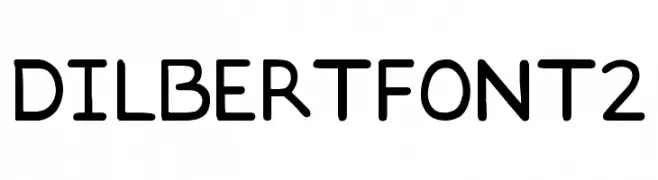
Herunterladen 387 Downloads@WebFont -
![DILBERTFONT2 Frei Schriftart Herunterladen]() Herunterladen 387 Downloads@WebFont
Herunterladen 387 Downloads@WebFont -
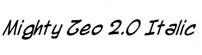
( Fonts by www.blambot.com )
A dynamic, italic script font with fluid strokes and a playful vibe.
![Mighty Zeo 2.0 Italic Frei Schriftart Herunterladen]() Herunterladen 387 Downloads@WebFont
Herunterladen 387 Downloads@WebFont -
( imagex - www.imagex-fonts.com )
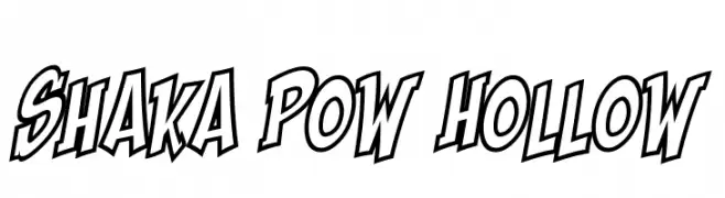
A bold, outlined font with a dynamic, comic-like style.
![Shaka Pow Hollow Frei Schriftart Herunterladen]() Herunterladen 387 Downloads@WebFont
Herunterladen 387 Downloads@WebFont -
( Fonts by Muhammad Sirojuddin - lettersiro.com - Personal-use only. For commercial use please contact owner. )
A flowing, cursive script font with elegant, handwritten characteristics.
![Reileigh Frei Schriftart Herunterladen]() Herunterladen 387 Downloads@WebFont
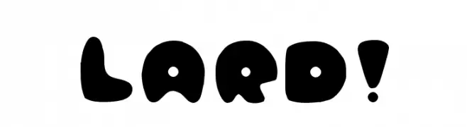
Herunterladen 387 Downloads@WebFont -
![Lard! Frei Schriftart Herunterladen]() Herunterladen 387 Downloads@WebFont
Herunterladen 387 Downloads@WebFont -
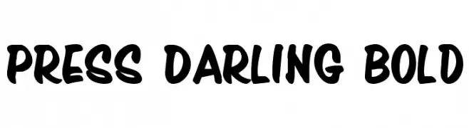
( Fonts by Daniel Zadorozny - www.iconian.com - Free for personal use )
A bold, playful font with rounded strokes and a dynamic slant.
![Press Darling Bold Frei Schriftart Herunterladen]() Herunterladen 387 Downloads@WebFont
Herunterladen 387 Downloads@WebFont -
( Fonts by Pizzadude )
A bold, rounded font with a playful and friendly style.
![Sunshine Formula DEMO Regular Frei Schriftart Herunterladen]() Herunterladen 387 Downloads@WebFont
Herunterladen 387 Downloads@WebFont -
( Fonts by Nick Curtis - www.nicksfonts.com )
A playful, bold outline font with a shadow effect for a 3D look.
![Toyland-OutlineA Frei Schriftart Herunterladen]() Herunterladen 387 Downloads
Herunterladen 387 Downloads -
( Fonts by Dieter Steffmann )
A bold, three-dimensional serif font with a vintage, embossed style.
![Waterloo Relief Frei Schriftart Herunterladen]() Herunterladen 387 Downloads@WebFont
Herunterladen 387 Downloads@WebFont -
( Fonts by Kreative Korporation - www.kreativekorp.com - personal use only )
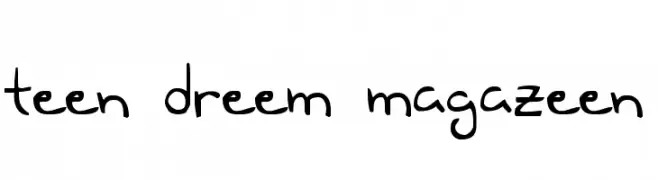
A playful, handwritten font with a whimsical and casual style.
![Teen Dreem Magazeen Frei Schriftart Herunterladen]() Herunterladen 387 Downloads@WebFont
Herunterladen 387 Downloads@WebFont -
( Fonts by Daniel Zadorozny - www.iconian.com - Free for personal use )
A bold, geometric font with a modern and futuristic style.
![U.S.S. Dallas Bold Frei Schriftart Herunterladen]() Herunterladen 387 Downloads@WebFont
Herunterladen 387 Downloads@WebFont -
( Fonts by Karsten Lampe )
A playful, casual handwritten font with smooth, rounded edges.
![Netsrak Frei Schriftart Herunterladen]() Herunterladen 387 Downloads@WebFont
Herunterladen 387 Downloads@WebFont -
( Fonts by Tursun Sultan - Personal-use only. For commercial use please contact owner. )
A bold serif typeface with strong, authoritative strokes and sharp serifs.
![UKIJ Tuz Basma Bold Frei Schriftart Herunterladen]() Herunterladen 387 Downloads@WebFont
Herunterladen 387 Downloads@WebFont -
( Fonts by Good Java Studio - www.creativefabrica.com/designer/goodjavastudio/ref/236564 - Personal-use only. For commercial use please contact owner. )
A bold, playful script font with a handwritten, energetic style.
![IceValley Frei Schriftart Herunterladen]() Herunterladen 387 Downloads@WebFont
Herunterladen 387 Downloads@WebFont -
( Fonts by Maelle.K - Thomas Boucherie )
A playful, artistic script font with flowing, interconnected letters and whimsical swirls.
![Slow Motion Frei Schriftart Herunterladen]() Herunterladen 387 Downloads@WebFont
Herunterladen 387 Downloads@WebFont -
( Fonts by EssentialsStudio - Personal-use only. For commercial use please contact owner. )
A playful, artistic script font with a handwritten feel and dynamic strokes.
![Mysthiqa Frei Schriftart Herunterladen]() Herunterladen 387 Downloads@WebFont
Herunterladen 387 Downloads@WebFont -
( Fonts by Union Sozialer Einrichtungen gGmbH - Mediengestaltung - Personal-use only. For commercial use please contact owner. )
A bold, expressive handwritten font with a playful and dynamic style.
![Lisa Frei Schriftart Herunterladen]() Herunterladen 387 Downloads@WebFont
Herunterladen 387 Downloads@WebFont -
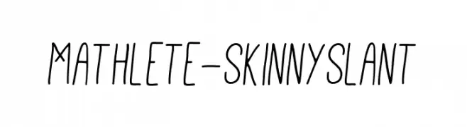
![Mathlete-SkinnySlant Frei Schriftart Herunterladen]() Herunterladen 387 Downloads@WebFont
Herunterladen 387 Downloads@WebFont -
![XG pixo Frei Schriftart Herunterladen]() Herunterladen 387 Downloads@WebFont
Herunterladen 387 Downloads@WebFont -
( Fonts by Typographer Mediengestaltung - Personal-use only. For commercial use please contact owner. )
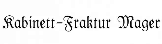
An ornate Blackletter font with intricate, historical letterforms.
![Kabinett-Fraktur Mager Frei Schriftart Herunterladen]() Herunterladen 387 Downloads@WebFont
Herunterladen 387 Downloads@WebFont -
( Fonts by Vladimir Nikolic )
A bold, decorative font with a three-dimensional, shadowed effect and intricate patterns.
![Chimney Sweep Regular Frei Schriftart Herunterladen]() Herunterladen 387 Downloads@WebFont
Herunterladen 387 Downloads@WebFont -
( Fonts by Daniel Zadorozny - www.iconian.com - Free for personal use )
A bold, futuristic font with italicized characters enclosed in circles.
![Dot.com Frei Schriftart Herunterladen]() Herunterladen 387 Downloads
Herunterladen 387 Downloads -
( Fonts by Mans Greback - Personal-use only. For commercial use please contact owner. )
A bold, high-contrast serif font with dramatic strokes and elegant serifs.
![Sharpe PERSONAL Black Frei Schriftart Herunterladen]() Herunterladen 387 Downloads@WebFont
Herunterladen 387 Downloads@WebFont


Welche Schriften sind gerade am populärsten?
Poppins, Roboto, Montserrat, Open Sans und Lato sind wegen ihrer klaren Formen und breiten Einsetzbarkeit sehr gefragt – von Markenauftritt über Landingpages bis hin zu Postern.
Welche Fonts eignen sich für Logos?
Geometrische Sans‑Serifs (z. B. Poppins, Familien im Gotham‑Stil) sind ein häufiger Griff für sauberes, skalierbares Branding. Für eine persönlichere Note bleiben Scripts und Handschrift‑Stile beliebt. Kombinieren Sie einen prägnanten Headline‑Font mit einer neutralen Brotschrift für Wiedererkennung und Harmonie.
Wie oft wird die Top‑Liste aktualisiert?
Regelmäßig – basierend auf realen Downloads und Interaktionen. Schauen Sie öfter vorbei, um aufstrebende Favoriten früh zu entdecken.
💡 Tipp: Seite bookmarken – Trends wechseln schnell, und heutige Top‑Schriften inspirieren morgen vielleicht das Rebranding.