Willkommen bei den Top‑Schriften – hier treffen Beliebtheit und Qualität aufeinander. Das sind die in diesem Jahr am häufigsten heruntergeladenen und genutzten Fonts. Wenn Sie sichere Optionen für Logo, Web oder Social suchen, starten Sie hier.
Jeder Top‑Font überzeugt durch Balance, Lesbarkeit und Vielseitigkeit. Sie finden moderne Sans‑Serifs, elegante Scripts, Vintage‑Serifs und minimalistische Displays.
-
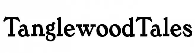
( Fonts by Nick Curtis - www.nicksfonts.com )
A bold, classic serif font with strong strokes and pronounced serifs.
 Herunterladen 386 Downloads
 -
( Fonts by Daniel Zadorozny - www.iconian.com )
A bold, geometric, and condensed font with a modern, futuristic style.
![Gemina 2 Condensed Frei Schriftart Herunterladen]() Herunterladen 386 Downloads@WebFont
Herunterladen 386 Downloads@WebFont -
( Fonts by Andrew Hart - dirt2.com )
A playful handwritten font with star accents and a whimsical style.
![Little Ryan O Lucky Frei Schriftart Herunterladen]() Herunterladen 386 Downloads@WebFont
Herunterladen 386 Downloads@WebFont -
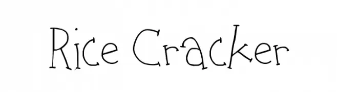
( Fonts by http://perso.calixo.net/~uzim/ )
A playful, hand-drawn font with irregular, whimsical strokes.
![Rice Cracker Frei Schriftart Herunterladen]() Herunterladen 386 Downloads@WebFont
Herunterladen 386 Downloads@WebFont -
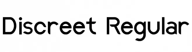
( Fonts by Thais Trizoli - www.behance.net/thaistrizoli )
A modern sans-serif font with rounded edges and balanced spacing.
![Discreet Regular Frei Schriftart Herunterladen]() Herunterladen 386 Downloads@WebFont
Herunterladen 386 Downloads@WebFont -
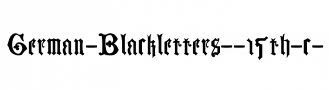
![German-Blackletters--15th-c- Frei Schriftart Herunterladen]() Herunterladen 386 Downloads@WebFont
Herunterladen 386 Downloads@WebFont -
( Fonts by Dieter Steffmann )
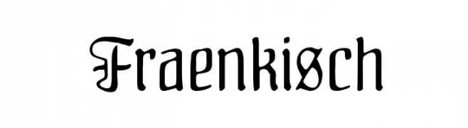
A Gothic-inspired font with ornate uppercase and streamlined lowercase letters.
![Fraenkisch Frei Schriftart Herunterladen]() Herunterladen 386 Downloads@WebFont
Herunterladen 386 Downloads@WebFont -
( Fonts by a Claude Pelletier . Personal-use only. For commercial use please contact owner. )
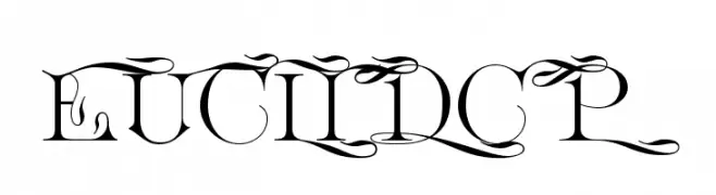
An ornate and decorative font with intricate flourishes and embellishments.
![EuclidCP Frei Schriftart Herunterladen]() Herunterladen 386 Downloads@WebFont
Herunterladen 386 Downloads@WebFont -
( Fonts by StringLabs Creative )
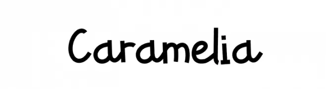
A playful, handwritten font with bold, rounded strokes and a casual, friendly style.
![Caramelia Frei Schriftart Herunterladen]() Herunterladen 386 Downloads@WebFont
Herunterladen 386 Downloads@WebFont -
( Fonts by adinuritype std. - Adianto Nuri Fahrezy - Personal-use only. For commercial use please contact owner. )
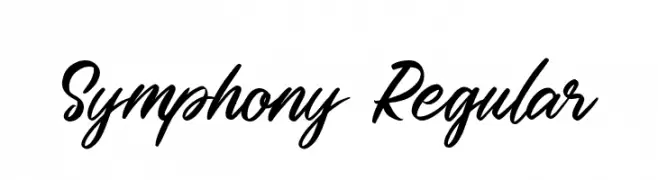
A dynamic and fluid script font with elegant, interconnected letters.
![Symphony Regular Frei Schriftart Herunterladen]() Herunterladen 386 Downloads@WebFont
Herunterladen 386 Downloads@WebFont -
( Fonts by Castcraft Software - opti.netii.net - check the website before use )
A decorative and elegant font with intricate line work and a sophisticated style.
![OPTICrystal Frei Schriftart Herunterladen]() Herunterladen 386 Downloads@WebFont
Herunterladen 386 Downloads@WebFont -
( (C)1998-2007 Gray Graphics. http://www.orange.ne.jp/~den7/ )
A playful, balloon-like font with bold, rounded characters.
![FancyBalloons Frei Schriftart Herunterladen]() Herunterladen 386 Downloads@WebFont
Herunterladen 386 Downloads@WebFont -
![Firts Christmas Frei Schriftart Herunterladen]() Herunterladen 386 Downloads@WebFont
Herunterladen 386 Downloads@WebFont -
![Aftershock Debris Condensed Frei Schriftart Herunterladen]() Herunterladen 386 Downloads@WebFont
Herunterladen 386 Downloads@WebFont -
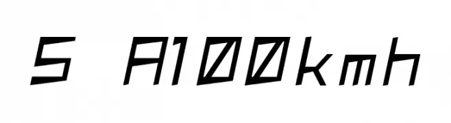
( These fonts are free to use in any private, recreational manner.For commercial go to www.flopdesign.com/fordesign/font.html )
A dynamic, angular font with a futuristic and sporty design.
![S A100kmh Frei Schriftart Herunterladen]() Herunterladen 386 Downloads@WebFont
Herunterladen 386 Downloads@WebFont -
( Fonts by Castcraft Software - opti.netii.net - check the website before use )
A classic, elegant serif typeface with an italic slant and refined cursive style.
![OPTIGoudyOpen-Italic Frei Schriftart Herunterladen]() Herunterladen 386 Downloads@WebFont
Herunterladen 386 Downloads@WebFont -
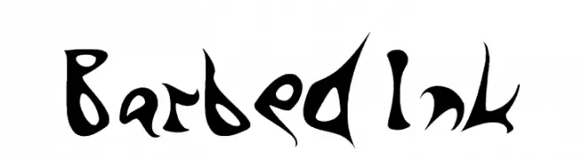
![Barbed Ink Frei Schriftart Herunterladen]() Herunterladen 386 Downloads@WebFont
Herunterladen 386 Downloads@WebFont -
![SF Viper Squadron Italic Frei Schriftart Herunterladen]() Herunterladen 386 Downloads@WebFont
Herunterladen 386 Downloads@WebFont -
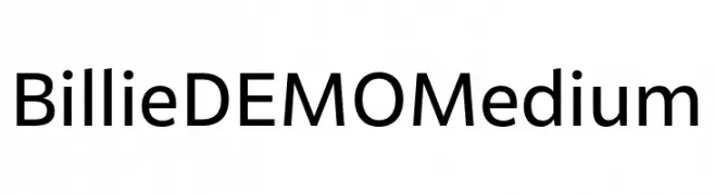
( Fonts by Font People - Personal-use only. For commercial use please contact owner. )
A modern, geometric sans-serif font with balanced proportions.
![Billie DEMO Medium Frei Schriftart Herunterladen]() Herunterladen 386 Downloads@WebFont
Herunterladen 386 Downloads@WebFont -
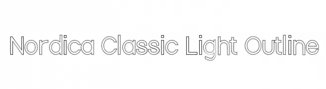
![Nordica Classic Light Outline Frei Schriftart Herunterladen]() Herunterladen 386 Downloads@WebFont
Herunterladen 386 Downloads@WebFont -
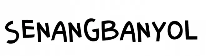
![SenangBanyol Frei Schriftart Herunterladen]() Herunterladen 386 Downloads@WebFont
Herunterladen 386 Downloads@WebFont -
( Fonts by dustBUST - Andreas Nylin )
A modern, wide, and italicized font with a futuristic design.
![Tech Font Wide Italic Frei Schriftart Herunterladen]() Herunterladen 386 Downloads@WebFont
Herunterladen 386 Downloads@WebFont -
( Fonts by Daniel Zadorozny - www.iconian.com - Free for personal use )
A bold, condensed italic font with a futuristic and geometric design.
![Iapetus Condensed Italic Frei Schriftart Herunterladen]() Herunterladen 386 Downloads@WebFont
Herunterladen 386 Downloads@WebFont -
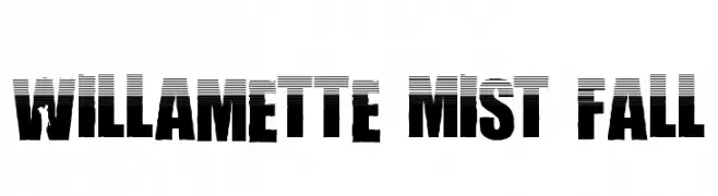
![Willamette Mist Fall Frei Schriftart Herunterladen]() Herunterladen 386 Downloads@WebFont
Herunterladen 386 Downloads@WebFont -
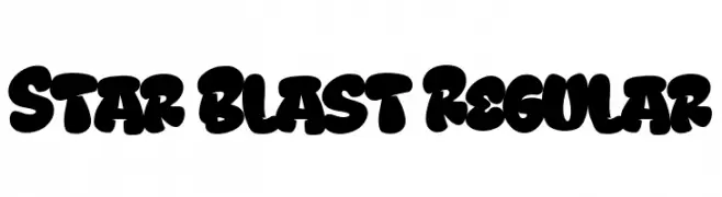
( Fonts by Bangkit Tri Setiadi )
A bold, rounded, and playful font with a graffiti-like style.
![Star Blast Regular Frei Schriftart Herunterladen]() Herunterladen 386 Downloads@WebFont
Herunterladen 386 Downloads@WebFont -
( Fonts by Dieter Steffmann )
Ornate initials with intricate floral borders, blending Gothic and Baroque styles.
![Schmuck-Initialen 1 Frei Schriftart Herunterladen]() Herunterladen 386 Downloads@WebFont
Herunterladen 386 Downloads@WebFont -
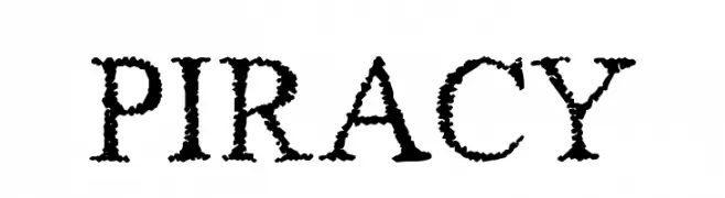
( Fonts by Jacob Fisher - www.pizzadude.dk )
A rugged, textured font with a hand-crafted, adventurous feel.
![Piracy Frei Schriftart Herunterladen]() Herunterladen 386 Downloads@WebFont
Herunterladen 386 Downloads@WebFont -
( Iconian Fonts - Daniel Zadorozny - www.iconian.com )
A bold, geometric font with an industrial and modern aesthetic.
![Buchanan Title Frei Schriftart Herunterladen]() Herunterladen 386 Downloads@WebFont
Herunterladen 386 Downloads@WebFont -
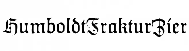
( Fonts by Dieter Steffmann )
A traditional blackletter font with intricate details and a medieval aesthetic.
![HumboldtFrakturZier Frei Schriftart Herunterladen]() Herunterladen 386 Downloads@WebFont
Herunterladen 386 Downloads@WebFont -
![Gallaudet Medium Frei Schriftart Herunterladen]() Herunterladen 386 Downloads
Herunterladen 386 Downloads -
( Fonts by Michael Tension - www.TensionType.com )
A bold, hand-drawn font with a playful, sketch-like appearance.
![Key Tab Metal Frei Schriftart Herunterladen]() Herunterladen 386 Downloads@WebFont
Herunterladen 386 Downloads@WebFont -
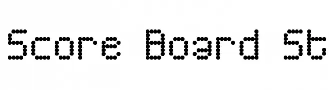
( Fonts by Southype )
A dot matrix font with a retro, digital scoreboard style.
![Score Board St Frei Schriftart Herunterladen]() Herunterladen 386 Downloads@WebFont
Herunterladen 386 Downloads@WebFont -
( Fonts by Solidtype - Personal-use only. For commercial use please contact owner. )
A bold, modern sans-serif font with clean lines and strong visual impact.
![Alesand Bold Frei Schriftart Herunterladen]() Herunterladen 386 Downloads@WebFont
Herunterladen 386 Downloads@WebFont -
( Fonts by Donald E. Knuth - Personal-use only. For commercial use please contact owner. )
A clean, modern semi-bold typeface with excellent readability and balance.
![CMU Bright SemiBold Frei Schriftart Herunterladen]() Herunterladen 386 Downloads@WebFont
Herunterladen 386 Downloads@WebFont -
![Aayat Quraan 1 Frei Schriftart Herunterladen]() Herunterladen 386 Downloads@WebFont
Herunterladen 386 Downloads@WebFont


Welche Schriften sind gerade am populärsten?
Poppins, Roboto, Montserrat, Open Sans und Lato sind wegen ihrer klaren Formen und breiten Einsetzbarkeit sehr gefragt – von Markenauftritt über Landingpages bis hin zu Postern.
Welche Fonts eignen sich für Logos?
Geometrische Sans‑Serifs (z. B. Poppins, Familien im Gotham‑Stil) sind ein häufiger Griff für sauberes, skalierbares Branding. Für eine persönlichere Note bleiben Scripts und Handschrift‑Stile beliebt. Kombinieren Sie einen prägnanten Headline‑Font mit einer neutralen Brotschrift für Wiedererkennung und Harmonie.
Wie oft wird die Top‑Liste aktualisiert?
Regelmäßig – basierend auf realen Downloads und Interaktionen. Schauen Sie öfter vorbei, um aufstrebende Favoriten früh zu entdecken.
💡 Tipp: Seite bookmarken – Trends wechseln schnell, und heutige Top‑Schriften inspirieren morgen vielleicht das Rebranding.