Willkommen bei den Top‑Schriften – hier treffen Beliebtheit und Qualität aufeinander. Das sind die in diesem Jahr am häufigsten heruntergeladenen und genutzten Fonts. Wenn Sie sichere Optionen für Logo, Web oder Social suchen, starten Sie hier.
Jeder Top‑Font überzeugt durch Balance, Lesbarkeit und Vielseitigkeit. Sie finden moderne Sans‑Serifs, elegante Scripts, Vintage‑Serifs und minimalistische Displays.
-
( Fonts by p joks )
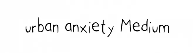
A playful, hand-drawn font with tall, narrow characters and a whimsical style.
 Herunterladen 385 Downloads@WebFont
 -
( Fonts by zulkhairilettering - Zulkhairi M Saleh - Personal-use only. For commercial use please contact owner. )
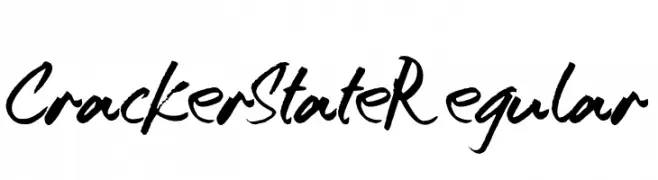
A bold, expressive handwritten font with dynamic brush strokes.
![CrackerStateRegular Frei Schriftart Herunterladen]() Herunterladen 385 Downloads@WebFont
Herunterladen 385 Downloads@WebFont -
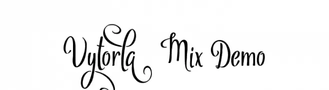
![Vytorla Mix Demo Frei Schriftart Herunterladen]() Herunterladen 385 Downloads@WebFont
Herunterladen 385 Downloads@WebFont -
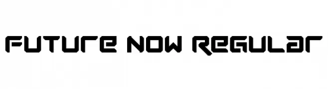
![Future Now Regular Frei Schriftart Herunterladen]() Herunterladen 385 Downloads@WebFont
Herunterladen 385 Downloads@WebFont -
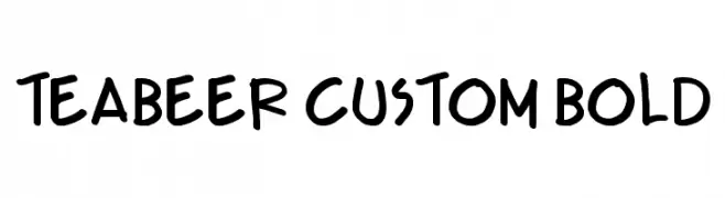
( Fonts by Press Gang Studios - Andeh Pinkard - www.pressgang-studios.com )
A bold, playful handwritten font with a lively and informal style.
![Teabeer Custom Bold Frei Schriftart Herunterladen]() Herunterladen 385 Downloads@WebFont
Herunterladen 385 Downloads@WebFont -
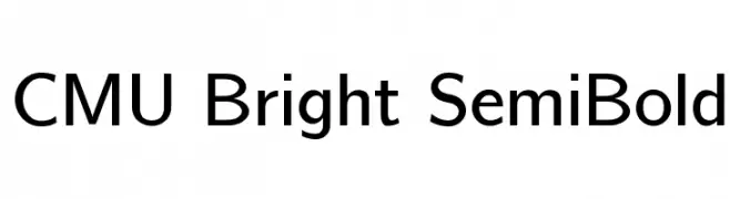
( Fonts by Donald E. Knuth - Personal-use only. For commercial use please contact owner. )
A clean, modern semi-bold typeface with excellent readability and balance.
![CMU Bright SemiBold Frei Schriftart Herunterladen]() Herunterladen 385 Downloads@WebFont
Herunterladen 385 Downloads@WebFont -
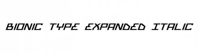
( Fonts by Daniel Zadorozny - www.iconian.com - Free for personal use )
A futuristic, angular, expanded italic font with sharp edges and geometric shapes.
![Bionic Type Expanded Italic Frei Schriftart Herunterladen]() Herunterladen 385 Downloads
Herunterladen 385 Downloads -
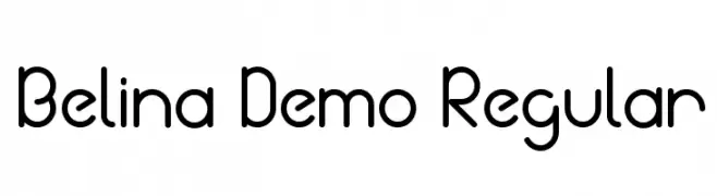
( Joz Gandoz - creativemarket.com/jozgandoz )
A modern, rounded sans-serif font with clean lines and geometric structure.
![Belina Demo Regular Frei Schriftart Herunterladen]() Herunterladen 385 Downloads@WebFont
Herunterladen 385 Downloads@WebFont -
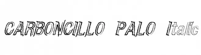
![CARBONCILLO PALO Italic Frei Schriftart Herunterladen]() Herunterladen 385 Downloads@WebFont
Herunterladen 385 Downloads@WebFont -
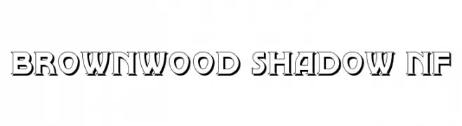
( Fonts by Nick Curtis - www.nicksfonts.com )
A bold, shadowed decorative font with strong visual impact.
![Brownwood Shadow NF Frei Schriftart Herunterladen]() Herunterladen 385 Downloads@WebFont
Herunterladen 385 Downloads@WebFont -
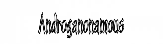
![Androganonamous Frei Schriftart Herunterladen]() Herunterladen 385 Downloads@WebFont
Herunterladen 385 Downloads@WebFont -
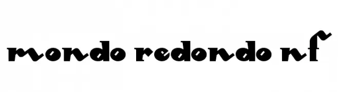
( Fonts by Nick Curtis - www.nicksfonts.com )
A bold, geometric font with playful, rounded characters and high contrast.
![Mondo Redondo NF Frei Schriftart Herunterladen]() Herunterladen 385 Downloads@WebFont
Herunterladen 385 Downloads@WebFont -
![NIBIRU Frei Schriftart Herunterladen]() Herunterladen 385 Downloads@WebFont
Herunterladen 385 Downloads@WebFont -
( Fonts by Khurasan )
A playful, bold font with rounded, bubble-like characters.
![Share Dong Frei Schriftart Herunterladen]() Herunterladen 385 Downloads@WebFont
Herunterladen 385 Downloads@WebFont -
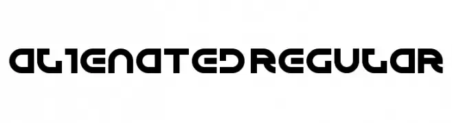
( Fonts by Andrew McCluskey - nalgames.com. Personal-use only. For commercial use please contact owner. )
A bold, futuristic font with geometric and rounded letterforms.
![Alienated Regular Frei Schriftart Herunterladen]() Herunterladen 385 Downloads@WebFont
Herunterladen 385 Downloads@WebFont -
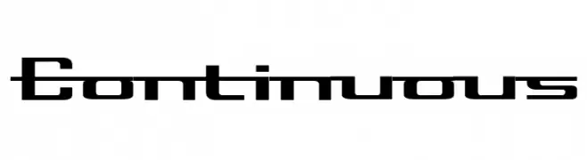
![Continuous Frei Schriftart Herunterladen]() Herunterladen 385 Downloads@WebFont
Herunterladen 385 Downloads@WebFont -
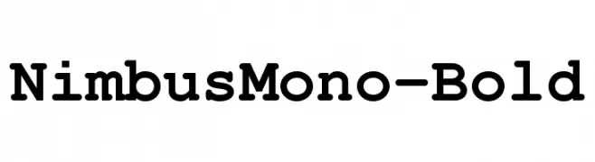
( Fonts by URW++ - Personal-use only. For commercial use please contact owner. )
A bold, monospaced slab serif font with uniform character width.
![NimbusMono-Bold Frei Schriftart Herunterladen]() Herunterladen 385 Downloads@WebFont
Herunterladen 385 Downloads@WebFont -
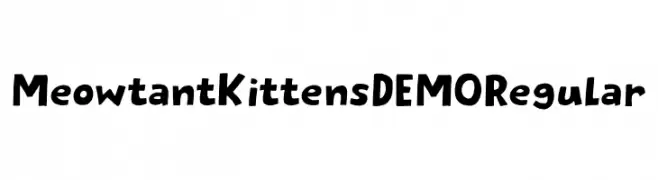
( Fonts by Hanoded )
A playful, hand-drawn font with cat-themed characters and a whimsical style.
![Meowtant Kittens DEMO Regular Frei Schriftart Herunterladen]() Herunterladen 385 Downloads@WebFont
Herunterladen 385 Downloads@WebFont -
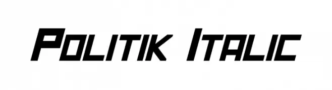
( Fonts by a Neale Davidson - www.pixelsagas.com. Personal-use only. For commercial use please contact owner. )
A bold, angular, and italicized font with a modern geometric style.
![Politik Italic Frei Schriftart Herunterladen]() Herunterladen 385 Downloads@WebFont
Herunterladen 385 Downloads@WebFont -
![KR Sweet Tooth Frei Schriftart Herunterladen]() Herunterladen 385 Downloads@WebFont
Herunterladen 385 Downloads@WebFont -
( Fonts by Iconian Fonts )
A futuristic, gradient-striped font with a bold, digital aesthetic.
![1968 Odyssey Gradient Frei Schriftart Herunterladen]() Herunterladen 385 Downloads@WebFont
Herunterladen 385 Downloads@WebFont -
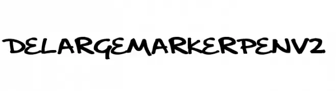
( Fonts by Paul Burgess - www.delarge.co.uk )
A bold, handwritten marker-style font with dynamic and lively strokes.
![delargeMarkerPenv2 Frei Schriftart Herunterladen]() Herunterladen 385 Downloads@WebFont
Herunterladen 385 Downloads@WebFont -
![The Waddys Frei Schriftart Herunterladen]() Herunterladen 385 Downloads@WebFont
Herunterladen 385 Downloads@WebFont -
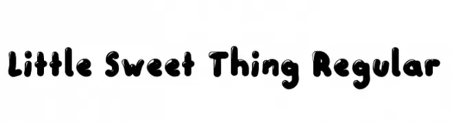
( Fonts by Brixdee )
A playful, bubbly font with bold, rounded characters and a friendly feel.
![Little Sweet Thing Regular Frei Schriftart Herunterladen]() Herunterladen 385 Downloads@WebFont
Herunterladen 385 Downloads@WebFont -
( Fonts by www.studiotypo.com - Personal-use only. For commercial use please contact owner. )
A clean, modern sans-serif font with uniform stroke width and excellent readability.
![Aprikas Regular Demo Frei Schriftart Herunterladen]() Herunterladen 385 Downloads@WebFont
Herunterladen 385 Downloads@WebFont -
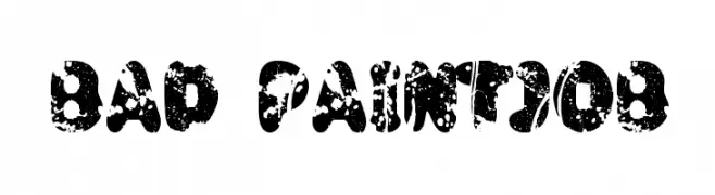
( Fonts by David Kerkhoff - www.hanodedphotography.com )
A bold, distressed font with a paint-splattered, grunge style.
![Bad Paintjob Frei Schriftart Herunterladen]() Herunterladen 385 Downloads@WebFont
Herunterladen 385 Downloads@WebFont -
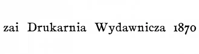
( Fonts by Tomasz Skowroński )
A bold, vintage serif font with a handcrafted feel.
![zai Drukarnia Wydawnicza 1870 Frei Schriftart Herunterladen]() Herunterladen 385 Downloads@WebFont
Herunterladen 385 Downloads@WebFont -
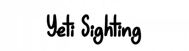
( Fonts by JSH creates )
Playful handwritten font with rounded edges.
![Yeti Sighting Frei Schriftart Herunterladen]() Herunterladen 385 Downloads@WebFont
Herunterladen 385 Downloads@WebFont -
( Fontscafe.com - fontscafe.com/ )
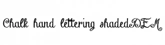
A decorative, hand-drawn font with elegant swirls and a chalk-like texture.
![Chalk-hand-lettering-shaded DEM Frei Schriftart Herunterladen]() Herunterladen 385 Downloads@WebFont
Herunterladen 385 Downloads@WebFont -
![harder typefoundry Frei Schriftart Herunterladen]() Herunterladen 385 Downloads@WebFont
Herunterladen 385 Downloads@WebFont -
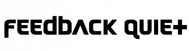
![Feedback Quiet Frei Schriftart Herunterladen]() Herunterladen 385 Downloads@WebFont
Herunterladen 385 Downloads@WebFont -
![Prozac Buzz Frei Schriftart Herunterladen]() Herunterladen 385 Downloads@WebFont
Herunterladen 385 Downloads@WebFont -
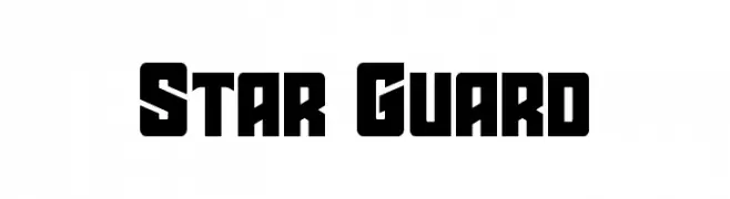
( Fonts by Iconian Fonts - Daniel Zadorozny - Personal-use only. For commercial use please contact owner. )
A bold, geometric font with a futuristic and sci-fi aesthetic.
![Star Guard Frei Schriftart Herunterladen]() Herunterladen 385 Downloads@WebFont
Herunterladen 385 Downloads@WebFont -
![V5 Cuadra2 Outline Frei Schriftart Herunterladen]() Herunterladen 385 Downloads@WebFont
Herunterladen 385 Downloads@WebFont -
( Roger White - web.archive.org/web/20120416090521/www.rogersfonts.org.uk/ )
A bold, condensed font with high contrast and a strong vertical emphasis.
![Tiverton Frei Schriftart Herunterladen]() Herunterladen 385 Downloads@WebFont
Herunterladen 385 Downloads@WebFont


Welche Schriften sind gerade am populärsten?
Poppins, Roboto, Montserrat, Open Sans und Lato sind wegen ihrer klaren Formen und breiten Einsetzbarkeit sehr gefragt – von Markenauftritt über Landingpages bis hin zu Postern.
Welche Fonts eignen sich für Logos?
Geometrische Sans‑Serifs (z. B. Poppins, Familien im Gotham‑Stil) sind ein häufiger Griff für sauberes, skalierbares Branding. Für eine persönlichere Note bleiben Scripts und Handschrift‑Stile beliebt. Kombinieren Sie einen prägnanten Headline‑Font mit einer neutralen Brotschrift für Wiedererkennung und Harmonie.
Wie oft wird die Top‑Liste aktualisiert?
Regelmäßig – basierend auf realen Downloads und Interaktionen. Schauen Sie öfter vorbei, um aufstrebende Favoriten früh zu entdecken.
💡 Tipp: Seite bookmarken – Trends wechseln schnell, und heutige Top‑Schriften inspirieren morgen vielleicht das Rebranding.