Willkommen bei den Top‑Schriften – hier treffen Beliebtheit und Qualität aufeinander. Das sind die in diesem Jahr am häufigsten heruntergeladenen und genutzten Fonts. Wenn Sie sichere Optionen für Logo, Web oder Social suchen, starten Sie hier.
Jeder Top‑Font überzeugt durch Balance, Lesbarkeit und Vielseitigkeit. Sie finden moderne Sans‑Serifs, elegante Scripts, Vintage‑Serifs und minimalistische Displays.
-
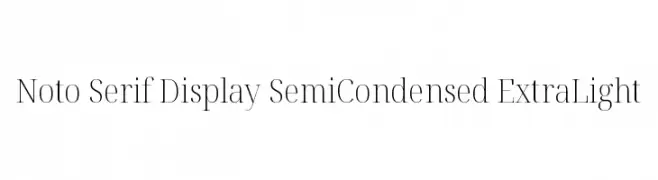
( Noto is a trademark of Google Inc. Noto fonts are open source. All Noto fonts are published under the SIL Open Font License, Version 1.1 )
A refined serif font with a semi-condensed, extra light style.
 Herunterladen 384 Downloads@WebFont
 -
![Hindolam Regular Frei Schriftart Herunterladen]() Herunterladen 384 Downloads@WebFont
Herunterladen 384 Downloads@WebFont -
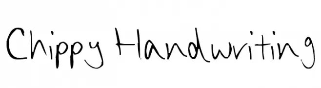
![Chippy Handwriting Frei Schriftart Herunterladen]() Herunterladen 384 Downloads@WebFont
Herunterladen 384 Downloads@WebFont -
![MacroMX Frei Schriftart Herunterladen]() Herunterladen 384 Downloads@WebFont
Herunterladen 384 Downloads@WebFont -
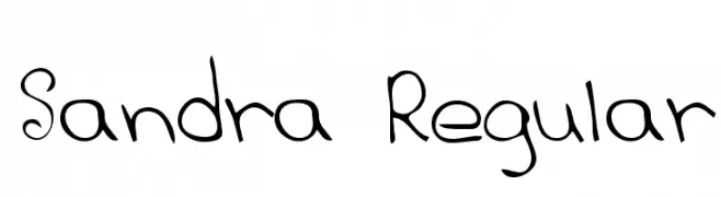
![Sandra Regular Frei Schriftart Herunterladen]() Herunterladen 383 Downloads@WebFont
Herunterladen 383 Downloads@WebFont -
( Free for a personal use. For a commercial use please visit www.kevinandamanda.com )
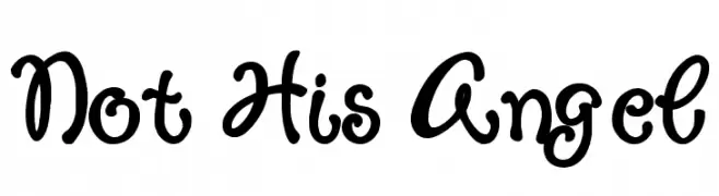
A playful, whimsical script font with interconnected, rounded letters and a handwritten aesthetic.
![Not His Angel Frei Schriftart Herunterladen]() Herunterladen 383 Downloads@WebFont
Herunterladen 383 Downloads@WebFont -
( Fonts by Zetafonts - Personal-use only. For commercial use please contact owner. )
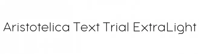
A modern, geometric sans-serif font with clean lines and rounded edges.
![Aristotelica Text Trial ExtraLight Frei Schriftart Herunterladen]() Herunterladen 383 Downloads@WebFont
Herunterladen 383 Downloads@WebFont -
( Fonts by Nick Curtis - www.nicksfonts.com )
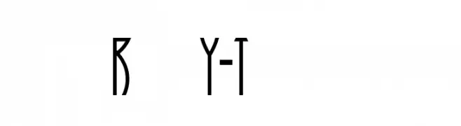
A modern, elongated font with geometric precision and high symmetry.
![Runy-Tunes Frei Schriftart Herunterladen]() Herunterladen 383 Downloads
Herunterladen 383 Downloads -
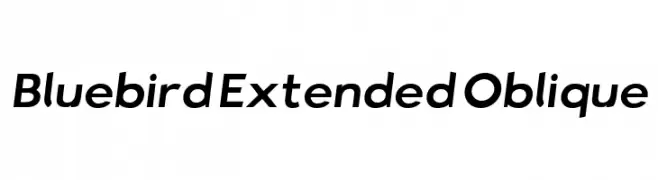
![Bluebird Extended Oblique Frei Schriftart Herunterladen]() Herunterladen 383 Downloads@WebFont
Herunterladen 383 Downloads@WebFont -
( Fonts by a Neale Davidson - www.pixelsagas.com. Personal-use only. For commercial use please contact owner. )
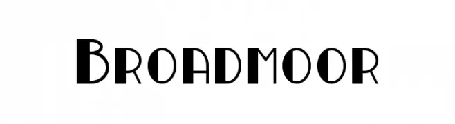
A bold, geometric font with sharp angles and modern design.
![Broadmoor Frei Schriftart Herunterladen]() Herunterladen 383 Downloads@WebFont
Herunterladen 383 Downloads@WebFont -
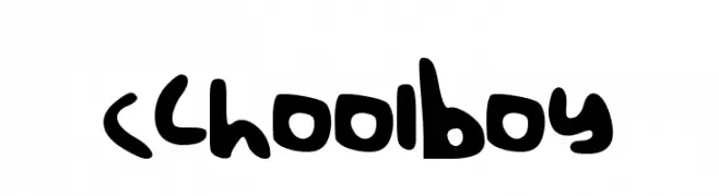
![schoolboy Frei Schriftart Herunterladen]() Herunterladen 383 Downloads@WebFont
Herunterladen 383 Downloads@WebFont -
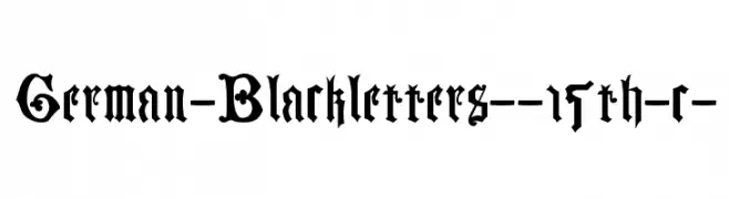
![German-Blackletters--15th-c- Frei Schriftart Herunterladen]() Herunterladen 383 Downloads@WebFont
Herunterladen 383 Downloads@WebFont -
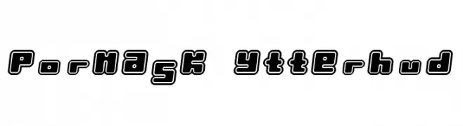
( Fonts by TarmSaft Font Factory - http://www.aska.nu/tarmsaft/ )
A bold, outlined font with a playful and three-dimensional appearance.
![Pormask Ytterhud Frei Schriftart Herunterladen]() Herunterladen 383 Downloads
Herunterladen 383 Downloads -
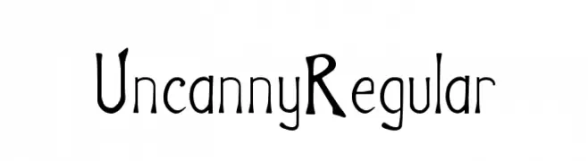
![Uncanny Regular Frei Schriftart Herunterladen]() Herunterladen 383 Downloads@WebFont
Herunterladen 383 Downloads@WebFont -
( Fonts by Ben Nathan )
A playful, bold font with rounded, irregular shapes and a hand-drawn feel.
![BN-Blurry Day Frei Schriftart Herunterladen]() Herunterladen 383 Downloads@WebFont
Herunterladen 383 Downloads@WebFont -
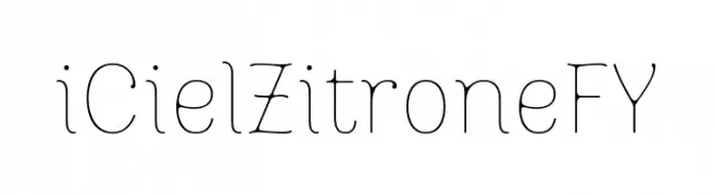
![iCielZitroneFY Frei Schriftart Herunterladen]() Herunterladen 383 Downloads@WebFont
Herunterladen 383 Downloads@WebFont -
( Fonts by Genericons - Personal-use only. For commercial use please contact owner. )
A versatile set of clean, minimalistic icons for digital applications.
![Genericons Regular Frei Schriftart Herunterladen]() Herunterladen 383 Downloads@WebFont
Herunterladen 383 Downloads@WebFont -
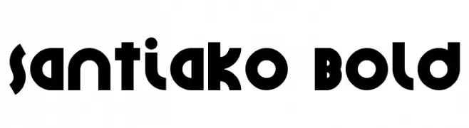
![Santiako Bold Frei Schriftart Herunterladen]() Herunterladen 383 Downloads@WebFont
Herunterladen 383 Downloads@WebFont -
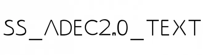
( Fonts by Serge Shi - www.behance.net/positivart )
A modern, geometric sans-serif font with clean lines and balanced proportions.
![SS_Adec2.0_text Frei Schriftart Herunterladen]() Herunterladen 383 Downloads@WebFont
Herunterladen 383 Downloads@WebFont -
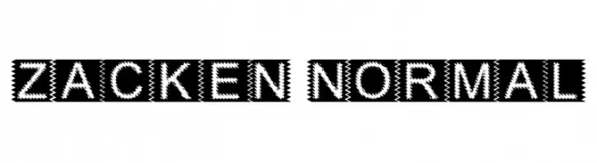
( Fonts by Dieter Schumacher )
A bold, zigzag-patterned font with a modern, digital style.
![Zacken Normal Frei Schriftart Herunterladen]() Herunterladen 383 Downloads@WebFont
Herunterladen 383 Downloads@WebFont -
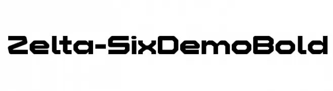
( Fonts by www.studiotypo.com - Personal-use only. For commercial use please contact owner. )
A bold, geometric font with a futuristic, digital aesthetic.
![Zelta-Six Demo Bold Frei Schriftart Herunterladen]() Herunterladen 383 Downloads@WebFont
Herunterladen 383 Downloads@WebFont -
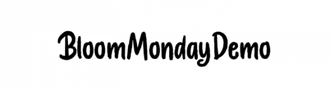
( Fonts by Letterhend Studio )
A playful, bold handwritten font with a lively and dynamic style.
![BloomMondayDemo Frei Schriftart Herunterladen]() Herunterladen 383 Downloads@WebFont
Herunterladen 383 Downloads@WebFont -
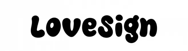
( Fonts by Khurasan )
A bold, playful font with rounded, bubbly characters perfect for fun and creative designs.
![Love Sign Frei Schriftart Herunterladen]() Herunterladen 383 Downloads@WebFont
Herunterladen 383 Downloads@WebFont -
( Free for a personal use. For a commercial use please visit www.kevinandamanda.com )
A highly distorted and blurred font with overlapping characters, creating an abstract visual effect.
![Sweet Blur Frei Schriftart Herunterladen]() Herunterladen 383 Downloads@WebFont
Herunterladen 383 Downloads@WebFont -
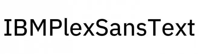
( Fonts by IBM )
A modern, geometric sans-serif font with excellent legibility and versatility.
![IBM Plex Sans Text Frei Schriftart Herunterladen]() Herunterladen 383 Downloads@WebFont
Herunterladen 383 Downloads@WebFont -
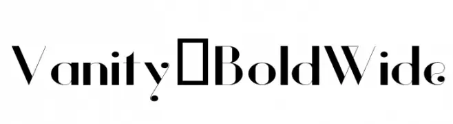
( Fonts by Hendrick Rolandez - Personal-use only. For commercial use please contact owner. )
A bold, wide font with high contrast and modern elegance.
![Vanity-BoldWide Frei Schriftart Herunterladen]() Herunterladen 383 Downloads@WebFont
Herunterladen 383 Downloads@WebFont -
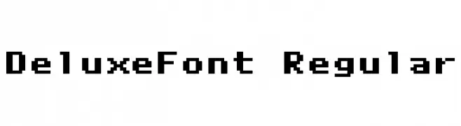
![DeluxeFont Regular Frei Schriftart Herunterladen]() Herunterladen 383 Downloads@WebFont
Herunterladen 383 Downloads@WebFont -
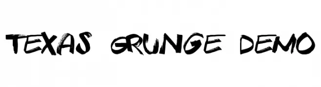
( Fonts by Roland Huse - rolandhuse.com )
A bold, grunge-style font with a dynamic, brushstroke appearance.
![Texas Grunge Demo Frei Schriftart Herunterladen]() Herunterladen 383 Downloads@WebFont
Herunterladen 383 Downloads@WebFont -
![Ganelon Demo Frei Schriftart Herunterladen]() Herunterladen 383 Downloads@WebFont
Herunterladen 383 Downloads@WebFont -
( Fonts by www.asleycruz.com - Asley Cruz - Personal-use only. For commercial use please contact owner. )
A bold, modern sans-serif font with a slightly condensed width and clean lines.
![Fineness Pro Black Cond Frei Schriftart Herunterladen]() Herunterladen 383 Downloads@WebFont
Herunterladen 383 Downloads@WebFont -
( Fonts by David Kerkhoff - www.hanodedphotography.com )
A lively, expressive handwritten font with dynamic strokes.
![DKAuRevoir Frei Schriftart Herunterladen]() Herunterladen 383 Downloads@WebFont
Herunterladen 383 Downloads@WebFont -
( Fonts by HENRIavecunK - Henrik - Personal-use only. For commercial use please contact owner. )
A bold, geometric font with angular lines and a modern, industrial style.
![BigStar-Regular Frei Schriftart Herunterladen]() Herunterladen 383 Downloads@WebFont
Herunterladen 383 Downloads@WebFont -
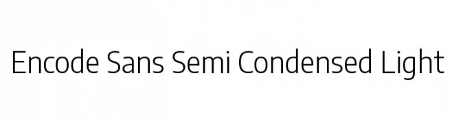
( Copyright 2012 The Encode Project Authors (impallari@gmail.com), with Reserved Font Name "Encode Sansâ€. )
A modern, semi-condensed sans-serif font with a light weight and excellent legibility.
![Encode Sans Semi Condensed Light Frei Schriftart Herunterladen]() Herunterladen 383 Downloads@WebFont
Herunterladen 383 Downloads@WebFont -
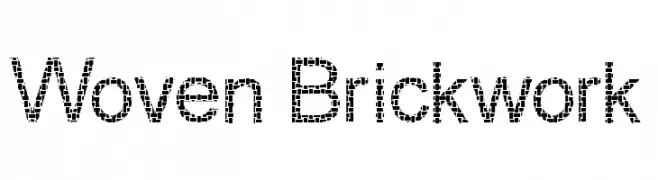
( Fonts by Graham Meade - GemFonts )
A decorative font with a woven, brick-like texture, ideal for impactful designs.
![Woven Brickwork Frei Schriftart Herunterladen]() Herunterladen 383 Downloads@WebFont
Herunterladen 383 Downloads@WebFont -
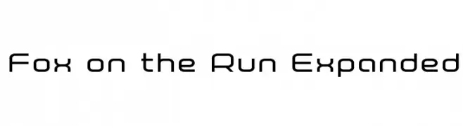
( Iconian Fonts - Daniel Zadorozny - www.iconian.com )
A modern, geometric font with rounded edges and a clean design.
![Fox on the Run Expanded Frei Schriftart Herunterladen]() Herunterladen 383 Downloads@WebFont
Herunterladen 383 Downloads@WebFont


Welche Schriften sind gerade am populärsten?
Poppins, Roboto, Montserrat, Open Sans und Lato sind wegen ihrer klaren Formen und breiten Einsetzbarkeit sehr gefragt – von Markenauftritt über Landingpages bis hin zu Postern.
Welche Fonts eignen sich für Logos?
Geometrische Sans‑Serifs (z. B. Poppins, Familien im Gotham‑Stil) sind ein häufiger Griff für sauberes, skalierbares Branding. Für eine persönlichere Note bleiben Scripts und Handschrift‑Stile beliebt. Kombinieren Sie einen prägnanten Headline‑Font mit einer neutralen Brotschrift für Wiedererkennung und Harmonie.
Wie oft wird die Top‑Liste aktualisiert?
Regelmäßig – basierend auf realen Downloads und Interaktionen. Schauen Sie öfter vorbei, um aufstrebende Favoriten früh zu entdecken.
💡 Tipp: Seite bookmarken – Trends wechseln schnell, und heutige Top‑Schriften inspirieren morgen vielleicht das Rebranding.