Willkommen bei den Top‑Schriften – hier treffen Beliebtheit und Qualität aufeinander. Das sind die in diesem Jahr am häufigsten heruntergeladenen und genutzten Fonts. Wenn Sie sichere Optionen für Logo, Web oder Social suchen, starten Sie hier.
Jeder Top‑Font überzeugt durch Balance, Lesbarkeit und Vielseitigkeit. Sie finden moderne Sans‑Serifs, elegante Scripts, Vintage‑Serifs und minimalistische Displays.
-
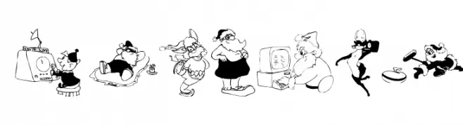
( Fonts by Manfred Klein - manfred-klein.ina-mar.com )
Cartoon character illustrations replace standard letterforms for a whimsical effect.
 Herunterladen 383 Downloads@WebFont
 -
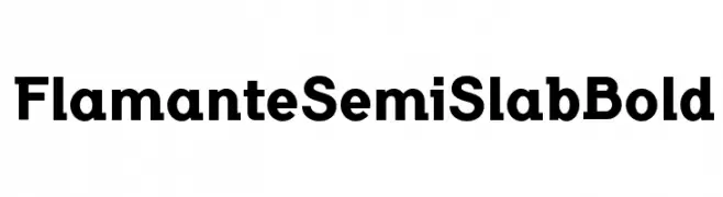
( deFharo - Fernando Haro - defharo.com )
A bold semi-slab serif font with a modern and impactful design.
![FlamanteSemiSlabBold Frei Schriftart Herunterladen]() Herunterladen 383 Downloads@WebFont
Herunterladen 383 Downloads@WebFont -
![Orange Book Frei Schriftart Herunterladen]() Herunterladen 383 Downloads@WebFont
Herunterladen 383 Downloads@WebFont -
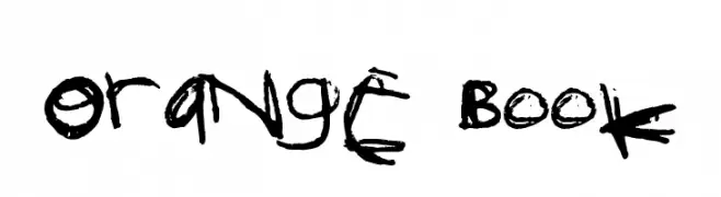
( Fonts by Castcraft Software - opti.netii.net - check the website before use )
A bold, high-contrast Hebrew font with a modern and decorative style.
![OPTIHebrew-One Frei Schriftart Herunterladen]() Herunterladen 383 Downloads@WebFont
Herunterladen 383 Downloads@WebFont -
![Goldberg Frei Schriftart Herunterladen]() Herunterladen 383 Downloads@WebFont
Herunterladen 383 Downloads@WebFont -
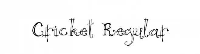
( Fonts by www.abecedarienne.com )
A whimsical, hand-drawn font with playful and irregular strokes.
![Cricket Regular Frei Schriftart Herunterladen]() Herunterladen 383 Downloads@WebFont
Herunterladen 383 Downloads@WebFont -
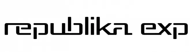
( Fonts by Apostrophic Lab )
A modern, geometric font with a futuristic and digital aesthetic.
![Republika Exp Frei Schriftart Herunterladen]() Herunterladen 383 Downloads@WebFont
Herunterladen 383 Downloads@WebFont -
( Fonts by bringtypestudio.co )
A bold, hand-drawn font with dynamic, uneven strokes and a playful style.
![Arakav Frei Schriftart Herunterladen]() Herunterladen 383 Downloads@WebFont
Herunterladen 383 Downloads@WebFont -
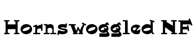
( Fonts by Nick Curtis - www.nicksfonts.com )
A bold, playful font with a vintage flair and unique serifs.
![Hornswoggled NF Frei Schriftart Herunterladen]() Herunterladen 383 Downloads@WebFont
Herunterladen 383 Downloads@WebFont -
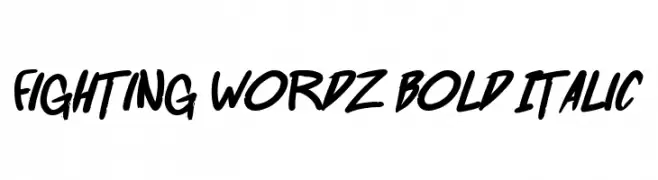
( Fonts by Press Gang Studios )
A bold, italicized font with dynamic, brush-like strokes.
![Fighting wordz Bold Italic Frei Schriftart Herunterladen]() Herunterladen 383 Downloads@WebFont
Herunterladen 383 Downloads@WebFont -
( Fonts by www.fenotype.com )
A bold, rounded font with a modern and playful geometric style.
![FT Roundabout round Frei Schriftart Herunterladen]() Herunterladen 383 Downloads@WebFont
Herunterladen 383 Downloads@WebFont -
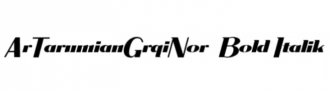
![ArTarumianGrqiNor Bold Italik Frei Schriftart Herunterladen]() Herunterladen 383 Downloads@WebFont
Herunterladen 383 Downloads@WebFont -
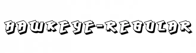
![Hawkeye-Regular Frei Schriftart Herunterladen]() Herunterladen 383 Downloads@WebFont
Herunterladen 383 Downloads@WebFont -
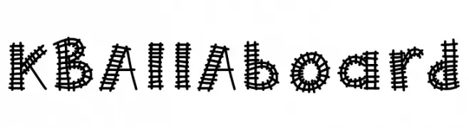
( Fonts by Khrys Bosland )
A playful, train track-themed decorative font with intricate detailing.
![KBAllAboard Frei Schriftart Herunterladen]() Herunterladen 383 Downloads@WebFont
Herunterladen 383 Downloads@WebFont -
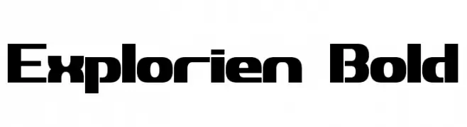
![Explorien Bold Frei Schriftart Herunterladen]() Herunterladen 383 Downloads@WebFont
Herunterladen 383 Downloads@WebFont -
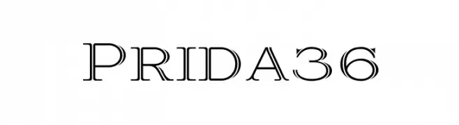
![Prida36 Frei Schriftart Herunterladen]() Herunterladen 383 Downloads@WebFont
Herunterladen 383 Downloads@WebFont -
( Fonts by www.peter-wiegel.de. Personal-use only. For commercial use please contact owner. )
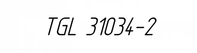
A sleek, modern, and slightly italicized font with a condensed and uniform appearance.
![TGL 31034-2 Frei Schriftart Herunterladen]() Herunterladen 383 Downloads@WebFont
Herunterladen 383 Downloads@WebFont -
( Fonts by Daniel Zadorozny - www.iconian.com - Personal-use only. For commercial use please contact owner. )
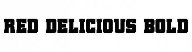
A bold, slab serif font with strong, block-like characters.
![Red Delicious Bold Frei Schriftart Herunterladen]() Herunterladen 383 Downloads@WebFont
Herunterladen 383 Downloads@WebFont -
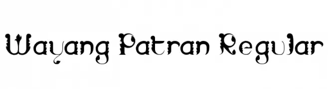
![Wayang Patran Regular Frei Schriftart Herunterladen]() Herunterladen 383 Downloads@WebFont
Herunterladen 383 Downloads@WebFont -
( Fonts by GLUK fonts )
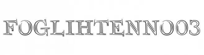
A decorative serif font with a double-line, shadowed design.
![FoglihtenNo03 Frei Schriftart Herunterladen]() Herunterladen 383 Downloads@WebFont
Herunterladen 383 Downloads@WebFont -
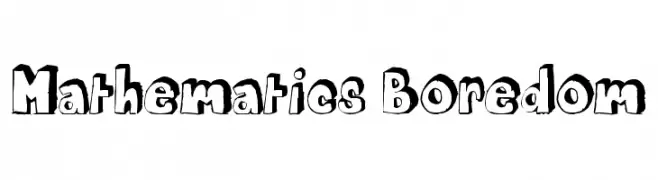
![Mathematics Boredom Frei Schriftart Herunterladen]() Herunterladen 383 Downloads@WebFont
Herunterladen 383 Downloads@WebFont -
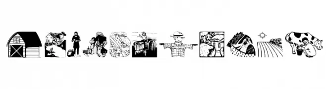
( Fonts by Manfred Klein. Free for private and charity use. Free for commercial with donation to organizations )
A decorative font featuring detailed illustrations of rural life elements.
![CountryLife Frei Schriftart Herunterladen]() Herunterladen 383 Downloads@WebFont
Herunterladen 383 Downloads@WebFont -
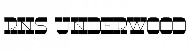
( Fonts by Yorlmar Campos - www.ycampos.com )
A bold, geometric font with a modern, industrial design.
![RNS Underwood Frei Schriftart Herunterladen]() Herunterladen 383 Downloads@WebFont
Herunterladen 383 Downloads@WebFont -
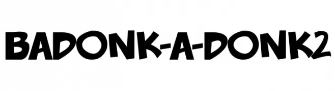
( Fonts by Press Gang Studios )
A bold, playful font with exaggerated, uneven strokes and a cartoonish flair.
![badonk-a-donk2 Frei Schriftart Herunterladen]() Herunterladen 383 Downloads@WebFont
Herunterladen 383 Downloads@WebFont -
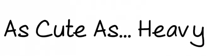
( Fonts by Steve Gardner - www.explogos.com. Personal-use only. For commercial use please contact owner. )
A playful, handwritten font with rounded edges and a casual style.
![As Cute As... Heavy Frei Schriftart Herunterladen]() Herunterladen 383 Downloads@WebFont
Herunterladen 383 Downloads@WebFont -
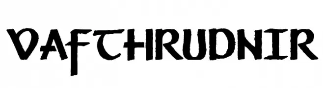
![Vafthrudnir Frei Schriftart Herunterladen]() Herunterladen 383 Downloads@WebFont
Herunterladen 383 Downloads@WebFont -
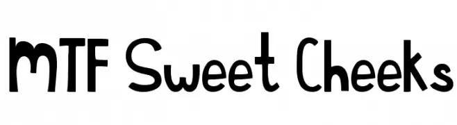
( Fonts by Miss Tiina at www.misstiina.com (please check the website before use) )
A playful and whimsical font with bold, rounded characters and a fun, informal style.
![MTF Sweet Cheeks Frei Schriftart Herunterladen]() Herunterladen 383 Downloads@WebFont
Herunterladen 383 Downloads@WebFont -
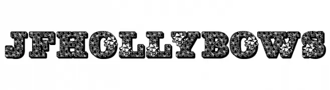
( Fonts by Jester Font Studio )
A bold, decorative font filled with festive holly and bow patterns.
![JFHollyBows Frei Schriftart Herunterladen]() Herunterladen 383 Downloads@WebFont
Herunterladen 383 Downloads@WebFont -
![keagan Frei Schriftart Herunterladen]() Herunterladen 383 Downloads@WebFont
Herunterladen 383 Downloads@WebFont -
![KAStormRain Frei Schriftart Herunterladen]() Herunterladen 383 Downloads@WebFont
Herunterladen 383 Downloads@WebFont -
![Poland Cannot Into DIN Frei Schriftart Herunterladen]() Herunterladen 383 Downloads@WebFont
Herunterladen 383 Downloads@WebFont -
![BM spiral Cap Cyr Frei Schriftart Herunterladen]() Herunterladen 383 Downloads@WebFont
Herunterladen 383 Downloads@WebFont -
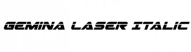
( Fonts by Daniel Zadorozny - www.iconian.com - Free for personal use )
A futuristic, italic font with sharp angles and a bold, dynamic style.
![Gemina Laser Italic Frei Schriftart Herunterladen]() Herunterladen 383 Downloads@WebFont
Herunterladen 383 Downloads@WebFont -
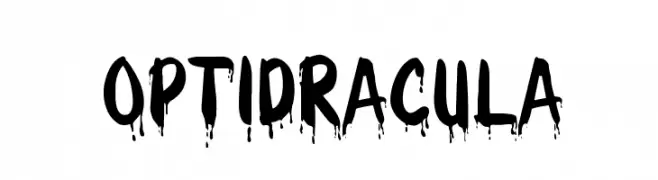
( Fonts by Castcraft Software - opti.netii.net - check the website before use )
A bold, dripping font with a spooky, horror-themed aesthetic.
![OPTIDracula Frei Schriftart Herunterladen]() Herunterladen 383 Downloads@WebFont
Herunterladen 383 Downloads@WebFont -
![Hawking Bowen Frei Schriftart Herunterladen]() Herunterladen 383 Downloads@WebFont
Herunterladen 383 Downloads@WebFont


Welche Schriften sind gerade am populärsten?
Poppins, Roboto, Montserrat, Open Sans und Lato sind wegen ihrer klaren Formen und breiten Einsetzbarkeit sehr gefragt – von Markenauftritt über Landingpages bis hin zu Postern.
Welche Fonts eignen sich für Logos?
Geometrische Sans‑Serifs (z. B. Poppins, Familien im Gotham‑Stil) sind ein häufiger Griff für sauberes, skalierbares Branding. Für eine persönlichere Note bleiben Scripts und Handschrift‑Stile beliebt. Kombinieren Sie einen prägnanten Headline‑Font mit einer neutralen Brotschrift für Wiedererkennung und Harmonie.
Wie oft wird die Top‑Liste aktualisiert?
Regelmäßig – basierend auf realen Downloads und Interaktionen. Schauen Sie öfter vorbei, um aufstrebende Favoriten früh zu entdecken.
💡 Tipp: Seite bookmarken – Trends wechseln schnell, und heutige Top‑Schriften inspirieren morgen vielleicht das Rebranding.