Willkommen bei den Top‑Schriften – hier treffen Beliebtheit und Qualität aufeinander. Das sind die in diesem Jahr am häufigsten heruntergeladenen und genutzten Fonts. Wenn Sie sichere Optionen für Logo, Web oder Social suchen, starten Sie hier.
Jeder Top‑Font überzeugt durch Balance, Lesbarkeit und Vielseitigkeit. Sie finden moderne Sans‑Serifs, elegante Scripts, Vintage‑Serifs und minimalistische Displays.
-
 Herunterladen 378 Downloads@WebFont
 -
( Fonts by Typographer Mediengestaltung - Personal-use only. For commercial use please contact owner. )
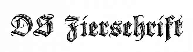
An ornate, blackletter-style font with intricate detailing and a medieval flair.
![DS Zierschrift Frei Schriftart Herunterladen]() Herunterladen 378 Downloads@WebFont
Herunterladen 378 Downloads@WebFont -
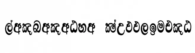
![Lankanatha Suppliment Frei Schriftart Herunterladen]() Herunterladen 378 Downloads
Herunterladen 378 Downloads -
( Fonts by Manuel Viergutz - Typo Graphic Design - www.typographicdesign.de )
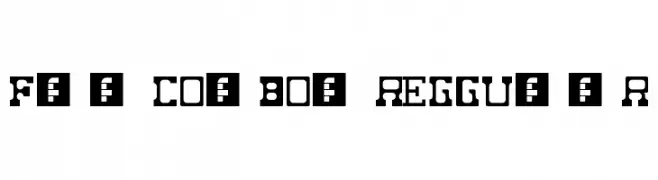
A bold, Western-style font with blocky, decorative characters.
![Fat Cowboy Regular Frei Schriftart Herunterladen]() Herunterladen 378 Downloads@WebFont
Herunterladen 378 Downloads@WebFont -
( Fonts by Prioritype Co )
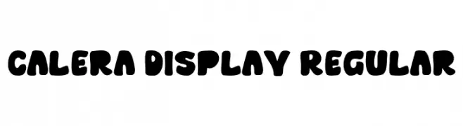
A bold, rounded font with a playful and friendly appearance.
![Calera Display Regular Frei Schriftart Herunterladen]() Herunterladen 378 Downloads@WebFont
Herunterladen 378 Downloads@WebFont -
( Fonts by ShyFonts )
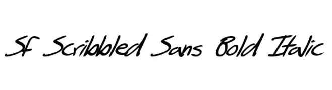
A bold, italic, handwritten font with a playful, scribbled style.
![SF Scribbled Sans Bold Italic Frei Schriftart Herunterladen]() Herunterladen 378 Downloads@WebFont
Herunterladen 378 Downloads@WebFont -
( Fonts by www.asleycruz.com - Asley Cruz - Personal-use only. For commercial use please contact owner. )
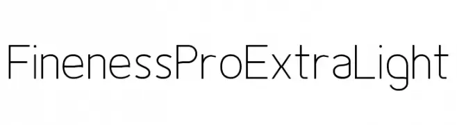
A sleek, modern, extra light font with uniform stroke width and rounded edges.
![Fineness Pro ExtraLight Frei Schriftart Herunterladen]() Herunterladen 378 Downloads@WebFont
Herunterladen 378 Downloads@WebFont -
Schriftart von davalignllc. For commercial use please contact the owner.
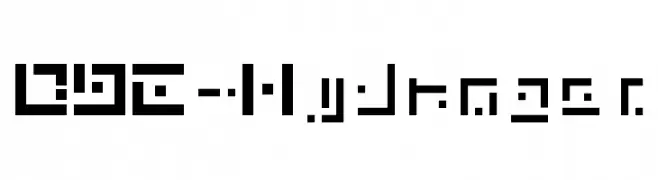
![DBE-Hydrogen Frei Schriftart Herunterladen]() Herunterladen 378 Downloads@WebFont
Herunterladen 378 Downloads@WebFont -
( Fonts by Steve Deffeyes - www.deffeyes.com )
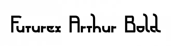
A bold, geometric font with a futuristic and modern design.
![Futurex Arthur Bold Frei Schriftart Herunterladen]() Herunterladen 378 Downloads@WebFont
Herunterladen 378 Downloads@WebFont -
( Fonts by a Jayvee Enaguas - harvettfox96.deviantart.com. Personal-use only. For commercial use please contact owner. )
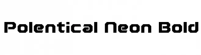
A bold, geometric font with a futuristic and angular design.
![Polentical Neon Bold Frei Schriftart Herunterladen]() Herunterladen 378 Downloads@WebFont
Herunterladen 378 Downloads@WebFont -
( Fonts by Inermedia Studio )
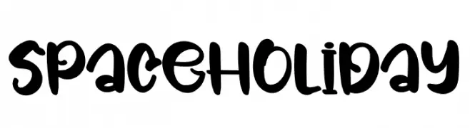
A playful, bold, and whimsical hand-drawn font with a festive feel.
![Space Holiday Frei Schriftart Herunterladen]() Herunterladen 378 Downloads@WebFont
Herunterladen 378 Downloads@WebFont -
![Cowboya-Bi Frei Schriftart Herunterladen]() Herunterladen 378 Downloads@WebFont
Herunterladen 378 Downloads@WebFont -
![Classroom Boredom Frei Schriftart Herunterladen]() Herunterladen 378 Downloads@WebFont
Herunterladen 378 Downloads@WebFont -
![ORAV Frei Schriftart Herunterladen]() Herunterladen 378 Downloads@WebFont
Herunterladen 378 Downloads@WebFont -
( Fonts by Mans Greback - Personal-use only. For commercial use please contact owner. )
A bold, modern font with clean lines and a strong presence.
![Canyon PERSONAL USE ONLY Black Frei Schriftart Herunterladen]() Herunterladen 378 Downloads@WebFont
Herunterladen 378 Downloads@WebFont -
( Fonts by Khurasan )
A bold, playful font with rounded, hand-drawn characteristics.
![Cheese Toast Frei Schriftart Herunterladen]() Herunterladen 378 Downloads@WebFont
Herunterladen 378 Downloads@WebFont -
![Engebrechtre Expanded Italic Frei Schriftart Herunterladen]() Herunterladen 378 Downloads@WebFont
Herunterladen 378 Downloads@WebFont -
( Fonts by ShyFonts )
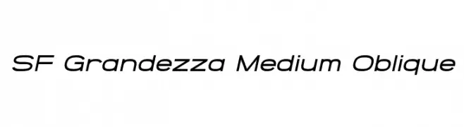
A modern, oblique font with clean lines and a dynamic style.
![SF Grandezza Medium Oblique Frei Schriftart Herunterladen]() Herunterladen 378 Downloads@WebFont
Herunterladen 378 Downloads@WebFont -
( Fonts by Vladimir Nikolic - www.creativefabrica.com/designer/vladimirnikolic/ - Personal-use only. For commercial use please contact owner. )
A bold, futuristic font with geometric elements and consistent thickness.
![Progress Extended 1 Regular Frei Schriftart Herunterladen]() Herunterladen 378 Downloads@WebFont
Herunterladen 378 Downloads@WebFont -
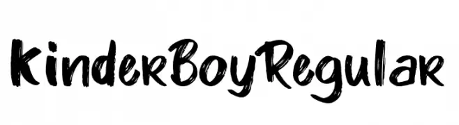
![Kinder Boy Regular Frei Schriftart Herunterladen]() Herunterladen 378 Downloads@WebFont
Herunterladen 378 Downloads@WebFont -
( Fonts by deFharo )
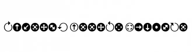
A decorative font featuring bold arrow symbols in circular and square borders.
![Uchrony Arrows Regular Frei Schriftart Herunterladen]() Herunterladen 378 Downloads@WebFont
Herunterladen 378 Downloads@WebFont -
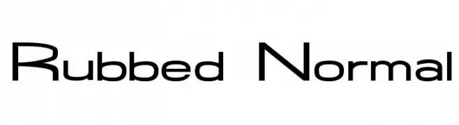
![Rubbed Normal Frei Schriftart Herunterladen]() Herunterladen 378 Downloads@WebFont
Herunterladen 378 Downloads@WebFont -
( Fonts by Dieter Steffmann )
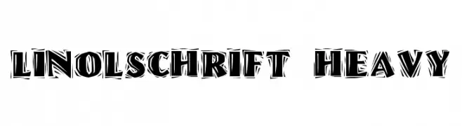
A bold, textured font with a hand-carved, woodcut style.
![Linolschrift Heavy Frei Schriftart Herunterladen]() Herunterladen 378 Downloads@WebFont
Herunterladen 378 Downloads@WebFont -
( Fonts by Uddi Uddi )
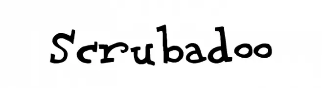
A playful, hand-drawn font with irregular, whimsical letterforms.
![Scrubadoo Frei Schriftart Herunterladen]() Herunterladen 378 Downloads@WebFont
Herunterladen 378 Downloads@WebFont -
( Fonts by Misti's Fonts )
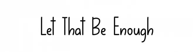
A playful handwritten font with smooth curves and elongated forms.
![Let That Be Enough Frei Schriftart Herunterladen]() Herunterladen 378 Downloads@WebFont
Herunterladen 378 Downloads@WebFont -
( Fonts by www.typodermicfonts.com - Ray Larabie )
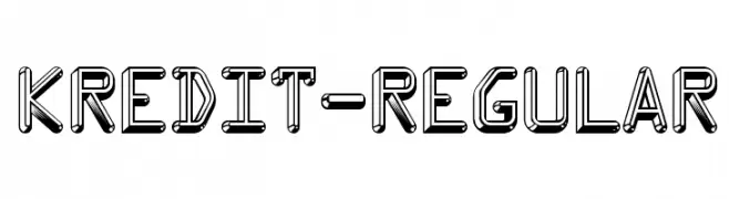
A bold, three-dimensional font with geometric precision and a modern aesthetic.
![Kredit-Regular Frei Schriftart Herunterladen]() Herunterladen 378 Downloads@WebFont
Herunterladen 378 Downloads@WebFont -
( Fonts by Bride & Groom www.brideandgroomdirect.co.uk )
A whimsical, handwritten font with a playful and casual appearance.
![Laura-Optional Frei Schriftart Herunterladen]() Herunterladen 378 Downloads@WebFont
Herunterladen 378 Downloads@WebFont -
![Lastwaerk regular Oblique Frei Schriftart Herunterladen]() Herunterladen 378 Downloads@WebFont
Herunterladen 378 Downloads@WebFont -
( Fonts by www.blambot.com )
A bold, futuristic font with a mechanical and industrial aesthetic.
![MechEffects2BB Frei Schriftart Herunterladen]() Herunterladen 378 Downloads@WebFont
Herunterladen 378 Downloads@WebFont -
( Fonts by StringLabs - stringlabscreative.com - Personal-use only. For commercial use please contact owner. )
A bold, blackletter font with intricate, gothic-inspired letterforms.
![Wilson wells Frei Schriftart Herunterladen]() Herunterladen 378 Downloads@WebFont
Herunterladen 378 Downloads@WebFont -
Schriftart von fontliner. For commercial use please contact the owner.
![Fundamental Frei Schriftart Herunterladen]() Herunterladen 378 Downloads@WebFont
Herunterladen 378 Downloads@WebFont -
( Fonts by Mans Greback - www.mawns.com )
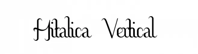
An elegant, vertically emphasized font with a classic calligraphic style.
![Hitalica Vertical Frei Schriftart Herunterladen]() Herunterladen 378 Downloads@WebFont
Herunterladen 378 Downloads@WebFont -
![Go Peanut Frei Schriftart Herunterladen]() Herunterladen 378 Downloads@WebFont
Herunterladen 378 Downloads@WebFont -
( Fonts by Creatype Studio )
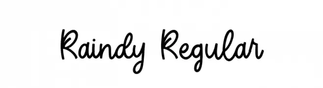
A playful, handwritten font with smooth curves and a casual style.
![Raindy Regular Frei Schriftart Herunterladen]() Herunterladen 378 Downloads@WebFont
Herunterladen 378 Downloads@WebFont -
( Fonts by Peter Wiegel - www.peter-wiegel.de - Personal-use only. For commercial use please contact owner. )
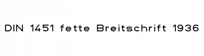
A geometric, modern typeface with uniform strokes and a technical appearance.
![DIN 1451 fette Breitschrift 1936 Frei Schriftart Herunterladen]() Herunterladen 378 Downloads@WebFont
Herunterladen 378 Downloads@WebFont


Welche Schriften sind gerade am populärsten?
Poppins, Roboto, Montserrat, Open Sans und Lato sind wegen ihrer klaren Formen und breiten Einsetzbarkeit sehr gefragt – von Markenauftritt über Landingpages bis hin zu Postern.
Welche Fonts eignen sich für Logos?
Geometrische Sans‑Serifs (z. B. Poppins, Familien im Gotham‑Stil) sind ein häufiger Griff für sauberes, skalierbares Branding. Für eine persönlichere Note bleiben Scripts und Handschrift‑Stile beliebt. Kombinieren Sie einen prägnanten Headline‑Font mit einer neutralen Brotschrift für Wiedererkennung und Harmonie.
Wie oft wird die Top‑Liste aktualisiert?
Regelmäßig – basierend auf realen Downloads und Interaktionen. Schauen Sie öfter vorbei, um aufstrebende Favoriten früh zu entdecken.
💡 Tipp: Seite bookmarken – Trends wechseln schnell, und heutige Top‑Schriften inspirieren morgen vielleicht das Rebranding.