Willkommen bei den Top‑Schriften – hier treffen Beliebtheit und Qualität aufeinander. Das sind die in diesem Jahr am häufigsten heruntergeladenen und genutzten Fonts. Wenn Sie sichere Optionen für Logo, Web oder Social suchen, starten Sie hier.
Jeder Top‑Font überzeugt durch Balance, Lesbarkeit und Vielseitigkeit. Sie finden moderne Sans‑Serifs, elegante Scripts, Vintage‑Serifs und minimalistische Displays.
-
( Fonts by wep - Wahyu Eka Prasetya - Personal-use only. For commercial use please contact owner. )
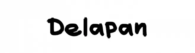
A bold, hand-drawn font with a playful and energetic style.
 Herunterladen 375 Downloads@WebFont
 -
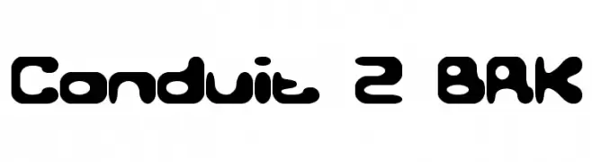
![Conduit 2 BRK Frei Schriftart Herunterladen]() Herunterladen 375 Downloads@WebFont
Herunterladen 375 Downloads@WebFont -
( Fonts by Apostrophic Lab )
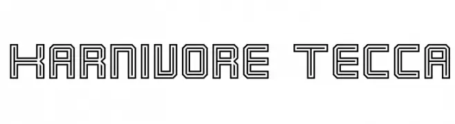
A bold, geometric font with a futuristic outline style.
![Karnivore Tecca Frei Schriftart Herunterladen]() Herunterladen 375 Downloads@WebFont
Herunterladen 375 Downloads@WebFont -
( Fonts by www.peter-wiegel.de. Personal-use only. For commercial use please contact owner. )
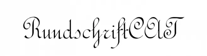
An elegant and flowing script font with ornate uppercase and graceful lowercase letters.
![RundschriftCAT Frei Schriftart Herunterladen]() Herunterladen 375 Downloads@WebFont
Herunterladen 375 Downloads@WebFont -
![Modern Antiqua Frei Schriftart Herunterladen]() Herunterladen 375 Downloads@WebFont
Herunterladen 375 Downloads@WebFont -
( Fonts by a Max Infeld - XEROGRAPHER FONTS - xerographer.blogspot.com . Personal-use only. For commercial use please contact owner. )
A bold, textured font with a modern and decorative style.
![Space Frei Schriftart Herunterladen]() Herunterladen 375 Downloads@WebFont
Herunterladen 375 Downloads@WebFont -
( Fonts by www.gliphmaker.com. Personal-use only. For commercial use please contact owner. )
A bold, geometric font with a strong, industrial aesthetic.
![Kareta A Frei Schriftart Herunterladen]() Herunterladen 375 Downloads@WebFont
Herunterladen 375 Downloads@WebFont -
( Fadhil Aqsa - creativemarket.com/Meutuwah )
A stylish and elegant script font with fluid, cursive strokes and a handcrafted feel.
![Vettorell free Frei Schriftart Herunterladen]() Herunterladen 375 Downloads@WebFont
Herunterladen 375 Downloads@WebFont -
( Fonts by Daniel Zadorozny - www.iconian.com - Free for personal use )
A bold, 3D italic font with an outlined, futuristic style.
![Power Lord 3D Italic Frei Schriftart Herunterladen]() Herunterladen 374 Downloads@WebFont
Herunterladen 374 Downloads@WebFont -
( Copyright 2019 The Red Hat Project Authors (https://github.com/RedHatOfficial/RedHatFont) )
A modern, bold, and italicized font with a clean and professional appearance.
![Red Hat Display Bold It Frei Schriftart Herunterladen]() Herunterladen 374 Downloads@WebFont
Herunterladen 374 Downloads@WebFont -
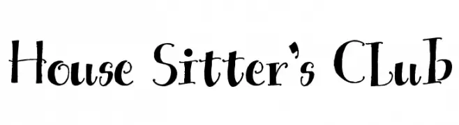
( Free for a personal use. For a commercial use please visit www.kevinandamanda.com )
A whimsical and artistic font with playful curves and varying stroke widths.
![House Sitter's Club Frei Schriftart Herunterladen]() Herunterladen 374 Downloads@WebFont
Herunterladen 374 Downloads@WebFont -
![Ufo Frei Schriftart Herunterladen]() Herunterladen 374 Downloads@WebFont
Herunterladen 374 Downloads@WebFont -
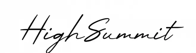
( Fonts by Hartadi Design - Personal-use only. For commercial use please contact owner. )
A fluid and elegant script font with smooth, flowing lines.
![High Summit Frei Schriftart Herunterladen]() Herunterladen 374 Downloads@WebFont
Herunterladen 374 Downloads@WebFont -
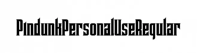
( Tama Putra - be.net/tmptr )
A bold, gothic-inspired font with sharp, angular edges.
![Pindunk Personal Use Regular Frei Schriftart Herunterladen]() Herunterladen 374 Downloads@WebFont
Herunterladen 374 Downloads@WebFont -
( Fonts by Blue Vinyl - Jess Latham - www.bvfonts.com )
The image contains decorative heart symbols, not a valid font.
![Hearts BV Frei Schriftart Herunterladen]() Herunterladen 374 Downloads@WebFont
Herunterladen 374 Downloads@WebFont -
( Font by Sven Stuber - www.superlooper.de )
A bold, geometric font with strong, angular lines and minimal spacing.
![Superimpose Black Frei Schriftart Herunterladen]() Herunterladen 374 Downloads@WebFont
Herunterladen 374 Downloads@WebFont -
![Fireworksfont Frei Schriftart Herunterladen]() Herunterladen 374 Downloads
Herunterladen 374 Downloads -
( Fonts by Blue Vinyl - Jess Latham - www.bvfonts.com )
Hand-drawn icon dingbat font with a playful, sketchy style.
![Webstar BV Frei Schriftart Herunterladen]() Herunterladen 374 Downloads@WebFont
Herunterladen 374 Downloads@WebFont -
![Great Heights BRK Frei Schriftart Herunterladen]() Herunterladen 374 Downloads@WebFont
Herunterladen 374 Downloads@WebFont -
( Mycandythemes - Filia )
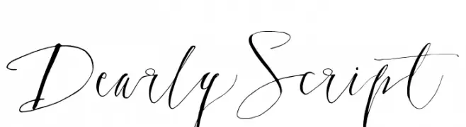
An elegant, flowing script font with a handwritten appearance.
![DearlyScript Frei Schriftart Herunterladen]() Herunterladen 374 Downloads@WebFont
Herunterladen 374 Downloads@WebFont -
( Fonts by a Max Infeld - XEROGRAPHER FONTS - xerographer.blogspot.com . Personal-use only. For commercial use please contact owner. )
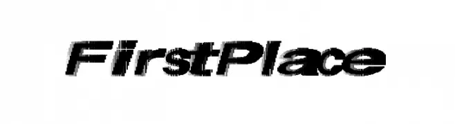
A bold, italic, and dynamic font with high contrast and a modern style.
![FirstPlace Frei Schriftart Herunterladen]() Herunterladen 374 Downloads@WebFont
Herunterladen 374 Downloads@WebFont -
![Berylium Bold Italic Frei Schriftart Herunterladen]() Herunterladen 374 Downloads@WebFont
Herunterladen 374 Downloads@WebFont -
( Iconian Fonts - Daniel Zadorozny - www.iconian.com )
A bold, blocky font with an industrial and modern aesthetic.
![Uglier Things Expanded Frei Schriftart Herunterladen]() Herunterladen 374 Downloads@WebFont
Herunterladen 374 Downloads@WebFont -
( Fonts by Apostrophic Lab )
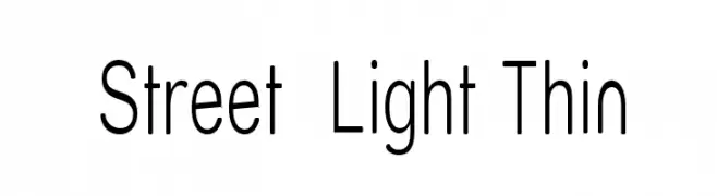
A modern, thin sans-serif font with a sleek and minimalist design.
![Street Light Thin Frei Schriftart Herunterladen]() Herunterladen 374 Downloads@WebFont
Herunterladen 374 Downloads@WebFont -
![Alphabet Fantasie Regular Frei Schriftart Herunterladen]() Herunterladen 374 Downloads@WebFont
Herunterladen 374 Downloads@WebFont -
( Fonts by www.tepidmonkey.net )
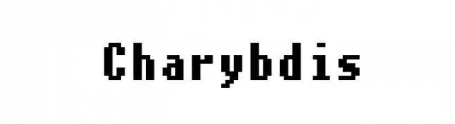
A bold, pixelated font with a retro digital aesthetic.
![Charybdis Frei Schriftart Herunterladen]() Herunterladen 374 Downloads@WebFont
Herunterladen 374 Downloads@WebFont -
( Fonts by Krysten Tom )
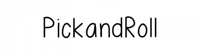
A playful, rounded, handwritten-style font with even spacing.
![PickandRoll Frei Schriftart Herunterladen]() Herunterladen 374 Downloads@WebFont
Herunterladen 374 Downloads@WebFont -
( Fonts by 50Fox Studio - www.50fox.com - Personal-use only. For commercial use please contact owner. )
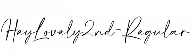
A lively and expressive handwritten font with fluid strokes and dynamic style.
![HeyLovely2nd-Regular Frei Schriftart Herunterladen]() Herunterladen 374 Downloads@WebFont
Herunterladen 374 Downloads@WebFont -
( Fonts by Woodcutter )
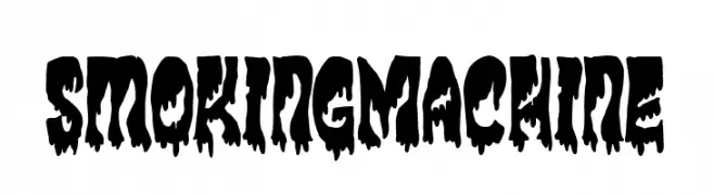
A bold, dripping font with a dramatic and eerie style.
![Smoking Machine Frei Schriftart Herunterladen]() Herunterladen 374 Downloads@WebFont
Herunterladen 374 Downloads@WebFont -
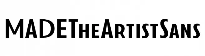
( Fonts by MadeType - Personal-use only. For commercial use please contact owner. )
A bold, modern sans-serif font with clean lines and a structured appearance.
![MADETheArtistSans Frei Schriftart Herunterladen]() Herunterladen 374 Downloads@WebFont
Herunterladen 374 Downloads@WebFont -
( Fonts by http://ar.photoshop.3abber.com - Personal-use only. For commercial use please contact owner. )
A bold and impactful font with thick strokes, perfect for headlines.
![VIP Rawy Bold Bold Frei Schriftart Herunterladen]() Herunterladen 374 Downloads
Herunterladen 374 Downloads -
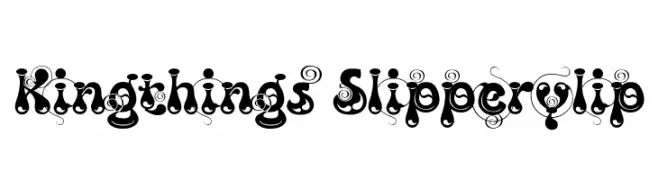
( Font by kingthingsfonts.co.uk )
A whimsical, decorative font with intricate swirls and high contrast.
![Kingthings Slipperylip Frei Schriftart Herunterladen]() Herunterladen 374 Downloads@WebFont
Herunterladen 374 Downloads@WebFont -
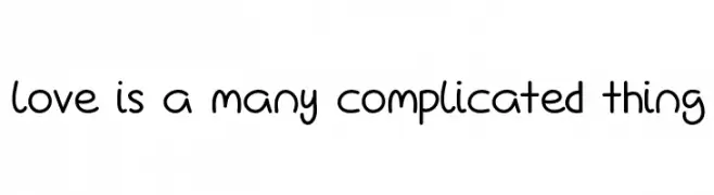
![Love Is A Many Complicated Thing Frei Schriftart Herunterladen]() Herunterladen 374 Downloads@WebFont
Herunterladen 374 Downloads@WebFont -
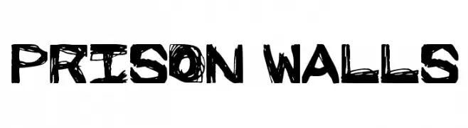
( Fonts by Cumberland Fontworks - http://www222.pair.com/sjohn/fonts.htm - S. John Ross )
A bold, distressed font with a gritty, hand-drawn style.
![Prison Walls Frei Schriftart Herunterladen]() Herunterladen 374 Downloads@WebFont
Herunterladen 374 Downloads@WebFont -
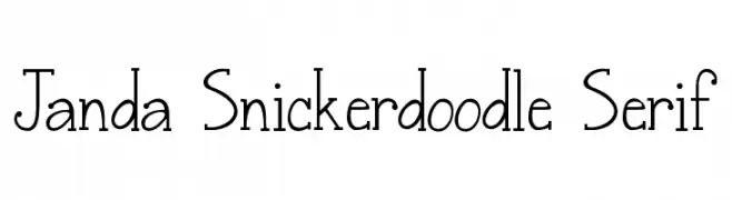
( Fonts by www.kimberlygeswein.com - Kimberly Geswein )
A playful serif font with tall, narrow characters and whimsical details.
![Janda Snickerdoodle Serif Frei Schriftart Herunterladen]() Herunterladen 374 Downloads@WebFont
Herunterladen 374 Downloads@WebFont


Welche Schriften sind gerade am populärsten?
Poppins, Roboto, Montserrat, Open Sans und Lato sind wegen ihrer klaren Formen und breiten Einsetzbarkeit sehr gefragt – von Markenauftritt über Landingpages bis hin zu Postern.
Welche Fonts eignen sich für Logos?
Geometrische Sans‑Serifs (z. B. Poppins, Familien im Gotham‑Stil) sind ein häufiger Griff für sauberes, skalierbares Branding. Für eine persönlichere Note bleiben Scripts und Handschrift‑Stile beliebt. Kombinieren Sie einen prägnanten Headline‑Font mit einer neutralen Brotschrift für Wiedererkennung und Harmonie.
Wie oft wird die Top‑Liste aktualisiert?
Regelmäßig – basierend auf realen Downloads und Interaktionen. Schauen Sie öfter vorbei, um aufstrebende Favoriten früh zu entdecken.
💡 Tipp: Seite bookmarken – Trends wechseln schnell, und heutige Top‑Schriften inspirieren morgen vielleicht das Rebranding.