Willkommen bei den Top‑Schriften – hier treffen Beliebtheit und Qualität aufeinander. Das sind die in diesem Jahr am häufigsten heruntergeladenen und genutzten Fonts. Wenn Sie sichere Optionen für Logo, Web oder Social suchen, starten Sie hier.
Jeder Top‑Font überzeugt durch Balance, Lesbarkeit und Vielseitigkeit. Sie finden moderne Sans‑Serifs, elegante Scripts, Vintage‑Serifs und minimalistische Displays.
-
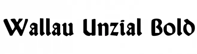
( Fonts by Dieter Steffmann )
A bold, medieval-inspired font with angular, sharp letterforms.
 Herunterladen 374 Downloads@WebFont
 -
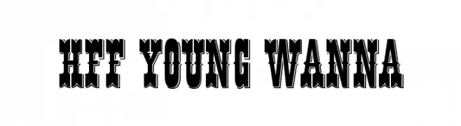
![HFF Young Wanna Frei Schriftart Herunterladen]() Herunterladen 374 Downloads@WebFont
Herunterladen 374 Downloads@WebFont -
![Verano Frei Schriftart Herunterladen]() Herunterladen 374 Downloads@WebFont
Herunterladen 374 Downloads@WebFont -
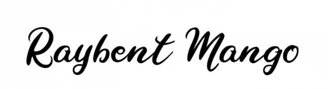
( Fonts by Fenny Wiryani - Personal-use only. For commercial use please contact owner. )
A bold, cursive script font with elegant curves and smooth transitions.
![Raybent Mango Frei Schriftart Herunterladen]() Herunterladen 374 Downloads@WebFont
Herunterladen 374 Downloads@WebFont -
( Fonts by Gabor Vad )
A bold, geometric font with a futuristic, robotic aesthetic.
![GiantRobotArmy Medium Frei Schriftart Herunterladen]() Herunterladen 374 Downloads@WebFont
Herunterladen 374 Downloads@WebFont -
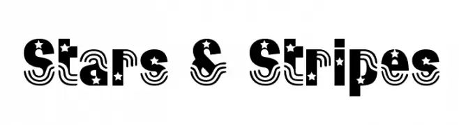
( Fonts by Broderbund Software - Personal-use only. For commercial use please contact owner. )
A bold, decorative font with stars and stripes, ideal for patriotic themes.
![Stars & Stripes Frei Schriftart Herunterladen]() Herunterladen 374 Downloads@WebFont
Herunterladen 374 Downloads@WebFont -
( Fonts by Daniel Zadorozny - www.iconian.com - Free for personal use )
A bold, italicized font with a modern, dynamic style and angular cuts.
![Singapore Sling Bold Italic Frei Schriftart Herunterladen]() Herunterladen 374 Downloads@WebFont
Herunterladen 374 Downloads@WebFont -
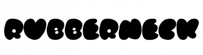
( Fonts by Jacob Fisher - www.pizzadude.dk )
A bold, playful font with thick, rounded characters and a whimsical style.
![Rubberneck Frei Schriftart Herunterladen]() Herunterladen 374 Downloads@WebFont
Herunterladen 374 Downloads@WebFont -
( Deepak Dogra - www.creativefabrica.com/designer/deepak-dogra/ )
A bold, textured font with a vintage, hand-crafted appearance.
![Renos Rough Regular Frei Schriftart Herunterladen]() Herunterladen 374 Downloads@WebFont
Herunterladen 374 Downloads@WebFont -
( Noto is a trademark of Google Inc. Noto fonts are open source. All Noto fonts are published under the SIL Open Font License, Version 1.1 )
A modern, clean sans-serif font supporting the Ethiopic script with excellent readability.
![Noto Sans Ethiopic Regular Frei Schriftart Herunterladen]() Herunterladen 374 Downloads@WebFont
Herunterladen 374 Downloads@WebFont -
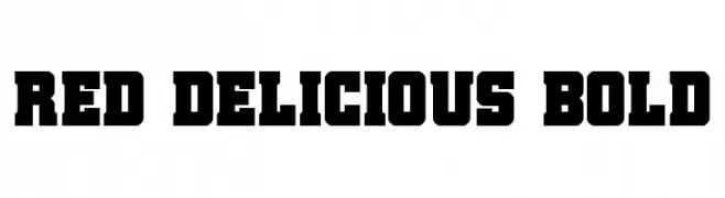
( Fonts by Daniel Zadorozny - www.iconian.com - Personal-use only. For commercial use please contact owner. )
A bold, slab serif font with strong, block-like characters.
![Red Delicious Bold Frei Schriftart Herunterladen]() Herunterladen 374 Downloads@WebFont
Herunterladen 374 Downloads@WebFont -
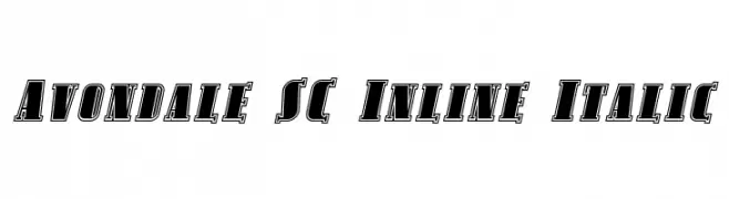
( Fonts by Apostrophic Lab )
A bold, italicized inline font with a dynamic and modern style.
![Avondale SC Inline Italic Frei Schriftart Herunterladen]() Herunterladen 374 Downloads@WebFont
Herunterladen 374 Downloads@WebFont -
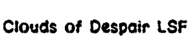
( Fonts by Jester Font Studio )
A bold, textured font with a cloud-like, artistic appearance.
![Clouds of Despair LSF Frei Schriftart Herunterladen]() Herunterladen 374 Downloads@WebFont
Herunterladen 374 Downloads@WebFont -
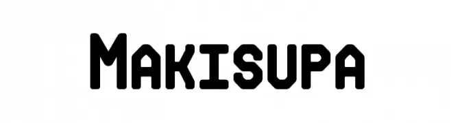
( Fonts by Rich Gast - www.greywolfwebworks.com Sponsoren Schriftart )
A bold, geometric font with rounded edges and a modern, industrial style.
![Makisupa Frei Schriftart Herunterladen]() Herunterladen 374 Downloads
Herunterladen 374 Downloads -
( Fonts by MJType )
A playful, casual handwritten font with smooth, flowing lines.
![Jhon Max Frei Schriftart Herunterladen]() Herunterladen 374 Downloads@WebFont
Herunterladen 374 Downloads@WebFont -
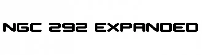
( Fonts by Daniel Zadorozny - www.iconian.com - Personal-use only. For commercial use please contact owner. )
A bold, futuristic font with rounded edges and expanded width.
![NGC 292 Expanded Frei Schriftart Herunterladen]() Herunterladen 374 Downloads@WebFont
Herunterladen 374 Downloads@WebFont -
![THE LABORATORY Frei Schriftart Herunterladen]() Herunterladen 374 Downloads@WebFont
Herunterladen 374 Downloads@WebFont -
![WFF LAGE grafica FGM Normal Frei Schriftart Herunterladen]() Herunterladen 374 Downloads@WebFont
Herunterladen 374 Downloads@WebFont -
( Axel Lymphos )
A bold, geometric font ideal for impactful headlines and logos.
![Perca Frei Schriftart Herunterladen]() Herunterladen 374 Downloads@WebFont
Herunterladen 374 Downloads@WebFont -
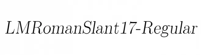
( Fonts by www.gust.org.pl )
Elegant serif font with a slant, offering a classic and sophisticated look.
![LMRomanSlant17-Regular Frei Schriftart Herunterladen]() Herunterladen 374 Downloads@WebFont
Herunterladen 374 Downloads@WebFont -
![Atman dings Frei Schriftart Herunterladen]() Herunterladen 374 Downloads@WebFont
Herunterladen 374 Downloads@WebFont -
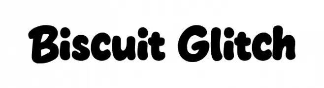
( Fonts by BlackFridayFont FMF )
Bold, rounded, playful sans-serif with a hand-drawn look.
![Biscuit Glitch Frei Schriftart Herunterladen]() Herunterladen 374 Downloads@WebFont
Herunterladen 374 Downloads@WebFont -
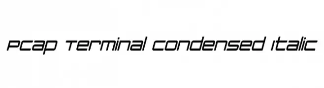
( Fonts by a Neale Davidson - www.pixelsagas.com. Personal-use only. For commercial use please contact owner. )
A sleek, modern, condensed italic font with consistent stroke thickness.
![PCap Terminal Condensed Italic Frei Schriftart Herunterladen]() Herunterladen 374 Downloads@WebFont
Herunterladen 374 Downloads@WebFont -
![jethose LOOSE Frei Schriftart Herunterladen]() Herunterladen 374 Downloads@WebFont
Herunterladen 374 Downloads@WebFont -
Schriftart von joorgemoron. For commercial use please contact the owner.
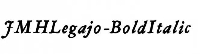
( Free for personal use. )
A bold, italicized font with dynamic strokes and a classic, expressive style.
![JMHLegajo-BoldItalic Frei Schriftart Herunterladen]() Herunterladen 374 Downloads@WebFont
Herunterladen 374 Downloads@WebFont -
( Fonts by appajid )
A modern, geometric sans-serif font with narrow, elongated characters.
![Chathura-Regular Frei Schriftart Herunterladen]() Herunterladen 374 Downloads@WebFont
Herunterladen 374 Downloads@WebFont -
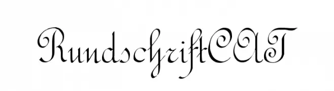
( Fonts by www.peter-wiegel.de. Personal-use only. For commercial use please contact owner. )
An elegant and flowing script font with ornate uppercase and graceful lowercase letters.
![RundschriftCAT Frei Schriftart Herunterladen]() Herunterladen 374 Downloads@WebFont
Herunterladen 374 Downloads@WebFont -
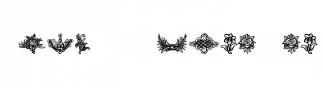
( Fonts by Dieter Steffmann )
Ornate floral and decorative vignette symbols.
![Schluss-Vignetten Frei Schriftart Herunterladen]() Herunterladen 374 Downloads@WebFont
Herunterladen 374 Downloads@WebFont -
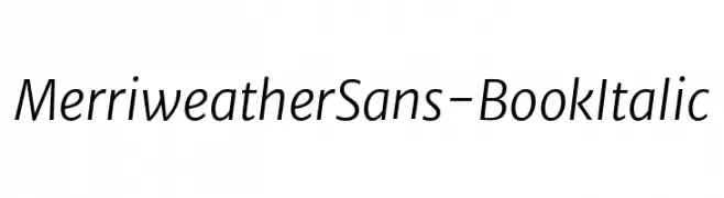
( Fonts by Sorkin Type Co )
A modern, italic sans-serif font with clean lines and balanced proportions.
![MerriweatherSans-BookItalic Frei Schriftart Herunterladen]() Herunterladen 374 Downloads@WebFont
Herunterladen 374 Downloads@WebFont -
( Fonts by vilogsign - Nur Kholis - Personal-use only. For commercial use please contact owner. )
A bold, geometric font with a modern twist and vintage influences.
![Arcana DEMO Frei Schriftart Herunterladen]() Herunterladen 374 Downloads@WebFont
Herunterladen 374 Downloads@WebFont -
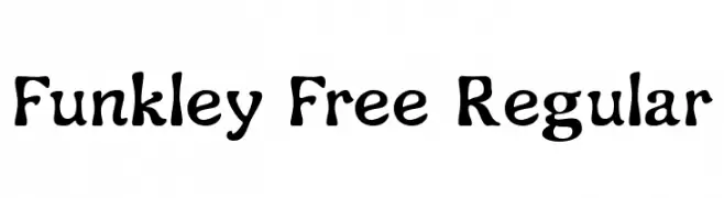
( Fonts by Craft Supply Co. )
A playful, bold, and whimsical font with a hand-drawn appearance.
![Funkley Free Regular Frei Schriftart Herunterladen]() Herunterladen 374 Downloads@WebFont
Herunterladen 374 Downloads@WebFont -
( www.facebook.com/palafotz )
A playful, casual handwritten font with smooth, rounded edges.
![Marker Palafotz Frei Schriftart Herunterladen]() Herunterladen 373 Downloads@WebFont
Herunterladen 373 Downloads@WebFont -
![Tt-Kp-Medium Frei Schriftart Herunterladen]() Herunterladen 373 Downloads@WebFont
Herunterladen 373 Downloads@WebFont -
( Fonts by Dieter Steffmann )
A bold slab serif font with thick strokes and rounded edges.
![Parsons Heavy Frei Schriftart Herunterladen]() Herunterladen 373 Downloads@WebFont
Herunterladen 373 Downloads@WebFont -
( Fonts by Dan P. Lyons - Personal-use only. For commercial use please contact owner. )
A casual, handwritten font with rounded, consistent strokes.
![Daniel's Handwriting Bold Frei Schriftart Herunterladen]() Herunterladen 373 Downloads@WebFont
Herunterladen 373 Downloads@WebFont


Welche Schriften sind gerade am populärsten?
Poppins, Roboto, Montserrat, Open Sans und Lato sind wegen ihrer klaren Formen und breiten Einsetzbarkeit sehr gefragt – von Markenauftritt über Landingpages bis hin zu Postern.
Welche Fonts eignen sich für Logos?
Geometrische Sans‑Serifs (z. B. Poppins, Familien im Gotham‑Stil) sind ein häufiger Griff für sauberes, skalierbares Branding. Für eine persönlichere Note bleiben Scripts und Handschrift‑Stile beliebt. Kombinieren Sie einen prägnanten Headline‑Font mit einer neutralen Brotschrift für Wiedererkennung und Harmonie.
Wie oft wird die Top‑Liste aktualisiert?
Regelmäßig – basierend auf realen Downloads und Interaktionen. Schauen Sie öfter vorbei, um aufstrebende Favoriten früh zu entdecken.
💡 Tipp: Seite bookmarken – Trends wechseln schnell, und heutige Top‑Schriften inspirieren morgen vielleicht das Rebranding.