Willkommen bei den Top‑Schriften – hier treffen Beliebtheit und Qualität aufeinander. Das sind die in diesem Jahr am häufigsten heruntergeladenen und genutzten Fonts. Wenn Sie sichere Optionen für Logo, Web oder Social suchen, starten Sie hier.
Jeder Top‑Font überzeugt durch Balance, Lesbarkeit und Vielseitigkeit. Sie finden moderne Sans‑Serifs, elegante Scripts, Vintage‑Serifs und minimalistische Displays.
-
 Herunterladen 372 Downloads@WebFont
 -
![Embrush Frei Schriftart Herunterladen]() Herunterladen 372 Downloads@WebFont
Herunterladen 372 Downloads@WebFont -
( Fonts by GGBotNet )
A modern, geometric sans-serif font with consistent stroke widths and a clean appearance.
![Jupiteroid Regular Frei Schriftart Herunterladen]() Herunterladen 372 Downloads@WebFont
Herunterladen 372 Downloads@WebFont -
![FortySeven NBP Frei Schriftart Herunterladen]() Herunterladen 372 Downloads@WebFont
Herunterladen 372 Downloads@WebFont -
( Fonts by www.chequered.ink - Chequered Ink - Personal-use only. For commercial use please contact owner. )
A sleek, geometric font with clean lines and a modern aesthetic.
![CookieCutterCulture Frei Schriftart Herunterladen]() Herunterladen 372 Downloads@WebFont
Herunterladen 372 Downloads@WebFont -
( Fonts by Michele Vannucchi MKT )
A playful, handwritten font with an informal and organic style.
![JEMBOhand Frei Schriftart Herunterladen]() Herunterladen 372 Downloads@WebFont
Herunterladen 372 Downloads@WebFont -
( Fonts by twinletter )
A bold, playful font with a hand-drawn, whimsical style.
![GAYENGPersonalUse Frei Schriftart Herunterladen]() Herunterladen 372 Downloads@WebFont
Herunterladen 372 Downloads@WebFont -
( Fonts by Iconian Fonts )
A bold, angular, and slightly italicized font with a futuristic style.
![Cruiser Fortress Semi-Italic Frei Schriftart Herunterladen]() Herunterladen 372 Downloads@WebFont
Herunterladen 372 Downloads@WebFont -
( Fonts by sronstudio )
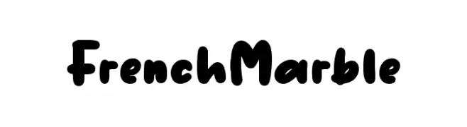
Bold, playful handwritten font.
![French Marble Frei Schriftart Herunterladen]() Herunterladen 372 Downloads@WebFont
Herunterladen 372 Downloads@WebFont -
( Fonts by Creavibes Design - Personal-use only. For commercial use please contact owner. )
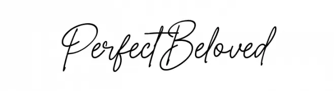
A cursive script font with elegant, flowing strokes and a handwritten appearance.
![Perfect Beloved Frei Schriftart Herunterladen]() Herunterladen 372 Downloads@WebFont
Herunterladen 372 Downloads@WebFont -
( Fonts by Peter Olexa )
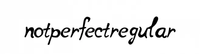
A playful, hand-drawn script font with dynamic strokes and whimsical flourishes.
![notperfectregular Frei Schriftart Herunterladen]() Herunterladen 372 Downloads@WebFont
Herunterladen 372 Downloads@WebFont -
( Fonts by Vic Fieger )
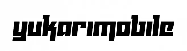
A bold, angular font with a geometric and dynamic style.
![Yukarimobile Frei Schriftart Herunterladen]() Herunterladen 372 Downloads@WebFont
Herunterladen 372 Downloads@WebFont -
( Fonts by Iconian Fonts )
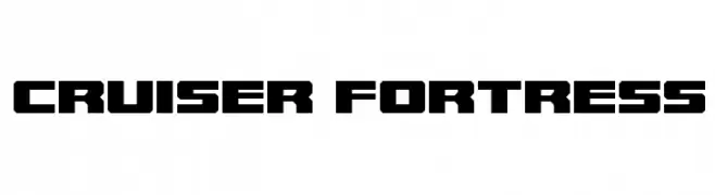
A bold, geometric font with an industrial and modern design.
![Cruiser Fortress Frei Schriftart Herunterladen]() Herunterladen 372 Downloads@WebFont
Herunterladen 372 Downloads@WebFont -
( Chequered Ink - chequered.ink/ )
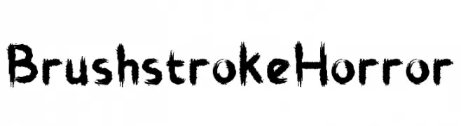
A horror-themed font with jagged, brushstroke-style letters.
![Brushstroke Horror Frei Schriftart Herunterladen]() Herunterladen 372 Downloads@WebFont
Herunterladen 372 Downloads@WebFont -
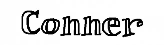
![Conner Frei Schriftart Herunterladen]() Herunterladen 372 Downloads@WebFont
Herunterladen 372 Downloads@WebFont -
( Fonts by Benoit Sjoholm - www.benoitsjoholm.com - All my fonts are for sale )
A bold, high-contrast font with a modern and elegant design.
![Nolla01 Frei Schriftart Herunterladen]() Herunterladen 372 Downloads@WebFont
Herunterladen 372 Downloads@WebFont -
( Copyright (c) 2012-2015, The Mozilla Foundation and Telefonica S.A. )
A modern, extra-condensed, thin sans-serif font with a clean and minimalist design.
![Fira Sans Extra Condensed Thin Frei Schriftart Herunterladen]() Herunterladen 372 Downloads@WebFont
Herunterladen 372 Downloads@WebFont -
( Fonts by www.kimberlygeswein.com - Kimberly Geswein )
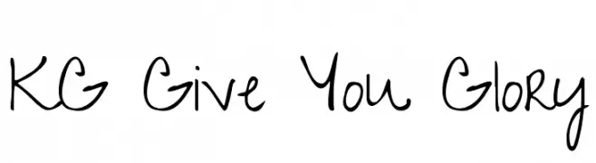
A playful, casual handwritten font with fluid strokes and a natural flow.
![KG Give You Glory Frei Schriftart Herunterladen]() Herunterladen 372 Downloads@WebFont
Herunterladen 372 Downloads@WebFont -
![Cone Of Silence Frei Schriftart Herunterladen]() Herunterladen 372 Downloads@WebFont
Herunterladen 372 Downloads@WebFont -
( Fonts by Daniel Zadorozny - www.iconian.com - Free for personal use )
A bold, futuristic font with sharp, angular lines and geometric shapes.
![Snubfighter Frei Schriftart Herunterladen]() Herunterladen 372 Downloads@WebFont
Herunterladen 372 Downloads@WebFont -
( Fonts by www.fontpanda.com. Personal-use only. For commercial use please contact owner. )
A playful, handwritten font with fluid strokes and a casual vibe.
![the Joynt Frei Schriftart Herunterladen]() Herunterladen 372 Downloads@WebFont
Herunterladen 372 Downloads@WebFont -
( Noto is a trademark of Google Inc. Noto fonts are open source. All Noto fonts are published under the SIL Open Font License, Version 1.1 )
No valid font glyphs are visible.
![Noto Sans Balinese Frei Schriftart Herunterladen]() Herunterladen 372 Downloads@WebFont
Herunterladen 372 Downloads@WebFont -
( Fonts by Bartek Nowak - www.nowak.tv/fontoholic/ )
No recognizable font is present.
![Hieroglify Frei Schriftart Herunterladen]() Herunterladen 372 Downloads@WebFont
Herunterladen 372 Downloads@WebFont -
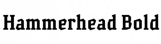
![Hammerhead Bold Frei Schriftart Herunterladen]() Herunterladen 372 Downloads@WebFont
Herunterladen 372 Downloads@WebFont -
( Fonts by huawei.com - Personal-use only. For commercial use please contact owner. )
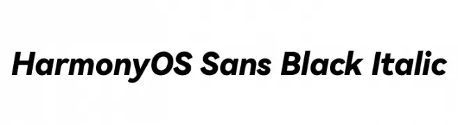
A bold, modern sans-serif font with an italic style, perfect for impactful designs.
![HarmonyOS Sans Black Italic Frei Schriftart Herunterladen]() Herunterladen 372 Downloads@WebFont
Herunterladen 372 Downloads@WebFont -
![Short Frei Schriftart Herunterladen]() Herunterladen 372 Downloads@WebFont
Herunterladen 372 Downloads@WebFont -
( Anton Bohlin - antonbohlin.com )
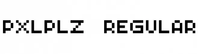
A pixelated, retro-style font with a digital, blocky appearance.
![PXLPLZ Regular Frei Schriftart Herunterladen]() Herunterladen 372 Downloads@WebFont
Herunterladen 372 Downloads@WebFont -
( Fonts by Kimberly Geswein - kimberlygeswein.com )
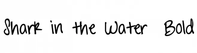
A bold, playful handwritten font with a casual and lively style.
![Shark in the Water Bold Frei Schriftart Herunterladen]() Herunterladen 372 Downloads@WebFont
Herunterladen 372 Downloads@WebFont -
( Fonts by JengOut Studio )
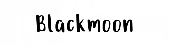
A bold, playful handwritten font with thick strokes and a casual style.
![Blackmoon Frei Schriftart Herunterladen]() Herunterladen 372 Downloads@WebFont
Herunterladen 372 Downloads@WebFont -
![Gothik#107 Frei Schriftart Herunterladen]() Herunterladen 372 Downloads@WebFont
Herunterladen 372 Downloads@WebFont -
( Fonts by SnailFonts )
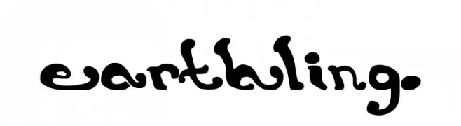
A whimsical and artistic font with fluid, decorative letterforms.
![earthling. Frei Schriftart Herunterladen]() Herunterladen 372 Downloads@WebFont
Herunterladen 372 Downloads@WebFont -
Schriftart von antipixel. For commercial use please contact the owner.
![Nue Frei Schriftart Herunterladen]() Herunterladen 372 Downloads@WebFont
Herunterladen 372 Downloads@WebFont -
![Hellbetika Bold Frei Schriftart Herunterladen]() Herunterladen 372 Downloads@WebFont
Herunterladen 372 Downloads@WebFont -
( Fonts by Beyond Design - Ola Bjorling )
A futuristic, bold outline font with rounded, continuous lines.
![hybrid Outline Frei Schriftart Herunterladen]() Herunterladen 372 Downloads@WebFont
Herunterladen 372 Downloads@WebFont -
( Fonts by Ariq Sya - marsnev.com - Personal-use only. For commercial use please contact owner. )
A bold, modern font with a double-line style and geometric structure.
![Dopest by MARSNEV light italic Frei Schriftart Herunterladen]() Herunterladen 372 Downloads@WebFont
Herunterladen 372 Downloads@WebFont


Welche Schriften sind gerade am populärsten?
Poppins, Roboto, Montserrat, Open Sans und Lato sind wegen ihrer klaren Formen und breiten Einsetzbarkeit sehr gefragt – von Markenauftritt über Landingpages bis hin zu Postern.
Welche Fonts eignen sich für Logos?
Geometrische Sans‑Serifs (z. B. Poppins, Familien im Gotham‑Stil) sind ein häufiger Griff für sauberes, skalierbares Branding. Für eine persönlichere Note bleiben Scripts und Handschrift‑Stile beliebt. Kombinieren Sie einen prägnanten Headline‑Font mit einer neutralen Brotschrift für Wiedererkennung und Harmonie.
Wie oft wird die Top‑Liste aktualisiert?
Regelmäßig – basierend auf realen Downloads und Interaktionen. Schauen Sie öfter vorbei, um aufstrebende Favoriten früh zu entdecken.
💡 Tipp: Seite bookmarken – Trends wechseln schnell, und heutige Top‑Schriften inspirieren morgen vielleicht das Rebranding.