Willkommen bei den Top‑Schriften – hier treffen Beliebtheit und Qualität aufeinander. Das sind die in diesem Jahr am häufigsten heruntergeladenen und genutzten Fonts. Wenn Sie sichere Optionen für Logo, Web oder Social suchen, starten Sie hier.
Jeder Top‑Font überzeugt durch Balance, Lesbarkeit und Vielseitigkeit. Sie finden moderne Sans‑Serifs, elegante Scripts, Vintage‑Serifs und minimalistische Displays.
-
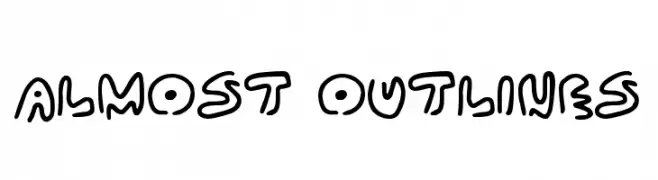
( Fonts by Darrell Flood )
A playful, bold outline font with a cartoonish and dynamic style.
 Herunterladen 370 Downloads@WebFont
 -
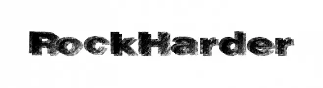
( Fonts by a Max Infeld - XEROGRAPHER FONTS - xerographer.blogspot.com . Personal-use only. For commercial use please contact owner. )
A bold, textured font with a rugged, rock-like appearance.
![RockHarder Frei Schriftart Herunterladen]() Herunterladen 370 Downloads@WebFont
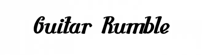
Herunterladen 370 Downloads@WebFont -
![Guitar Rumble Frei Schriftart Herunterladen]() Herunterladen 370 Downloads@WebFont
Herunterladen 370 Downloads@WebFont -
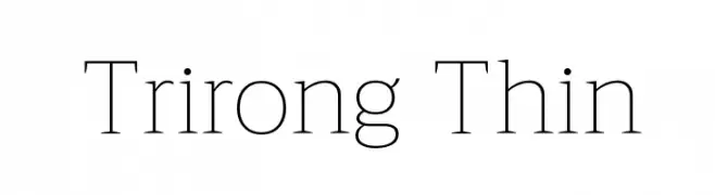
( Copyright (c) 2015, Cadson Demak (info@cadsondemak.com) )
A thin, elegant serif font with high contrast and sharp serifs.
![Trirong Thin Frei Schriftart Herunterladen]() Herunterladen 370 Downloads@WebFont
Herunterladen 370 Downloads@WebFont -
![Kirsty Ink Frei Schriftart Herunterladen]() Herunterladen 370 Downloads@WebFont
Herunterladen 370 Downloads@WebFont -
( Fonts by LyonsType - Daniel Lyons - Personal-use only. For commercial use please contact owner. )
A modern, geometric sans-serif font with clean lines and uniform strokes.
![LT Asus Frei Schriftart Herunterladen]() Herunterladen 370 Downloads@WebFont
Herunterladen 370 Downloads@WebFont -
( Fonts by Iconian Fonts )
A bold, italic font with a modern, geometric style.
![Illumino Super-Italic Frei Schriftart Herunterladen]() Herunterladen 370 Downloads@WebFont
Herunterladen 370 Downloads@WebFont -
( Fonts by Kanye West - www.kanyewest.com - Personal-use only. For commercial use please contact owner. )
A bold, dynamic font with a hand-drawn, energetic style.
![Ftr Fnt Regular Frei Schriftart Herunterladen]() Herunterladen 370 Downloads@WebFont
Herunterladen 370 Downloads@WebFont -
( Fonts by Yun Gonzalez - g3drakoheart-arts.deviantart.com - Personal-use only. For commercial use please contact owner. )
A sleek, modern font with clean lines and geometric shapes.
![EleganTech!]() Herunterladen 370 Downloads@WebFont
Herunterladen 370 Downloads@WebFont -
( Fonts by Peter Wiegel - www.peter-wiegel.de - Personal-use only. For commercial use please contact owner. )
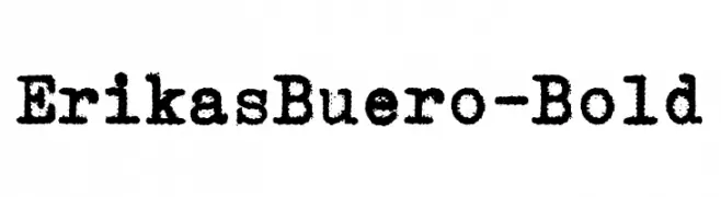
A bold, textured font with a vintage, typewriter-like appearance.
![ErikasBuero-Bold Frei Schriftart Herunterladen]() Herunterladen 370 Downloads@WebFont
Herunterladen 370 Downloads@WebFont -
( Fonts by CannotIntoSpaceFonts - KineticPlasma Fonts - Personal-use only. For commercial use please contact owner. )
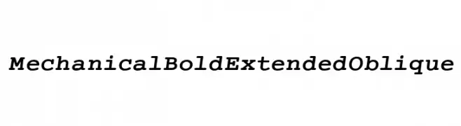
A bold, extended, and oblique font with a mechanical precision and modern appeal.
![Mechanical Bold Extended Oblique Frei Schriftart Herunterladen]() Herunterladen 370 Downloads@WebFont
Herunterladen 370 Downloads@WebFont -
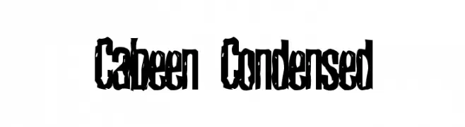
![Cabeen Condensed Frei Schriftart Herunterladen]() Herunterladen 370 Downloads@WebFont
Herunterladen 370 Downloads@WebFont -
( Fonts by a Neale Davidson - www.pixelsagas.com. Personal-use only. For commercial use please contact owner. )
A bold, italicized font with a modern and dynamic style.
![Erte Bold Italic Frei Schriftart Herunterladen]() Herunterladen 370 Downloads@WebFont
Herunterladen 370 Downloads@WebFont -
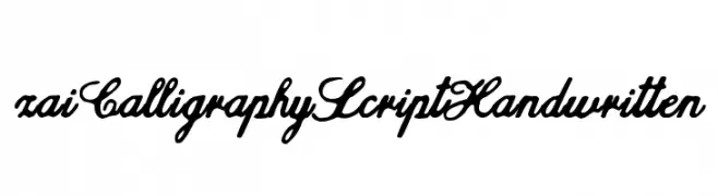
( Fonts by Tomasz Skowroński )
A bold, cursive script font with elegant, flowing strokes.
![zai Calligraphy Script Handwritten Frei Schriftart Herunterladen]() Herunterladen 370 Downloads@WebFont
Herunterladen 370 Downloads@WebFont -
( Fonts by Manuel Viergutz - Typo Graphic Design - www.typographicdesign.de )
A pixelated, maze-like font with a retro, digital aesthetic.
![IndiaSnakePixelLabyrinthGame Frei Schriftart Herunterladen]() Herunterladen 370 Downloads@WebFont
Herunterladen 370 Downloads@WebFont -
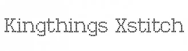
( Font by kingthingsfonts.co.uk )
A decorative font with a cross-stitch pattern, resembling traditional embroidery.
![Kingthings Xstitch Frei Schriftart Herunterladen]() Herunterladen 370 Downloads@WebFont
Herunterladen 370 Downloads@WebFont -
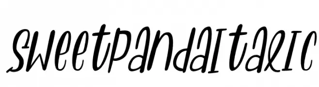
( Fonts by Letterena Studios )
A playful, handwritten italic font with dynamic strokes.
![Sweet Panda Italic Frei Schriftart Herunterladen]() Herunterladen 370 Downloads@WebFont
Herunterladen 370 Downloads@WebFont -
( Fonts by David Kerkhoff - www.hanodedphotography.com )
A whimsical, decorative font with charming swirls and curls.
![DKFatherFrost Frei Schriftart Herunterladen]() Herunterladen 370 Downloads@WebFont
Herunterladen 370 Downloads@WebFont -
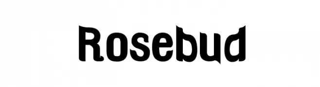
( Fonts by Barry Bujol - theoriginal19.blogspot.com )
A bold, playful font with rounded and angular elements, offering a modern yet retro charm.
![Rosebud Frei Schriftart Herunterladen]() Herunterladen 370 Downloads@WebFont
Herunterladen 370 Downloads@WebFont -
( Fonts by Zetafonts - Personal-use only. For commercial use please contact owner. )
A modern, clean typeface with consistent stroke widths and geometric structure.
![Eastman Roman Trial Md Frei Schriftart Herunterladen]() Herunterladen 370 Downloads@WebFont
Herunterladen 370 Downloads@WebFont -
( Fonts by Jayde Garrow - GarrowGlitch - http://jaydegarrow.wix.com/jaydefonts. Personal-use only. For commercial use please contact owner. )
A bold, distressed font with a grungy, textured appearance.
![Destroy Humans Frei Schriftart Herunterladen]() Herunterladen 370 Downloads@WebFont
Herunterladen 370 Downloads@WebFont -
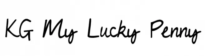
( Fonts by www.kimberlygeswein.com - Kimberly Geswein )
A playful, casual handwritten font with smooth, flowing curves.
![KG My Lucky Penny Frei Schriftart Herunterladen]() Herunterladen 370 Downloads@WebFont
Herunterladen 370 Downloads@WebFont -
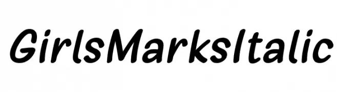
( 7NTypes - Situjuh Nazara - 7ntypes.com )
A playful, italic script font with rounded, smooth characters.
![Girls Marks Italic Frei Schriftart Herunterladen]() Herunterladen 370 Downloads@WebFont
Herunterladen 370 Downloads@WebFont -
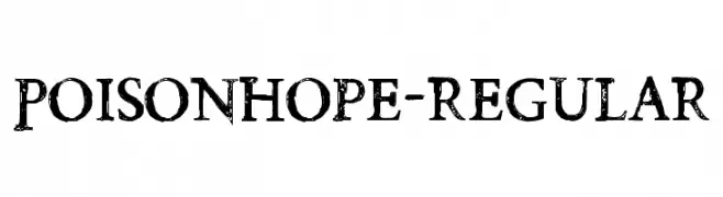
( Fonts by Chris Vile )
A distressed, grunge-style font with a rough, textured appearance.
![PoisonHope-Regular Frei Schriftart Herunterladen]() Herunterladen 370 Downloads@WebFont
Herunterladen 370 Downloads@WebFont -
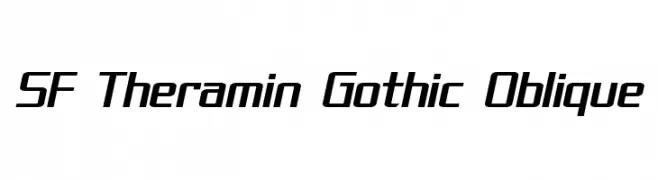
( Fonts by ShyFonts )
A sleek, modern oblique font with sharp angles and a futuristic aesthetic.
![SF Theramin Gothic Oblique Frei Schriftart Herunterladen]() Herunterladen 370 Downloads@WebFont
Herunterladen 370 Downloads@WebFont -
( Personal-use only. For commercial use please contact owner. )
A bold, rounded font with smooth curves and uniform stroke width, offering a modern and approachable style.
![Cactron Regular Frei Schriftart Herunterladen]() Herunterladen 370 Downloads@WebFont
Herunterladen 370 Downloads@WebFont -
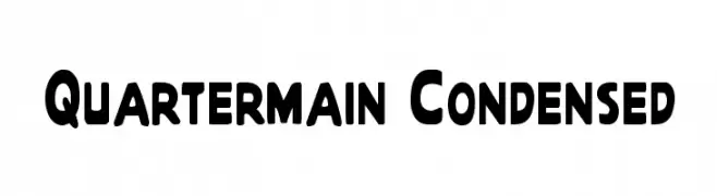
![Quartermain Condensed Frei Schriftart Herunterladen]() Herunterladen 370 Downloads
Herunterladen 370 Downloads -
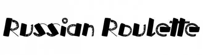
( www.tattoowoo.com )
A bold, edgy font with a hand-drawn, rebellious style.
![Russian Roulette Frei Schriftart Herunterladen]() Herunterladen 370 Downloads@WebFont
Herunterladen 370 Downloads@WebFont -
( Fonts by Pirated Material )
A bold, hand-drawn font with irregular, playful letterforms.
![Typephace Frei Schriftart Herunterladen]() Herunterladen 370 Downloads@WebFont
Herunterladen 370 Downloads@WebFont -
![Political Graft Fill Frei Schriftart Herunterladen]() Herunterladen 370 Downloads@WebFont
Herunterladen 370 Downloads@WebFont -
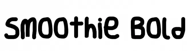
![Smoothie Bold Frei Schriftart Herunterladen]() Herunterladen 370 Downloads@WebFont
Herunterladen 370 Downloads@WebFont -
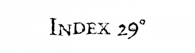
( Fonts by http://perso.calixo.net/~uzim/ )
A rugged, hand-drawn font with a vintage, weathered appearance.
![Index 29° Frei Schriftart Herunterladen]() Herunterladen 370 Downloads@WebFont
Herunterladen 370 Downloads@WebFont -
( Fonts by Manuel Viergutz - Typo Graphic Design - www.typographicdesign.de )
A textured, hand-drawn style font with bold, condensed characters.
![ScrFIBbLE Frei Schriftart Herunterladen]() Herunterladen 370 Downloads@WebFont
Herunterladen 370 Downloads@WebFont -
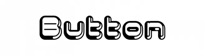
( Fonts by Masato Shimojima - Personal-use only. For commercial use please contact owner. )
A bold, playful font with a 3D shadow effect and rounded characters.
![Button Frei Schriftart Herunterladen]() Herunterladen 370 Downloads@WebFont
Herunterladen 370 Downloads@WebFont -
( Fonts by billyargel.blogspot.com - Billy Argel )
A modern, geometric font with sharp edges and a futuristic style.
![MANABU Frei Schriftart Herunterladen]() Herunterladen 370 Downloads@WebFont
Herunterladen 370 Downloads@WebFont


Welche Schriften sind gerade am populärsten?
Poppins, Roboto, Montserrat, Open Sans und Lato sind wegen ihrer klaren Formen und breiten Einsetzbarkeit sehr gefragt – von Markenauftritt über Landingpages bis hin zu Postern.
Welche Fonts eignen sich für Logos?
Geometrische Sans‑Serifs (z. B. Poppins, Familien im Gotham‑Stil) sind ein häufiger Griff für sauberes, skalierbares Branding. Für eine persönlichere Note bleiben Scripts und Handschrift‑Stile beliebt. Kombinieren Sie einen prägnanten Headline‑Font mit einer neutralen Brotschrift für Wiedererkennung und Harmonie.
Wie oft wird die Top‑Liste aktualisiert?
Regelmäßig – basierend auf realen Downloads und Interaktionen. Schauen Sie öfter vorbei, um aufstrebende Favoriten früh zu entdecken.
💡 Tipp: Seite bookmarken – Trends wechseln schnell, und heutige Top‑Schriften inspirieren morgen vielleicht das Rebranding.