Willkommen bei den Top‑Schriften – hier treffen Beliebtheit und Qualität aufeinander. Das sind die in diesem Jahr am häufigsten heruntergeladenen und genutzten Fonts. Wenn Sie sichere Optionen für Logo, Web oder Social suchen, starten Sie hier.
Jeder Top‑Font überzeugt durch Balance, Lesbarkeit und Vielseitigkeit. Sie finden moderne Sans‑Serifs, elegante Scripts, Vintage‑Serifs und minimalistische Displays.
-
( Fonts by Jecko Development - www.jeckodevelopment.com )
A playful, handwritten font with fluid strokes and a casual style.
 Herunterladen 368 Downloads@WebFont
 -
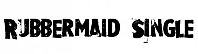
![Rubbermaid Single Frei Schriftart Herunterladen]() Herunterladen 368 Downloads@WebFont
Herunterladen 368 Downloads@WebFont -
( Copyright 2018 Boutros International. (http://www.boutrosfonts.com) )
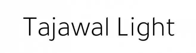
A modern, light sans-serif font with low contrast and excellent readability.
![Tajawal Light Frei Schriftart Herunterladen]() Herunterladen 368 Downloads@WebFont
Herunterladen 368 Downloads@WebFont -
( Fonts by a Neale Davidson - www.pixelsagas.com. Personal-use only. For commercial use please contact owner. )
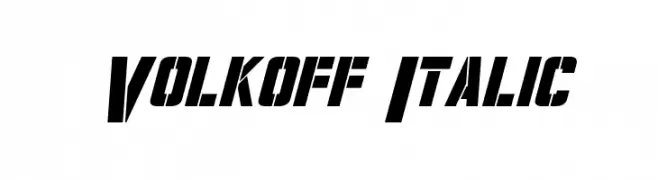
Bold, italicized font with sharp angles and a dynamic presence.
![Volkoff Italic Frei Schriftart Herunterladen]() Herunterladen 368 Downloads@WebFont
Herunterladen 368 Downloads@WebFont -
( Fonts by Khurasan )
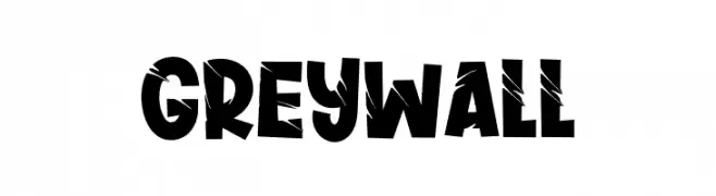
A bold, distressed font with a rugged, edgy appearance.
![Greywall Frei Schriftart Herunterladen]() Herunterladen 368 Downloads@WebFont
Herunterladen 368 Downloads@WebFont -
![Grixel Kyrou 9 Regular Bold Frei Schriftart Herunterladen]() Herunterladen 368 Downloads@WebFont
Herunterladen 368 Downloads@WebFont -
( Fonts by ShyFonts )
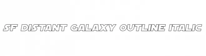
A futuristic, italicized outline font with bold, angular letterforms.
![SF Distant Galaxy Outline Italic Frei Schriftart Herunterladen]() Herunterladen 368 Downloads@WebFont
Herunterladen 368 Downloads@WebFont -
![Subpear Frei Schriftart Herunterladen]() Herunterladen 368 Downloads@WebFont
Herunterladen 368 Downloads@WebFont -
( Fonts by Manuel Ramos - www.infinitismo.com - Personal-use only. For commercial use please contact owner. )
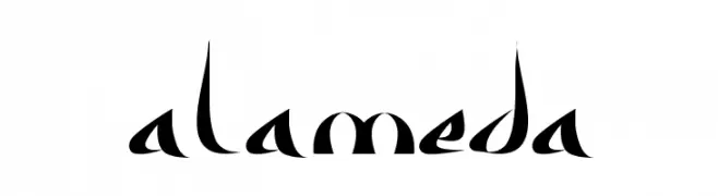
A modern, artistic font with sharp, angular strokes and high contrast.
![Alameda Frei Schriftart Herunterladen]() Herunterladen 368 Downloads@WebFont
Herunterladen 368 Downloads@WebFont -
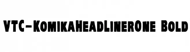
( Fonts by Vigilante Typeface Corporation Larry Yerkes. Personal-use only. For commercial use please contact owner. )
A bold, impactful font with thick strokes and a strong visual presence.
![VTC-KomikaHeadLinerOne Bold Frei Schriftart Herunterladen]() Herunterladen 368 Downloads@WebFont
Herunterladen 368 Downloads@WebFont -
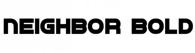
( Vladimir Nikolic - www.coroflot.com/vladimirnikolic )
A bold, geometric typeface with rounded edges and a modern, impactful style.
![Neighbor Bold Frei Schriftart Herunterladen]() Herunterladen 368 Downloads@WebFont
Herunterladen 368 Downloads@WebFont -
![Political Graft Fill Frei Schriftart Herunterladen]() Herunterladen 368 Downloads@WebFont
Herunterladen 368 Downloads@WebFont -
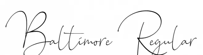
( Sronstudio - Yusron Billah )
An elegant and flowing script font with graceful curves and loops.
![Baltimore Regular Frei Schriftart Herunterladen]() Herunterladen 368 Downloads@WebFont
Herunterladen 368 Downloads@WebFont -
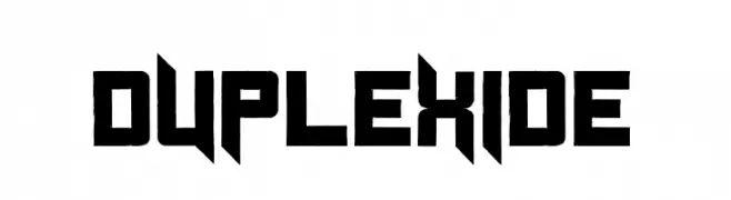
( Fonts by Cpr.Sparhelt )
A bold, angular font with a futuristic and geometric design.
![Duplexide Frei Schriftart Herunterladen]() Herunterladen 368 Downloads@WebFont
Herunterladen 368 Downloads@WebFont -
![Inquisition Italic Frei Schriftart Herunterladen]() Herunterladen 368 Downloads@WebFont
Herunterladen 368 Downloads@WebFont -
( Fonts by www.typodermicfonts.com - Ray Larabie )
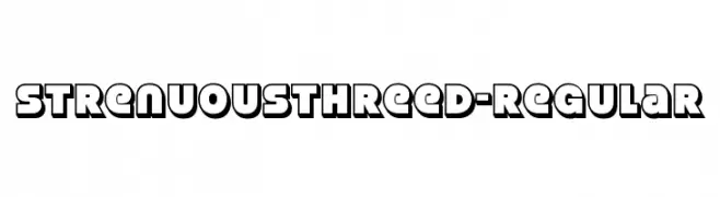
A bold, three-dimensional font with a striking, shadowed design.
![StrenuousThreeD-Regular Frei Schriftart Herunterladen]() Herunterladen 368 Downloads@WebFont
Herunterladen 368 Downloads@WebFont -
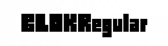
![BLOKRegular Frei Schriftart Herunterladen]() Herunterladen 368 Downloads@WebFont
Herunterladen 368 Downloads@WebFont -
![Atomium Frei Schriftart Herunterladen]() Herunterladen 368 Downloads@WebFont
Herunterladen 368 Downloads@WebFont -
![Ataxia [BRK] Frei Schriftart Herunterladen]() Herunterladen 368 Downloads@WebFont
Herunterladen 368 Downloads@WebFont -
( Zetafonts - www.zetafonts.com )
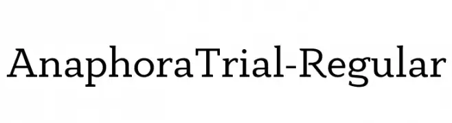
A modern serif font with elegant and refined letterforms, suitable for formal use.
![AnaphoraTrial-Regular Frei Schriftart Herunterladen]() Herunterladen 368 Downloads@WebFont
Herunterladen 368 Downloads@WebFont -
( Fonts by Daniel Zadorozny - www.iconian.com )
A bold, condensed font with a modern, industrial style.
![October Guard Condensed Frei Schriftart Herunterladen]() Herunterladen 368 Downloads@WebFont
Herunterladen 368 Downloads@WebFont -
( Fonts by Pizzadude )
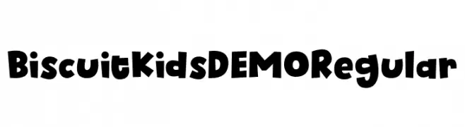
A playful, bold font with rounded, cartoonish characters.
![Biscuit Kids DEMO Regular Frei Schriftart Herunterladen]() Herunterladen 368 Downloads@WebFont
Herunterladen 368 Downloads@WebFont -
( Fonts by Faqih Fawaji - Personal-use only. For commercial use please contact owner. )
A modern, high-contrast font with sleek, elegant lines.
![zesant Frei Schriftart Herunterladen]() Herunterladen 368 Downloads@WebFont
Herunterladen 368 Downloads@WebFont -
![billbonessans Frei Schriftart Herunterladen]() Herunterladen 368 Downloads@WebFont
Herunterladen 368 Downloads@WebFont -
![Marchesa Frei Schriftart Herunterladen]() Herunterladen 368 Downloads@WebFont
Herunterladen 368 Downloads@WebFont -
![Roddy Frei Schriftart Herunterladen]() Herunterladen 368 Downloads@WebFont
Herunterladen 368 Downloads@WebFont -
( Fonts by Bearytype )
A playful, handwritten font with flowing, cursive-like strokes.
![Oneday Frei Schriftart Herunterladen]() Herunterladen 368 Downloads@WebFont
Herunterladen 368 Downloads@WebFont -
( Fonts by a Max Infeld - XEROGRAPHER FONTS - xerographer.blogspot.com . Personal-use only. For commercial use please contact owner. )
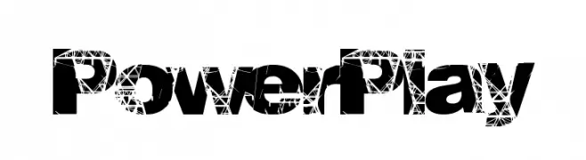
A bold, distressed font with a shattered glass effect.
![PowerPlay Frei Schriftart Herunterladen]() Herunterladen 368 Downloads@WebFont
Herunterladen 368 Downloads@WebFont -
![BodoFlo Frei Schriftart Herunterladen]() Herunterladen 368 Downloads@WebFont
Herunterladen 368 Downloads@WebFont -
( Noto is a trademark of Google Inc. Noto fonts are open source. All Noto fonts are published under the SIL Open Font License, Version 1.1 )
A monospaced, extra condensed, light sans-serif font with a modern and clean design.
![Noto Sans Mono ExtraCondensed Light Frei Schriftart Herunterladen]() Herunterladen 368 Downloads@WebFont
Herunterladen 368 Downloads@WebFont -
( Fonts by Iconian Fonts )
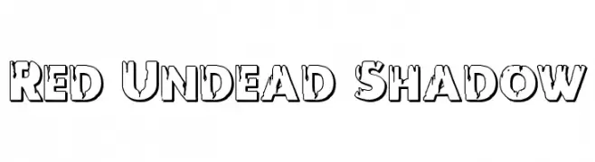
A bold, shadowed font with a distressed, grunge-like texture.
![Red Undead Shadow Frei Schriftart Herunterladen]() Herunterladen 368 Downloads@WebFont
Herunterladen 368 Downloads@WebFont -
( Fonts by Mystical Type - Candi Erwanto - Personal-use only. For commercial use please contact owner. )
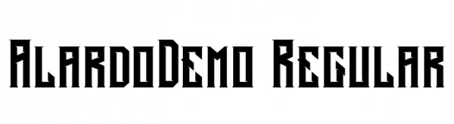
A bold, angular font with a geometric and edgy design.
![AlardoDemo-Regular Frei Schriftart Herunterladen]() Herunterladen 368 Downloads@WebFont
Herunterladen 368 Downloads@WebFont -
( Fonts by Chris Vile )
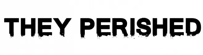
A bold, distressed font with a grunge effect, perfect for impactful designs.
![They Perished Frei Schriftart Herunterladen]() Herunterladen 368 Downloads@WebFont
Herunterladen 368 Downloads@WebFont -
( Fonts by www.DigitalDreamDesign.net )
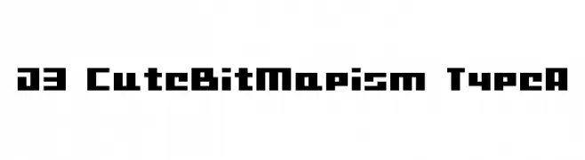
A bold, pixelated font with a retro digital aesthetic.
![D3 CuteBitMapism TypeA Frei Schriftart Herunterladen]() Herunterladen 368 Downloads@WebFont
Herunterladen 368 Downloads@WebFont -
( deFharo - Fernando Haro - defharo.com )
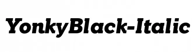
A bold, italic font with a dynamic and modern style.
![YonkyBlack-Italic Frei Schriftart Herunterladen]() Herunterladen 368 Downloads@WebFont
Herunterladen 368 Downloads@WebFont


![Ataxia [BRK] Frei Schriftart Herunterladen](https://d144mzi0q5mijx.cloudfront.net/img/A/T/Ataxia-BRK.webp)


Welche Schriften sind gerade am populärsten?
Poppins, Roboto, Montserrat, Open Sans und Lato sind wegen ihrer klaren Formen und breiten Einsetzbarkeit sehr gefragt – von Markenauftritt über Landingpages bis hin zu Postern.
Welche Fonts eignen sich für Logos?
Geometrische Sans‑Serifs (z. B. Poppins, Familien im Gotham‑Stil) sind ein häufiger Griff für sauberes, skalierbares Branding. Für eine persönlichere Note bleiben Scripts und Handschrift‑Stile beliebt. Kombinieren Sie einen prägnanten Headline‑Font mit einer neutralen Brotschrift für Wiedererkennung und Harmonie.
Wie oft wird die Top‑Liste aktualisiert?
Regelmäßig – basierend auf realen Downloads und Interaktionen. Schauen Sie öfter vorbei, um aufstrebende Favoriten früh zu entdecken.
💡 Tipp: Seite bookmarken – Trends wechseln schnell, und heutige Top‑Schriften inspirieren morgen vielleicht das Rebranding.