Willkommen bei den Top‑Schriften – hier treffen Beliebtheit und Qualität aufeinander. Das sind die in diesem Jahr am häufigsten heruntergeladenen und genutzten Fonts. Wenn Sie sichere Optionen für Logo, Web oder Social suchen, starten Sie hier.
Jeder Top‑Font überzeugt durch Balance, Lesbarkeit und Vielseitigkeit. Sie finden moderne Sans‑Serifs, elegante Scripts, Vintage‑Serifs und minimalistische Displays.
-
 Herunterladen 348 Downloads@WebFont
 -
( Fonts by www.junkohanhero.com )
A bold, distressed font with a vintage, grunge aesthetic.
![IKHIOOGLA Frei Schriftart Herunterladen]() Herunterladen 348 Downloads@WebFont
Herunterladen 348 Downloads@WebFont -
( Fonts by GGBot )
A modern, geometric font with a clean and minimalistic design.
![Zector Frei Schriftart Herunterladen]() Herunterladen 348 Downloads@WebFont
Herunterladen 348 Downloads@WebFont -
![umop Frei Schriftart Herunterladen]() Herunterladen 348 Downloads@WebFont
Herunterladen 348 Downloads@WebFont -
( Fonts by Pracas Upreti )
A bold, playful handwritten font with rounded, slanted characters.
![Pracas Frei Schriftart Herunterladen]() Herunterladen 348 Downloads@WebFont
Herunterladen 348 Downloads@WebFont -
-
( Fonts by madeDeduk Suandanaipandemade )
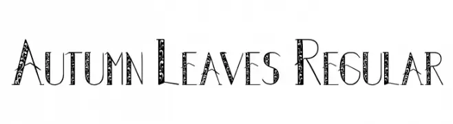
A decorative font with intricate leaf patterns within each character.
![Autumn Leaves Regular Frei Schriftart Herunterladen]() Herunterladen 348 Downloads@WebFont
Herunterladen 348 Downloads@WebFont -
( Fonts by dustBUST - Andreas Nylin )
A bold, italicized font with a futuristic and sleek design.
![Life Support Bold Italic Frei Schriftart Herunterladen]() Herunterladen 348 Downloads@WebFont
Herunterladen 348 Downloads@WebFont -
( Fonts by Roland Huse - rolandhuse.com )
A sleek, ultra-thin font with a modern, geometric design.
![Slim Extreme Frei Schriftart Herunterladen]() Herunterladen 348 Downloads@WebFont
Herunterladen 348 Downloads@WebFont -
( Fonts by Daniel Gauthier )
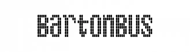
A dot matrix style font with a retro digital display look.
![BartonBus Frei Schriftart Herunterladen]() Herunterladen 348 Downloads@WebFont
Herunterladen 348 Downloads@WebFont -
( Creatype Studio - Rian Rahardi - creativemarket.com/creatype )
A bold, brush-style font with dynamic, expressive strokes.
![Banshee Frei Schriftart Herunterladen]() Herunterladen 348 Downloads@WebFont
Herunterladen 348 Downloads@WebFont -
![Severely Extreme Frei Schriftart Herunterladen]() Herunterladen 348 Downloads@WebFont
Herunterladen 348 Downloads@WebFont -
( Fonts by Peter Wiegel - www.peter-wiegel.de - Personal-use only. For commercial use please contact owner. )
A bold, geometric font with a modern, industrial aesthetic.
![TokeelyBrookings Frei Schriftart Herunterladen]() Herunterladen 348 Downloads@WebFont
Herunterladen 348 Downloads@WebFont -
( Fonts by Andrew McCluskey - nalgames.com. Personal-use only. For commercial use please contact owner. )
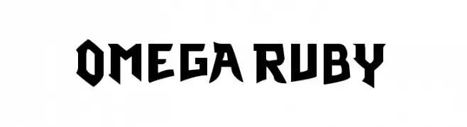
A bold, angular font with a modern, geometric style.
![Omega Ruby Frei Schriftart Herunterladen]() Herunterladen 348 Downloads@WebFont
Herunterladen 348 Downloads@WebFont -
( Paul Lloyd Fonts )
A whimsical and airy font with delicate, flowing strokes.
![Sylph Frei Schriftart Herunterladen]() Herunterladen 348 Downloads@WebFont
Herunterladen 348 Downloads@WebFont -
( Fonts by Mikko Sumulong - Mix Fonts - mixfonts.com - Personal-use only. For commercial use please contact owner. )
A playful, handwritten font with bold, rounded characters.
![MixQuixotic Frei Schriftart Herunterladen]() Herunterladen 348 Downloads@WebFont
Herunterladen 348 Downloads@WebFont -
( Fonts by Douglas Vitkauskas - www.vtksdesign.com. Personal-use only. For commercial use please contact owner. )
A bold, dramatic Blackletter-style font with intricate detailing.
![VTKS Rafia Frei Schriftart Herunterladen]() Herunterladen 348 Downloads@WebFont
Herunterladen 348 Downloads@WebFont -
( Fonts by Mans Greback - Personal-use only. For commercial use please contact owner. )
A bold, modern font with strong geometric shapes and clean lines.
![Famiar PERSONAL USE ONLY Black Frei Schriftart Herunterladen]() Herunterladen 348 Downloads@WebFont
Herunterladen 348 Downloads@WebFont -
![Wira Frei Schriftart Herunterladen]() Herunterladen 348 Downloads@WebFont
Herunterladen 348 Downloads@WebFont -
( Font by Jonathan Harris - www.tattoowoo.com )
A bold, gothic-inspired font with sharp, angular edges and intricate details.
![League of Ages Frei Schriftart Herunterladen]() Herunterladen 348 Downloads@WebFont
Herunterladen 348 Downloads@WebFont -
( Fonts by Jacob Fisher - www.pizzadude.dk )
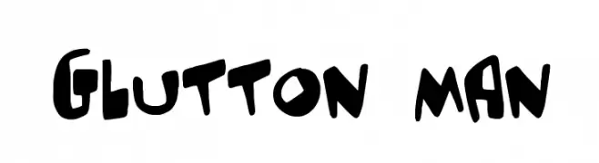
A bold, playful font with a hand-drawn, whimsical style.
![Glutton man Frei Schriftart Herunterladen]() Herunterladen 348 Downloads@WebFont
Herunterladen 348 Downloads@WebFont -
![Prince Dub Frei Schriftart Herunterladen]() Herunterladen 348 Downloads@WebFont
Herunterladen 348 Downloads@WebFont -
( Fonts by James Whitworth )
A playful, handwritten font with a casual and informal style.
![JW_Script Frei Schriftart Herunterladen]() Herunterladen 348 Downloads@WebFont
Herunterladen 348 Downloads@WebFont -
( Fonts by Alejandro Fabuel )
A tall, slender font with thin strokes and a modern, elegant style.
![Fab Craft Frei Schriftart Herunterladen]() Herunterladen 348 Downloads@WebFont
Herunterladen 348 Downloads@WebFont -
![Asimov Edge ExtremeItalic Frei Schriftart Herunterladen]() Herunterladen 348 Downloads@WebFont
Herunterladen 348 Downloads@WebFont -
( Fonts by Dieter Steffmann )
An ornate, Gothic-inspired decorative font with intricate patterns.
![Ehmcke-Schwabacher Initialen Frei Schriftart Herunterladen]() Herunterladen 348 Downloads@WebFont
Herunterladen 348 Downloads@WebFont -
![Avaza Frei Schriftart Herunterladen]() Herunterladen 348 Downloads
Herunterladen 348 Downloads -
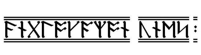
![AngloSaxon Runes 2 Frei Schriftart Herunterladen]() Herunterladen 348 Downloads
Herunterladen 348 Downloads -
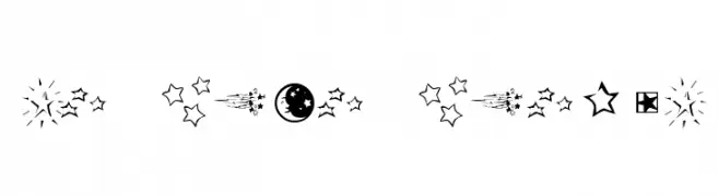
![KR Star Struck Frei Schriftart Herunterladen]() Herunterladen 348 Downloads@WebFont
Herunterladen 348 Downloads@WebFont -
( Fonts by Dieter Steffmann )
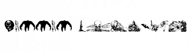
Horror-themed decorative dingbats.
![Horror Dingbats Frei Schriftart Herunterladen]() Herunterladen 348 Downloads@WebFont
Herunterladen 348 Downloads@WebFont -
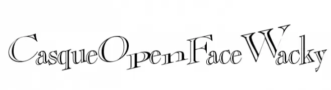
![CasqueOpenFaceWacky Frei Schriftart Herunterladen]() Herunterladen 348 Downloads@WebFont
Herunterladen 348 Downloads@WebFont -
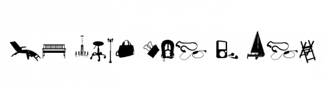
( Fonts by Christophe Feray - www.wcfonts.com )
A diverse collection of silhouette pictograms representing everyday objects.
![WC Sold Out D Bta Frei Schriftart Herunterladen]() Herunterladen 348 Downloads@WebFont
Herunterladen 348 Downloads@WebFont -
( Fonts by Font Environment - fontenvironment.com )
A bold, decorative font with a playful and vintage-inspired style.
![FESongABC Frei Schriftart Herunterladen]() Herunterladen 348 Downloads@WebFont
Herunterladen 348 Downloads@WebFont -
( Fonts by Octotype - www.foundmyfont.com - Personal-use only. For commercial use please contact owner. )
A bold, brush-style font with dynamic, expressive strokes.
![Calypsoka One Frei Schriftart Herunterladen]() Herunterladen 348 Downloads@WebFont
Herunterladen 348 Downloads@WebFont -
![Distant Galaxy Outline Italic Frei Schriftart Herunterladen]() Herunterladen 348 Downloads@WebFont
Herunterladen 348 Downloads@WebFont -
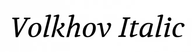
( Copyright (c) 2011, Cyreal (www.cyreal.org) )
An elegant italic serif font with smooth, flowing lines and a classic feel.
![Volkhov Italic Frei Schriftart Herunterladen]() Herunterladen 348 Downloads@WebFont
Herunterladen 348 Downloads@WebFont


Welche Schriften sind gerade am populärsten?
Poppins, Roboto, Montserrat, Open Sans und Lato sind wegen ihrer klaren Formen und breiten Einsetzbarkeit sehr gefragt – von Markenauftritt über Landingpages bis hin zu Postern.
Welche Fonts eignen sich für Logos?
Geometrische Sans‑Serifs (z. B. Poppins, Familien im Gotham‑Stil) sind ein häufiger Griff für sauberes, skalierbares Branding. Für eine persönlichere Note bleiben Scripts und Handschrift‑Stile beliebt. Kombinieren Sie einen prägnanten Headline‑Font mit einer neutralen Brotschrift für Wiedererkennung und Harmonie.
Wie oft wird die Top‑Liste aktualisiert?
Regelmäßig – basierend auf realen Downloads und Interaktionen. Schauen Sie öfter vorbei, um aufstrebende Favoriten früh zu entdecken.
💡 Tipp: Seite bookmarken – Trends wechseln schnell, und heutige Top‑Schriften inspirieren morgen vielleicht das Rebranding.