Willkommen bei den Top‑Schriften – hier treffen Beliebtheit und Qualität aufeinander. Das sind die in diesem Jahr am häufigsten heruntergeladenen und genutzten Fonts. Wenn Sie sichere Optionen für Logo, Web oder Social suchen, starten Sie hier.
Jeder Top‑Font überzeugt durch Balance, Lesbarkeit und Vielseitigkeit. Sie finden moderne Sans‑Serifs, elegante Scripts, Vintage‑Serifs und minimalistische Displays.
-
( Fonts by Jen Jones )
A playful, modern font with rounded edges and a clean aesthetic.
 Herunterladen 359 Downloads@WebFont
 -
![Garbageschrift Thin Frei Schriftart Herunterladen]() Herunterladen 359 Downloads@WebFont
Herunterladen 359 Downloads@WebFont -
( winty5.wix.com/noahtheawesome )
Bold geometric dingbat symbols with high contrast and decorative patterns.
![5Geomedings Regular Frei Schriftart Herunterladen]() Herunterladen 359 Downloads@WebFont
Herunterladen 359 Downloads@WebFont -
![Marquis De Sade Frei Schriftart Herunterladen]() Herunterladen 359 Downloads@WebFont
Herunterladen 359 Downloads@WebFont -
( Fonts by Sorkin Type Co )
A bold, playful typeface with a slightly condensed and whimsical design.
![Wellfleet Frei Schriftart Herunterladen]() Herunterladen 359 Downloads@WebFont
Herunterladen 359 Downloads@WebFont -
( Fonts by Bartek Nowak - www.nowak.tv/fontoholic/ )
A bold, outlined font with a geometric and modern style.
![InfantylOut Frei Schriftart Herunterladen]() Herunterladen 359 Downloads@WebFont
Herunterladen 359 Downloads@WebFont -
( Fonts by StudioTypo - Personal-use only. For commercial use please contact owner. )
A bold, italicized font with a modern and dynamic style.
![Minalis_Demo Bold Italic Frei Schriftart Herunterladen]() Herunterladen 359 Downloads@WebFont
Herunterladen 359 Downloads@WebFont -
( گالری فانت فارسی پژوهش آريانا - only compatible with Farsi and Arabic )
A classic serif font with elegant curves and a traditional appearance.
![Islam Frei Schriftart Herunterladen]() Herunterladen 359 Downloads@WebFont
Herunterladen 359 Downloads@WebFont -
Schriftart von defharo. For commercial use please contact the owner.
![Libertinas-co.ffp Frei Schriftart Herunterladen]() Herunterladen 359 Downloads@WebFont
Herunterladen 359 Downloads@WebFont -
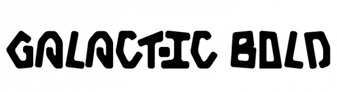
![Galactic Bold Frei Schriftart Herunterladen]() Herunterladen 359 Downloads@WebFont
Herunterladen 359 Downloads@WebFont -
( Fonts by Hendra Pratama - Personal-use only. For commercial use please contact owner. )
A classic script font with elegant, flowing cursive letters.
![Buckerley Frei Schriftart Herunterladen]() Herunterladen 359 Downloads@WebFont
Herunterladen 359 Downloads@WebFont -
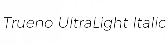
![Trueno UltraLight Italic Frei Schriftart Herunterladen]() Herunterladen 359 Downloads@WebFont
Herunterladen 359 Downloads@WebFont -
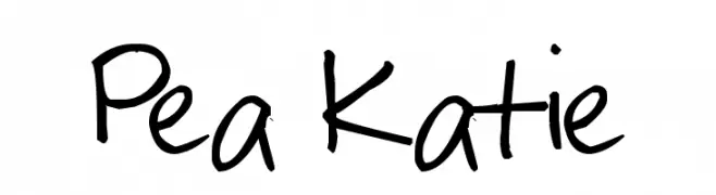
( Free for a personal use. For a commercial use please visit www.kevinandamanda.com )
A playful, casual handwritten font with a natural flow and informal touch.
![Pea Katie Frei Schriftart Herunterladen]() Herunterladen 359 Downloads@WebFont
Herunterladen 359 Downloads@WebFont -
( Fonts by Utopiafonts )
A futuristic, geometric font with clean lines and unique character elements.
![the monkey's ate my soul Frei Schriftart Herunterladen]() Herunterladen 359 Downloads@WebFont
Herunterladen 359 Downloads@WebFont -
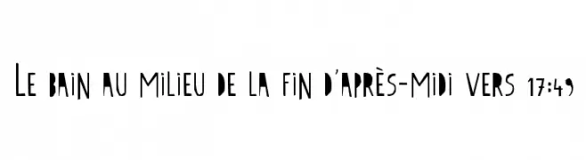
( Fonts by Tn2 - TOM )
An artistic, irregular font with jagged edges and a hand-crafted appearance.
![Le bain au milieu de la fin d'après-midi vers 17:49 Frei Schriftart Herunterladen]() Herunterladen 359 Downloads@WebFont
Herunterladen 359 Downloads@WebFont -
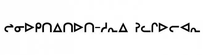
![Inuktitut-Sri Regular Frei Schriftart Herunterladen]() Herunterladen 359 Downloads@WebFont
Herunterladen 359 Downloads@WebFont -
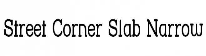
( Fonts by Apostrophic Lab )
A bold, narrow slab serif font with a modern yet classic appeal.
![Street Corner Slab Narrow Frei Schriftart Herunterladen]() Herunterladen 359 Downloads@WebFont
Herunterladen 359 Downloads@WebFont -
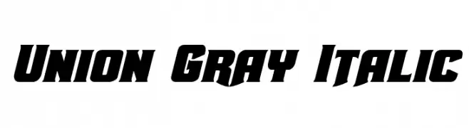
( Fonts by Daniel Zadorozny - www.iconian.com - Free for personal use )
A bold, italic font with a dynamic and modern style.
![Union Gray Italic Frei Schriftart Herunterladen]() Herunterladen 359 Downloads@WebFont
Herunterladen 359 Downloads@WebFont -
( Fonts by Tokopress )
A bold, rugged, hand-drawn font with thick, blocky characters.
![GIBATOWN Frei Schriftart Herunterladen]() Herunterladen 359 Downloads@WebFont
Herunterladen 359 Downloads@WebFont -
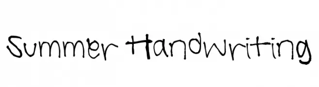
![Summer Handwriting Frei Schriftart Herunterladen]() Herunterladen 359 Downloads@WebFont
Herunterladen 359 Downloads@WebFont -
![Philadelphia Italic Light Frei Schriftart Herunterladen]() Herunterladen 359 Downloads@WebFont
Herunterladen 359 Downloads@WebFont -
( Fonts by www.kimberlygeswein.com - Kimberly Geswein )
A whimsical and decorative font with playful curls and swirls.
![Janda Hide And Seek Frei Schriftart Herunterladen]() Herunterladen 359 Downloads@WebFont
Herunterladen 359 Downloads@WebFont -
( Fonts by Google )
A modern, condensed sans-serif font with light strokes and excellent readability.
![Noto Sans Condensed Light Frei Schriftart Herunterladen]() Herunterladen 359 Downloads@WebFont
Herunterladen 359 Downloads@WebFont -
( Fonts by www.typodermicfonts.com - Ray Larabie )
A bold, dynamic font with a strong presence and unique character.
![KingRichard-Regular Frei Schriftart Herunterladen]() Herunterladen 359 Downloads@WebFont
Herunterladen 359 Downloads@WebFont -
![2015 Cruiser Hollow Bold Italic Frei Schriftart Herunterladen]() Herunterladen 359 Downloads@WebFont
Herunterladen 359 Downloads@WebFont -
( Fonts by Manfred Klein. Free for private and charity use. Free for commercial with donation to organizations )
A modern, geometric sans-serif font with a light weight and clean design.
![FolksDecoon-Light Frei Schriftart Herunterladen]() Herunterladen 359 Downloads@WebFont
Herunterladen 359 Downloads@WebFont -
( Fonts by Nick Curtis - www.nicksfonts.com )
A modern, elegant font with tall, narrow letterforms and high contrast strokes.
![ModernTypography Frei Schriftart Herunterladen]() Herunterladen 359 Downloads@WebFont
Herunterladen 359 Downloads@WebFont -
![Hello Heartache Frei Schriftart Herunterladen]() Herunterladen 359 Downloads@WebFont
Herunterladen 359 Downloads@WebFont -
( Fonts by a Neale Davidson - www.pixelsagas.com. Personal-use only. For commercial use please contact owner. )
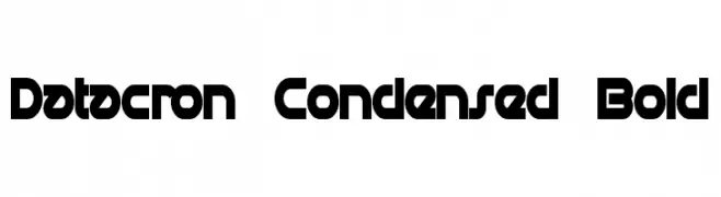
A bold, condensed, and geometric font with a futuristic style.
![Datacron Condensed Bold Frei Schriftart Herunterladen]() Herunterladen 359 Downloads@WebFont
Herunterladen 359 Downloads@WebFont -
( Fonts by Mans Greback - Personal-use only. For commercial use please contact owner. )
A bold, modern font with strong geometric shapes and clean lines.
![Famiar PERSONAL USE ONLY Black Frei Schriftart Herunterladen]() Herunterladen 359 Downloads@WebFont
Herunterladen 359 Downloads@WebFont -
( Fonts by The Font Emporium )
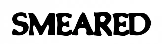
A bold, playful font with wavy, rounded characters and a whimsical style.
![Smeared Frei Schriftart Herunterladen]() Herunterladen 359 Downloads@WebFont
Herunterladen 359 Downloads@WebFont -
( Fonts by Iconian Fonts )
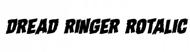
A bold, slanted, and distressed font with a dynamic and rugged style.
![Dread Ringer Rotalic Frei Schriftart Herunterladen]() Herunterladen 359 Downloads@WebFont
Herunterladen 359 Downloads@WebFont -
( OldStudioo - Muhammad Ilham - www.fontdraft.com )
An elegant script font with flowing, cursive letters and intricate swashes.
![Anastasia script [demo] Frei Schriftart Herunterladen]() Herunterladen 359 Downloads@WebFont
Herunterladen 359 Downloads@WebFont -
![Hertziano Frei Schriftart Herunterladen]() Herunterladen 359 Downloads@WebFont
Herunterladen 359 Downloads@WebFont -
( Fonts by Iconian Fonts )
A bold, playful font with rounded characters and a cartoonish style.
![Villain Team-Up Expanded Frei Schriftart Herunterladen]() Herunterladen 359 Downloads@WebFont
Herunterladen 359 Downloads@WebFont


![Anastasia script [demo] Frei Schriftart Herunterladen](https://d144mzi0q5mijx.cloudfront.net/img/A/N/Anastasia-script-demo.webp)


Welche Schriften sind gerade am populärsten?
Poppins, Roboto, Montserrat, Open Sans und Lato sind wegen ihrer klaren Formen und breiten Einsetzbarkeit sehr gefragt – von Markenauftritt über Landingpages bis hin zu Postern.
Welche Fonts eignen sich für Logos?
Geometrische Sans‑Serifs (z. B. Poppins, Familien im Gotham‑Stil) sind ein häufiger Griff für sauberes, skalierbares Branding. Für eine persönlichere Note bleiben Scripts und Handschrift‑Stile beliebt. Kombinieren Sie einen prägnanten Headline‑Font mit einer neutralen Brotschrift für Wiedererkennung und Harmonie.
Wie oft wird die Top‑Liste aktualisiert?
Regelmäßig – basierend auf realen Downloads und Interaktionen. Schauen Sie öfter vorbei, um aufstrebende Favoriten früh zu entdecken.
💡 Tipp: Seite bookmarken – Trends wechseln schnell, und heutige Top‑Schriften inspirieren morgen vielleicht das Rebranding.