Willkommen bei den Top‑Schriften – hier treffen Beliebtheit und Qualität aufeinander. Das sind die in diesem Jahr am häufigsten heruntergeladenen und genutzten Fonts. Wenn Sie sichere Optionen für Logo, Web oder Social suchen, starten Sie hier.
Jeder Top‑Font überzeugt durch Balance, Lesbarkeit und Vielseitigkeit. Sie finden moderne Sans‑Serifs, elegante Scripts, Vintage‑Serifs und minimalistische Displays.
-
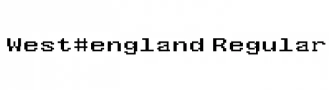
( Fonts by Kevin Richey - Personal-use only. For commercial use please contact owner. )
A pixelated, monospaced font with a retro digital aesthetic.
 Herunterladen 352 Downloads@WebFont
 -
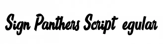
![Sign Panthers Script Regular Frei Schriftart Herunterladen]() Herunterladen 352 Downloads@WebFont
Herunterladen 352 Downloads@WebFont -
( Fonts by Khurasan )
A playful, bold font with rounded, bubbly characters ideal for informal projects.
![Cushy Frei Schriftart Herunterladen]() Herunterladen 352 Downloads@WebFont
Herunterladen 352 Downloads@WebFont -
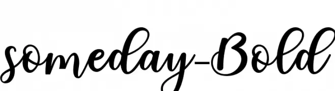
( Fonts by Mr Letters - https://www.creativefabrica.com/designer/mrletters/ - Personal-use only. For commercial use please contact owner. )
A bold, flowing script font with elegant curves and modern flair.
![someday-Bold Frei Schriftart Herunterladen]() Herunterladen 352 Downloads@WebFont
Herunterladen 352 Downloads@WebFont -
![Alyrii Frei Schriftart Herunterladen]() Herunterladen 352 Downloads@WebFont
Herunterladen 352 Downloads@WebFont -
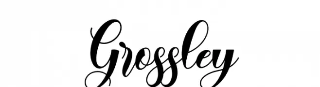
( Fonts by Naharstd - Nanda Hardiansyah - Personal-use only. For commercial use please contact owner. )
An elegant, flowing script font with decorative flourishes and high contrast.
![Grossley Frei Schriftart Herunterladen]() Herunterladen 352 Downloads@WebFont
Herunterladen 352 Downloads@WebFont -
( Fonts by Måns Grebäck )
A bold, classic serif typeface with strong vertical lines and prominent serifs.
![Vacer Serif Personal Frei Schriftart Herunterladen]() Herunterladen 352 Downloads@WebFont
Herunterladen 352 Downloads@WebFont -
( Fonts by Mr Letters - https://www.creativefabrica.com/designer/mrletters/ - Personal-use only. For commercial use please contact owner. )
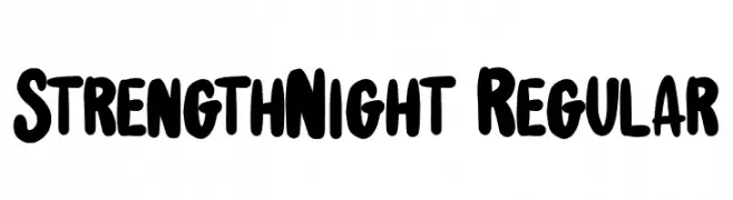
A bold, rounded, and playful font with a hand-drawn appearance.
![StrengthNight-Regular Frei Schriftart Herunterladen]() Herunterladen 352 Downloads@WebFont
Herunterladen 352 Downloads@WebFont -
![cachetona Frei Schriftart Herunterladen]() Herunterladen 352 Downloads@WebFont
Herunterladen 352 Downloads@WebFont -
( Fonts by Vladimir Nikolic )
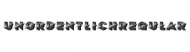
A bold, geometric font with dynamic, overlapping lines and a three-dimensional look.
![Unordentlich Regular Frei Schriftart Herunterladen]() Herunterladen 352 Downloads@WebFont
Herunterladen 352 Downloads@WebFont -
( Fonts by www.tepidmonkey.net )
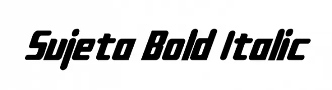
A bold, italic font with a modern and dynamic style.
![Sujeta Bold Italic Frei Schriftart Herunterladen]() Herunterladen 352 Downloads@WebFont
Herunterladen 352 Downloads@WebFont -
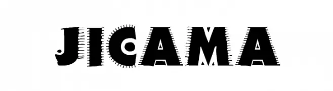
![JICAMA Frei Schriftart Herunterladen]() Herunterladen 352 Downloads@WebFont
Herunterladen 352 Downloads@WebFont -
( Fonts by Daniel Zadorozny - www.iconian.com - Free for personal use )
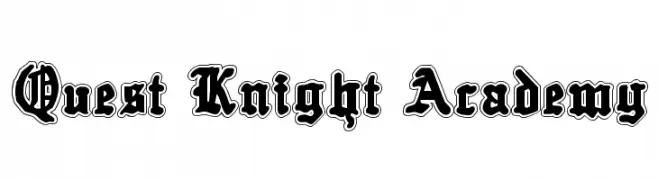
A bold, gothic-inspired font with ornate, medieval-style letterforms.
![Quest Knight Academy Frei Schriftart Herunterladen]() Herunterladen 352 Downloads@WebFont
Herunterladen 352 Downloads@WebFont -
( Fonts by imagex )
A bold, playful handwritten font with rounded, irregular characters.
![Shiny Signature Frei Schriftart Herunterladen]() Herunterladen 352 Downloads@WebFont
Herunterladen 352 Downloads@WebFont -
( Fonts by Niskala Huruf )
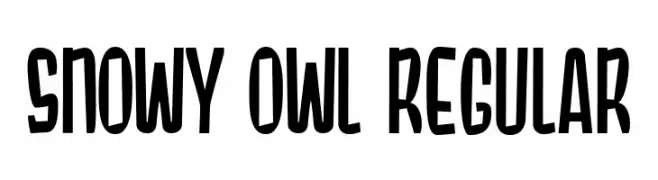
A bold, playful font with a hand-drawn, condensed style.
![Snowy Owl Regular Frei Schriftart Herunterladen]() Herunterladen 352 Downloads@WebFont
Herunterladen 352 Downloads@WebFont -
![Simply Mono Oblique Frei Schriftart Herunterladen]() Herunterladen 352 Downloads@WebFont
Herunterladen 352 Downloads@WebFont -
( Anthony Robinson - www.redbubble.com/people/anfa/portfolio )
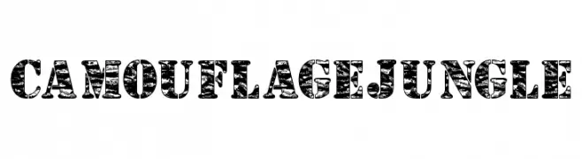
A bold, rugged font with a jungle camouflage pattern and distressed texture.
![Camouflage Jungle Frei Schriftart Herunterladen]() Herunterladen 352 Downloads@WebFont
Herunterladen 352 Downloads@WebFont -
( Cooldesignlab - Kurniadi Saputra - creativemarket.com/cooldesignlab?u=cooldesignlab )
An elegant, flowing script font with intricate loops and swashes, ideal for formal use.
![StarliveScript Frei Schriftart Herunterladen]() Herunterladen 352 Downloads@WebFont
Herunterladen 352 Downloads@WebFont -
![StencilIntellectaLimitedSet Frei Schriftart Herunterladen]() Herunterladen 352 Downloads@WebFont
Herunterladen 352 Downloads@WebFont -
( Fonts by Wojciech Kalinowski "wmk69" (wmk69@o2.pl) - Personal-use only. For commercial use please contact owner. )
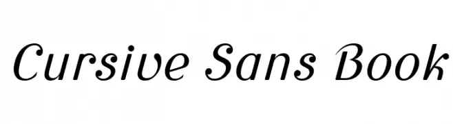
A cursive-inspired sans-serif font with elegant, slanted characters.
![Cursive Sans Book Frei Schriftart Herunterladen]() Herunterladen 352 Downloads@WebFont
Herunterladen 352 Downloads@WebFont -
( Fonts by Billy Argel - Personal-use only. For commercial use please contact owner. )
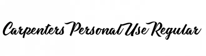
A bold, cursive font with a flowing, handwritten style.
![Carpenters Personal Use Regular Frei Schriftart Herunterladen]() Herunterladen 352 Downloads@WebFont
Herunterladen 352 Downloads@WebFont -
![Synchronous Frei Schriftart Herunterladen]() Herunterladen 352 Downloads@WebFont
Herunterladen 352 Downloads@WebFont -
( Fonts by Rochadi Sudarma [Rochart Studio] - Personal-use only. For commercial use please contact owner. )
A bold, expressive script font with flowing, cursive letterforms and decorative flair.
![Aligore Frei Schriftart Herunterladen]() Herunterladen 352 Downloads@WebFont
Herunterladen 352 Downloads@WebFont -
( Fonts by Manuel Viergutz - Typo Graphic Design - www.typographicdesign.de )
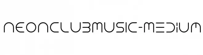
A modern, rounded font with a futuristic and fluid design.
![NEONCLUBMUSIC-Medium Frei Schriftart Herunterladen]() Herunterladen 352 Downloads@WebFont
Herunterladen 352 Downloads@WebFont -
![logos bein aljazeera Frei Schriftart Herunterladen]() Herunterladen 352 Downloads@WebFont
Herunterladen 352 Downloads@WebFont -
![Aftershock Debris Italic Frei Schriftart Herunterladen]() Herunterladen 352 Downloads@WebFont
Herunterladen 352 Downloads@WebFont -
( Fonts by Manfred Klein. Free for private and charity use. Free for commercial with donation to organizations )
Abstract, collage-like font using cutout imagery for each character.
![AbstractClassicCuts Frei Schriftart Herunterladen]() Herunterladen 352 Downloads@WebFont
Herunterladen 352 Downloads@WebFont -
![Trust Us Frei Schriftart Herunterladen]() Herunterladen 352 Downloads@WebFont
Herunterladen 352 Downloads@WebFont -
( Fonts by Utopiafonts )
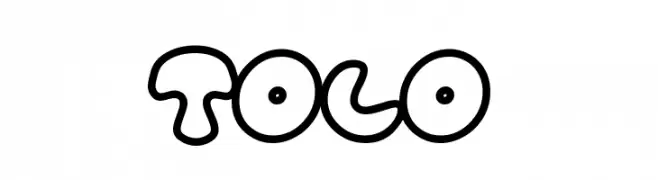
A playful, bubble-like font with outlined characters and a whimsical style.
![Tolo Frei Schriftart Herunterladen]() Herunterladen 352 Downloads@WebFont
Herunterladen 352 Downloads@WebFont -
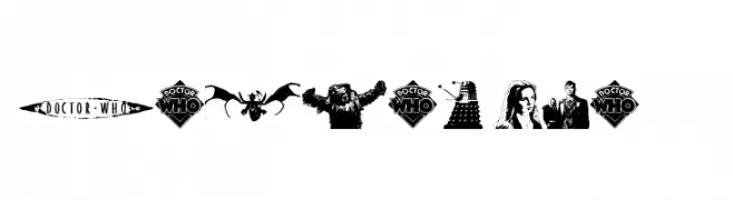
![Doctor Who 2006 Frei Schriftart Herunterladen]() Herunterladen 352 Downloads@WebFont
Herunterladen 352 Downloads@WebFont -
( Fonts by wep )
A playful, bold, hand-drawn font with thick, uneven strokes.
![Disikno Frei Schriftart Herunterladen]() Herunterladen 352 Downloads@WebFont
Herunterladen 352 Downloads@WebFont -
( Aleksandr Savenkov - asavenkov.com )
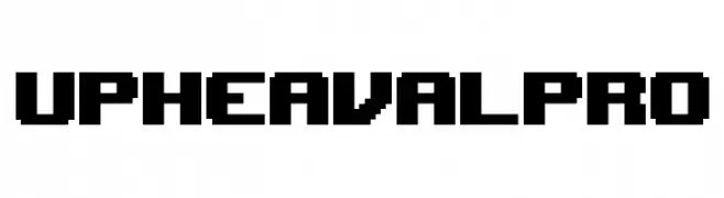
A bold, pixelated font with a retro, video game-inspired style.
![UpheavalPro Frei Schriftart Herunterladen]() Herunterladen 352 Downloads@WebFont
Herunterladen 352 Downloads@WebFont -
Schriftart von JuanCasco. For commercial use please contact the owner.
( Fonts by Juan Casco - www.juancasco.net )
An elegant and artistic script font with flowing, intricate letterforms.
![La Fance Amor Frei Schriftart Herunterladen]() Herunterladen 352 Downloads@WebFont
Herunterladen 352 Downloads@WebFont -
( Fonts by huawei.com - Personal-use only. For commercial use please contact owner. )
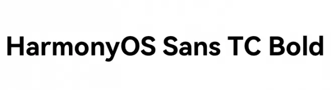
A bold, modern sans-serif font with clean lines and balanced proportions.
![HarmonyOS Sans TC Bold Frei Schriftart Herunterladen]() Herunterladen 352 Downloads@WebFont
Herunterladen 352 Downloads@WebFont -
( Fonts by Din Studio - Donis Miftahudin - Personal-use only. For commercial use please contact owner. )
A bold, playful font with thick, rounded characters and an urban graffiti vibe.
![Urban Blocker personal use Solid Frei Schriftart Herunterladen]() Herunterladen 352 Downloads@WebFont
Herunterladen 352 Downloads@WebFont


Welche Schriften sind gerade am populärsten?
Poppins, Roboto, Montserrat, Open Sans und Lato sind wegen ihrer klaren Formen und breiten Einsetzbarkeit sehr gefragt – von Markenauftritt über Landingpages bis hin zu Postern.
Welche Fonts eignen sich für Logos?
Geometrische Sans‑Serifs (z. B. Poppins, Familien im Gotham‑Stil) sind ein häufiger Griff für sauberes, skalierbares Branding. Für eine persönlichere Note bleiben Scripts und Handschrift‑Stile beliebt. Kombinieren Sie einen prägnanten Headline‑Font mit einer neutralen Brotschrift für Wiedererkennung und Harmonie.
Wie oft wird die Top‑Liste aktualisiert?
Regelmäßig – basierend auf realen Downloads und Interaktionen. Schauen Sie öfter vorbei, um aufstrebende Favoriten früh zu entdecken.
💡 Tipp: Seite bookmarken – Trends wechseln schnell, und heutige Top‑Schriften inspirieren morgen vielleicht das Rebranding.