Willkommen bei den Top‑Schriften – hier treffen Beliebtheit und Qualität aufeinander. Das sind die in diesem Jahr am häufigsten heruntergeladenen und genutzten Fonts. Wenn Sie sichere Optionen für Logo, Web oder Social suchen, starten Sie hier.
Jeder Top‑Font überzeugt durch Balance, Lesbarkeit und Vielseitigkeit. Sie finden moderne Sans‑Serifs, elegante Scripts, Vintage‑Serifs und minimalistische Displays.
-
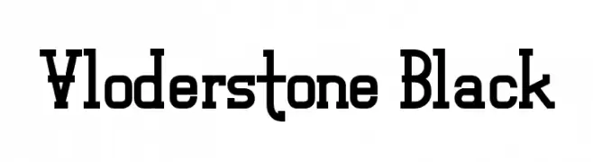
( Fonts by Andrew Hart - dirt2.com )
A bold slab serif font with strong, block-like serifs and a modern yet classic appeal.
 Herunterladen 337 Downloads@WebFont
 -
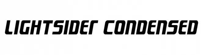
( Fonts by Daniel Zadorozny - www.iconian.com - Free for personal use )
A bold, modern, and condensed font with a dynamic slant and geometric shapes.
![Lightsider Condensed Frei Schriftart Herunterladen]() Herunterladen 337 Downloads@WebFont
Herunterladen 337 Downloads@WebFont -
![Movie SoundtracK SemiBold Frei Schriftart Herunterladen]() Herunterladen 337 Downloads@WebFont
Herunterladen 337 Downloads@WebFont -
![EastLift Frei Schriftart Herunterladen]() Herunterladen 337 Downloads@WebFont
Herunterladen 337 Downloads@WebFont -
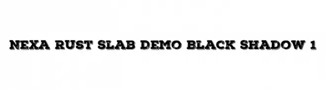
( Fonts by Fontfabric - Svetoslav Simov - Personal-use only. For commercial use please contact owner. )
A bold, textured slab serif font with a vintage shadow effect.
![Nexa Rust Slab Demo Black Shadow 1 Frei Schriftart Herunterladen]() Herunterladen 337 Downloads@WebFont
Herunterladen 337 Downloads@WebFont -
-
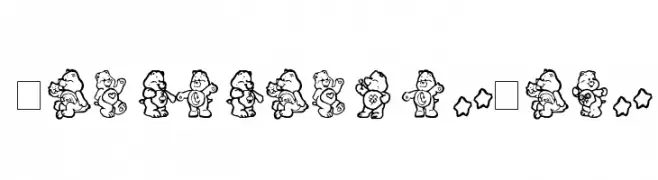
![CarebearsbyIacy Frei Schriftart Herunterladen]() Herunterladen 337 Downloads@WebFont
Herunterladen 337 Downloads@WebFont -
( Fonts by Daniel Zadorozny - www.iconian.com - Personal-use only. For commercial use please contact owner. )
A bold, expanded font with a geometric and modern design.
![Blue Cobra Bold Expanded Frei Schriftart Herunterladen]() Herunterladen 337 Downloads@WebFont
Herunterladen 337 Downloads@WebFont -
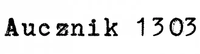
![Aucznik 1303 Frei Schriftart Herunterladen]() Herunterladen 337 Downloads@WebFont
Herunterladen 337 Downloads@WebFont -
( Fonts by Manfred Klein. Free for private and charity use. Free for commercial with donation to organizations )
A modern, rounded font with uniform stroke width and smooth curves.
![RoundSans Frei Schriftart Herunterladen]() Herunterladen 337 Downloads@WebFont
Herunterladen 337 Downloads@WebFont -
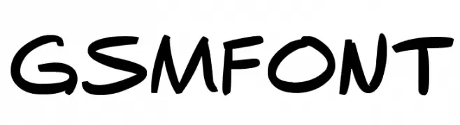
( Fonts by Grant Morrison )
A playful, handwritten-style font with bold, slightly tilted characters.
![gsmfont Frei Schriftart Herunterladen]() Herunterladen 337 Downloads@WebFont
Herunterladen 337 Downloads@WebFont -
![BaconFarm Frei Schriftart Herunterladen]() Herunterladen 337 Downloads@WebFont
Herunterladen 337 Downloads@WebFont -
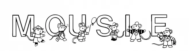
( Fonts by www.houseoflime.com )
A whimsical font featuring cartoon mice interacting with bold, outlined letters.
![Mousie Frei Schriftart Herunterladen]() Herunterladen 337 Downloads@WebFont
Herunterladen 337 Downloads@WebFont -
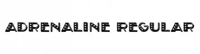
( Fonts by Vladimir Nikolic )
A bold, decorative font with star patterns and a vintage marquee style.
![Adrenaline Regular Frei Schriftart Herunterladen]() Herunterladen 337 Downloads@WebFont
Herunterladen 337 Downloads@WebFont -
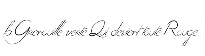
( Fonts by Maelle.K - Thomas Boucherie )
An elegant script font with flowing, interconnected letters and a sophisticated style.
![la Grenouille verte Qui devient toute Rouge... Frei Schriftart Herunterladen]() Herunterladen 337 Downloads@WebFont
Herunterladen 337 Downloads@WebFont -
![Cuomotype Frei Schriftart Herunterladen]() Herunterladen 337 Downloads@WebFont
Herunterladen 337 Downloads@WebFont -
( Fonts by www.pia-frauss.de )
A traditional Blackletter font with ornate, medieval-inspired design.
![XiBeronne Frei Schriftart Herunterladen]() Herunterladen 337 Downloads@WebFont
Herunterladen 337 Downloads@WebFont -
( Fonts by Sabrcreative - Personal-use only. For commercial use please contact owner. )
A bold, impactful font with a vintage yet modern style, perfect for standout designs.
![Bonaro Clean Demo Clean Frei Schriftart Herunterladen]() Herunterladen 337 Downloads@WebFont
Herunterladen 337 Downloads@WebFont -
![dubbed Frei Schriftart Herunterladen]() Herunterladen 337 Downloads
Herunterladen 337 Downloads -
![Boldilocks Frei Schriftart Herunterladen]() Herunterladen 337 Downloads@WebFont
Herunterladen 337 Downloads@WebFont -
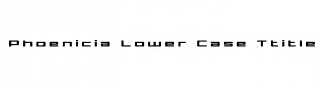
( Iconian Fonts - Daniel Zadorozny - www.iconian.com )
A modern, geometric font with clean lines and a structured appearance.
![Phoenicia Lower Case Ttitle Frei Schriftart Herunterladen]() Herunterladen 337 Downloads@WebFont
Herunterladen 337 Downloads@WebFont -
( Fonts by Edric Studio www.creativefabrica.com/designer/edricstudio/ - Personal-use only. For commercial use please contact owner. )
A bold, geometric font with a modern, industrial style.
![FORNEVER Frei Schriftart Herunterladen]() Herunterladen 337 Downloads@WebFont
Herunterladen 337 Downloads@WebFont -
( Fonts by wep )
A bold, playful handwritten font with thick strokes and rounded edges.
![Istime Frei Schriftart Herunterladen]() Herunterladen 337 Downloads@WebFont
Herunterladen 337 Downloads@WebFont -
( www.aidascrap.blogspot.com )
A playful, casual handwritten font with dynamic strokes and a friendly appearance.
![Aida Garmo Frei Schriftart Herunterladen]() Herunterladen 337 Downloads@WebFont
Herunterladen 337 Downloads@WebFont -
( Fonts by www.philing.net )
A dynamic handwritten font with fluid strokes and a playful character.
![Virginie Frei Schriftart Herunterladen]() Herunterladen 337 Downloads@WebFont
Herunterladen 337 Downloads@WebFont -
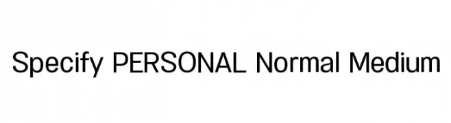
( Måns Grebäck - www.mansgreback.com )
A modern, clean sans-serif font with uniform strokes and excellent readability.
![Specify PERSONAL Normal Medium Frei Schriftart Herunterladen]() Herunterladen 337 Downloads@WebFont
Herunterladen 337 Downloads@WebFont -
![Biting My Nails Outline Frei Schriftart Herunterladen]() Herunterladen 337 Downloads@WebFont
Herunterladen 337 Downloads@WebFont -
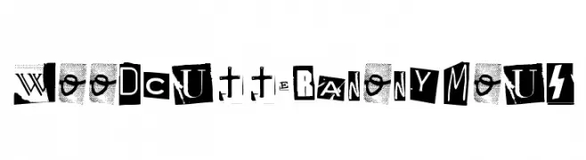
( www.woodcutter.es )
A bold, eclectic display typeface mimicking cut-out letters with unique styles.
![Woodcutter Anonymous Frei Schriftart Herunterladen]() Herunterladen 337 Downloads@WebFont
Herunterladen 337 Downloads@WebFont -
( Fonts by Arkandis Digital Foundry )
A classic serif typeface with an elegant italic slant and moderate stroke contrast.
![VenturisADFCdStyle-Italic Frei Schriftart Herunterladen]() Herunterladen 337 Downloads@WebFont
Herunterladen 337 Downloads@WebFont -
( www.styleseven.com/ )
A dot matrix style font with a digital, retro aesthetic.
![LED Counter 7 Frei Schriftart Herunterladen]() Herunterladen 337 Downloads@WebFont
Herunterladen 337 Downloads@WebFont -
( Fonts by Style-7 - www.styleseven.com - Personal-use only. For commercial use please contact owner. )
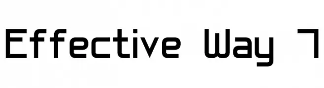
A modern, geometric font with a clean, structured design.
![Effective Way 7 Frei Schriftart Herunterladen]() Herunterladen 337 Downloads@WebFont
Herunterladen 337 Downloads@WebFont -
( Copyright (c) 2011-2012 by Sorkin Type Co (www.sorkintype.com) )
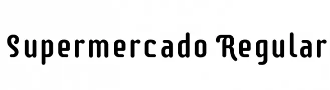
A bold, rounded font with a playful and structured style.
![Supermercado Regular Frei Schriftart Herunterladen]() Herunterladen 337 Downloads@WebFont
Herunterladen 337 Downloads@WebFont -
( Adam Wunn )
A bold, high-contrast serif font with a classic and authoritative style.
![DailyPlanet Black Frei Schriftart Herunterladen]() Herunterladen 337 Downloads@WebFont
Herunterladen 337 Downloads@WebFont -
( Fonts by Scratchones )
Decorative script font with elegant, flowing lines.
![Olive Oil Frei Schriftart Herunterladen]() Herunterladen 337 Downloads@WebFont
Herunterladen 337 Downloads@WebFont -
( Fonts by Daniel Zadorozny - www.iconian.com - Free for personal use )
A bold, expanded, and futuristic font with geometric shapes and sharp angles.
![Free Agent Bold Expanded Frei Schriftart Herunterladen]() Herunterladen 337 Downloads@WebFont
Herunterladen 337 Downloads@WebFont -
( Fonts by Darrell Flood - Personal-use only. For commercial use please contact owner. )
A bold, geometric font with rounded edges and a futuristic style.
![Digital Dreamers Frei Schriftart Herunterladen]() Herunterladen 336 Downloads@WebFont
Herunterladen 336 Downloads@WebFont


Welche Schriften sind gerade am populärsten?
Poppins, Roboto, Montserrat, Open Sans und Lato sind wegen ihrer klaren Formen und breiten Einsetzbarkeit sehr gefragt – von Markenauftritt über Landingpages bis hin zu Postern.
Welche Fonts eignen sich für Logos?
Geometrische Sans‑Serifs (z. B. Poppins, Familien im Gotham‑Stil) sind ein häufiger Griff für sauberes, skalierbares Branding. Für eine persönlichere Note bleiben Scripts und Handschrift‑Stile beliebt. Kombinieren Sie einen prägnanten Headline‑Font mit einer neutralen Brotschrift für Wiedererkennung und Harmonie.
Wie oft wird die Top‑Liste aktualisiert?
Regelmäßig – basierend auf realen Downloads und Interaktionen. Schauen Sie öfter vorbei, um aufstrebende Favoriten früh zu entdecken.
💡 Tipp: Seite bookmarken – Trends wechseln schnell, und heutige Top‑Schriften inspirieren morgen vielleicht das Rebranding.