Willkommen bei den Top‑Schriften – hier treffen Beliebtheit und Qualität aufeinander. Das sind die in diesem Jahr am häufigsten heruntergeladenen und genutzten Fonts. Wenn Sie sichere Optionen für Logo, Web oder Social suchen, starten Sie hier.
Jeder Top‑Font überzeugt durch Balance, Lesbarkeit und Vielseitigkeit. Sie finden moderne Sans‑Serifs, elegante Scripts, Vintage‑Serifs und minimalistische Displays.
-
 Herunterladen 346 Downloads@WebFont
 -
( Fonts by Jacob Fisher - www.pizzadude.dk )
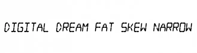
A digital, futuristic font with a skewed, narrow design and bold geometric shapes.
![Digital dream Fat Skew Narrow Frei Schriftart Herunterladen]() Herunterladen 346 Downloads@WebFont
Herunterladen 346 Downloads@WebFont -
( Fonts by www.houseoflime.com )
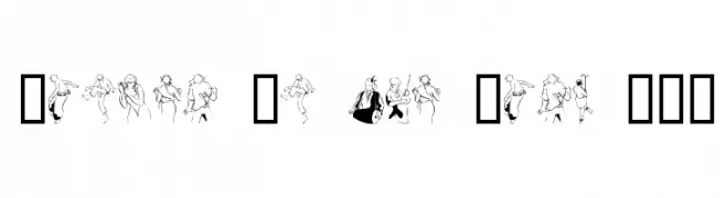
Expressive line-art font with dancing figure illustrations for each character.
![Dancer In The Dark III Frei Schriftart Herunterladen]() Herunterladen 346 Downloads@WebFont
Herunterladen 346 Downloads@WebFont -
![Ochent Silibrina 3 Frei Schriftart Herunterladen]() Herunterladen 346 Downloads@WebFont
Herunterladen 346 Downloads@WebFont -
( Fonts by www.blambot.com )
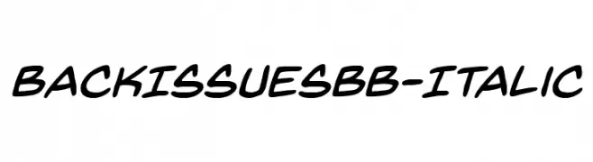
A playful, handwritten-style italic font with smooth, fluid strokes.
![BackIssuesBB-Italic Frei Schriftart Herunterladen]() Herunterladen 346 Downloads@WebFont
Herunterladen 346 Downloads@WebFont -
( Fonts by fontease - Kolyu Kolev - Personal-use only. For commercial use please contact owner. )
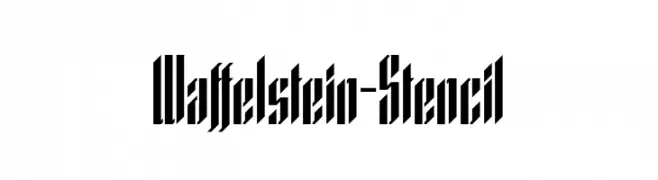
A bold, stencil-style font with sharp, angular edges and a geometric design.
![Waffelstein-Stencil Frei Schriftart Herunterladen]() Herunterladen 346 Downloads@WebFont
Herunterladen 346 Downloads@WebFont -
( Fonts by Gassstype )
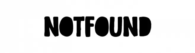
A bold, playful font with thick, rounded strokes and a hand-drawn feel.
![Not Found Frei Schriftart Herunterladen]() Herunterladen 346 Downloads@WebFont
Herunterladen 346 Downloads@WebFont -
( Fonts by Apostrophic Lab )
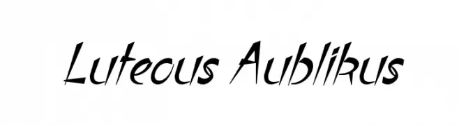
A dynamic, angular font with a forward-leaning slant and dramatic flair.
![Luteous Aublikus Frei Schriftart Herunterladen]() Herunterladen 346 Downloads@WebFont
Herunterladen 346 Downloads@WebFont -
( Fonts by Mans Greback - www.mawns.com )
An elegant script font with intricate swashes and flourishes.
![Before the Rain Swashes DEMO Frei Schriftart Herunterladen]() Herunterladen 346 Downloads@WebFont
Herunterladen 346 Downloads@WebFont -
( Fonts by Ospiro Enterprises - Personal-use only. For commercial use please contact owner. )
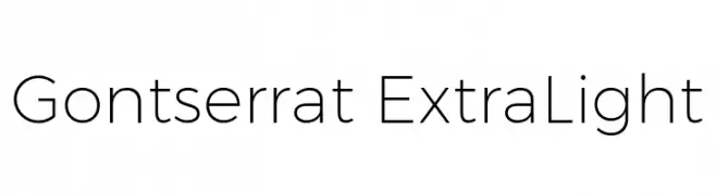
A modern, geometric sans-serif font with thin, uniform strokes.
![Gontserrat ExtraLight Frei Schriftart Herunterladen]() Herunterladen 346 Downloads@WebFont
Herunterladen 346 Downloads@WebFont -
( Doel Creative - creativemarket.com/fajriyandi )
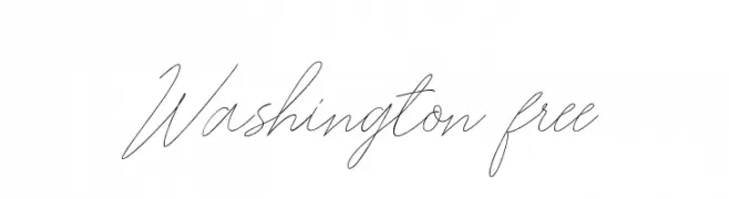
A graceful, cursive script font with elegant, flowing lines.
![Washington free Frei Schriftart Herunterladen]() Herunterladen 346 Downloads@WebFont
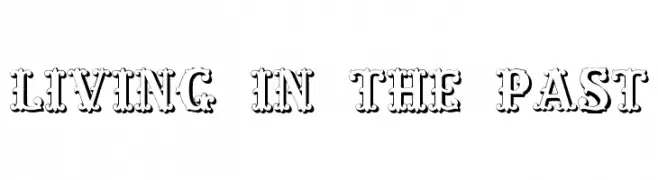
Herunterladen 346 Downloads@WebFont -
![Living in the Past Frei Schriftart Herunterladen]() Herunterladen 346 Downloads@WebFont
Herunterladen 346 Downloads@WebFont -
( Fonts by Dan Steinbok - Out Of Step Font Company - outofstepfontco.com - Personal-use only. For commercial use please contact owner. )
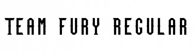
A bold, geometric font with a modern, industrial aesthetic.
![Team Fury Regular Frei Schriftart Herunterladen]() Herunterladen 346 Downloads@WebFont
Herunterladen 346 Downloads@WebFont -
( Fonts by Velvetyne Type Foundry - Personal-use only. For commercial use please contact owner. )
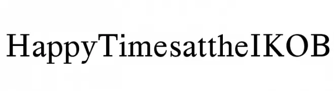
A classic serif font with balanced structure and moderate contrast.
![Happy Times at the IKOB Frei Schriftart Herunterladen]() Herunterladen 346 Downloads@WebFont
Herunterladen 346 Downloads@WebFont -
( Chequered Ink - chequered.ink/ )
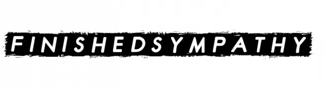
A bold, modern sans-serif font with a distressed background for a striking effect.
![Finished Sympathy Frei Schriftart Herunterladen]() Herunterladen 346 Downloads@WebFont
Herunterladen 346 Downloads@WebFont -
( Fonts of Afrika - www.themaps.co.za/downloads.asp )
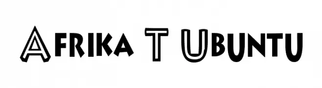
A bold, geometric font with a dynamic and modern style.
![Afrika T Ubuntu Frei Schriftart Herunterladen]() Herunterladen 346 Downloads@WebFont
Herunterladen 346 Downloads@WebFont -
( Font by Jayvee D. Enaguas - grandchaos9000.deviantart.com )
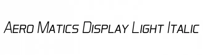
A sleek, modern italic font with a light weight and geometric design.
![Aero Matics Display Light Italic Frei Schriftart Herunterladen]() Herunterladen 346 Downloads@WebFont
Herunterladen 346 Downloads@WebFont -
( Fonts by Daniel Zadorozny - www.iconian.com - Free for personal use )
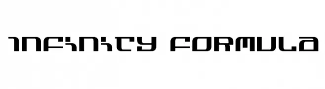
A futuristic, geometric font with bold, angular shapes and clean lines.
![Infinity Formula Frei Schriftart Herunterladen]() Herunterladen 346 Downloads@WebFont
Herunterladen 346 Downloads@WebFont -
( Fonts by Galdino Otten Fonts )
A playful, hand-drawn font with tall, narrow characters and a whimsical style.
![Tune Toons Frei Schriftart Herunterladen]() Herunterladen 346 Downloads@WebFont
Herunterladen 346 Downloads@WebFont -
( Fonts by Daniel Zadorozny - www.iconian.com )
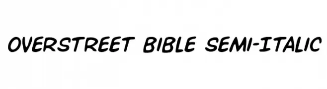
A playful, semi-italic font with bold, rounded characters.
![Overstreet Bible Semi-Italic Frei Schriftart Herunterladen]() Herunterladen 346 Downloads@WebFont
Herunterladen 346 Downloads@WebFont -
( Fonts by Mans Greback - www.mawns.com )
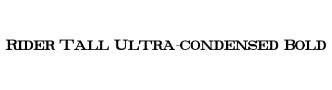
Ultra-condensed, tall, and bold font with a striking presence.
![Rider Tall Ultra-condensed Bold Frei Schriftart Herunterladen]() Herunterladen 346 Downloads@WebFont
Herunterladen 346 Downloads@WebFont -
![anadya Personal Use Only Frei Schriftart Herunterladen]() Herunterladen 346 Downloads@WebFont
Herunterladen 346 Downloads@WebFont -
( Copyright (c) 2011, Joe Prince, Admix Designs (http://www.admixdesigns.com/) )
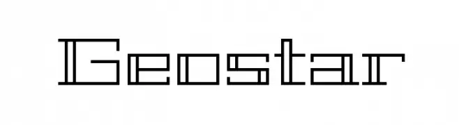
A geometric, futuristic font with angular, modular letterforms and consistent line weight.
![Geostar Frei Schriftart Herunterladen]() Herunterladen 346 Downloads@WebFont
Herunterladen 346 Downloads@WebFont -
( Fonts by Abo Daniel Studio )
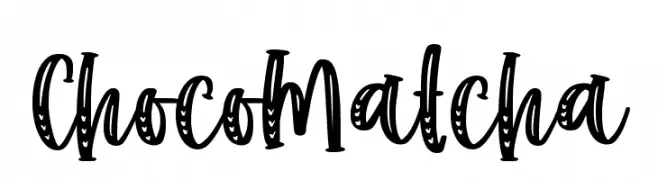
A bold, decorative font with playful, hand-drawn characters.
![Choco Matcha Frei Schriftart Herunterladen]() Herunterladen 346 Downloads@WebFont
Herunterladen 346 Downloads@WebFont -
( Arief Pribadi )
A playful, bold handwritten font with rounded letterforms.
![nenyns Frei Schriftart Herunterladen]() Herunterladen 346 Downloads@WebFont
Herunterladen 346 Downloads@WebFont -
Schriftart von Qbotype. For commercial use please contact the owner.
( Fonts by www.phuxerdesigns.com.ar - Non-commercial use of any typeface free version, only buying the full version )
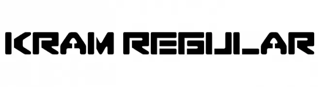
A bold, geometric font with a futuristic and industrial style.
![Kram regular Frei Schriftart Herunterladen]() Herunterladen 346 Downloads@WebFont
Herunterladen 346 Downloads@WebFont -
( Fonts by scratchones )
Playful and energetic handwritten font.
![Really Frei Schriftart Herunterladen]() Herunterladen 346 Downloads@WebFont
Herunterladen 346 Downloads@WebFont -
( Fonts by www.koenhachmang.com - Glitch )
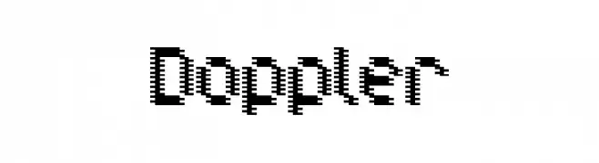
A pixelated, retro-style font with a bold, digital appearance.
![Doppler Frei Schriftart Herunterladen]() Herunterladen 346 Downloads@WebFont
Herunterladen 346 Downloads@WebFont -
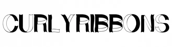
![CurlyRibbons Frei Schriftart Herunterladen]() Herunterladen 346 Downloads@WebFont
Herunterladen 346 Downloads@WebFont -
( Font by Jonathan Harris - www.tattoowoo.com )
A collection of tribal-style butterfly illustrations.
![Tribal Butterflies Frei Schriftart Herunterladen]() Herunterladen 346 Downloads@WebFont
Herunterladen 346 Downloads@WebFont -
( Fonts by www.stimuleyefonts.com )
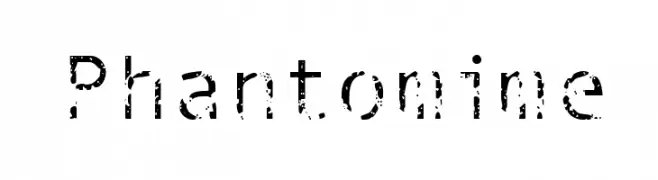
A distressed, grunge-style font with a textured, weathered appearance.
![Phantomime Frei Schriftart Herunterladen]() Herunterladen 346 Downloads@WebFont
Herunterladen 346 Downloads@WebFont -
Schriftart von darrencaylin. For commercial use please contact the owner.
( Are you writing to a cat fancier then this font is for you.https://biostim.com.au/free-fonts/ )
A playful font with cat face motifs on each character, perfect for fun and creative projects.
![Cat Frei Schriftart Herunterladen]() Herunterladen 346 Downloads@WebFont
Herunterladen 346 Downloads@WebFont -
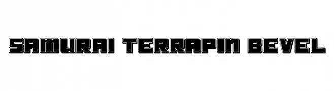
![Samurai Terrapin Bevel Frei Schriftart Herunterladen]() Herunterladen 346 Downloads@WebFont
Herunterladen 346 Downloads@WebFont -
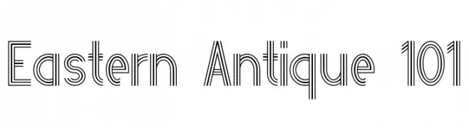
![Eastern Antique 101 Frei Schriftart Herunterladen]() Herunterladen 346 Downloads@WebFont
Herunterladen 346 Downloads@WebFont -
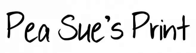
( Free for a personal use. For a commercial use please visit www.kevinandamanda.com )
A playful, casual handwritten font with a lively and dynamic style.
![Pea Sue's Print Frei Schriftart Herunterladen]() Herunterladen 346 Downloads@WebFont
Herunterladen 346 Downloads@WebFont


Welche Schriften sind gerade am populärsten?
Poppins, Roboto, Montserrat, Open Sans und Lato sind wegen ihrer klaren Formen und breiten Einsetzbarkeit sehr gefragt – von Markenauftritt über Landingpages bis hin zu Postern.
Welche Fonts eignen sich für Logos?
Geometrische Sans‑Serifs (z. B. Poppins, Familien im Gotham‑Stil) sind ein häufiger Griff für sauberes, skalierbares Branding. Für eine persönlichere Note bleiben Scripts und Handschrift‑Stile beliebt. Kombinieren Sie einen prägnanten Headline‑Font mit einer neutralen Brotschrift für Wiedererkennung und Harmonie.
Wie oft wird die Top‑Liste aktualisiert?
Regelmäßig – basierend auf realen Downloads und Interaktionen. Schauen Sie öfter vorbei, um aufstrebende Favoriten früh zu entdecken.
💡 Tipp: Seite bookmarken – Trends wechseln schnell, und heutige Top‑Schriften inspirieren morgen vielleicht das Rebranding.