Willkommen bei den Top‑Schriften – hier treffen Beliebtheit und Qualität aufeinander. Das sind die in diesem Jahr am häufigsten heruntergeladenen und genutzten Fonts. Wenn Sie sichere Optionen für Logo, Web oder Social suchen, starten Sie hier.
Jeder Top‑Font überzeugt durch Balance, Lesbarkeit und Vielseitigkeit. Sie finden moderne Sans‑Serifs, elegante Scripts, Vintage‑Serifs und minimalistische Displays.
-
Schriftart von SteveCampa. For commercial use please contact the owner.
( Free )
A modern and elegant font with clean lines and balanced characters.
 Herunterladen 350 Downloads
 -
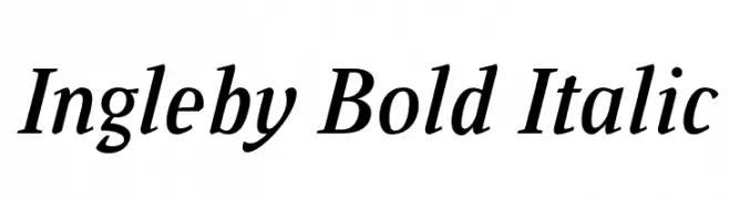
![Ingleby Bold Italic Frei Schriftart Herunterladen]() Herunterladen 350 Downloads@WebFont
Herunterladen 350 Downloads@WebFont -
![The Youther Frei Schriftart Herunterladen]() Herunterladen 350 Downloads@WebFont
Herunterladen 350 Downloads@WebFont -
![BOLT CUTTER Frei Schriftart Herunterladen]() Herunterladen 350 Downloads@WebFont
Herunterladen 350 Downloads@WebFont -
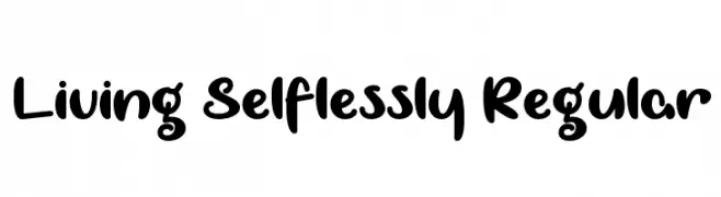
![Living Selflessly Regular Frei Schriftart Herunterladen]() Herunterladen 350 Downloads@WebFont
Herunterladen 350 Downloads@WebFont -
( Fonts by Adien Gunarta - fontasticindonesia.blogspot.com )
A bold, italic sans-serif font with a dynamic and modern style.
![QuickArgani Frei Schriftart Herunterladen]() Herunterladen 350 Downloads@WebFont
Herunterladen 350 Downloads@WebFont -
![de Manu 2 Frei Schriftart Herunterladen]() Herunterladen 350 Downloads@WebFont
Herunterladen 350 Downloads@WebFont -
( Fonts by Letterhend Studio )
A bold, playful font with geometric shapes and dynamic character tilt.
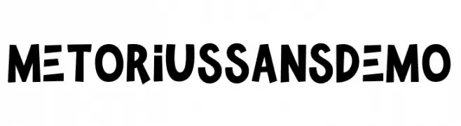
![MetoriusSansDemo Frei Schriftart Herunterladen]() Herunterladen 350 Downloads@WebFont
Herunterladen 350 Downloads@WebFont -
![Biting My Nails Outline Frei Schriftart Herunterladen]() Herunterladen 350 Downloads@WebFont
Herunterladen 350 Downloads@WebFont -
![Macedonian Helv Bold Italic Frei Schriftart Herunterladen]() Herunterladen 350 Downloads@WebFont
Herunterladen 350 Downloads@WebFont -
( Fonts by Arkandis Digital Foundry )
A classic serif typeface with an elegant italic slant and moderate stroke contrast.
![VenturisADFCdStyle-Italic Frei Schriftart Herunterladen]() Herunterladen 350 Downloads@WebFont
Herunterladen 350 Downloads@WebFont -
( Fonts by Jonathan Harris - www.tattoowoo.com )
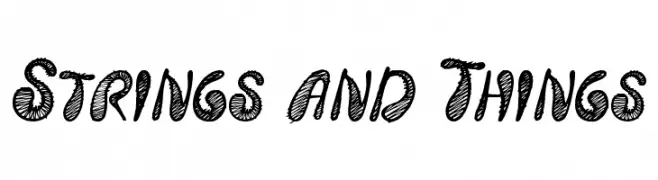
A bold, hand-drawn font with a textured, scribble-like pattern.
![Strings and Things Frei Schriftart Herunterladen]() Herunterladen 350 Downloads@WebFont
Herunterladen 350 Downloads@WebFont -
( Fonts by MJType - mjtype.com - Personal-use only. For commercial use please contact owner. )
A playful, handwritten font with smooth, rounded edges and a casual style.
![Artistry Valentino Frei Schriftart Herunterladen]() Herunterladen 350 Downloads@WebFont
Herunterladen 350 Downloads@WebFont -
( Fonts by Darcy Baldwin - darcybaldwin.com. Free for personal use only )
A whimsical, hand-drawn font with a magical, playful style.
![DJB Im No Wizard Frei Schriftart Herunterladen]() Herunterladen 350 Downloads@WebFont
Herunterladen 350 Downloads@WebFont -
( Fonts by www.gliphmaker.com. Personal-use only. For commercial use please contact owner. )
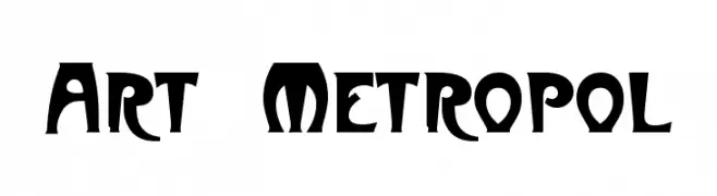
A bold, artistic font with high contrast and playful curves.
![Art-Metropol Frei Schriftart Herunterladen]() Herunterladen 350 Downloads@WebFont
Herunterladen 350 Downloads@WebFont -
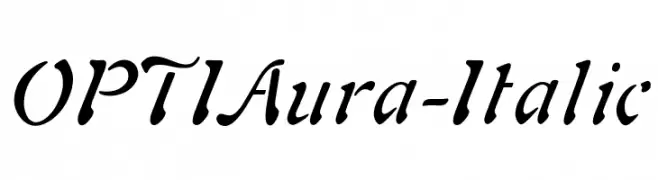
( Fonts by Castcraft Software - opti.netii.net - check the website before use )
An elegant italic font with flowing, cursive strokes and a moderate slant.
![OPTIAura-Italic Frei Schriftart Herunterladen]() Herunterladen 350 Downloads@WebFont
Herunterladen 350 Downloads@WebFont -
( Fonts by www.legacyofdefeat.com )
A bold, three-dimensional font with a vintage, geometric style and strong shadow effects.
![H74 The Nomad Heavy Frei Schriftart Herunterladen]() Herunterladen 350 Downloads@WebFont
Herunterladen 350 Downloads@WebFont -
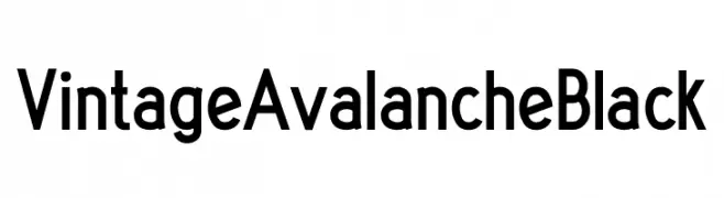
( Fonts by Abraham Plaza - behance.net/abrahamplazadelpino - For fully operational commercial use of any of my fonts please donate 12€ (10£/14$) via PayPal abrahamplapi(at)gmail.com - Personal-use only. )
A bold, geometric font with a modern and professional appearance.
![Vintage Avalanche Black Frei Schriftart Herunterladen]() Herunterladen 350 Downloads@WebFont
Herunterladen 350 Downloads@WebFont -
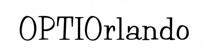
( Fonts by Castcraft Software - OPTI Fonts Archive - opti.netii.net - Personal-use only. For commercial use please contact owner. )
A playful, hand-drawn serif font with a whimsical and modern twist.
![OPTIOrlando Frei Schriftart Herunterladen]() Herunterladen 349 Downloads@WebFont
Herunterladen 349 Downloads@WebFont -
![Lower-WestSide Frei Schriftart Herunterladen]() Herunterladen 349 Downloads
Herunterladen 349 Downloads -
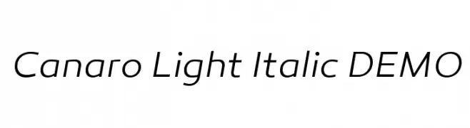
( Fonts by a www.fontfabric.com. Personal-use only. For commercial use please contact owner. )
A sleek, modern, light italic font with elegant slanted characters.
![Canaro Light Italic DEMO Frei Schriftart Herunterladen]() Herunterladen 349 Downloads@WebFont
Herunterladen 349 Downloads@WebFont -
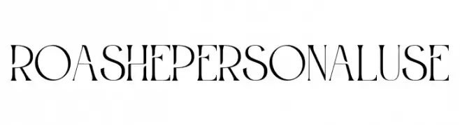
( Fonts by Din Studio - Donis Miftahudin - Personal-use only. For commercial use please contact owner. )
A modern, high-contrast serif font with elegant and stylish characters.
![Roashe Personal Use Frei Schriftart Herunterladen]() Herunterladen 349 Downloads@WebFont
Herunterladen 349 Downloads@WebFont -
Schriftart von JuanCasco. For commercial use please contact the owner.
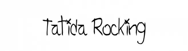
( Fonts by Juan Casco - www.juancasco.net )
A playful, hand-drawn font with irregular strokes and a dynamic, informal style.
![Tatida Rocking Frei Schriftart Herunterladen]() Herunterladen 349 Downloads@WebFont
Herunterladen 349 Downloads@WebFont -
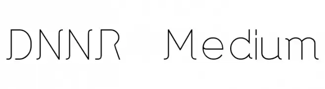
![DNNR Medium Frei Schriftart Herunterladen]() Herunterladen 349 Downloads@WebFont
Herunterladen 349 Downloads@WebFont -
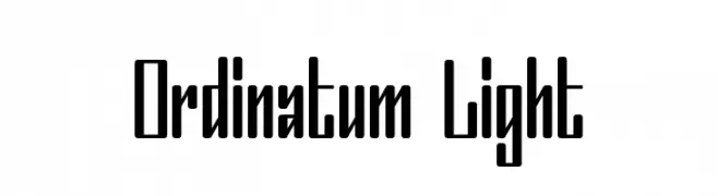
( Fonts by Mans Greback - www.mawns.com )
A modern, geometric font with tall, narrow characters and medium contrast.
![Ordinatum Light Frei Schriftart Herunterladen]() Herunterladen 349 Downloads@WebFont
Herunterladen 349 Downloads@WebFont -
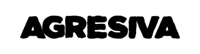
( Fonts by Woodcutter Manero - http://www.woodcutter.es - Personal-use only. For commercial use please contact owner. )
A bold, rounded font with a strong, playful presence.
![Agresiva Frei Schriftart Herunterladen]() Herunterladen 349 Downloads@WebFont
Herunterladen 349 Downloads@WebFont -
( Fonts by Graham Meade - GemFonts )
A sleek, oblique font with tall, narrow characters and a modern aesthetic.
![Tall Films Expanded Oblique Frei Schriftart Herunterladen]() Herunterladen 349 Downloads@WebFont
Herunterladen 349 Downloads@WebFont -
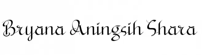
( Fonts by a Situjuh Nazara - c7n1.wordpress.com. Personal-use only. For commercial use please contact owner. )
An elegant script font with flowing, decorative letterforms.
![Bryana Aningsih Shara Frei Schriftart Herunterladen]() Herunterladen 349 Downloads@WebFont
Herunterladen 349 Downloads@WebFont -
![Edgy Regular Frei Schriftart Herunterladen]() Herunterladen 349 Downloads@WebFont
Herunterladen 349 Downloads@WebFont -
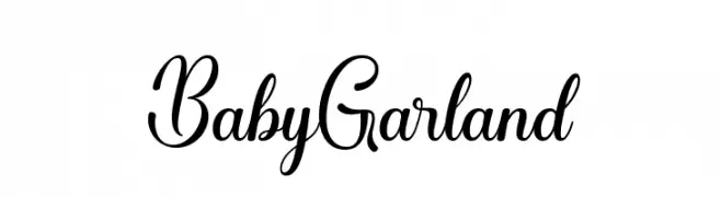
( Fonts by Sidiq Fahmi - Personal-use only. For commercial use please contact owner. )
A cursive, elegant script font with flowing loops and swashes.
![BabyGarland Frei Schriftart Herunterladen]() Herunterladen 349 Downloads@WebFont
Herunterladen 349 Downloads@WebFont -
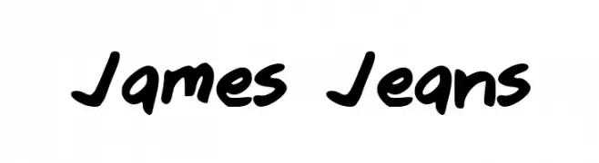
Schriftart von 100FreeFonts. For commercial use please contact the owner.
![James Jeans Frei Schriftart Herunterladen]() Herunterladen 349 Downloads@WebFont
Herunterladen 349 Downloads@WebFont -
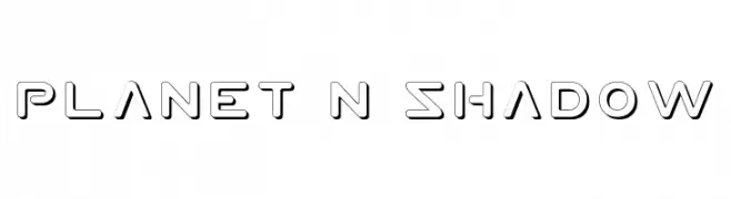
( Fonts by Daniel Zadorozny - www.iconian.com - Free for personal use )
A futuristic, geometric font with bold, hollow letters and a shadow effect.
![Planet N Shadow Frei Schriftart Herunterladen]() Herunterladen 349 Downloads@WebFont
Herunterladen 349 Downloads@WebFont -
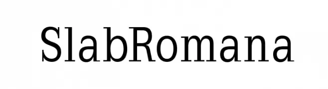
( Fonts by Manfred Klein - manfred-klein.ina-mar.com )
A bold, structured slab serif font with uniform stroke widths and block-like serifs.
![SlabRomana Frei Schriftart Herunterladen]() Herunterladen 349 Downloads@WebFont
Herunterladen 349 Downloads@WebFont -
( Copyright (c) 2011, Cyreal (www.cyreal.org) )
A modern serif font with elegant, elongated serifs and balanced letterforms.
![Tienne Regular Frei Schriftart Herunterladen]() Herunterladen 349 Downloads@WebFont
Herunterladen 349 Downloads@WebFont -
( Fonts by Dan P. Lyons - Personal-use only. For commercial use please contact owner. )
A playful, rounded font with a hand-drawn, casual style.
![Roundling Frei Schriftart Herunterladen]() Herunterladen 349 Downloads@WebFont
Herunterladen 349 Downloads@WebFont


Welche Schriften sind gerade am populärsten?
Poppins, Roboto, Montserrat, Open Sans und Lato sind wegen ihrer klaren Formen und breiten Einsetzbarkeit sehr gefragt – von Markenauftritt über Landingpages bis hin zu Postern.
Welche Fonts eignen sich für Logos?
Geometrische Sans‑Serifs (z. B. Poppins, Familien im Gotham‑Stil) sind ein häufiger Griff für sauberes, skalierbares Branding. Für eine persönlichere Note bleiben Scripts und Handschrift‑Stile beliebt. Kombinieren Sie einen prägnanten Headline‑Font mit einer neutralen Brotschrift für Wiedererkennung und Harmonie.
Wie oft wird die Top‑Liste aktualisiert?
Regelmäßig – basierend auf realen Downloads und Interaktionen. Schauen Sie öfter vorbei, um aufstrebende Favoriten früh zu entdecken.
💡 Tipp: Seite bookmarken – Trends wechseln schnell, und heutige Top‑Schriften inspirieren morgen vielleicht das Rebranding.