Willkommen bei den Top‑Schriften – hier treffen Beliebtheit und Qualität aufeinander. Das sind die in diesem Jahr am häufigsten heruntergeladenen und genutzten Fonts. Wenn Sie sichere Optionen für Logo, Web oder Social suchen, starten Sie hier.
Jeder Top‑Font überzeugt durch Balance, Lesbarkeit und Vielseitigkeit. Sie finden moderne Sans‑Serifs, elegante Scripts, Vintage‑Serifs und minimalistische Displays.
-
( Fonts by MJType - mjtype.com - Personal-use only. For commercial use please contact owner. )
A playful, handwritten font with smooth, rounded edges and a casual style.
 Herunterladen 349 Downloads@WebFont
 -
( Fonts by Altsys Metamorphosis )
A bold, three-dimensional font with a futuristic and geometric style.
![CosmosCaps Frei Schriftart Herunterladen]() Herunterladen 349 Downloads@WebFont
Herunterladen 349 Downloads@WebFont -
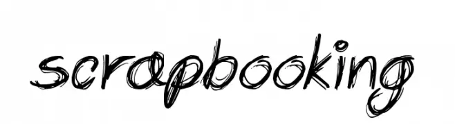
![Scrapbooking Frei Schriftart Herunterladen]() Herunterladen 349 Downloads@WebFont
Herunterladen 349 Downloads@WebFont -
![SexyRexy-Smitten Frei Schriftart Herunterladen]() Herunterladen 349 Downloads@WebFont
Herunterladen 349 Downloads@WebFont -
( Fonts by Wiggly Pichi )
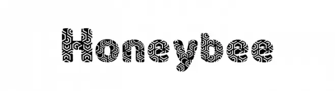
A bold, decorative font with intricate maze-like patterns inside each character.
![Honeybee Frei Schriftart Herunterladen]() Herunterladen 349 Downloads@WebFont
Herunterladen 349 Downloads@WebFont -
( Fonts by welovefont@gmail.com welovefont - Personal-use only. For commercial use please contact owner. )
A dynamic and elegant script font with fluid, cursive letterforms.
![Theremerq Frei Schriftart Herunterladen]() Herunterladen 349 Downloads@WebFont
Herunterladen 349 Downloads@WebFont -
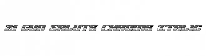
( Fonts by Daniel Zadorozny - www.iconian.com - Free for personal use )
A bold, italicized font with a chrome-like, futuristic design.
![21 Gun Salute Chrome Italic Frei Schriftart Herunterladen]() Herunterladen 348 Downloads@WebFont
Herunterladen 348 Downloads@WebFont -
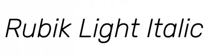
( Copyright 2015 The Rubik Project Authors (https://github.com/googlefonts/rubik) )
A modern, clean, and slightly italic font with excellent legibility.
![Rubik Light Italic Frei Schriftart Herunterladen]() Herunterladen 348 Downloads@WebFont
Herunterladen 348 Downloads@WebFont -
![Lower-WestSide Frei Schriftart Herunterladen]() Herunterladen 348 Downloads
Herunterladen 348 Downloads -
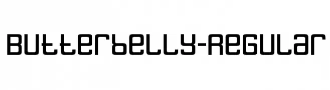
( Fonts by www.typodermicfonts.com - Ray Larabie )
A bold, geometric font with rounded edges and a modern, friendly appearance.
![Butterbelly-Regular Frei Schriftart Herunterladen]() Herunterladen 348 Downloads@WebFont
Herunterladen 348 Downloads@WebFont -
( Fonts by Darrell Flood - Personal-use only. For commercial use please contact owner. )
A bold, geometric font with rounded edges and a futuristic style.
![Digital Dreamers Frei Schriftart Herunterladen]() Herunterladen 348 Downloads@WebFont
Herunterladen 348 Downloads@WebFont -
![DHF Semangat 2012 Demo Frei Schriftart Herunterladen]() Herunterladen 348 Downloads@WebFont
Herunterladen 348 Downloads@WebFont -
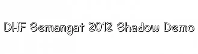
![DHF Semangat 2012 Shadow Demo Frei Schriftart Herunterladen]() Herunterladen 348 Downloads@WebFont
Herunterladen 348 Downloads@WebFont -
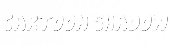
( Font by Jonathan Harris - www.tattoowoo.com )
A playful, cartoon-style font with subtle shadow effects for a 3D look.
![Cartoon Shadow Frei Schriftart Herunterladen]() Herunterladen 348 Downloads@WebFont
Herunterladen 348 Downloads@WebFont -
( Fonts by Dirtyline Studio )
A playful, hand-drawn font with bold, rounded strokes and a casual style.
![Reshuffle Sans Regular Frei Schriftart Herunterladen]() Herunterladen 348 Downloads@WebFont
Herunterladen 348 Downloads@WebFont -
( Fonts by Dieter Schumacher )
A bold, geometric font with a futuristic and modern style.
![Oneworldonefuture ExtraBold Frei Schriftart Herunterladen]() Herunterladen 348 Downloads@WebFont
Herunterladen 348 Downloads@WebFont -
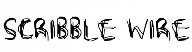
![Scribble Wire Frei Schriftart Herunterladen]() Herunterladen 348 Downloads@WebFont
Herunterladen 348 Downloads@WebFont -
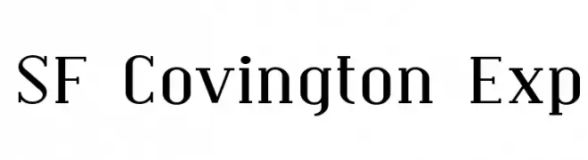
![SF Covington Exp Frei Schriftart Herunterladen]() Herunterladen 348 Downloads@WebFont
Herunterladen 348 Downloads@WebFont -
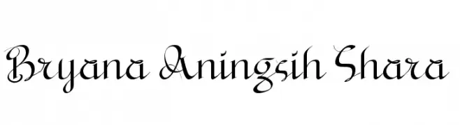
( Fonts by a Situjuh Nazara - c7n1.wordpress.com. Personal-use only. For commercial use please contact owner. )
An elegant script font with flowing, decorative letterforms.
![Bryana Aningsih Shara Frei Schriftart Herunterladen]() Herunterladen 348 Downloads@WebFont
Herunterladen 348 Downloads@WebFont -
( Fonts by www.stimuleyefonts.com )
A modern, geometric font with consistent stroke width and rounded edges.
![Quares Frei Schriftart Herunterladen]() Herunterladen 348 Downloads@WebFont
Herunterladen 348 Downloads@WebFont -
![Pixel Berry 08/84 Ltd.Edition Frei Schriftart Herunterladen]() Herunterladen 348 Downloads@WebFont
Herunterladen 348 Downloads@WebFont -
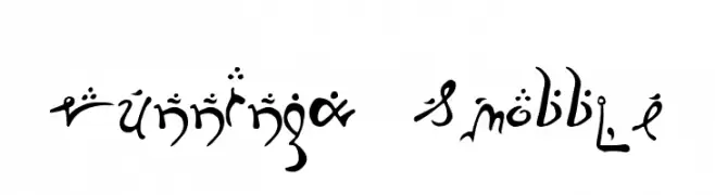
( Fonts by Uddi Uddi )
A whimsical and artistic font with decorative elements and varying stroke thickness.
![Running-Smobble Frei Schriftart Herunterladen]() Herunterladen 348 Downloads@WebFont
Herunterladen 348 Downloads@WebFont -
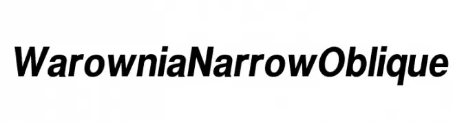
( Fonts by CannotIntoSpaceFonts - KineticPlasma Fonts - Personal-use only. For commercial use please contact owner. )
A sleek, narrow, and oblique font with a modern and dynamic style.
![Warownia Narrow Oblique Frei Schriftart Herunterladen]() Herunterladen 348 Downloads@WebFont
Herunterladen 348 Downloads@WebFont -
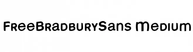
( Fonts by Manfred Klein. Free for private and charity use. Free for commercial with donation to organizations )
A playful, bold font with rounded edges and a hand-drawn feel.
![FreeBradburySans Medium Frei Schriftart Herunterladen]() Herunterladen 348 Downloads@WebFont
Herunterladen 348 Downloads@WebFont -
( Fonts by Kelvin Ma - letterpunch.blogspot.com - Personal-use only. For commercial use please contact owner. )
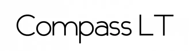
A modern, geometric sans-serif font with clean lines and balanced spacing.
![Compass LT Frei Schriftart Herunterladen]() Herunterladen 348 Downloads@WebFont
Herunterladen 348 Downloads@WebFont -
Schriftart von JuanCasco. For commercial use please contact the owner.
( Fonts by Juan Casco - www.juancasco.net )
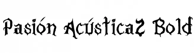
A bold, gothic-style font with intricate, angular detailing.
![Pasión Acústica2 Bold Frei Schriftart Herunterladen]() Herunterladen 348 Downloads@WebFont
Herunterladen 348 Downloads@WebFont -
( Fonts by Misti Hammers - mistifonts.com - Personal-use only. For commercial use please contact owner. )
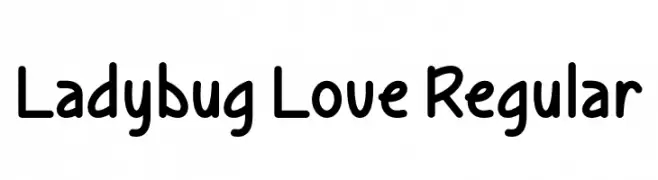
A playful, rounded font with smooth curves and a friendly vibe.
![Ladybug Love Regular Frei Schriftart Herunterladen]() Herunterladen 348 Downloads@WebFont
Herunterladen 348 Downloads@WebFont -
( Fonts by Bangkit Tri Setiadi )
A bold, playful font with decorative cutouts and rounded characters.
![Crafty Signs Regular Frei Schriftart Herunterladen]() Herunterladen 348 Downloads@WebFont
Herunterladen 348 Downloads@WebFont -
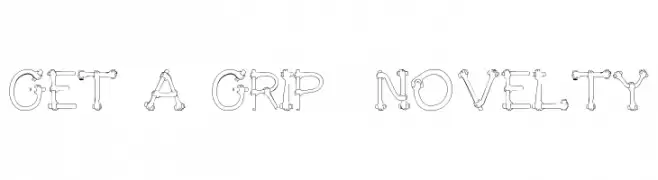
![Get A Grip Novelty Frei Schriftart Herunterladen]() Herunterladen 348 Downloads@WebFont
Herunterladen 348 Downloads@WebFont -
( Copyright (c) 2011, Cyreal (www.cyreal.org) )
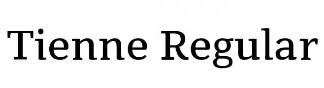
A modern serif font with elegant, elongated serifs and balanced letterforms.
![Tienne Regular Frei Schriftart Herunterladen]() Herunterladen 348 Downloads@WebFont
Herunterladen 348 Downloads@WebFont -
( Fonts by Rvst )
A playful and whimsical font with bold, curvy letterforms and exaggerated serifs.
![Whimsy Dhimsy Demo Frei Schriftart Herunterladen]() Herunterladen 348 Downloads@WebFont
Herunterladen 348 Downloads@WebFont -
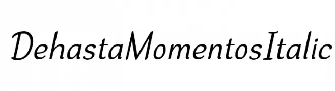
( Fonts by Situjuh Nazara - 7ntypes.com - Personal-use only. For commercial use please contact owner. )
A smooth, flowing script font with an elegant italic style.
![Dehasta Momentos Italic Frei Schriftart Herunterladen]() Herunterladen 348 Downloads@WebFont
Herunterladen 348 Downloads@WebFont -
( Fonts by Billy Argel - Personal-use only. For commercial use please contact owner. )
A bold, dynamic script font with a modern and energetic style.
![Honey Lips Personal Use Regular Frei Schriftart Herunterladen]() Herunterladen 348 Downloads@WebFont
Herunterladen 348 Downloads@WebFont -
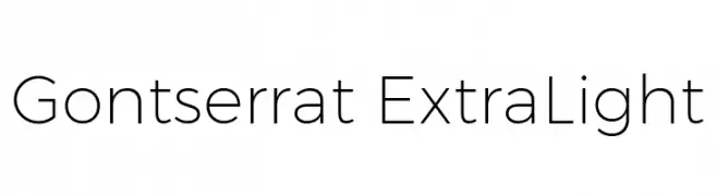
( Fonts by Ospiro Enterprises - Personal-use only. For commercial use please contact owner. )
A modern, geometric sans-serif font with thin, uniform strokes.
![Gontserrat ExtraLight Frei Schriftart Herunterladen]() Herunterladen 348 Downloads@WebFont
Herunterladen 348 Downloads@WebFont -
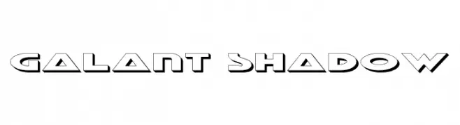
( Fonts by Daniel Zadorozny - www.iconian.com - Free for personal use )
A bold, geometric font with a shadow effect for a dynamic, futuristic look.
![Galant Shadow Frei Schriftart Herunterladen]() Herunterladen 348 Downloads@WebFont
Herunterladen 348 Downloads@WebFont


Welche Schriften sind gerade am populärsten?
Poppins, Roboto, Montserrat, Open Sans und Lato sind wegen ihrer klaren Formen und breiten Einsetzbarkeit sehr gefragt – von Markenauftritt über Landingpages bis hin zu Postern.
Welche Fonts eignen sich für Logos?
Geometrische Sans‑Serifs (z. B. Poppins, Familien im Gotham‑Stil) sind ein häufiger Griff für sauberes, skalierbares Branding. Für eine persönlichere Note bleiben Scripts und Handschrift‑Stile beliebt. Kombinieren Sie einen prägnanten Headline‑Font mit einer neutralen Brotschrift für Wiedererkennung und Harmonie.
Wie oft wird die Top‑Liste aktualisiert?
Regelmäßig – basierend auf realen Downloads und Interaktionen. Schauen Sie öfter vorbei, um aufstrebende Favoriten früh zu entdecken.
💡 Tipp: Seite bookmarken – Trends wechseln schnell, und heutige Top‑Schriften inspirieren morgen vielleicht das Rebranding.