Willkommen bei den Top‑Schriften – hier treffen Beliebtheit und Qualität aufeinander. Das sind die in diesem Jahr am häufigsten heruntergeladenen und genutzten Fonts. Wenn Sie sichere Optionen für Logo, Web oder Social suchen, starten Sie hier.
Jeder Top‑Font überzeugt durch Balance, Lesbarkeit und Vielseitigkeit. Sie finden moderne Sans‑Serifs, elegante Scripts, Vintage‑Serifs und minimalistische Displays.
-
 Herunterladen 345 Downloads@WebFont
 -
( Fonts by www.blambot.com )
A bold, energetic script font with a hand-drawn appearance.
![Keelhauled BB Frei Schriftart Herunterladen]() Herunterladen 345 Downloads@WebFont
Herunterladen 345 Downloads@WebFont -
( Fonts by Daniel Zadorozny - www.iconian.com - Free for personal use )
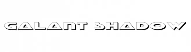
A bold, geometric font with a shadow effect for a dynamic, futuristic look.
![Galant Shadow Frei Schriftart Herunterladen]() Herunterladen 345 Downloads@WebFont
Herunterladen 345 Downloads@WebFont -
( Fonts by Vladimir Nikolic - www.creativefabrica.com/designer/vladimirnikolic/ - Personal-use only. For commercial use please contact owner. )
A bold, italicized font with a modern, angular design.
![Archigadget Italic Frei Schriftart Herunterladen]() Herunterladen 345 Downloads@WebFont
Herunterladen 345 Downloads@WebFont -
( Fonts by David Kerkhoff - www.hanodedphotography.com )
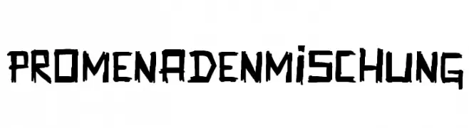
A bold, hand-drawn font with a rugged and artistic style.
![Promenadenmischung Frei Schriftart Herunterladen]() Herunterladen 345 Downloads@WebFont
Herunterladen 345 Downloads@WebFont -
( www.watesawal.blogspot.com )
A playful, bold font with cartoonish outlines and a whimsical style.
![bobotoh Frei Schriftart Herunterladen]() Herunterladen 345 Downloads@WebFont
Herunterladen 345 Downloads@WebFont -
![MoshimojiP Frei Schriftart Herunterladen]() Herunterladen 345 Downloads@WebFont
Herunterladen 345 Downloads@WebFont -
( Fonts by Castcraft Software - opti.netii.net - check the website before use )
A bold, outlined font with uniform width and strong presence.
![OPTICompitOutline Frei Schriftart Herunterladen]() Herunterladen 345 Downloads@WebFont
Herunterladen 345 Downloads@WebFont -
( Fonts by Geronimo )
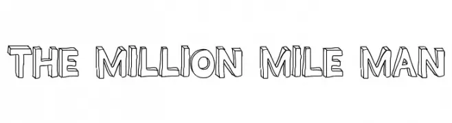
A bold, three-dimensional font with a playful and dynamic style.
![THE MILLION MILE MAN Frei Schriftart Herunterladen]() Herunterladen 345 Downloads@WebFont
Herunterladen 345 Downloads@WebFont -
( Fonts by Utopiafonts )
A dynamic, angular font with a modern, handwritten feel.
![Dael Neu Frei Schriftart Herunterladen]() Herunterladen 345 Downloads@WebFont
Herunterladen 345 Downloads@WebFont -
( Fonts by Origin Type )
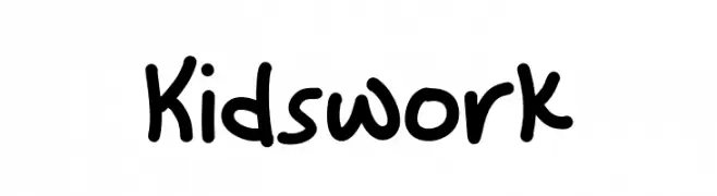
A playful, rounded font with a childlike, handwritten style.
![Kidswork Frei Schriftart Herunterladen]() Herunterladen 345 Downloads@WebFont
Herunterladen 345 Downloads@WebFont -
( Fonts by Style-7 - www.styleseven.com - Personal-use only. For commercial use please contact owner. )
A pixelated outline font with a retro digital aesthetic.
![Outline Pixel-7 Frei Schriftart Herunterladen]() Herunterladen 345 Downloads@WebFont
Herunterladen 345 Downloads@WebFont -
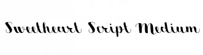
![Sweetheart Script Medium Frei Schriftart Herunterladen]() Herunterladen 345 Downloads@WebFont
Herunterladen 345 Downloads@WebFont -
( Fonts by JOEBOB graphics )
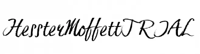
A dynamic, brush-style script font with expressive, hand-drawn strokes.
![HessterMoffettTRIAL Frei Schriftart Herunterladen]() Herunterladen 345 Downloads@WebFont
Herunterladen 345 Downloads@WebFont -
( Fonts by Andrew McCluskey - nalgames.com )
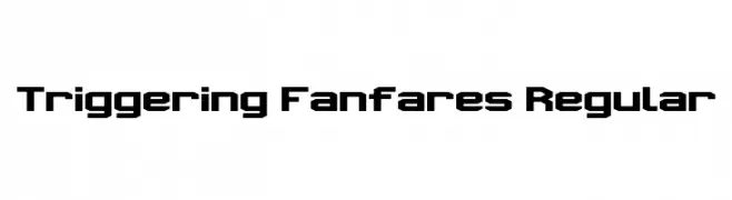
A bold, geometric font with a modern, futuristic style.
![Triggering Fanfares Regular Frei Schriftart Herunterladen]() Herunterladen 345 Downloads@WebFont
Herunterladen 345 Downloads@WebFont -
( Fonts by MJType )
A playful, bold font with rounded edges and a hand-drawn style.
![Happy Paradise Frei Schriftart Herunterladen]() Herunterladen 345 Downloads@WebFont
Herunterladen 345 Downloads@WebFont -
![dopenakedfoul phat Frei Schriftart Herunterladen]() Herunterladen 345 Downloads@WebFont
Herunterladen 345 Downloads@WebFont -
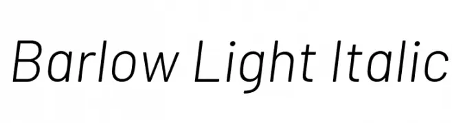
( Copyright 2017 The Barlow Project Authors (https://github.com/jpt/barlow) )
A modern, light, italic sans-serif font with low contrast and normal spacing.
![Barlow Light Italic Frei Schriftart Herunterladen]() Herunterladen 345 Downloads@WebFont
Herunterladen 345 Downloads@WebFont -
( Fonts by ShyFonts )
A bold, geometric font with a three-dimensional shaded effect.
![SF Theramin Gothic Shaded Frei Schriftart Herunterladen]() Herunterladen 345 Downloads@WebFont
Herunterladen 345 Downloads@WebFont -
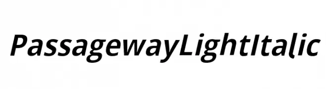
( Fonts by CannotIntoSpaceFonts - KineticPlasma Fonts - Personal-use only. For commercial use please contact owner. )
A sleek, modern light italic font with smooth, dynamic strokes.
![Passageway Light Italic Frei Schriftart Herunterladen]() Herunterladen 345 Downloads@WebFont
Herunterladen 345 Downloads@WebFont -
( Haksen Letters - Sarwo Edhi Prayitno )
A bold, playful font with rounded edges and a friendly appearance.
![The King Frei Schriftart Herunterladen]() Herunterladen 345 Downloads@WebFont
Herunterladen 345 Downloads@WebFont -
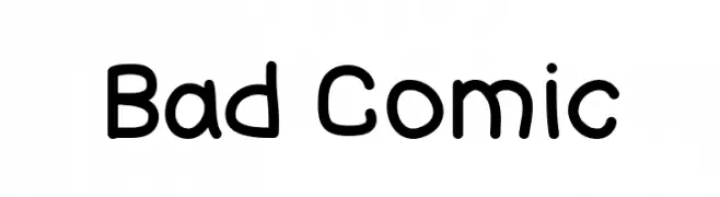
( Fonts by GGBot )
A playful, informal typeface with rounded, hand-drawn comic book style letters.
![Bad Comic Frei Schriftart Herunterladen]() Herunterladen 345 Downloads@WebFont
Herunterladen 345 Downloads@WebFont -
![Cathy's Art Deco Dings LT Frei Schriftart Herunterladen]() Herunterladen 345 Downloads@WebFont
Herunterladen 345 Downloads@WebFont -
( Fonts by Jacob Fisher - www.pizzadude.dk )
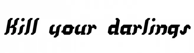
A bold, angular font with a futuristic and industrial feel.
![Kill your darlings Frei Schriftart Herunterladen]() Herunterladen 345 Downloads@WebFont
Herunterladen 345 Downloads@WebFont -
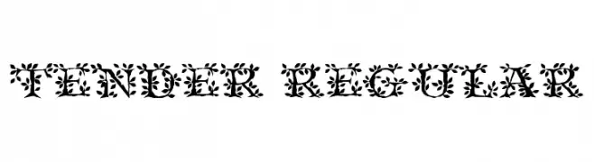
![Tender Regular Frei Schriftart Herunterladen]() Herunterladen 345 Downloads@WebFont
Herunterladen 345 Downloads@WebFont -
Schriftart von HeroglyphsStudio. For commercial use please contact the owner.
( Thank you for downloading this font This font is free for PERSONAL USE ONLY! Commercial license for this font can be purchased at: http://bit.ly/2xZ1L6Y )
A dynamic handwritten font with fluid, expressive strokes.
![Historia Frei Schriftart Herunterladen]() Herunterladen 345 Downloads@WebFont
Herunterladen 345 Downloads@WebFont -
![Number 19000 Block Regular Frei Schriftart Herunterladen]() Herunterladen 345 Downloads@WebFont
Herunterladen 345 Downloads@WebFont -
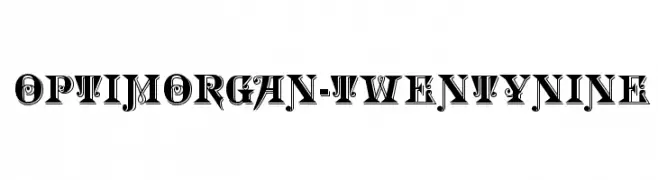
( Fonts by Castcraft Software - opti.netii.net - check the website before use )
A bold, decorative font with high contrast and intricate detailing.
![OPTIMorgan-TwentyNine Frei Schriftart Herunterladen]() Herunterladen 345 Downloads@WebFont
Herunterladen 345 Downloads@WebFont -
![AmSubodh Frei Schriftart Herunterladen]() Herunterladen 345 Downloads@WebFont
Herunterladen 345 Downloads@WebFont -
( Fonts by sronstudio )
A playful, bold handwritten font with rounded edges and a casual style.
![Misty Pink Frei Schriftart Herunterladen]() Herunterladen 345 Downloads@WebFont
Herunterladen 345 Downloads@WebFont -
( Fonts by Haksen Studio - Sarwo Edhi Prayitno - Personal-use only. For commercial use please contact owner. )
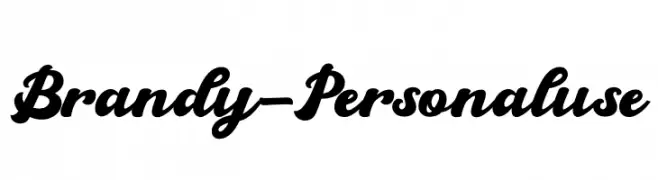
A bold, flowing script font with elegant, cursive letterforms.
![Brandy - Personal use Frei Schriftart Herunterladen]() Herunterladen 345 Downloads@WebFont
Herunterladen 345 Downloads@WebFont -
( Fonts by Press Gang Studios - Andeh Pinkard - www.pressgang-studios.com )
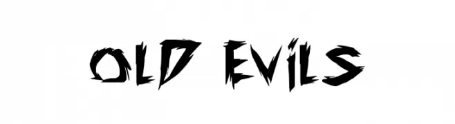
A bold, jagged font with sharp, angular edges and a dynamic, aggressive style.
![old evils Frei Schriftart Herunterladen]() Herunterladen 345 Downloads@WebFont
Herunterladen 345 Downloads@WebFont -
( Fonts by a Neale Davidson - www.pixelsagas.com. Personal-use only. For commercial use please contact owner. )
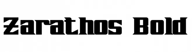
A bold, angular font with strong geometric shapes and a modern edge.
![Zarathos Bold Frei Schriftart Herunterladen]() Herunterladen 345 Downloads@WebFont
Herunterladen 345 Downloads@WebFont -
![612KosheyLinePL-Bold Frei Schriftart Herunterladen]() Herunterladen 345 Downloads@WebFont
Herunterladen 345 Downloads@WebFont -
![Questions Frei Schriftart Herunterladen]() Herunterladen 345 Downloads@WebFont
Herunterladen 345 Downloads@WebFont


Welche Schriften sind gerade am populärsten?
Poppins, Roboto, Montserrat, Open Sans und Lato sind wegen ihrer klaren Formen und breiten Einsetzbarkeit sehr gefragt – von Markenauftritt über Landingpages bis hin zu Postern.
Welche Fonts eignen sich für Logos?
Geometrische Sans‑Serifs (z. B. Poppins, Familien im Gotham‑Stil) sind ein häufiger Griff für sauberes, skalierbares Branding. Für eine persönlichere Note bleiben Scripts und Handschrift‑Stile beliebt. Kombinieren Sie einen prägnanten Headline‑Font mit einer neutralen Brotschrift für Wiedererkennung und Harmonie.
Wie oft wird die Top‑Liste aktualisiert?
Regelmäßig – basierend auf realen Downloads und Interaktionen. Schauen Sie öfter vorbei, um aufstrebende Favoriten früh zu entdecken.
💡 Tipp: Seite bookmarken – Trends wechseln schnell, und heutige Top‑Schriften inspirieren morgen vielleicht das Rebranding.