Willkommen bei den Top‑Schriften – hier treffen Beliebtheit und Qualität aufeinander. Das sind die in diesem Jahr am häufigsten heruntergeladenen und genutzten Fonts. Wenn Sie sichere Optionen für Logo, Web oder Social suchen, starten Sie hier.
Jeder Top‑Font überzeugt durch Balance, Lesbarkeit und Vielseitigkeit. Sie finden moderne Sans‑Serifs, elegante Scripts, Vintage‑Serifs und minimalistische Displays.
-
 Herunterladen 344 Downloads@WebFont
 -
( Ana - www.anasfonts.com/ )
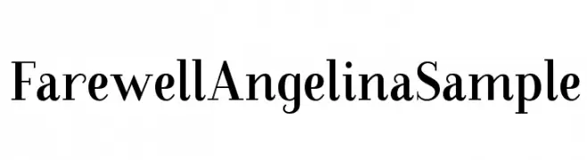
A classic serif font with elegant strokes and medium contrast.
![FarewellAngelinaSample Frei Schriftart Herunterladen]() Herunterladen 344 Downloads@WebFont
Herunterladen 344 Downloads@WebFont -
( Copyright 2016 The Chivo Project Authors (omnibus.type@gmail.com) )
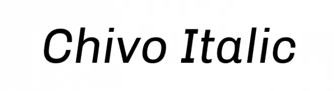
A modern, italic sans-serif font with clean lines and a dynamic slant.
![Chivo Italic Frei Schriftart Herunterladen]() Herunterladen 344 Downloads@WebFont
Herunterladen 344 Downloads@WebFont -
( Fonts by Steve Cloutier - www.cloutierfontes.ca )
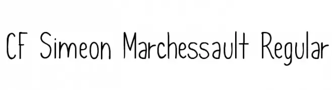
A playful, handwritten font with a modern and clean appearance.
![CF Simeon Marchessault Regular Frei Schriftart Herunterladen]() Herunterladen 344 Downloads@WebFont
Herunterladen 344 Downloads@WebFont -
( Fonts by prescottdesignshop.com - Personal-use only. For commercial use please contact owner. )
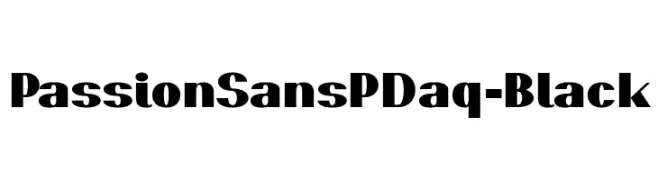
A bold, modern font with thick strokes and a dynamic slant.
![PassionSansPDaq-Black Frei Schriftart Herunterladen]() Herunterladen 344 Downloads@WebFont
Herunterladen 344 Downloads@WebFont -
( Fonts by Philatype - Personal-use only. For commercial use please contact owner. )
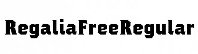
A bold, angular font with a modern geometric style.
![Regalia Free Regular Frei Schriftart Herunterladen]() Herunterladen 344 Downloads@WebFont
Herunterladen 344 Downloads@WebFont -
![nekoFont Frei Schriftart Herunterladen]() Herunterladen 344 Downloads@WebFont
Herunterladen 344 Downloads@WebFont -
( Studio Typo - www.studiotypo.com )
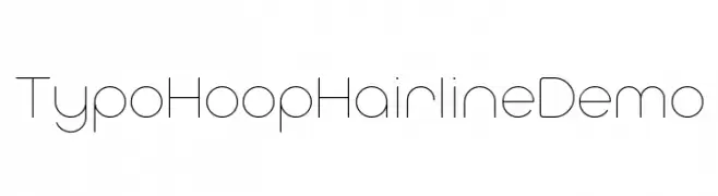
A minimalist, geometric font with thin, consistent strokes for a modern look.
![Typo Hoop Hairline Demo Frei Schriftart Herunterladen]() Herunterladen 344 Downloads@WebFont
Herunterladen 344 Downloads@WebFont -
( Fonts by Typhoon Type - Suthi Srisopha - www.typhoontype.net - Personal-use only. For commercial use please contact owner. )
A playful and elegant script font with smooth, flowing curves.
![MaketheBestPersonalUse Frei Schriftart Herunterladen]() Herunterladen 344 Downloads@WebFont
Herunterladen 344 Downloads@WebFont -
( Fonts by Nick Curtis - www.nicksfonts.com )
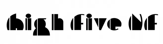
A bold, geometric font with Art Deco influences and unique cutout designs.
![High Five NF Frei Schriftart Herunterladen]() Herunterladen 344 Downloads@WebFont
Herunterladen 344 Downloads@WebFont -
( Fonts by Hideki Katayama - com4t-fff.seesaa.net )
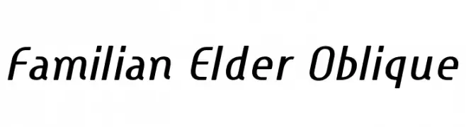
A modern, oblique font with clean lines and a dynamic style.
![Familian Elder Oblique Frei Schriftart Herunterladen]() Herunterladen 344 Downloads@WebFont
Herunterladen 344 Downloads@WebFont -
( Fonts by Daniel Zadorozny - www.iconian.com )
A futuristic, narrow font with consistent stroke widths and a modern aesthetic.
![Alien League Condensed Frei Schriftart Herunterladen]() Herunterladen 344 Downloads@WebFont
Herunterladen 344 Downloads@WebFont -
![Asimov Edge Extreme Frei Schriftart Herunterladen]() Herunterladen 344 Downloads@WebFont
Herunterladen 344 Downloads@WebFont -
( Fonts by www.aenigmafonts.com )
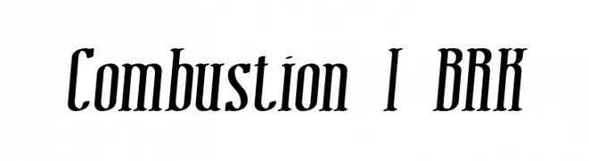
A bold, dynamic font with a slant and sharp serifs, ideal for impactful designs.
![Combustion I BRK Frei Schriftart Herunterladen]() Herunterladen 344 Downloads@WebFont
Herunterladen 344 Downloads@WebFont -
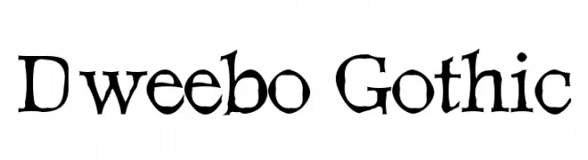
![Dweebo Gothic Frei Schriftart Herunterladen]() Herunterladen 344 Downloads@WebFont
Herunterladen 344 Downloads@WebFont -
( Fonts by www.DigitalDreamDesign.net )
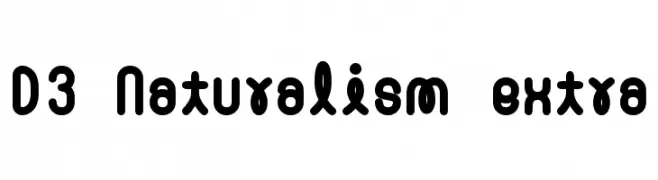
A bold, rounded font with a playful and modern style.
![D3 Naturalism extra Frei Schriftart Herunterladen]() Herunterladen 344 Downloads@WebFont
Herunterladen 344 Downloads@WebFont -
( Fonts by Scott Aneloski - www.aneloski.com )
A playful, whimsical handwritten font with flowing curves and loops.
![Ellephont Frei Schriftart Herunterladen]() Herunterladen 344 Downloads@WebFont
Herunterladen 344 Downloads@WebFont -
( Fonts by bob istheowl http://luc.devroye.org/bobistheowl.html )
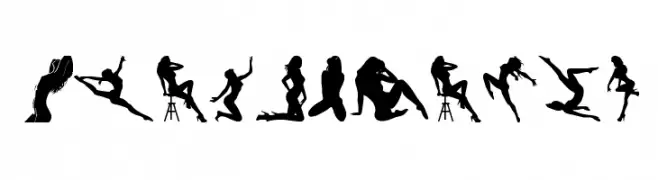
A display font featuring artistic female silhouettes as characters.
![BeautyMarks Frei Schriftart Herunterladen]() Herunterladen 344 Downloads@WebFont
Herunterladen 344 Downloads@WebFont -
( Fonts by Arkandis Digital Foundry )
A classic serif font with elegant italic styling and moderate contrast.
![AccanthisADFStdNo2-BoldItalic Frei Schriftart Herunterladen]() Herunterladen 344 Downloads@WebFont
Herunterladen 344 Downloads@WebFont -
( Copyright (c) 2015, Cadson Demak (info@cadsondemak.com) )
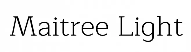
A modern serif font with elegant proportions and balanced stroke contrast.
![Maitree Light Frei Schriftart Herunterladen]() Herunterladen 344 Downloads@WebFont
Herunterladen 344 Downloads@WebFont -
( Fonts by www.chequered.ink - Chequered Ink - Personal-use only. For commercial use please contact owner. )
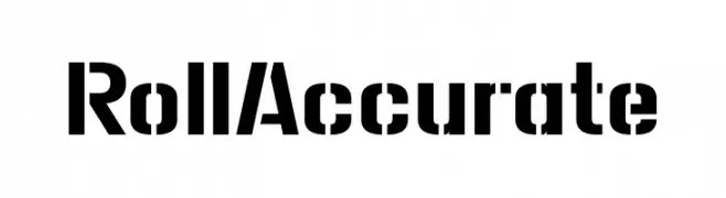
A bold, geometric stencil font with a modern industrial style.
![Roll Accurate Frei Schriftart Herunterladen]() Herunterladen 344 Downloads@WebFont
Herunterladen 344 Downloads@WebFont -
( Fonts by Darcy Baldwin - darcybaldwin.com. Free for personal use only )
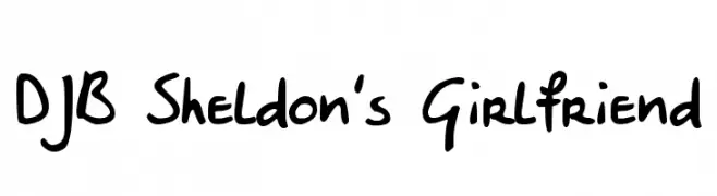
A playful, casual handwritten font with a friendly vibe.
![DJB Sheldon's Girlfriend Frei Schriftart Herunterladen]() Herunterladen 344 Downloads@WebFont
Herunterladen 344 Downloads@WebFont -
![Ingleby Bold Italic Frei Schriftart Herunterladen]() Herunterladen 344 Downloads@WebFont
Herunterladen 344 Downloads@WebFont -
( Fonts by Eddy Goodboy )
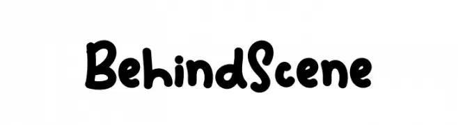
Playful, bold handwritten font.
![Behind Scene Frei Schriftart Herunterladen]() Herunterladen 344 Downloads@WebFont
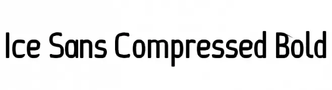
Herunterladen 344 Downloads@WebFont -
![Ice Sans Compressed Bold Frei Schriftart Herunterladen]() Herunterladen 344 Downloads@WebFont
Herunterladen 344 Downloads@WebFont -
( Fonts by Jacob Fisher - www.pizzadude.dk )
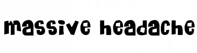
A bold, playful font with quirky, uneven characters.
![Massive Headache Frei Schriftart Herunterladen]() Herunterladen 344 Downloads@WebFont
Herunterladen 344 Downloads@WebFont -
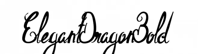
![ElegantDragonBold Frei Schriftart Herunterladen]() Herunterladen 344 Downloads@WebFont
Herunterladen 344 Downloads@WebFont -
![Macedonian Helv Bold Italic Frei Schriftart Herunterladen]() Herunterladen 344 Downloads@WebFont
Herunterladen 344 Downloads@WebFont -
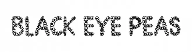
( Font by Jonathan Harris - www.tattoowoo.com )
A playful, circular-themed font with a bubbly and dynamic appearance.
![Black Eye Peas Frei Schriftart Herunterladen]() Herunterladen 344 Downloads@WebFont
Herunterladen 344 Downloads@WebFont -
( Fonts by www.fontalicious.com )
A futuristic, geometric font with a bold, digital aesthetic.
![Digit Cube Frei Schriftart Herunterladen]() Herunterladen 344 Downloads@WebFont
Herunterladen 344 Downloads@WebFont -
( Fonts by Octotype - www.foundmyfont.com - Personal-use only. For commercial use please contact owner. )
A bold, vintage-style font with a strong, commanding presence.
![Bien dans mon Slip Frei Schriftart Herunterladen]() Herunterladen 344 Downloads@WebFont
Herunterladen 344 Downloads@WebFont -
( Fonts by ShyFonts )
A bold, italic font with a modern and sleek design.
![SF New Republic Bold Italic Frei Schriftart Herunterladen]() Herunterladen 344 Downloads@WebFont
Herunterladen 344 Downloads@WebFont -
( Fonts by Daniel Zadorozny - www.iconian.com - Free for personal use )
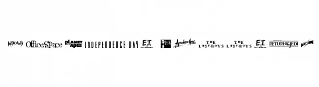
A display font where each character is styled after a famous movie logo.
![Movie Gallery Frei Schriftart Herunterladen]() Herunterladen 344 Downloads@WebFont
Herunterladen 344 Downloads@WebFont -
( Fonts by Graphicfresh - Personal-use only. For commercial use please contact owner. )
A bold, geometric sans-serif font with uniform strokes and a modern look.
![Edmund-Free Frei Schriftart Herunterladen]() Herunterladen 344 Downloads@WebFont
Herunterladen 344 Downloads@WebFont -
( Fonts by Scratchones )
Decorative script font with elegant, flowing lines.
![Olive Oil Frei Schriftart Herunterladen]() Herunterladen 344 Downloads@WebFont
Herunterladen 344 Downloads@WebFont


Welche Schriften sind gerade am populärsten?
Poppins, Roboto, Montserrat, Open Sans und Lato sind wegen ihrer klaren Formen und breiten Einsetzbarkeit sehr gefragt – von Markenauftritt über Landingpages bis hin zu Postern.
Welche Fonts eignen sich für Logos?
Geometrische Sans‑Serifs (z. B. Poppins, Familien im Gotham‑Stil) sind ein häufiger Griff für sauberes, skalierbares Branding. Für eine persönlichere Note bleiben Scripts und Handschrift‑Stile beliebt. Kombinieren Sie einen prägnanten Headline‑Font mit einer neutralen Brotschrift für Wiedererkennung und Harmonie.
Wie oft wird die Top‑Liste aktualisiert?
Regelmäßig – basierend auf realen Downloads und Interaktionen. Schauen Sie öfter vorbei, um aufstrebende Favoriten früh zu entdecken.
💡 Tipp: Seite bookmarken – Trends wechseln schnell, und heutige Top‑Schriften inspirieren morgen vielleicht das Rebranding.